

When it comes to enhancing the look of a brick house, choosing the right accent colors can make all the difference. I’ve seen how various hues can transform a home’s character and curb appeal. From classic whites to bold oranges, each color brings something unique to the table. Curious to find out which shades can elevate your brick home’s aesthetic? Let’s explore some enchanting options that might just inspire your next project.
Choosing the Right Accent Colors for Your Brick Home

When considering accent colors for your brick home, it’s essential to think about how these hues will complement the natural tones of the brick.
I’ve found that earthy greens and soft blues can enhance the warm undertones beautifully.
You might also explore deeper shades like charcoal or navy, which add depth and sophistication, creating a striking contrast without overwhelming your home’s charm.
Classic White: A Timeless Accent

Classic white serves as a timeless accent for brick homes, effortlessly enhancing their beauty.
I love how it brightens the facade, creating a fresh, inviting look.
It instantly brightens the exterior, adding a welcoming and vibrant touch to any home.
Whether it’s trim, shutters, or doors, white brings a clean contrast that highlights the brick’s rich textures.
This classic choice never goes out of style, making it a reliable option for any homeowner wanting elegance.
Deep Charcoal: Bold Contrast for Brick
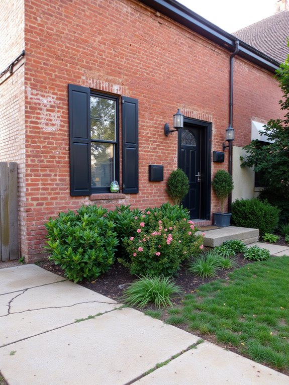
While many accent colors can complement brick, deep charcoal stands out as a bold choice that adds sophistication and drama.
I love how it creates a striking contrast against warm brick tones, making architectural details pop.
Whether it’s for window frames or front doors, deep charcoal exudes elegance.
It’s the perfect way to elevate your brick home’s overall aesthetic.
Soft Sage Green: A Refreshing Natural Touch
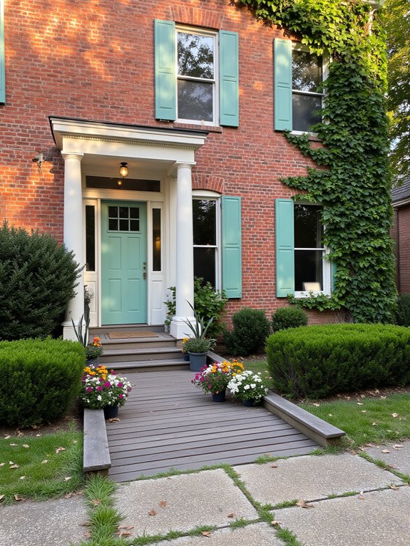
Soft sage green is one of my favorite accent colors for brick homes, offering a rejuvenating natural touch that breathes life into the exterior.
It harmonizes beautifully with earthy tones and lush landscapes, creating a serene atmosphere.
Whether it’s used for shutters, doors, or trim, soft sage green adds subtle elegance, making your brick home feel inviting and fresh without overwhelming its charm.
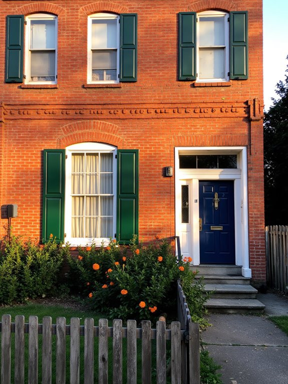
Rich Navy Blue: Elevating Curb Appeal

If you’re looking to make a bold statement with your brick home’s exterior, consider incorporating rich navy blue as an accent color.
This deep hue beautifully contrasts with warm brick tones, creating an eye-catching effect.
I love how navy blue enhances architectural details like shutters or doors, adding depth and sophistication.
It’s a timeless choice that elevates curb appeal and makes your home truly stand out.
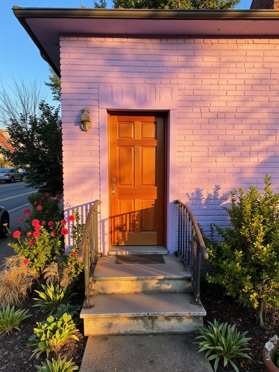
Vibrant Coral: A Cheerful Splash

How can you bring a vibrant burst of energy to your brick home? Consider painting your front door or shutters a lively coral.
This cheerful hue instantly brightens the space and invites warmth. I’ve tried this myself, and it creates a stunning contrast against the classic brick.
Plus, coral complements various landscaping elements, making your home feel welcoming and alive.
Earthy Terracotta: A Warm Complement
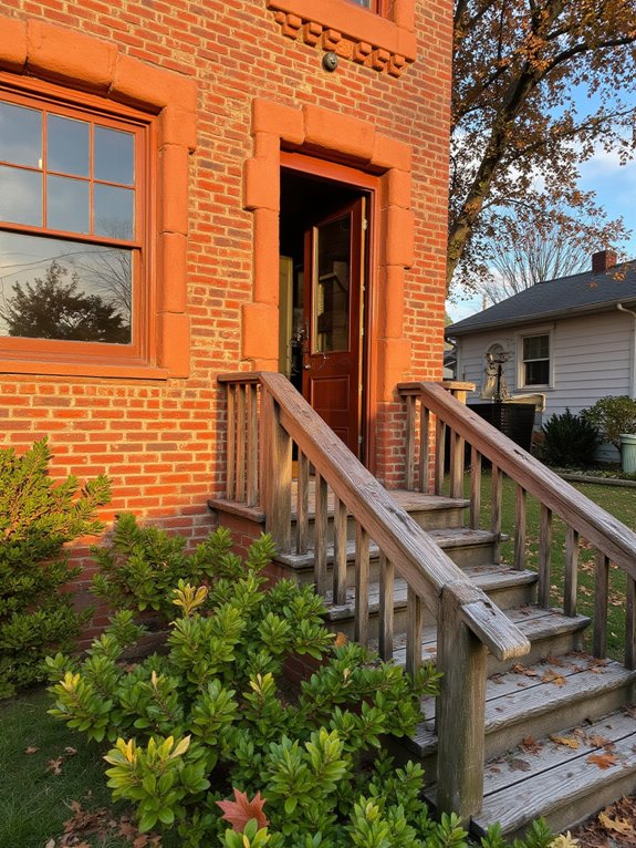
After adding a vibrant coral touch to your home, consider the warmth of earthy terracotta for a more grounded look.
This rich, warm hue beautifully complements brick, enhancing its natural tones. I love how terracotta adds an inviting touch, creating a cozy atmosphere.
Whether on shutters or front doors, it’s a versatile choice that harmonizes effortlessly with your home’s overall aesthetic.
Crisp Black: A Dramatic Modern Touch
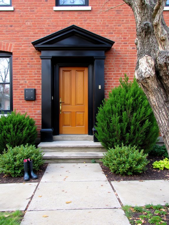
While earthy terracotta brings warmth to a brick facade, crisp black introduces a striking contrast that modernizes the entire look.
I love how black accents elevate the home’s aesthetic, providing a bold statement against the warm tones of the brick.
Whether it’s window frames, doors, or trim, this color choice adds a dramatic flair that’s both sleek and sophisticated.
Trust me, you’ll adore it!
Pale Gray: Soft Sophistication
Pale gray offers an invigorating touch of soft sophistication that beautifully complements a brick house.
I love how it enhances the brick’s warmth while adding a modern twist. Choosing pale gray for shutters or trim creates a subtle contrast that’s both elegant and inviting.
It’s perfect for anyone looking to achieve a refined, understated look without overwhelming the classic beauty of brick.
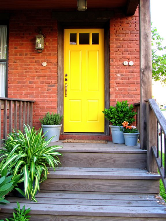
Golden Yellow: Brightening Your Brick Facade
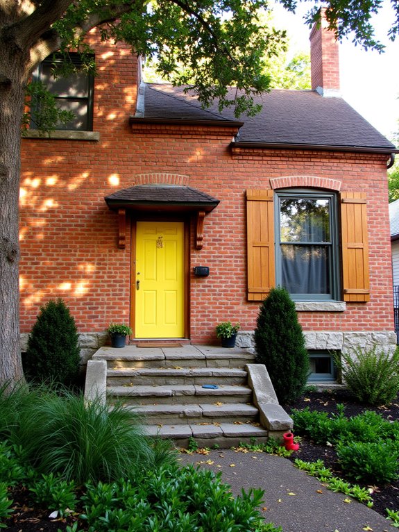
If you’re looking to infuse your brick facade with a cheerful burst of color, golden yellow is an excellent choice.
I’ve found that this vibrant hue not only brightens the overall appearance but also creates a welcoming atmosphere.
Whether you paint your front door or add shutters, golden yellow will definitely make your home stand out in the neighborhood!
Dusty Rose: A Soft, Romantic Accent
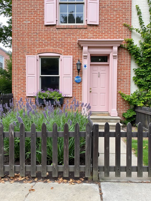
Romance and warmth come to life with the addition of dusty rose accents to your brick facade.
I love how this soft hue complements the earthy tones of brick, creating a cozy, inviting atmosphere.
Whether you choose dusty rose for shutters, doors, or trim, it adds a touch of elegance and charm, making your home feel uniquely yours.
Opt for dusty rose accents on shutters, doors, or trim to infuse your home with elegance and personal charm.
It’s simply enchanting!
Forest Green: Nature at Your Doorstep
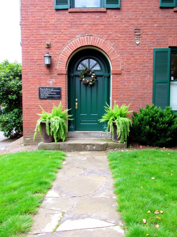
After embracing the soft elegance of dusty rose, consider how forest green can bring a rejuvenating touch of nature to your brick home.
This rich hue evokes lush forests, making your space feel vibrant and alive.
Pairing forest green shutters or front doors with your brick facade creates a stunning contrast that invites the outdoors in, enhancing your home’s charm beautifully.
Sunny Lemon: A Playful Addition
A splash of sunny lemon can transform your brick home into a cheerful retreat.
I’ve found that this vibrant hue adds a playful touch to doors, shutters, or even window boxes. It’s perfect for brightening up a more muted brick facade.
Plus, it pairs beautifully with greenery, creating a lively contrast that invites warmth and joy into your outdoor space.
Classic Red: Emphasizing Brick’s Warmth
Choosing accent colors for your brick home can create unique vibes, and while sunny lemon brings a playful energy, classic red truly emphasizes the warmth inherent in brick.
I love how classic red highlights the rich tones of my brick exterior, creating a cozy and inviting atmosphere.
It adds depth and character, making my home feel both timeless and welcoming.
Light Beige: A Cozy Contrast
While classic red beautifully highlights the warmth of brick, light beige offers a cozy contrast that softens the overall look of my home.
I love how it complements the earthy tones of the brick, creating a welcoming atmosphere.
This subtle hue enhances my outdoor decor, making the entryway feel more inviting.
It’s a perfect balance that adds charm without overwhelming the natural beauty of the brick.
Teal Blue: A Unique Accent Choice
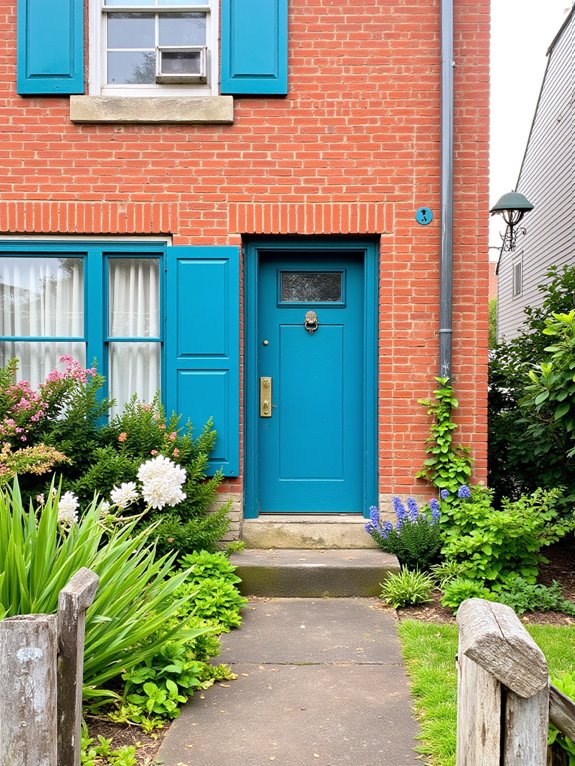
When incorporating teal blue into your brick home’s color scheme, you’ll discover a vibrant accent that brings a fresh and modern touch.
I’ve found that teal pairs beautifully with warm brick tones, creating a striking contrast.
Whether you choose teal shutters, a front door, or decorative elements, this unique color adds personality and charm, making your home stand out in the neighborhood.
Lavender: Softening With Color
As I explore the use of lavender in a brick home’s color scheme, I find it can beautifully soften the overall appearance.
This gentle hue complements the warm tones of brick, creating a serene and inviting atmosphere.
Whether it’s through shutters, trim, or flower boxes, lavender adds a touch of elegance without overwhelming the home’s natural beauty.
Lavender effortlessly enhances elegance, beautifully complementing the home’s natural beauty through shutters, trim, or flower boxes.
It’s truly a delightful choice!
Chocolate Brown: A Rich, Grounding Option
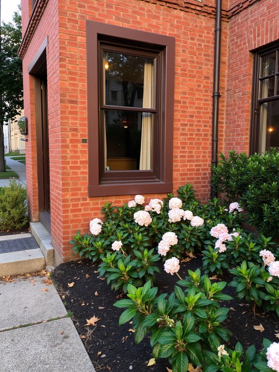
Chocolate brown serves as a rich, grounding option for accenting a brick home.
I love how it complements the warm tones of the bricks while adding depth and sophistication.
Whether you choose chocolate brown for shutters, doors, or trim, it creates a cohesive look that feels inviting.
This color truly enhances a home’s character, making it stand out beautifully in any neighborhood.
Bold Orange: Infusing Energy Into Your Home
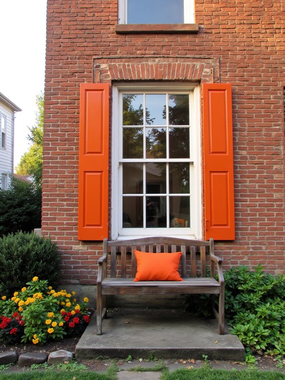
While chocolate brown offers a warm and grounding feel, bold orange brings a vibrant energy that can completely transform the look of your brick home.
I love how this color pops against the classic brick, creating an inviting atmosphere.
Whether it’s a front door or window shutters, bold orange not only energizes your space but also makes a striking statement that’s hard to ignore.