

When it comes to selecting the ideal exterior colors for contemporary homes, I love mixing timeless classics with bold accents. Each color can totally refresh a home’s look and enhance its curb appeal. From elegant whites to rich, nature-inspired tones, there’s so much to consider. I’ll be sharing ideas that aren’t just beautiful but enduring as well. Let’s explore these inspiring color palettes together.
Timeless White: A Classic Choice for Modern Homes
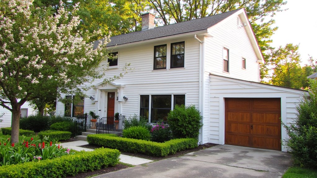
When it comes to choosing an exterior color, white stands out as a timeless choice that never goes out of style.
I love how it creates a clean, fresh look for modern homes. White reflects light beautifully, making spaces feel larger and more inviting.
Plus, it complements various architectural designs, allowing me to add personal touches with other accents effortlessly.
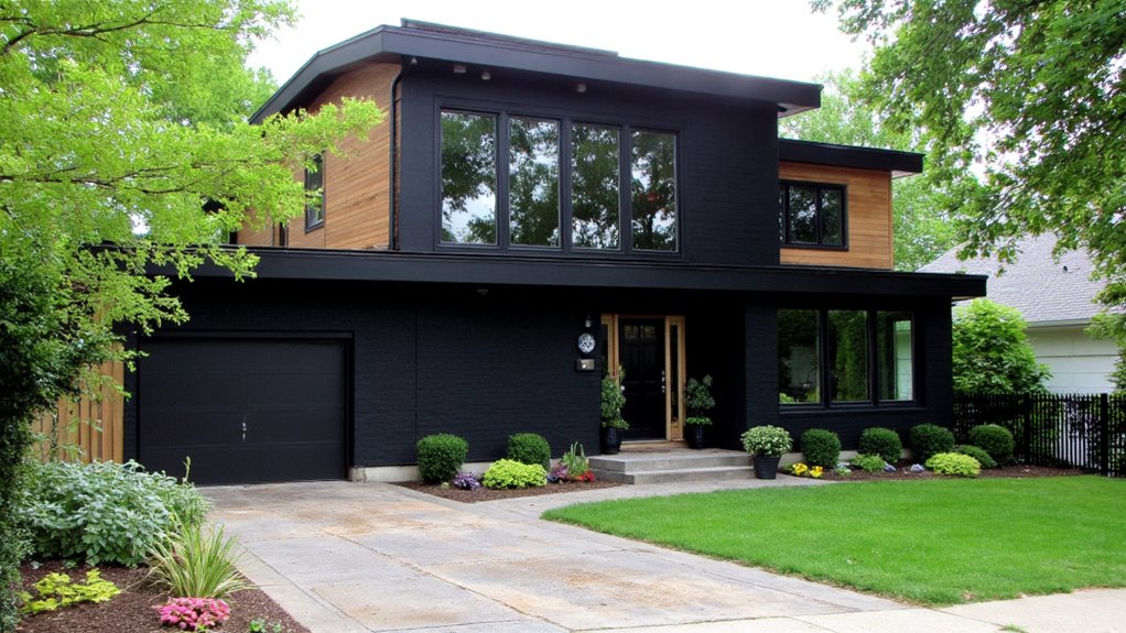
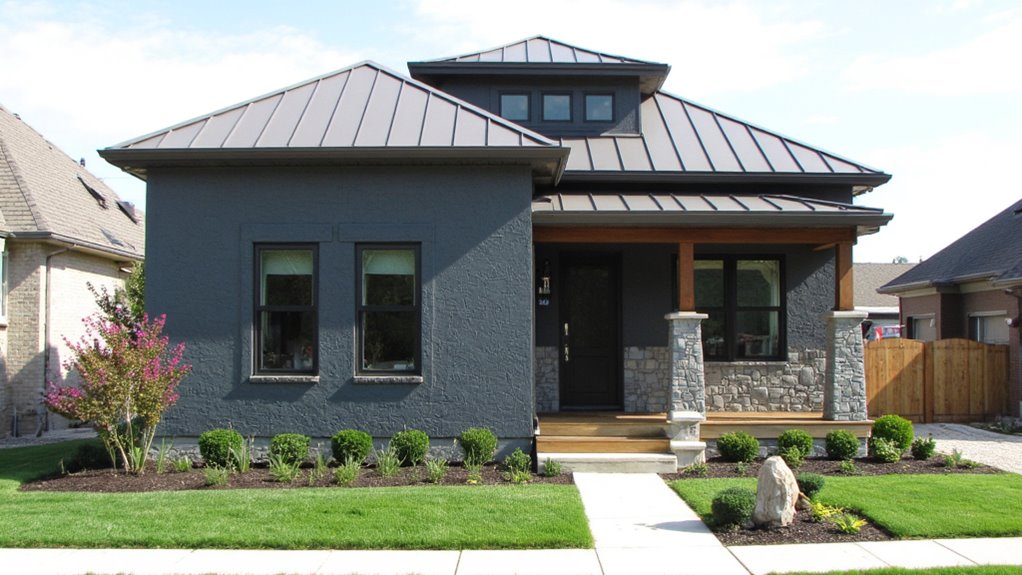
Bold Charcoal: Make a Statement With Dark Hues
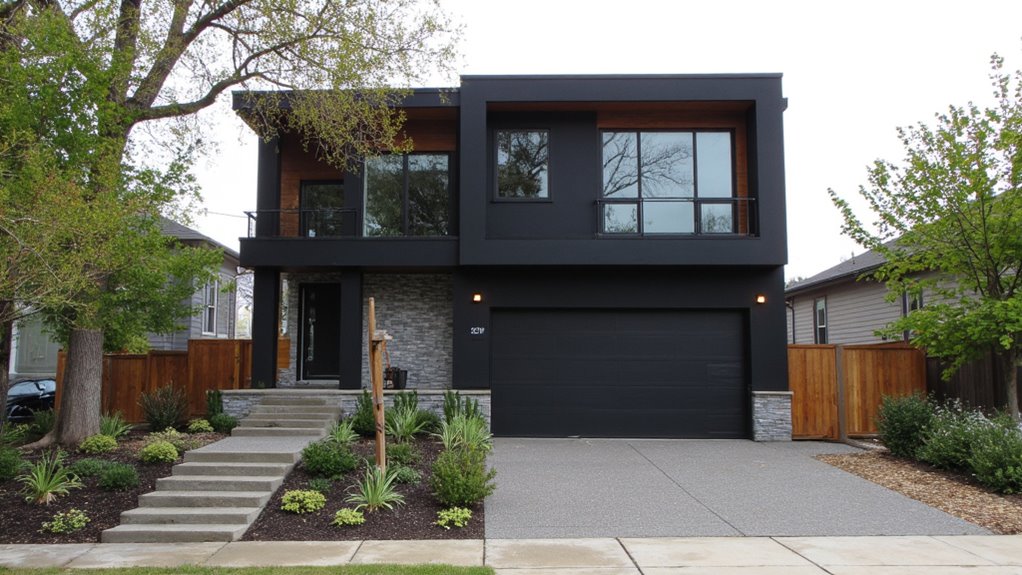
While light colors have their charm, I find that bold charcoal can truly transform a home’s exterior into a striking focal point.
This deep hue exudes sophistication and modernity, making your home stand out in any neighborhood.
Pair it with bright accents or natural wood elements, and you’ve created an eye-catching contrast that elevates your home’s overall aesthetic.
Combining bold charcoal with vibrant accents or natural wood creates a stunning contrast that enhances your home’s beauty.
It’s a daring choice that pays off beautifully.
Soft Beige: The Perfect Neutral for Any Style

After exploring the dramatic impact of bold charcoal, let’s consider the understated elegance of soft beige.
I love how this versatile shade complements any architectural style, from modern to traditional. Soft beige creates a warm, inviting atmosphere while allowing other design elements to shine.
Whether paired with crisp white trim or rich wood accents, it’s a timeless choice that never goes out of style.
Earthy Terracotta: Embrace Natural Warmth
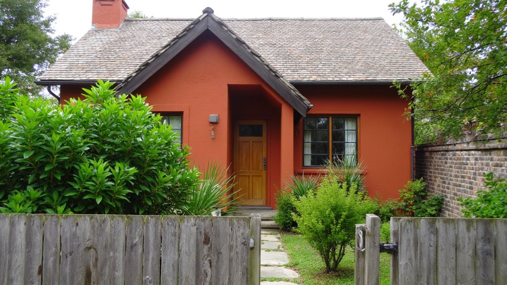
Embracing earthy terracotta brings a sense of warmth and connection to nature that I find enchanting.
This rich hue radiates comfort, making my home feel inviting and grounded.
I love how terracotta complements lush greenery and brightens up any space, creating a harmonious balance.
It’s a color that effortlessly enhances both modern and traditional designs, bringing a timeless charm to contemporary exteriors.
Cool Gray: A Contemporary Twist on Traditional Shades
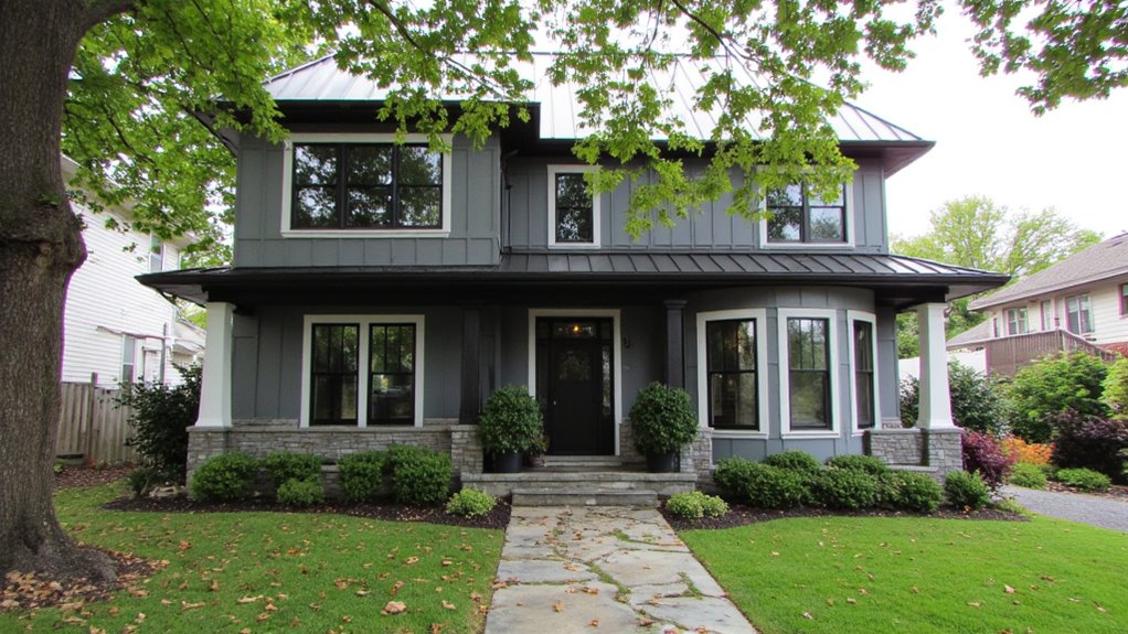
Switching gears from the warm embrace of earthy terracotta, cool gray offers a sleek and modern alternative that redefines traditional color palettes.
I love how this shade brings a refined elegance to contemporary homes, creating a calming backdrop. It pairs beautifully with various materials, enhancing architectural details while maintaining a chic simplicity.
Trust me, cool gray can truly elevate your home’s exterior.
Vibrant Blue: Energize Your Exterior With Color
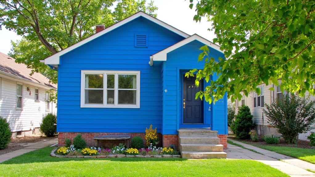
While many homeowners shy away from bold colors, I believe vibrant blue can truly transform your exterior into a stunning focal point.
This striking hue not only energizes your space but also creates a welcoming vibe.
Whether you choose to paint your entire house or add vibrant blue accents, it’s a sure way to make a lasting impression in your neighborhood.
Why You’ll Love Sage Green for a Nature-Inspired Look

After exploring the bold allure of vibrant blue, let’s turn our attention to sage green, a color that beautifully embodies the tranquility of nature.
I love how sage green creates a calming atmosphere, seamlessly blending with the surrounding landscape.
Sage green fosters a soothing ambiance, harmonizing effortlessly with nature’s beauty.
It evokes a sense of peace and harmony, making my home feel like a serene retreat.
Trust me, you’ll adore this nature-inspired hue!
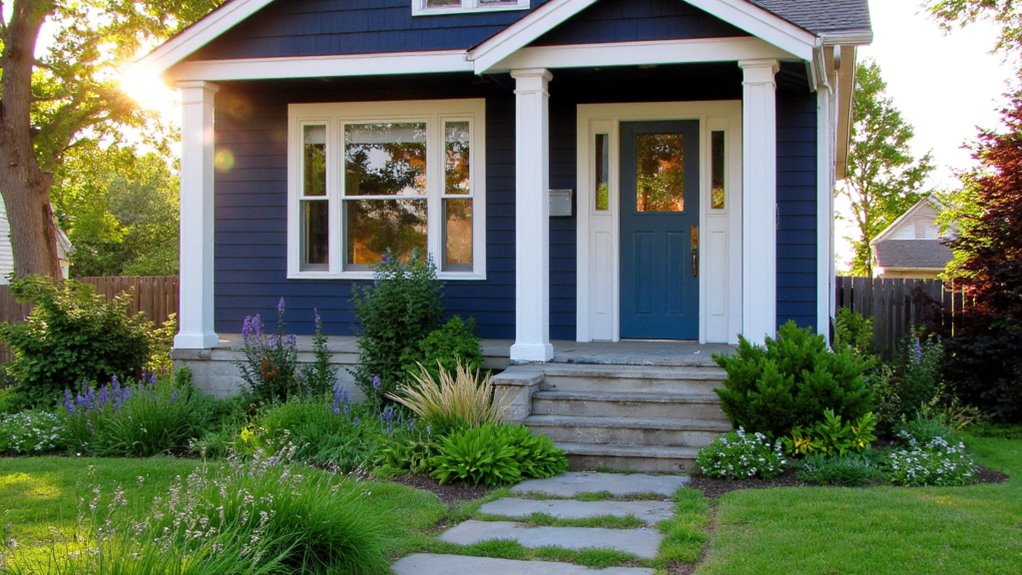
Rich Navy: A Sophisticated Alternative to Black
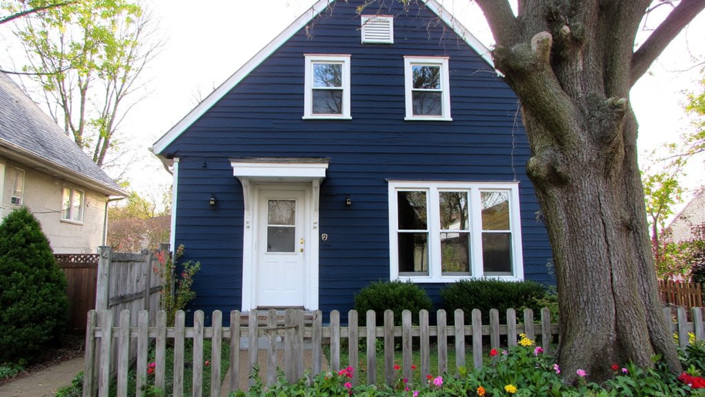
If you’re looking for a color that exudes sophistication without the harshness of black, rich navy is the perfect choice.
It adds depth and elegance to any contemporary home, creating a striking contrast with white trim or natural wood accents.
I love how it can make a statement while still feeling timeless and inviting, transforming your exterior into a chic masterpiece.
Light Pastels: Soft Colors for a Charming Appearance
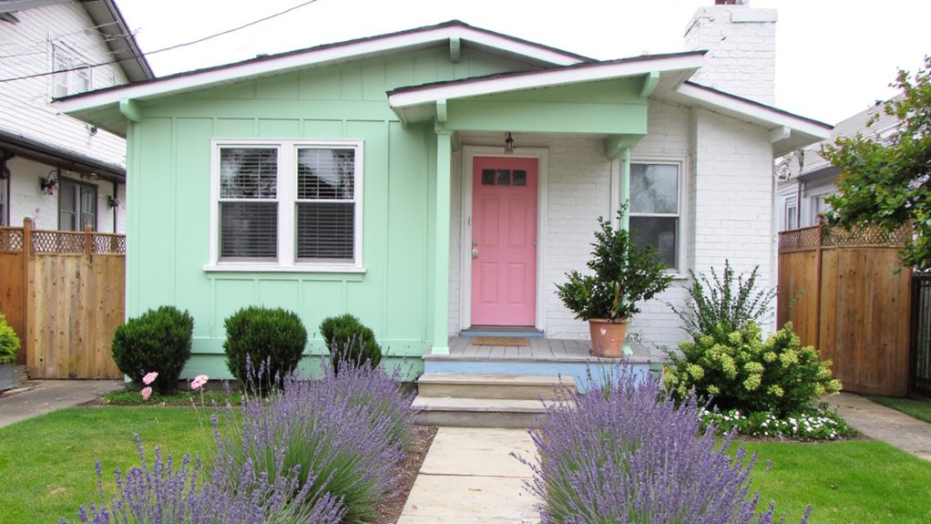
Rich navy offers a bold statement, but light pastels bring a revitalizing, soft charm that’s hard to resist.
When I think of serene exteriors, I envision gentle shades like mint green, blush pink, or baby blue.
These colors not only enhance a home’s appeal but also create a welcoming atmosphere.
Trust me, light pastels can transform your house into a charming retreat.
Bright Red: Energizing Your Home’s Curb Appeal

Bright red can instantly elevate your home’s curb appeal, making it a standout in any neighborhood.
Bright red enhances curb appeal, making your home a vibrant standout in the neighborhood.
I’ve seen how this bold color radiates energy and warmth, drawing attention and sparking conversations.
It’s perfect for creating a modern yet inviting atmosphere.
Whether you choose a full façade or just accent details, bright red can transform your home into an eye-catching masterpiece.
Warm Taupe: A Versatile Color for Modern Designs
After exploring the vibrant energy of bright red, let’s turn to warm taupe, a color that brings a sophisticated touch to modern designs.
I love how this versatile hue complements various architectural styles, from sleek minimalism to cozy craftsman homes.
It creates a calming atmosphere while enhancing your home’s natural surroundings, making it an ideal choice for an inviting and elegant exterior.
Classic Black: A Timeless Exterior Color Choice
While some may shy away from darker colors, I find that classic black stands as a striking and timeless choice for home exteriors.
It exudes elegance and sophistication, making a bold statement without being overwhelming.
Black pairs beautifully with various architectural styles and landscaping, enhancing the overall aesthetic.
Black complements diverse architectural styles and landscaping, elevating the overall visual appeal of any home.
Plus, it offers a sleek backdrop that allows other design elements to shine.
Muted Mustard: A Unique Color That Stands Out
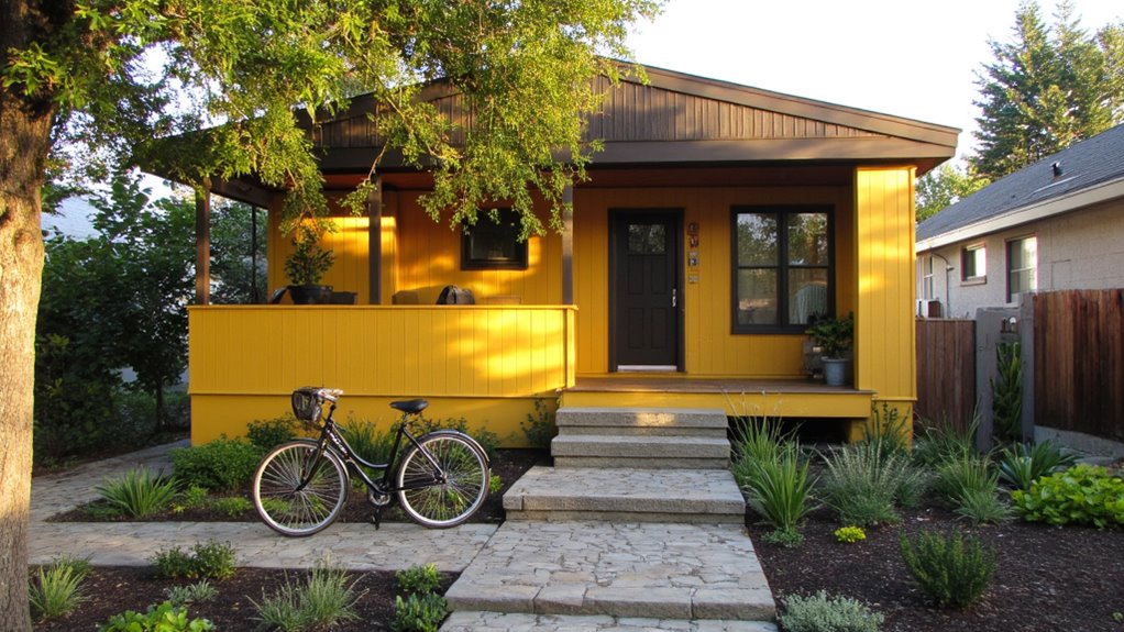
Moving from the bold elegance of black, muted mustard offers an invigorating alternative that truly stands out.
I love how this warm hue adds character and warmth to contemporary homes. It pairs beautifully with natural elements like wood and stone, creating a welcoming atmosphere.
If you want your house to be unique yet inviting, muted mustard is a fantastic choice.
Fresh Mint: A Refreshing Coastal Vibe for Your Home
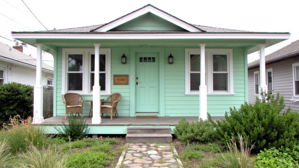
If you’re looking to infuse your home with a revitalizing coastal vibe, fresh mint is an excellent choice.
This soft, airy hue evokes the soothing essence of ocean breezes and sunlit shores.
Pair it with crisp white trim for a clean contrast, or mix it with natural wood elements for warmth.
Trust me, fresh mint will transform your space into a serene coastal retreat.
Deep Forest Green: Bold Choices for Nature Lovers
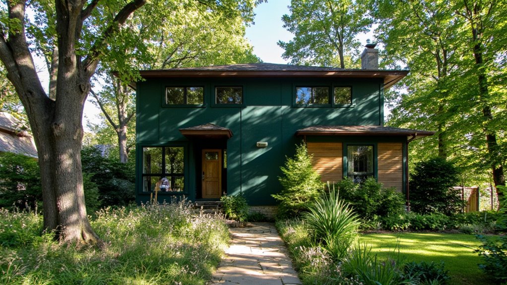
When you want to make a statement that connects your home to the tranquility of nature, deep forest green is a powerful choice.
It envelops your space in a soothing ambiance, creating a seamless blend with the landscape. This bold hue not only stands out but also complements natural elements, inviting a sense of peace and harmony that resonates with nature lovers like me.
Chic Slate: Modern Meets Traditional in Color
While some might think choosing a color for a modern home means going bold or bright, I find that chic slate strikes the perfect balance between contemporary and traditional.
This versatile shade adds sophistication without overwhelming the senses. It complements various architectural styles beautifully, allowing your home to stand out effortlessly.
Plus, slate pairs wonderfully with natural surroundings, creating a harmonious aesthetic.
Sunny Yellow: Brighten Up Your Home’s Exterior

Choosing sunny yellow for your home’s exterior can instantly uplift its appearance, creating a warm and inviting atmosphere.
I’ve found that this vibrant color not only brightens up the surroundings but also lifts my mood every time I approach my front door.
Paired with white trim, sunny yellow really pops, making my home stand out in the neighborhood while radiating positivity.
Warm Cinnamon: Cozy Options for Rustic Homes
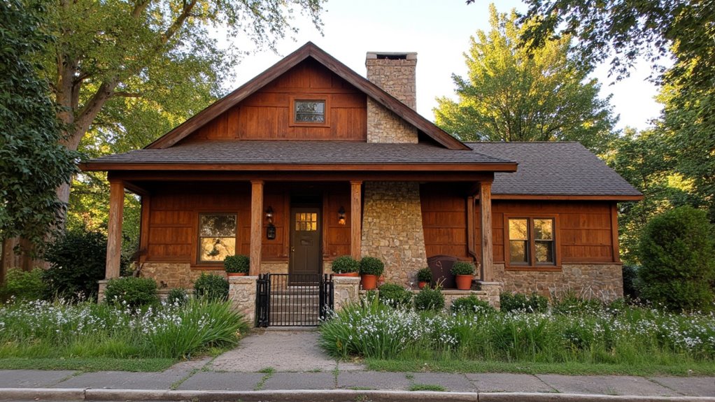
After brightening up your home with sunny yellow, consider the warm and inviting tones of cinnamon for a more rustic appeal.
This earthy hue adds a cozy charm that complements natural materials like wood and stone.
I love how cinnamon can evoke feelings of warmth and comfort, making your home feel welcoming.
It’s perfect for creating a serene, inviting atmosphere.
Subtle Lilac: A Soft Touch for Contemporary Styles
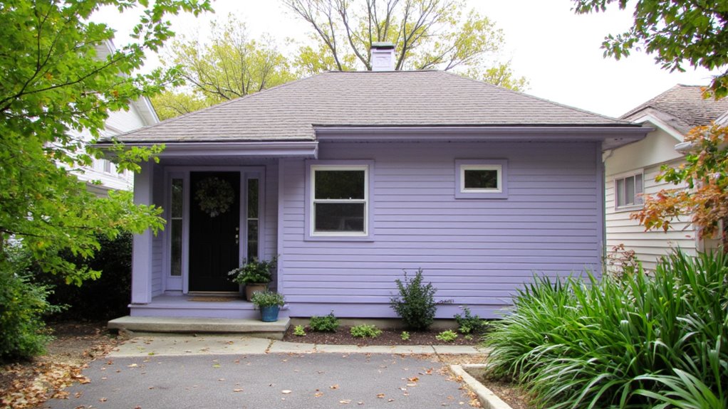
When I think about adding a touch of elegance to contemporary homes, subtle lilac immediately comes to mind.
This gentle hue brings a revitalizing softness that enhances modern designs without overwhelming them.
I love how it pairs beautifully with crisp whites and dark accents, creating a balanced look.
Whether used as a main color or an accent, subtle lilac truly stands out.
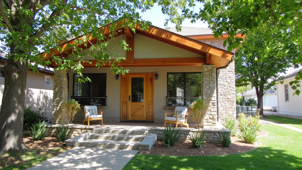
Choosing Textured Finishes to Enhance Color Impact
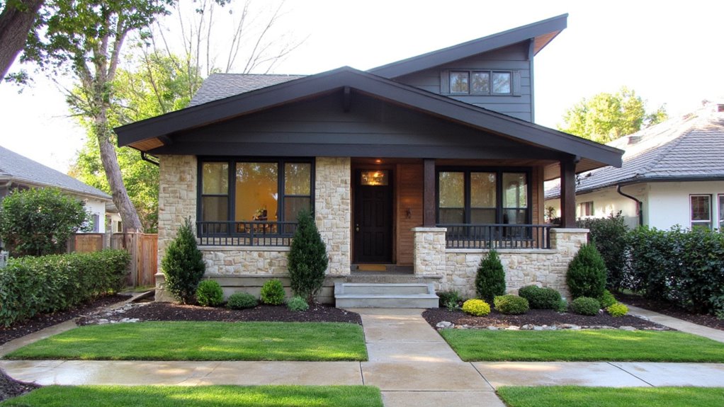
While I often focus on color when planning a home’s exterior, textured finishes can greatly enhance the overall impact.
Incorporating materials like stucco, wood, or stone adds depth and interest, making colors pop. I love how a rough texture can contrast with smooth surfaces, creating a dynamic look.
Choosing the right finish not only elevates color but also defines your home’s character.
Trim Colors That Complement Your Main Hue
Textured finishes not only enhance color impact but also set the stage for selecting trim colors that can truly elevate your home’s exterior.
I’ve found that complementary hues, like crisp whites or deep charcoals, can beautifully highlight your main color.
Consider the overall mood you want to create, whether it’s inviting or modern, and choose trim shades that reflect that vision.
Seasonal Tips for Choosing Your Exterior Colors Year-Round

As the seasons change, so can your home’s exterior colors, allowing you to reflect the beauty of nature throughout the year.
In spring, I love soft pastels; summer calls for vibrant hues; autumn inspires warm earth tones; and winter often feels best with cool, crisp shades.