

I’ve spent weekends pondering paint colors that turn ordinary houses into modern standouts.
Colors flop hardest when homeowners ignore how afternoon light shifts tones across the walls.
They succeed by limiting bold shades to one key surface and surrounding them with calm neutrals.
The soft slate blue on a facade paired with pale trim keeps drawing my eye.
Try that approach next time.
Black Exterior Paint
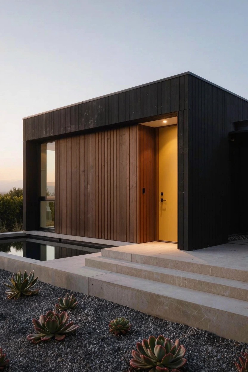
Black paint on the outside of a house like this one turns a simple modern box into something that really catches the eye. The deep, almost matte black on those vertical boards soaks up the fading light and sets off the warmer wood around the door. It feels bold without trying too hard.
You can pull this off on flat-roofed homes or anywhere with clean lines. Just add a wood door or some stone steps nearby to warm it up. It suits dry spots like hillsides, where dust won’t show as much… but test a patch first to see how the sun hits it.
Navy Garage Door on Light Blue Siding
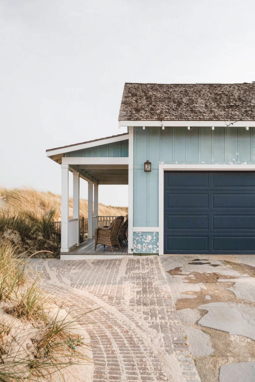
A navy garage door stands out strong against light blue siding like you see here. That dark color pulls your eye right to the front of the house and gives it some punch. It’s a simple change that makes the place look put together and fresh, especially with the white trim around it.
This works best on homes with pale walls, like beach cottages or modern farmhouses. Paint the door first if it’s faded. Keep the rest light so the navy does its job. Not too many colors though, or it gets busy.
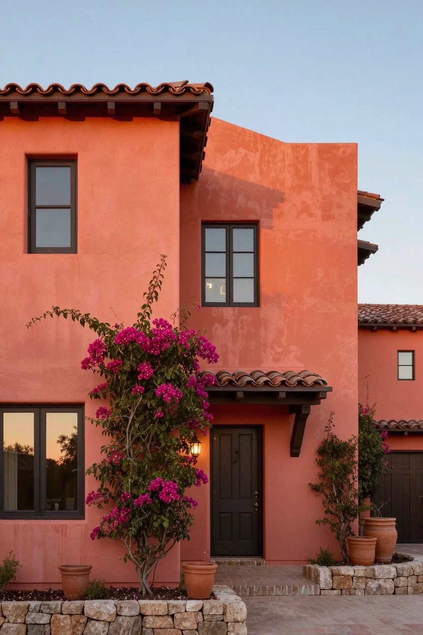
Terracotta Exterior Walls
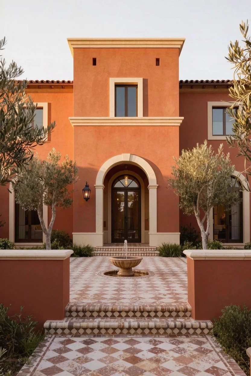
Terracotta paint on house walls brings a warm, earthy glow that feels fresh and modern. It stands out against green landscaping like those olive trees here. The color picks up the sun nicely and gives the whole front a welcoming vibe without being too loud.
Try it on stucco or smooth plaster homes in sunny spots. It works best with simple white or beige trim around doors and windows. Pair it with a tiled entry area for extra interest. Just clean it now and then. Dirt shows up more on the orange tones.
Light Gray Siding for Clean Modern Homes
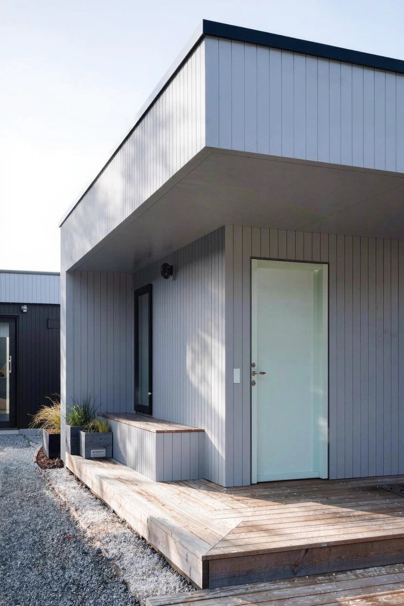
Light gray siding like this shows up clean and simple on a house. It keeps things modern without much fuss. The pale shade picks up the sky and nearby trees. A white door stands out just right at the entry.
This color works best on boxy homes or ones with flat roofs. Add a wood deck out front for some warmth. It suits gravel yards or open lots. Just make sure the gray isn’t too cool. Test a sample first in your light.
White Siding with Dark Trim
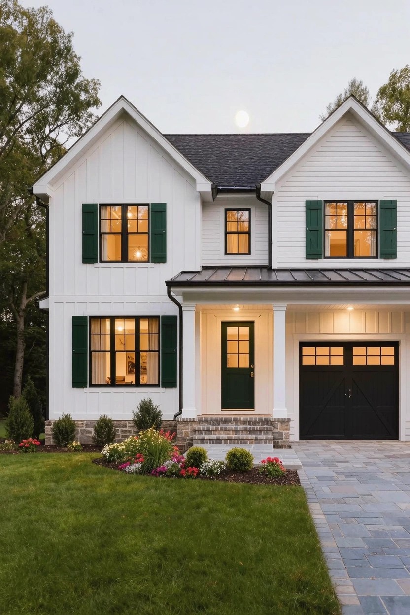
A white siding like this board-and-batten style looks fresh and clean when you add dark trim around the windows and doors. The black front door and garage pull it together. Dark green shutters give just enough color without overdoing it. That contrast works well because it makes the house show up better from the street. Especially nice in the evening light.
Put this on a simple two-story home in the suburbs or country. Pick a bright white paint that holds up to weather, and go with black or deep green on trim areas. Skip it on super busy streets where dirt shows more. Add some boxwoods or flowers along the walk to finish it off.
Bright Yellow Walls
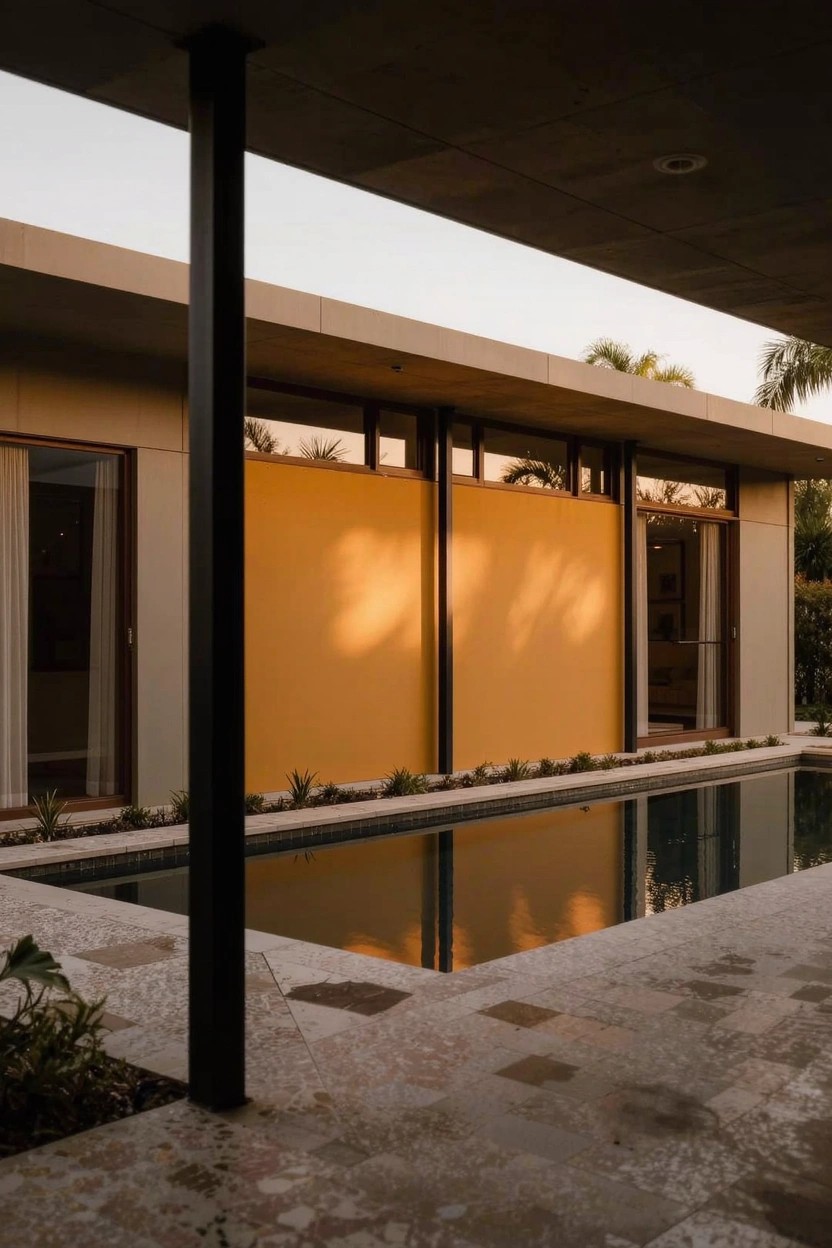
A bright yellow wall like this one turns a simple modern house into something you remember. It stands out against plain concrete pillars and glass doors. The color picks up sunset light nicely and makes the whole outdoor space feel warmer. People notice it right away from the pool deck.
Try this on flat modern facades or midcentury homes in sunny spots. Pair it with stone paving or black trim to keep things balanced. Skip it on busy streets. It works best where you want a pop of color without going overboard.
Dark Navy Paint on House Siding
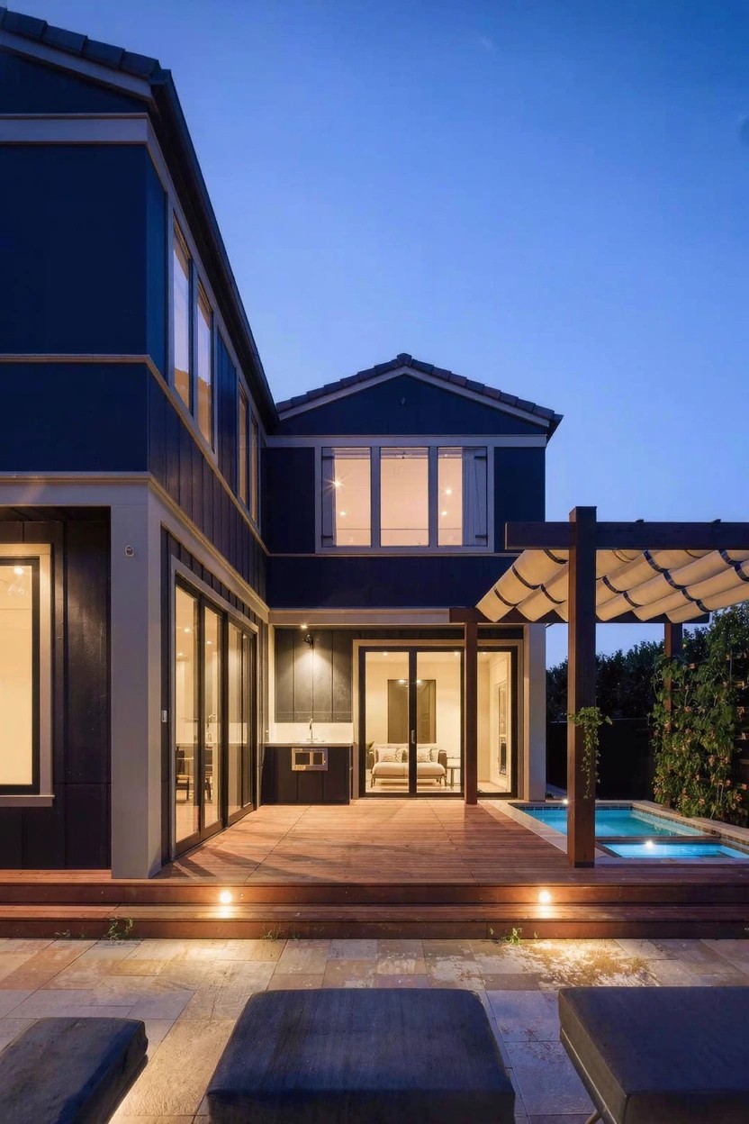
A deep navy paint like this one turns a simple modern house into something that really stands out. It covers the main siding panels and makes the big glass doors and windows pop even more. At dusk, the color picks up the low lights around the deck and gives the whole front a quiet, moody look folks notice from the street.
You can pull this off on homes with flat roofs and lots of glass. It suits places with some yard space for a deck or patio nearby. Pick a paint rated for outdoors that won’t fade fast, and pair it with wood accents to keep things from feeling too heavy.
Matte Black Textured Walls
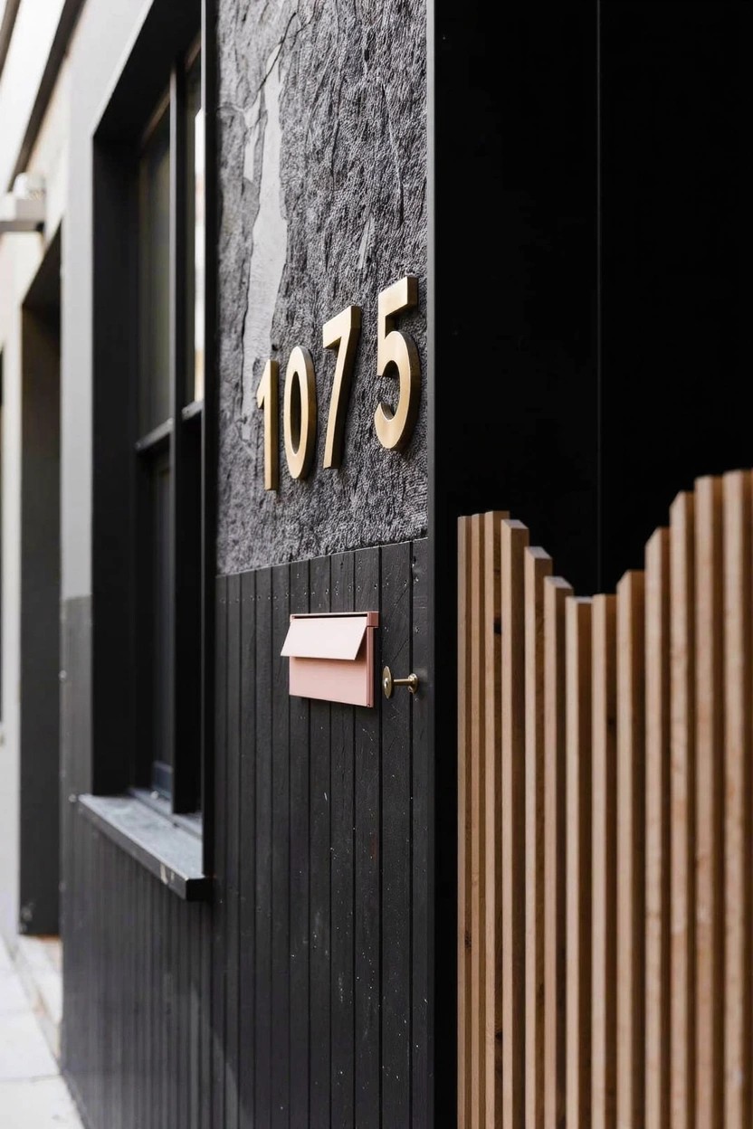
Matte black paint on a textured wall like this turns a plain side of the house into something with real presence. The rough surface catches shadows just right and stands up to everyday wear without showing dirt. Those gold house numbers catch the eye without trying too hard.
This works best on modern homes or additions where you want a low-key backdrop. Slap it on stucco or rough plaster and add wood slats nearby for balance. Skip it on small houses, though. It can feel heavy up close.
Sage Green House Paint
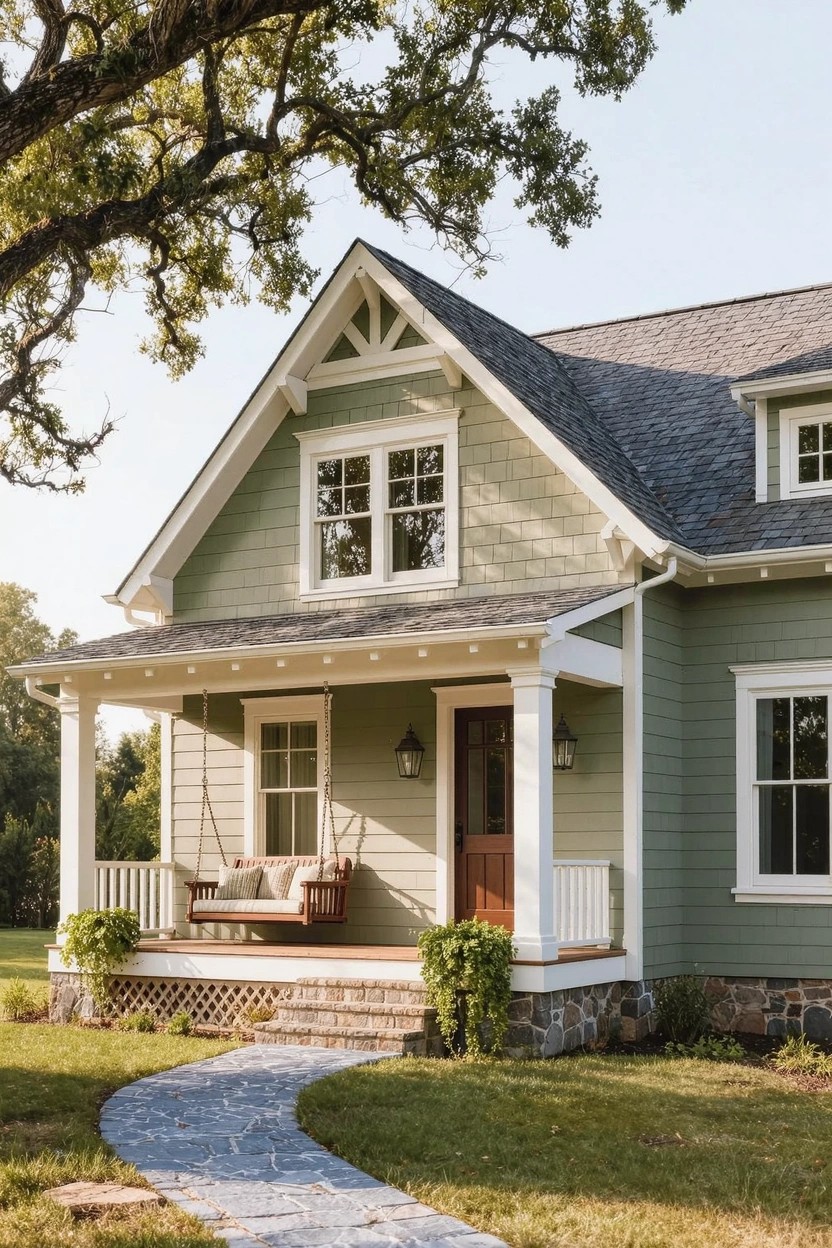
Sage green paint on a house exterior gives that calm, natural feel folks keep coming back to. It’s not screaming for attention like brighter colors, but it pulls the eye nicely against white trim and dark shingles. On this home, it wraps the porch and siding just right, making the whole front look settled and fresh at the same time.
You’ll want this color on traditional homes with some porch or gable details. It shines in yards with trees and grass nearby. Go for a soft shade like this one, paired with lanterns and a swing for extra charm. Watch that the trim stays bright white, or the green might fade into the background.
White Facade Over Charcoal Base
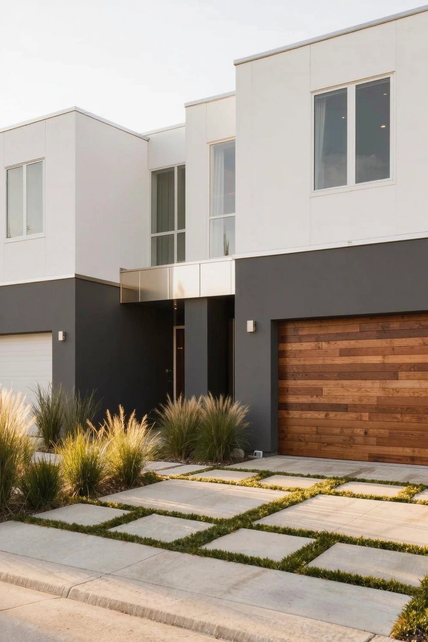
A white upper facade over a charcoal gray base makes a modern house look taller and cleaner. The light color lifts the top part. The dark base settles things down. Folks notice how it plays off simple wood like that garage door.
This works best on boxy homes in sunny spots. Paint the stucco or siding white up high. Go charcoal below the windows or halfway up. Add grasses out front to keep it easy. Skip it on busy streets… too much contrast might fight the noise.
Terracotta Stucco Walls
Terracotta paint on stucco gives a house that warm, earthy feel without trying too hard. It catches the light nicely, especially at dusk, and holds up in dry climates. Here, a bougainvillea vine climbs right up the corner, adding some natural color that fits without overwhelming the walls.
This works best on modern homes with clean lines or Southwestern touches. Pair it with black window frames and a dark door for contrast. Just test the shade first. It can fade if the sun’s too harsh, so pick a quality paint with UV protection.
Teal Siding for Modern Homes
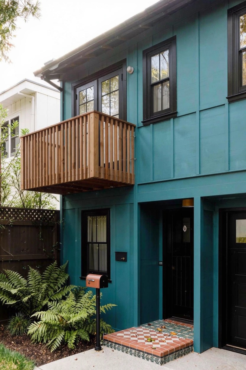
Teal paint on house siding like this brings a cool, unexpected vibe to the front of the place. It stands out nice against plain neighbor houses, and the color has enough depth to look good in different lights. Here, black window frames and a dark door keep everything crisp without getting busy.
This works best on homes with straight lines or simple shapes, maybe midcentury styles or basic boxes. Pick a quality paint that holds color over time, and test it on a small spot first. Dark trim helps pull it together. Just right for yards with green plants nearby.
Navy Blue House Siding
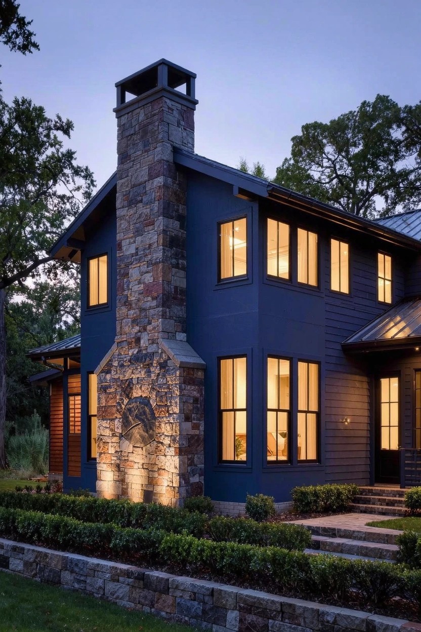
Navy blue paint on house siding turns a simple exterior into something bold and modern. It stands out against lighter stonework like the tall chimney here. The color picks up evening light nicely too. People notice it right away from the street.
Try this on homes with some natural stone details or wood accents. It suits modern farmhouses or craftsman styles in wooded areas best. Just make sure your trim is crisp white or black to keep things clean. Avoid it on super small houses where it might feel heavy.
Terracotta Accent Walls
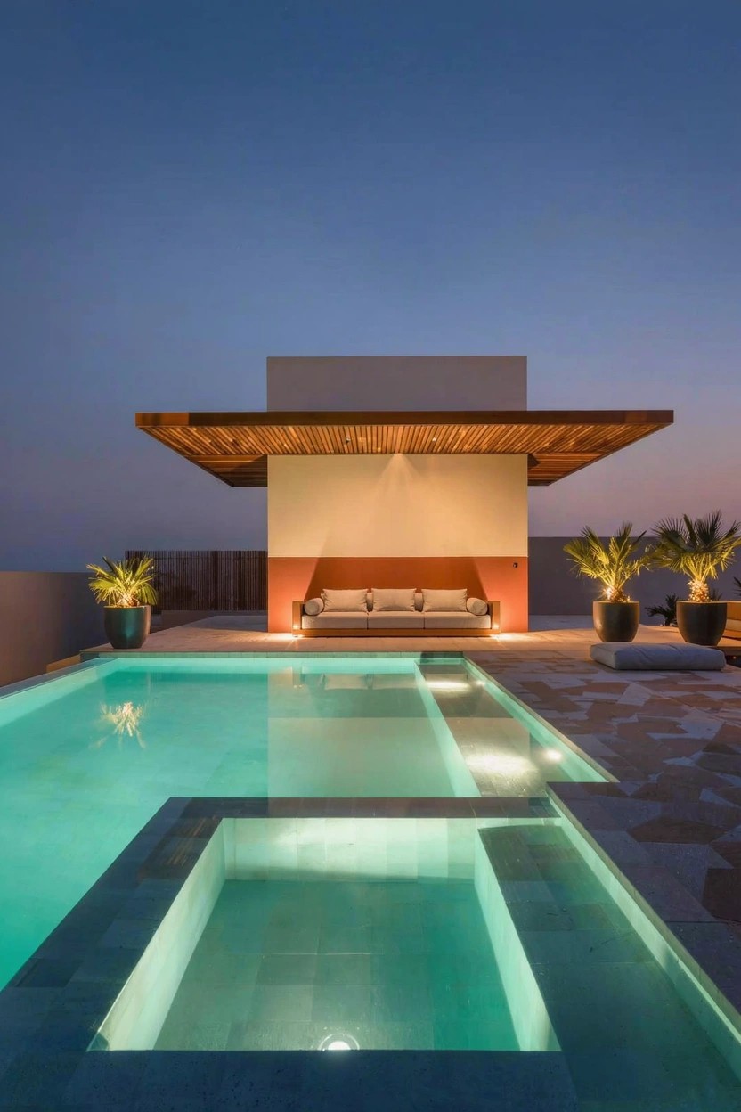
A terracotta accent wall brings real life to a plain white exterior. You see it here behind the seating area, that warm orange-red shade pulling your eye right in without overwhelming the clean stucco lines. It fits modern homes especially well because it nods to earthy roots while keeping things fresh and simple.
Paint one flat wall like this near a patio or pool, and it changes the whole look come evening. Best for sunny spots or places with some height, like a rooftop deck. Stick to matte finish to avoid glare, and don’t overdo it, one wall does the trick.
A Bold Orange Door on Gray Siding
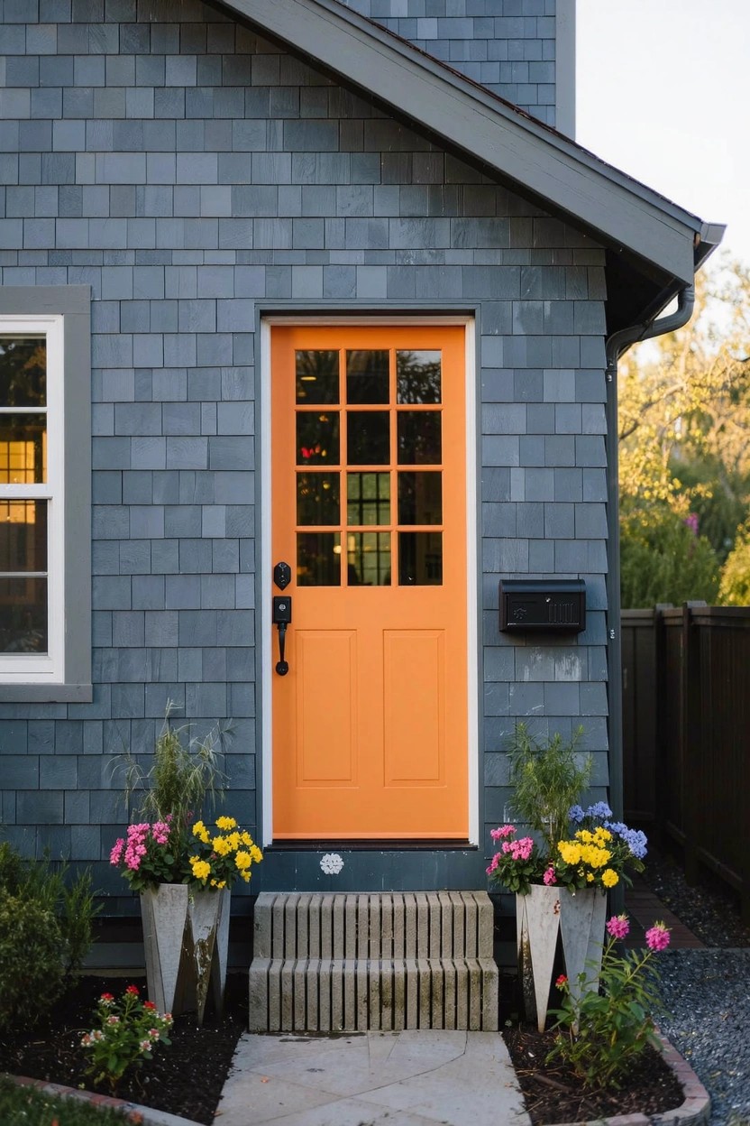
A bright orange front door stands out nice against plain gray siding. It adds color where you want it most, right at the entry. People walking by can’t help but notice, and it gives the house some life without much fuss.
This works best on simpler homes, like ones with shingle or clapboard sides in grays or taupes. Face it toward the street for that first impression. Pair it with a few potted plants at the steps… keeps things cheerful without overdoing the yard work.
Purple Paint on Modern Walls
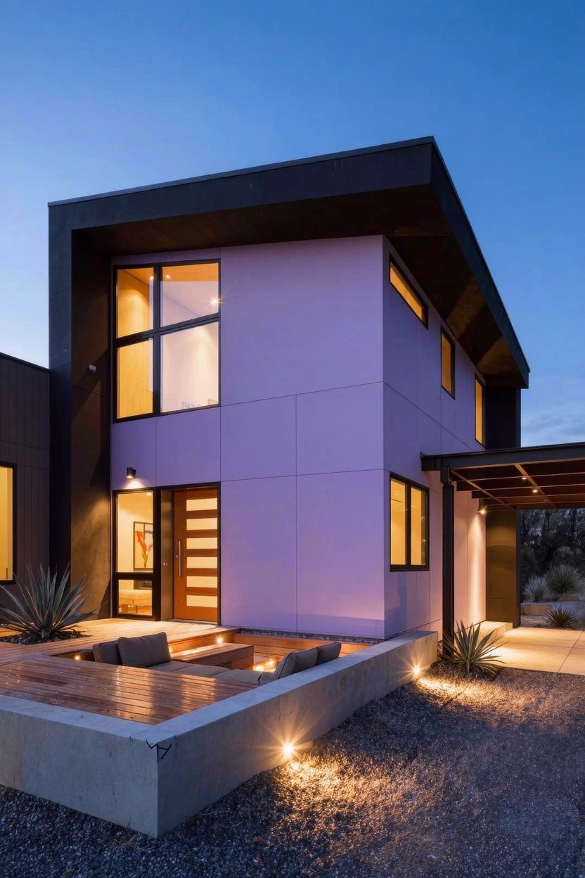
Purple paint shows up bold on this house’s main walls. It pairs with black window frames and a dark roof to make the clean lines pop. At dusk, the color warms up under the lights, turning a simple box shape into something you notice from the street.
Try it on flat-roofed contemporary homes in sunny spots. It fits desert yards with gravel and spiky plants like agave. Go for quality exterior paint that holds color in full sun… and keep accents dark to let the purple do its thing.
Blue Shutters on White Siding
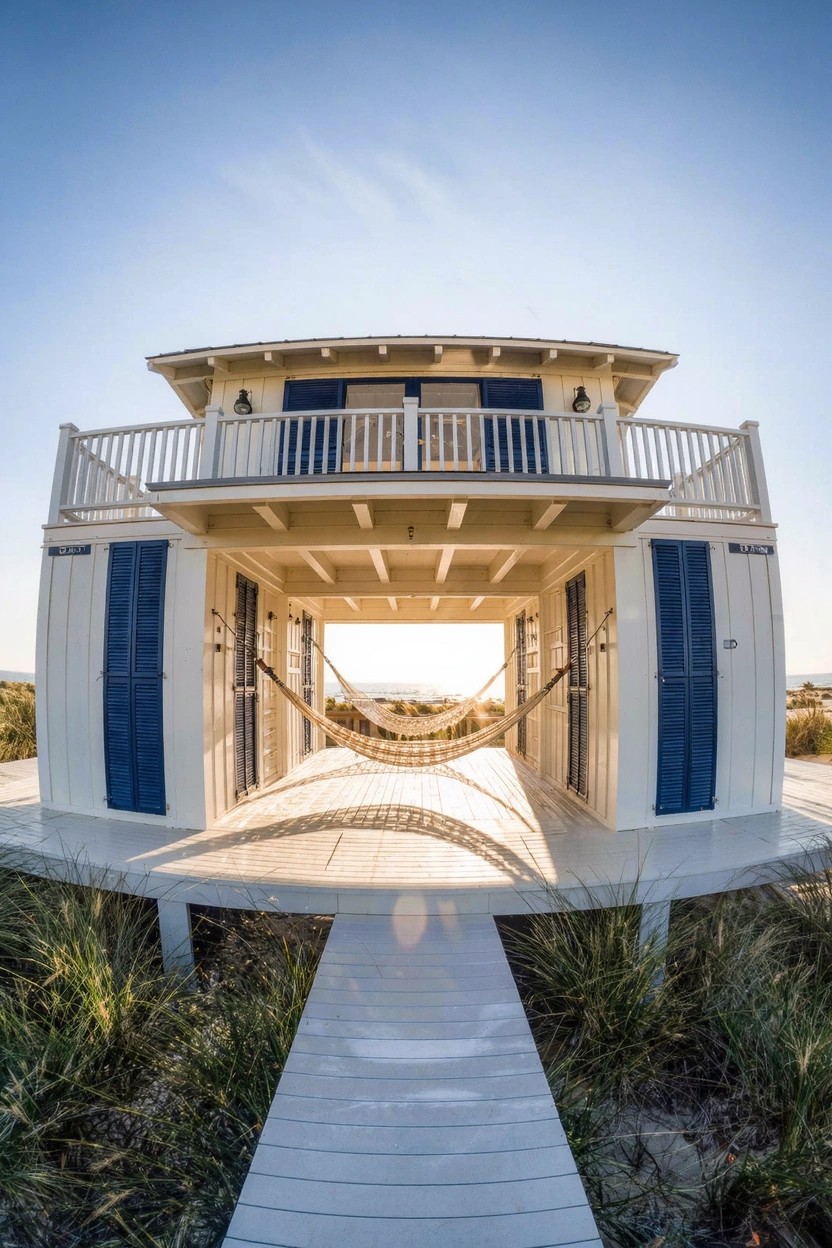
A white exterior painted bright and clean pairs up with navy blue shutters for a look that’s simple yet sharp. The white keeps the house looking fresh and open, especially in sunny spots like the beach. Those blue shutters add just enough color to catch the eye without overwhelming the whole place.
This combo works best on coastal homes or any house with light clapboard siding. Paint the body in a flat white for easy upkeep, and pick a true navy for the shutters. Skip glossy finishes though. They show dirt faster outdoors.
Black Exterior Walls
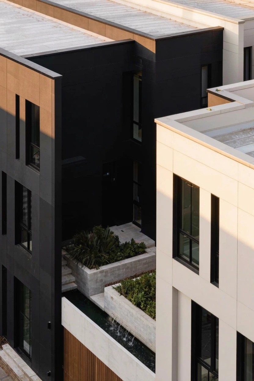
Black paint on exterior walls brings a clean, modern edge to any home. It creates sharp contrast with lighter areas nearby, like the white trim and wood panels you see here. Folks notice it right away, and it keeps the look simple yet bold without needing fancy details.
Try it on flat-sided homes or townhouses where you want geometric lines. Paint full panels or one whole side for impact. It suits urban spots best. Pick a tough matte finish that holds up to weather, and pair it with plants at the base to soften things a bit.
Warm Terracotta Exterior Paint
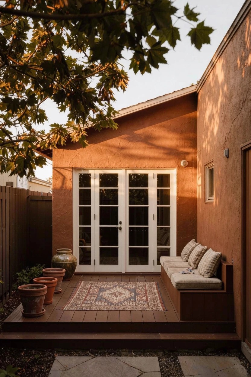
A warm terracotta paint on stucco walls brings a grounded modern look to this home. It stands out against the white French doors and wood deck without overwhelming the space. The color feels right at home with nearby plants and fence, pulling everything together in a simple way.
This paint works best on homes with straightforward shapes, especially in mild climates where the tone can catch the light. Use it on side walls or patios like this one. Stick to mid-tone shades, and test a sample first to see how it settles with your yard’s green.
Spiral Concrete Staircase Entry
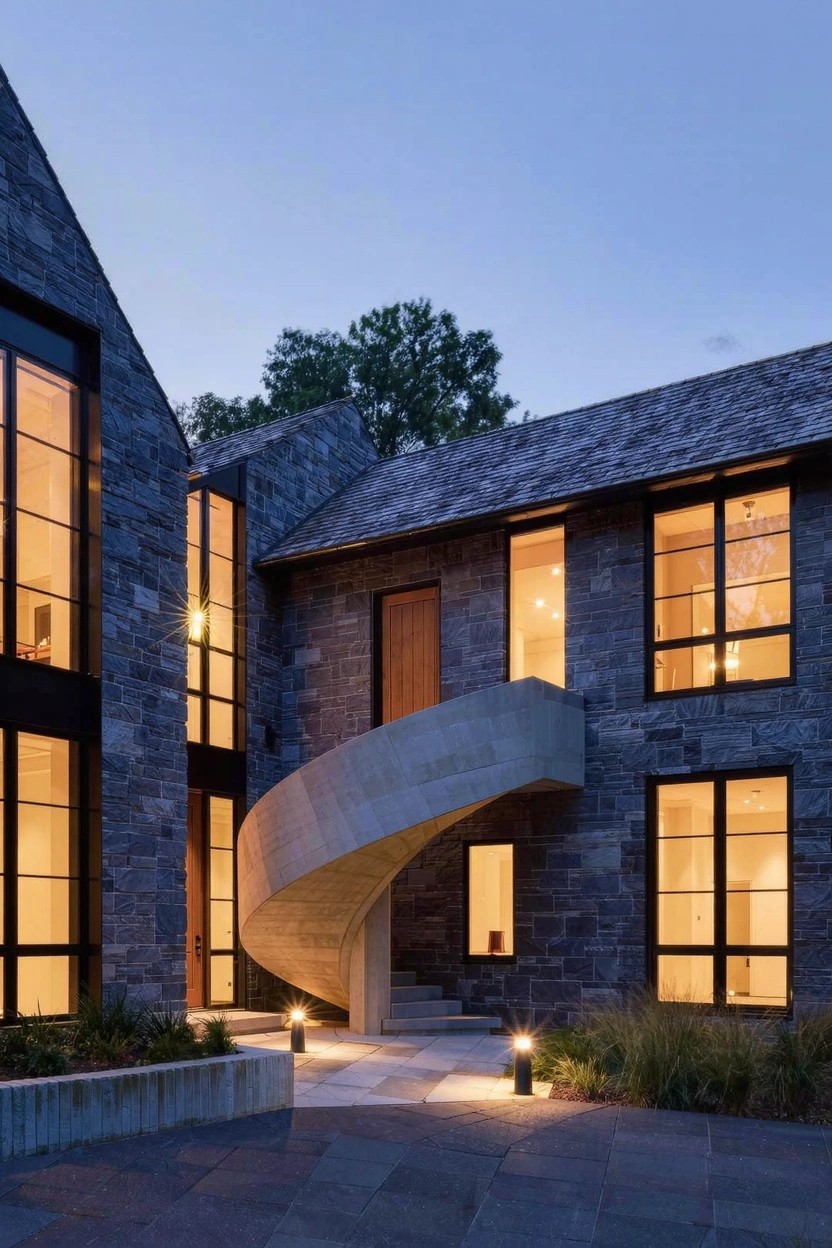
A spiral staircase made of smooth concrete winds right up to this front door. Against the rugged stone walls it looks sharp and pulls your eye straight to the entrance. That curve adds a modern twist without much fuss.
Try this on homes with a raised entry or gentle slope. It fits contemporary stone or stucco houses best. Add path lights at the base so it stays safe after dark.
Coral Exterior Walls
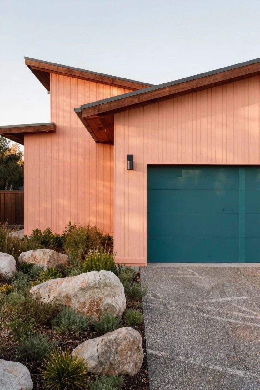
Coral paint turns a plain modern house into something that catches the eye right away. It’s a warm shade, not too orange or pink, that feels fresh and fits right in with today’s clean lines. That teal garage door nearby keeps things from getting boring. Folks notice it more than you might think.
This works best on homes with simple shapes, like ones with flat roofs or wood trim. Go for a matte finish to tone it down, and test the color in your light first since it shifts with the sun. Skip it on super traditional places, but it’s great where you want easy upkeep with plants hugging the base.
Frequently Asked Questions
Q: How do I test a bold paint color in my actual room before committing?
A: Grab some sample pints and paint big swatches right on the wall in a few spots.
Move around the room and check them morning, noon, and night. Light changes everything, so live with them a week.
Q: What colors work best if my space gets crappy natural light?
A: Go for warm grays or soft taupes with a hint of yellow undertone. They bounce light around without feeling cold or cave-like. Skip cool blues, they can turn gloomy fast.
Q: Can I pair these modern colors with my existing furniture?
A: Pick one accent wall in a standout shade and keep the rest neutral. Your furniture pops against it, and nothing fights for attention. And that creates balance.
Q: How do I avoid a color that looks great in the store but dated in a year?
A: Stick to timeless twists like muted terracotta over trendy neons. Test in your light, then commit.