

I’ve been eyeing contemporary homes around town, and it’s clear that paint transforms their clean lines into something livable. The keepers blend hues that nod to the architecture and yard, creating quiet harmony instead of shouting matches. They flop hard when shades overwhelm slim siding or turn chalky after a season of rain and sun. I usually pass on anything too stark because it leaves sleek designs feeling cold and distant. A handful here shift my view.
Soft Green Board-and-Batten Siding
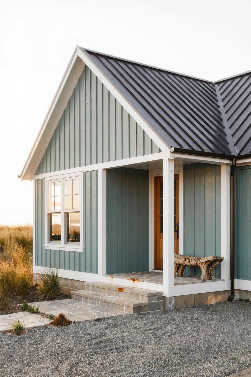
This soft green paint on board-and-batten siding brings a calm, fresh look to house exteriors. It feels modern without trying too hard, especially when you pair it with a dark metal roof like the one here. The vertical lines make the color pop just right, and it works well in places with a bit of coastal or country feel.
You can use this on ranch or farmhouse style homes where you want something livable and not too bold. Pick a shade that’s not too yellow or blue, then keep trim white for clean lines. Add a simple bench by the door… it ties things together without much fuss. Just make sure your roof contrasts to keep it from looking dull.
Warm Wood Trim on Gray Siding
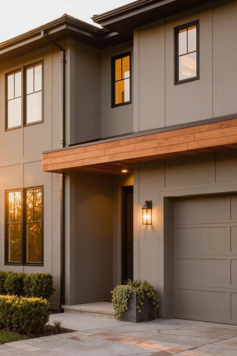
Gray siding gives a house that clean, modern look many folks go for these days. But it can feel a bit cold on its own. Adding warm wood trim, like the beam over the entry and garage here, brings some life right in. It softens things up without much fuss.
This setup works great on homes with simple lines, especially in suburbs or milder climates. Go for cedar or something similar that weathers nicely. Just make sure the wood is protected from the elements, or it might not hold up long term. Fits ranch styles or two-stories like this one.
Blue Accent Wall
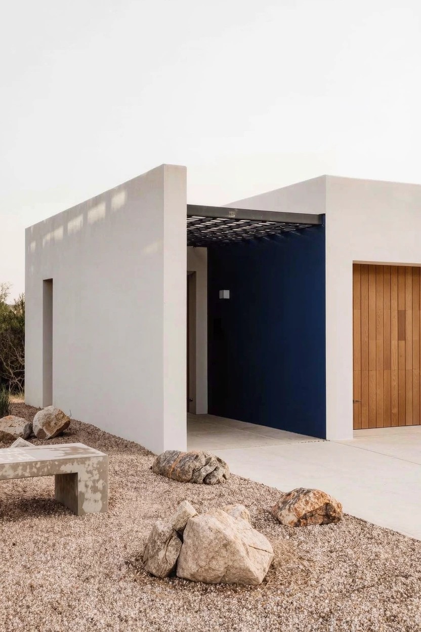
A deep blue wall like this one next to the garage adds real punch to a plain white house front. It pulls your eye right to the entry without overwhelming the look. Folks like how it keeps things simple yet fresh. Modern. Clean.
Paint it on a flat wall facing the street or drive. Suits stucco homes in dry areas best, where gravel yards let the colors stand out. Go bold blue against crisp white. Just one wall though. More might feel busy.
Timber Porch Posts
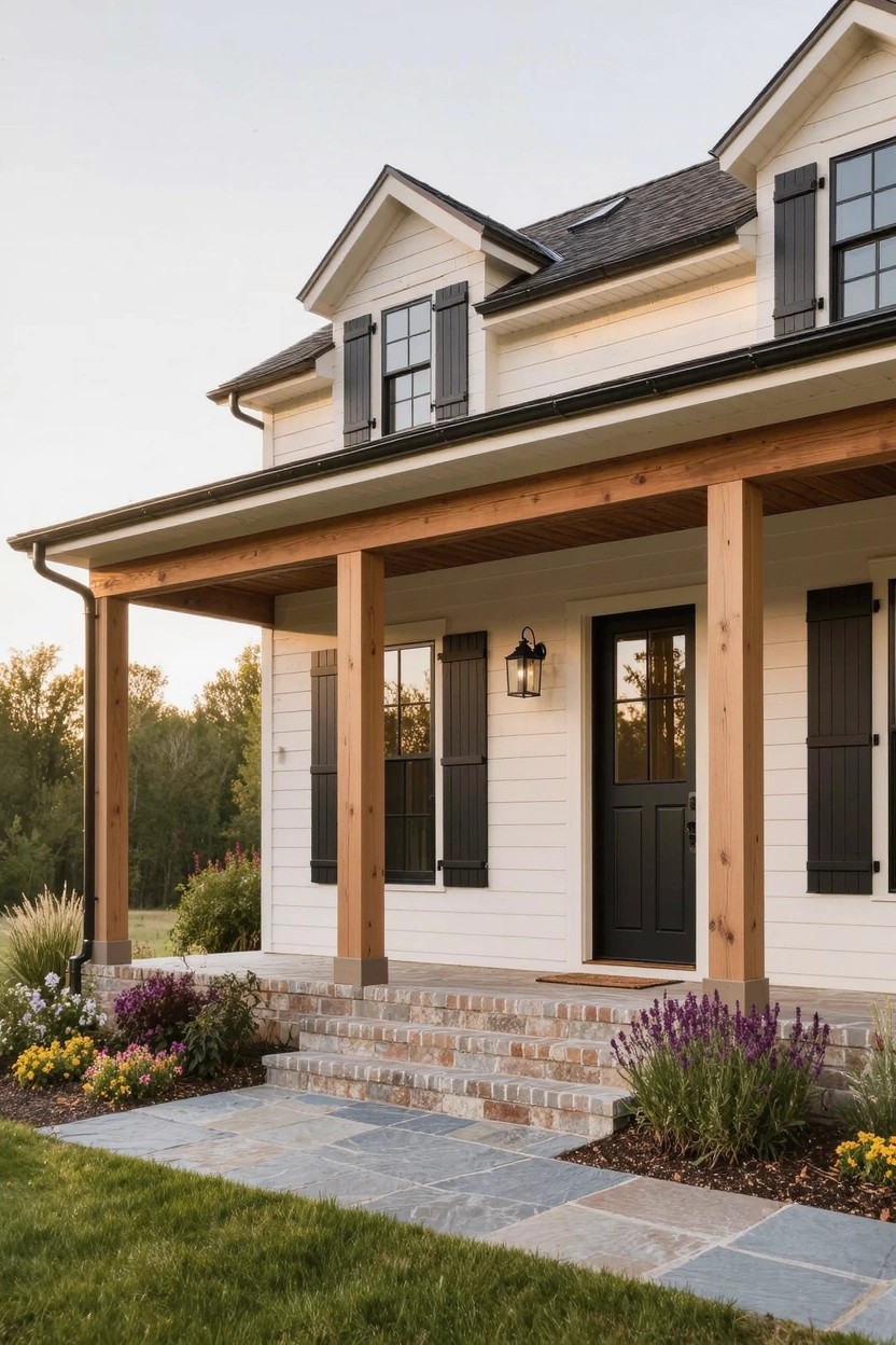
A front porch held up by thick timber posts like these brings a bit of rustic strength to a clean white house. The natural wood warms up the siding without overwhelming it. Folks notice that sturdy look right away. It makes the whole entry feel more solid.
Try this on ranch or farmhouse homes where you want shelter from rain but not a fussy design. Use cedar or Douglas fir for the posts so they weather nicely over time. Keep the landscaping simple around the base, like low plants and a stone path. Just seal the wood now and then.
Sage Green Paint on Rowhouses
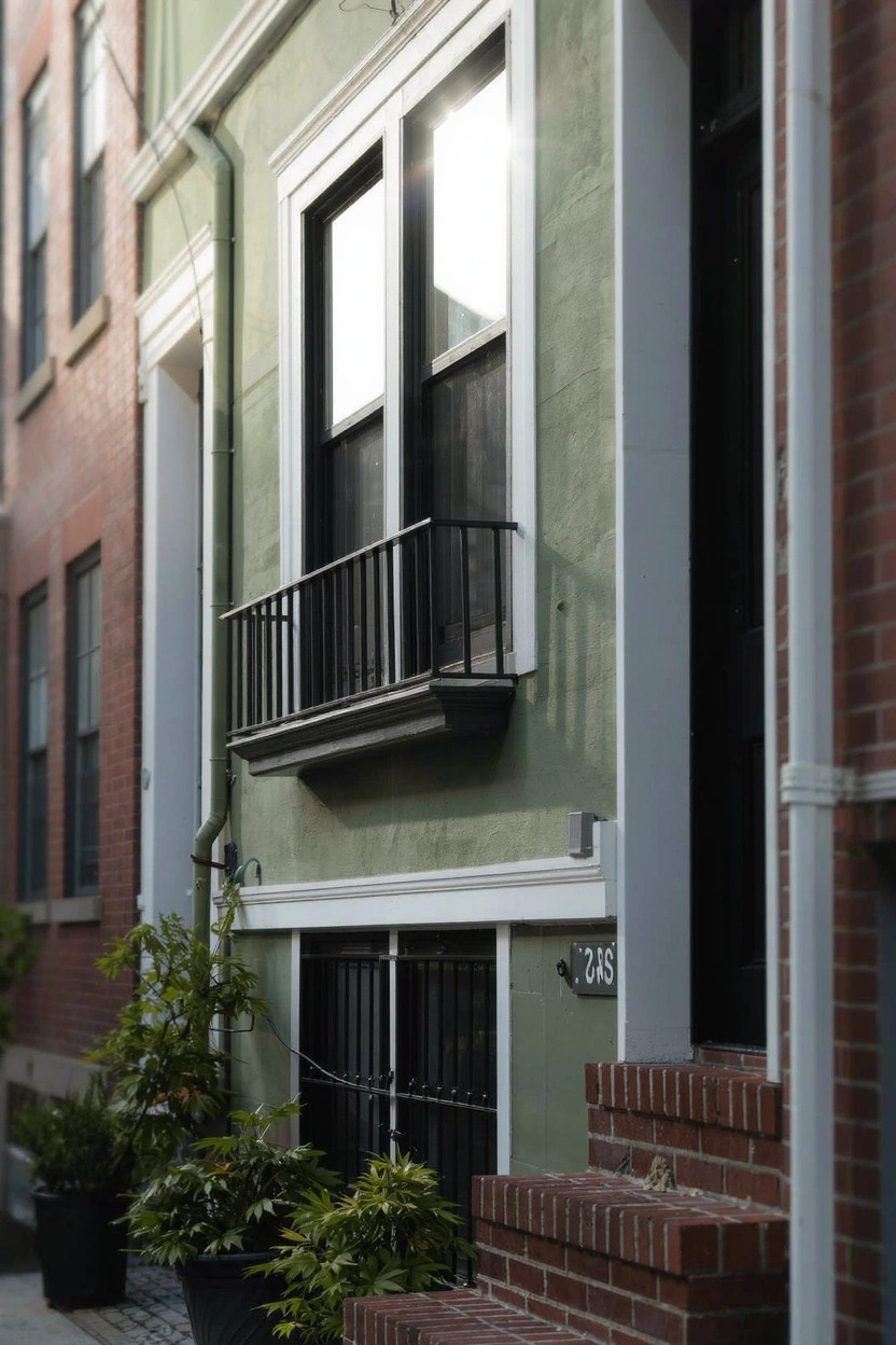
Sage green paint gives this older rowhouse a fresh, modern feel that stands out in a lineup of brick buildings. It’s soft enough not to overwhelm the street but lively against the black iron balcony and window grilles. That color choice wakes up the facade without much fuss.
Paint it on city townhomes or attached homes where you want subtle change. White trim keeps everything crisp. Add potted plants by the steps… and it pulls the entry together nicely. Works best on stucco or siding, not super dark brick.
Blue Band on White Walls
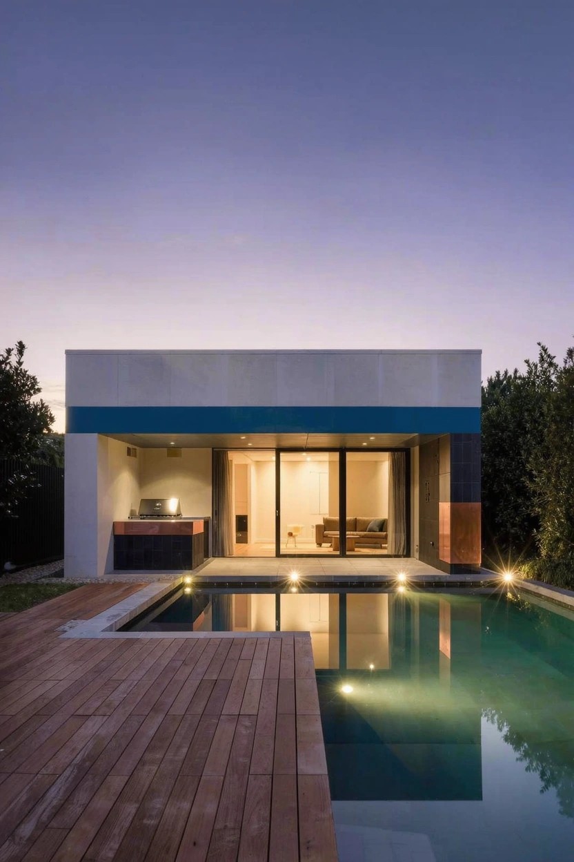
A simple blue band running horizontally across a white facade adds just enough color to a modern house without overwhelming it. That clean white base keeps things fresh and bright. The blue stripe, set high up near the roofline, catches the eye right away. It works because it breaks up the plain walls in a subtle way that feels intentional.
Try this on a flat-roofed contemporary home or a simple boxy addition. It suits yards with a pool or deck nearby, where the reflection in the water picks up the color nicely. Skip it on busier traditional houses. Just make sure the blue is a true mid-tone, not too bright or it might clash.
Warm Terracotta Stucco Paint
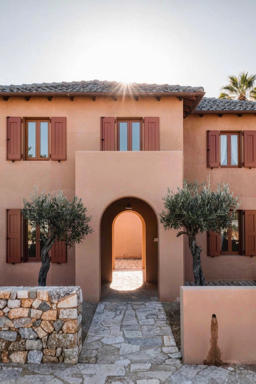
Warm terracotta paint on stucco walls brings a sunny, lived-in feel to a home exterior. It looks fresh against simple stone paths and olive trees, and holds up well in bright light without fading fast.
Try it on low-slung houses in warm climates, like those with tile roofs or arched doors. It suits yards with drought-tolerant plants. Just clean the walls now and then to keep the color true.
Bright Yellow Front Door
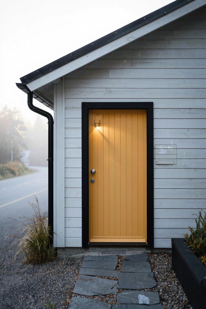
A yellow front door like this one brings a spot of cheer to a plain white house. It stands out right away against the siding and black trim. That color pulls your eye to the entry without much fuss. Folks notice it and smile. Simple as that.
Try it on a basic cabin or modern boxy home where you want some life up front. It works in wooded spots or foggy yards too. Just paint over a solid wood door and add a lantern light nearby. Keep the path clear with gravel or stones. Watch the paint for weather wear though.
Dark Green Base Color
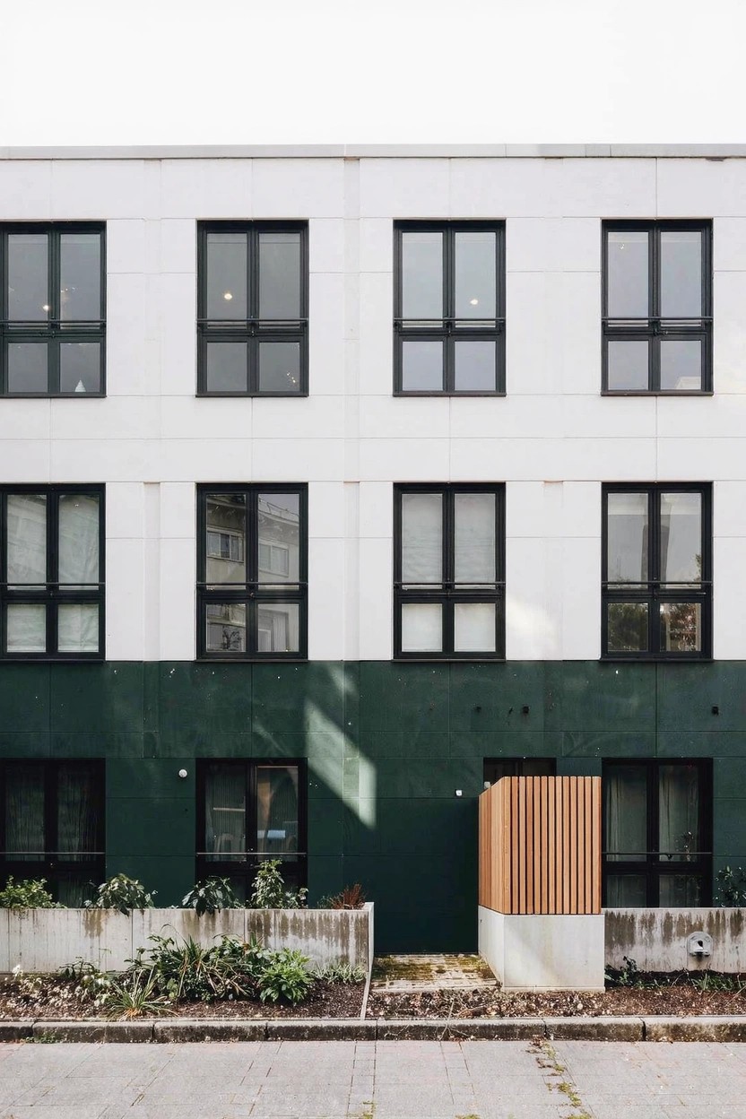
A dark green paint on the lower walls sets this house apart. It contrasts nicely with the white upper part and those big windows. The green feels fresh and ties into the plants along the bottom. Makes the whole front look grounded and modern at the same time.
Try this on homes with simple shapes and lots of windows. Paint just the bottom four or five feet green. It suits urban spots or yards with some greenery already. Skip it if your house has too much trim. That might fight the clean look.
Lattice Screens Around the Garage Door
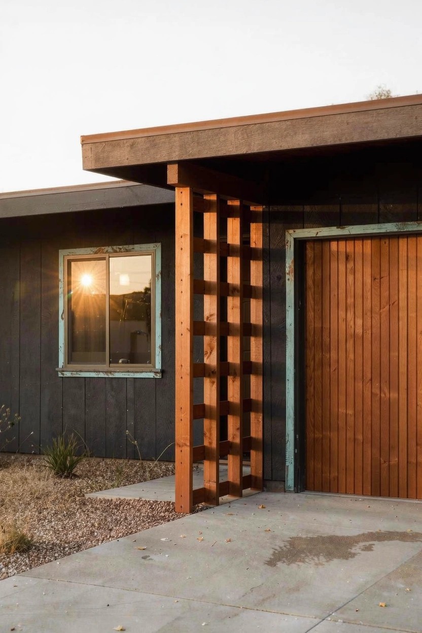
A simple way to break up a plain garage front is with tall wood posts and lattice panels. Here the dark siding stays crisp, but those vertical posts with slats across them add texture right where you pull up. The wood warms things up without much fuss.
This works best on flat-roof homes in sunny spots. Bolt the posts into concrete or a base, space the slats for some see-through, and stain to match your door. Skip it if your area’s too wet. Keeps the look open… not closed off.
Dark Walls with Light Stone Entry
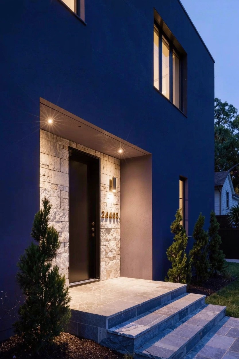
Dark walls like this deep blue make a house blend into the evening shadows. But that light stone around the door pulls your eye straight to the front entrance. It’s a simple way to add focus without much fuss. The black door and slim lights finish it off nicely.
This setup works best on clean modern homes where you want some drama up front. Pair it with small trees on either side for a bit of green. Keep the stone neutral so it really stands out against the dark paint. Just make sure your lighting hits the entry right at night… that’s when it shines.
Red Chimney Accent
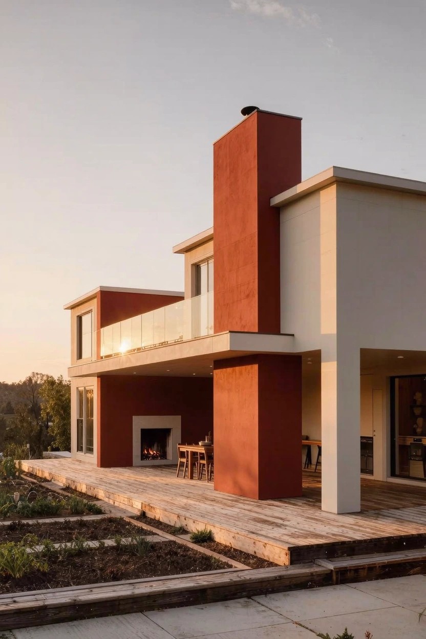
A red chimney like this one grabs attention on a plain white house. The color pops against the light walls and ties right into the outdoor fireplace below. It gives the whole setup a warm, modern feel without much fuss.
Paint a chimney or tall pillar red if your house has clean lines and neutral siding. It suits spots with some yard around it, like here on the deck side. Pick a good exterior paint so it holds up to sun and rain.
Terracotta Facade Paint
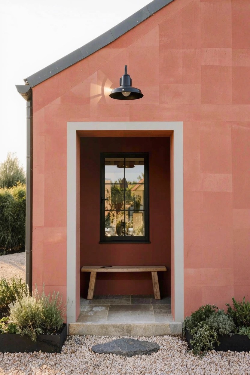
Terracotta paint brings a warm, grounded color to house exteriors that feels right at home in sunny yards. It has that earthy red tone, not too orange or pink, and works well with simple plantings around the base. Notice how it frames a basic bench and black light here. People like it because it looks lived-in yet sharp on clean walls.
Try it on stucco or smooth plaster houses, especially low ones with flat roofs. It suits dry areas where the color won’t fade fast. Add dark metal around windows for some punch. Just paint a test patch. The light shifts it through the day.
Black and White Facade Contrast
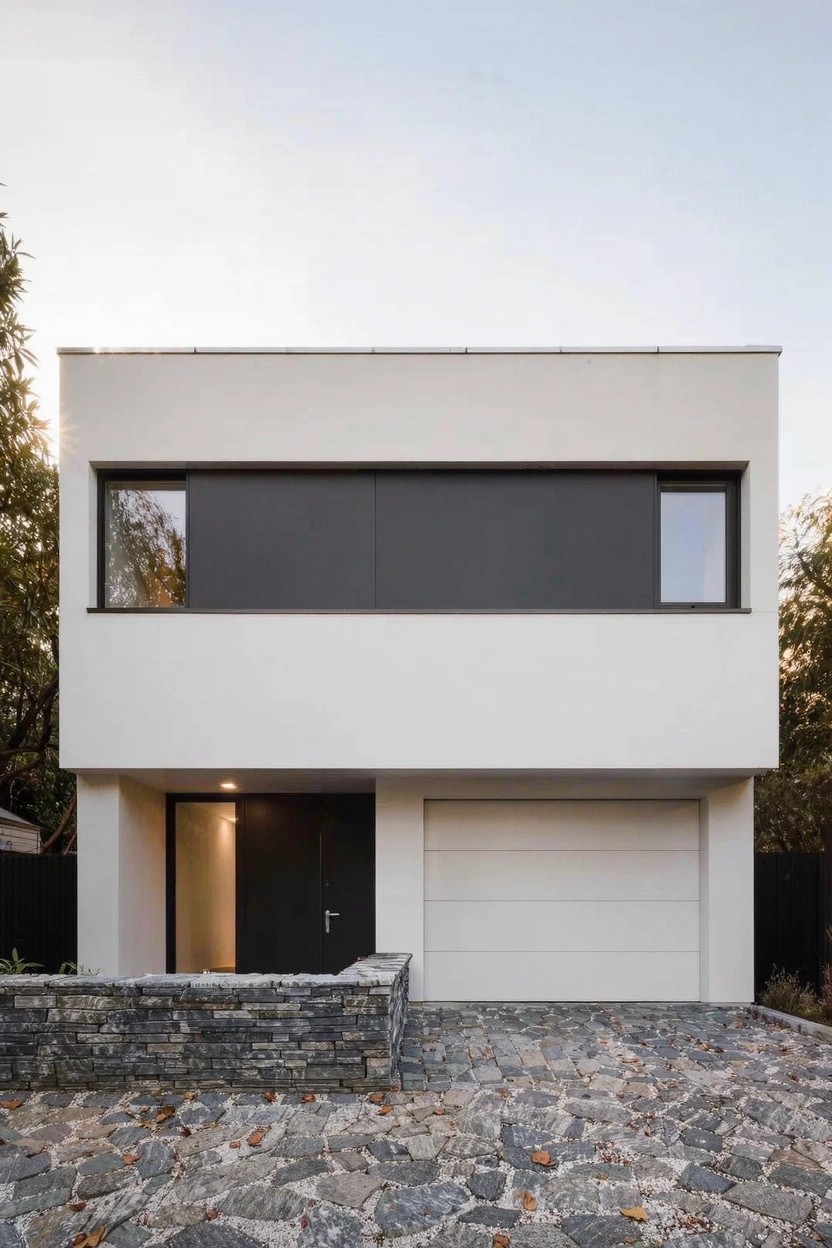
A white exterior painted smooth and bright pairs up with black accents like the wide upper band and window frames. It gives the front a clean, boxy feel that’s easy on the eyes. Folks notice how the black pulls focus without much fuss. Keeps things simple yet striking.
This setup suits newer homes with flat lines or ones you want to freshen up. Paint the body a true white for max pop, then black on select spots. Best in sunny spots where contrast shows. Skip it on super busy streets. Might feel too stark there.
Orange Door on Green Siding
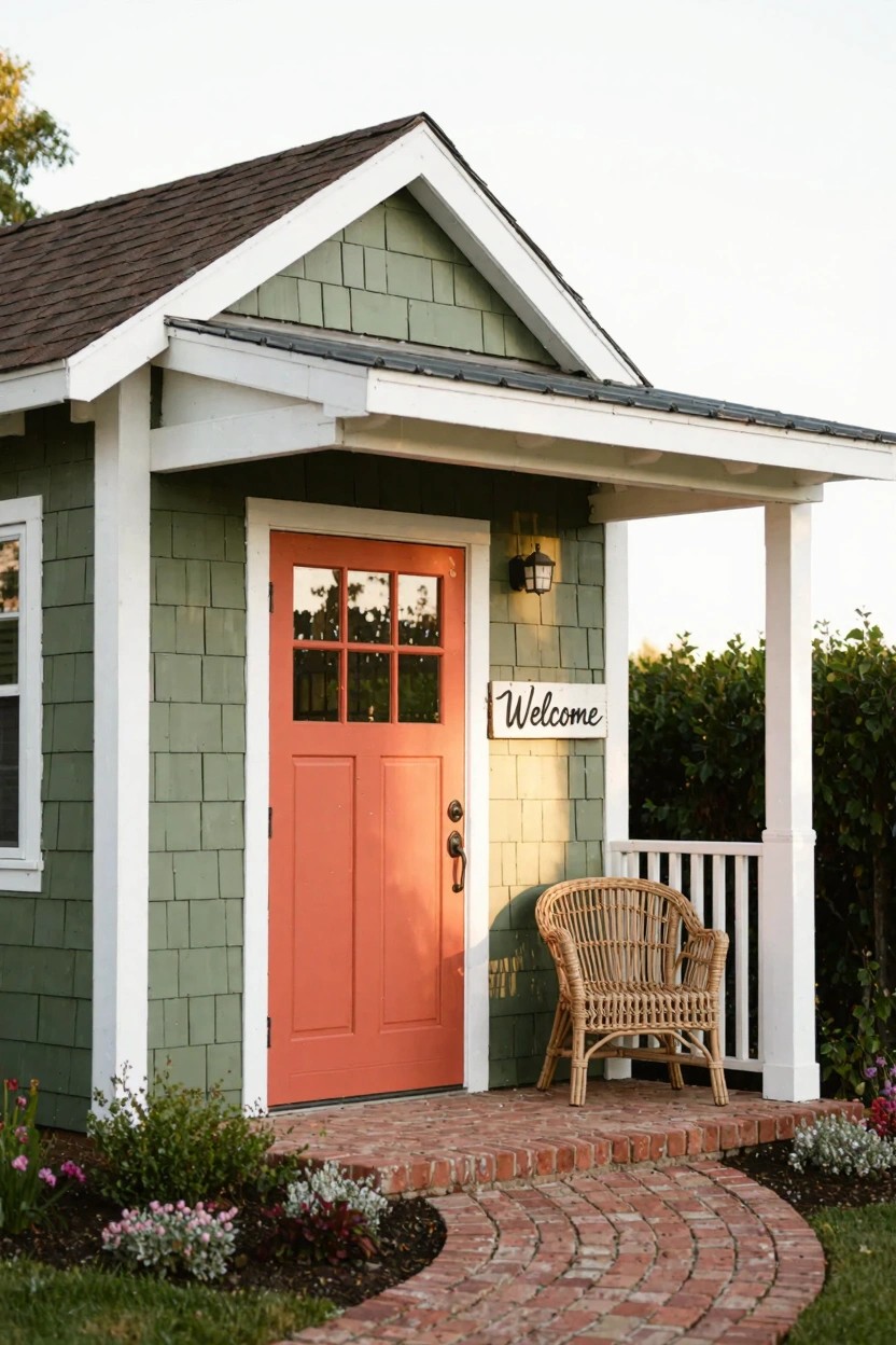
A sage green siding like this gives a house a calm, nature feel. Then that orange door jumps out as the focal point. The combo feels fresh and lively. It pulls your eye straight to the entrance without overwhelming the yard.
This paint idea suits cottages or small backyard structures best. Pair it with white trim to keep things crisp. It works in gardens with plants nearby since the green blends right in. Pick a durable exterior paint for the door. It holds the color through weather changes.
Black and Rust Exterior Colors
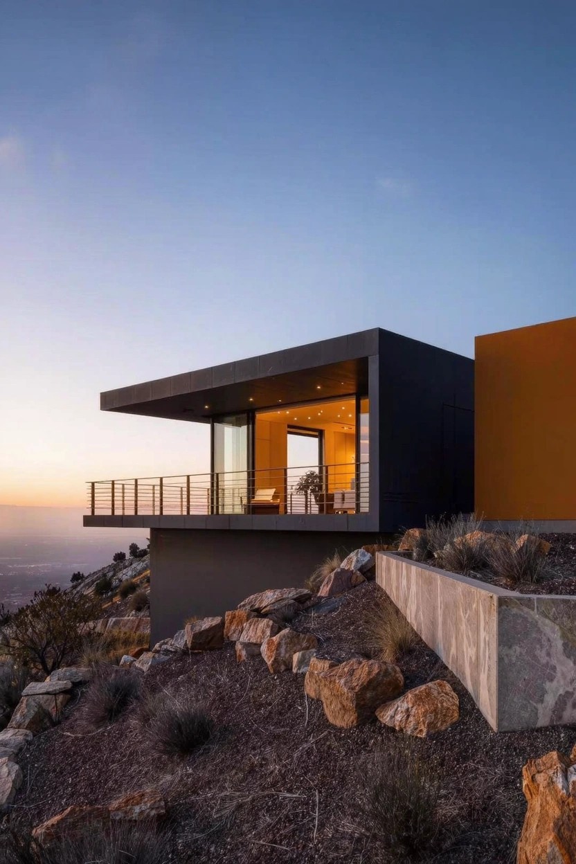
This setup uses a deep matte black on most of the walls, with one section punched up in a warm rust tone. It stands out because the black keeps things sleek and modern, while the rust adds just enough warmth to avoid looking cold. In a rocky desert spot like this, it ties right into the natural reds around it without trying too hard.
Try it on boxy contemporary homes where you want some color without going overboard. Paint the main body black and pick a smaller wing or upper story for the rust. It works best in sunny, dry areas, but test the paints for fade resistance first. Glass windows or balconies nearby make the colors pop even more.
White Slatted Siding
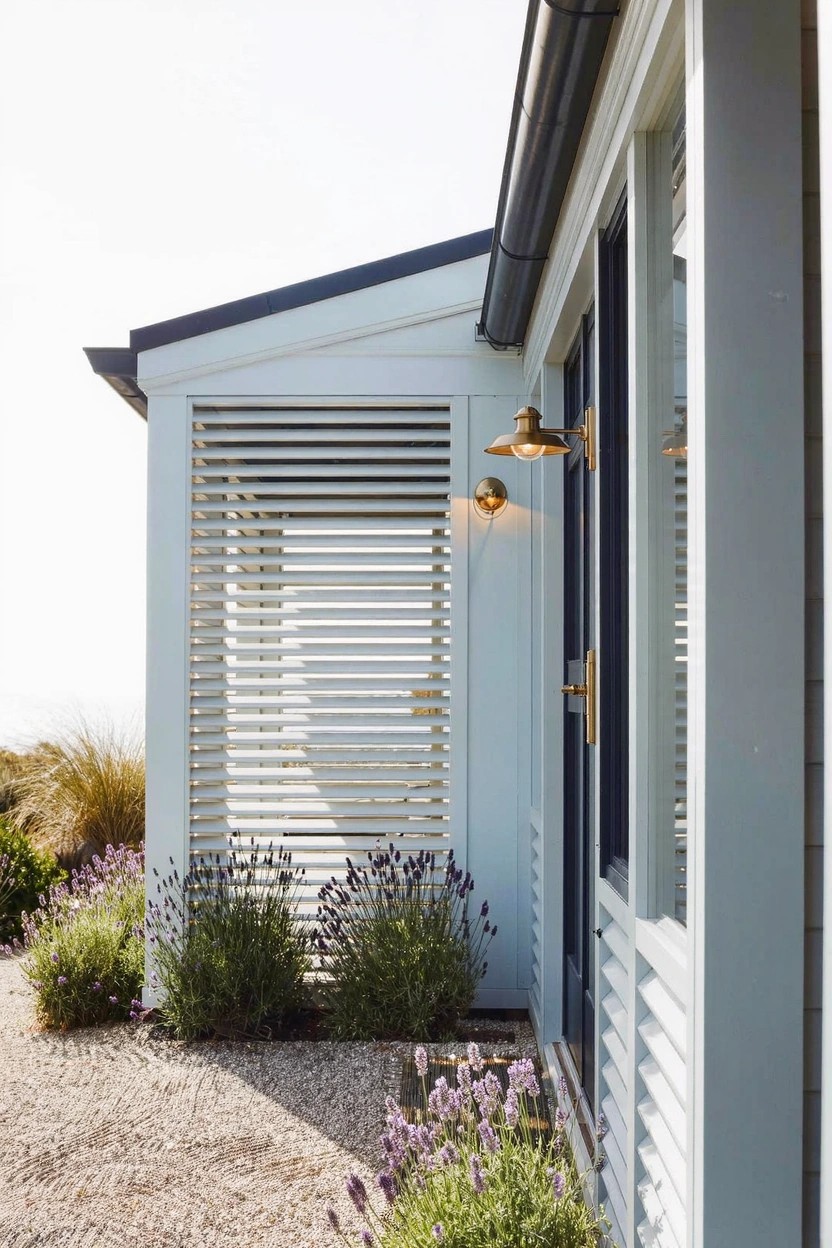
White slatted siding like this catches the eye on a simple house exterior. The horizontal boards create texture without much fuss. They let in light and air but block direct views, which works well in open spots like near dunes. That brass light fixture adds a bit of shine right at the entry.
You can paint basic siding boards white and space them out for this look. It suits low beach houses or modern ranch styles best. Plant some lavender along the bottom to soften things up. Just make sure the slats are treated for weather if you’re near the coast.
Bold Two-Tone Wall Colors
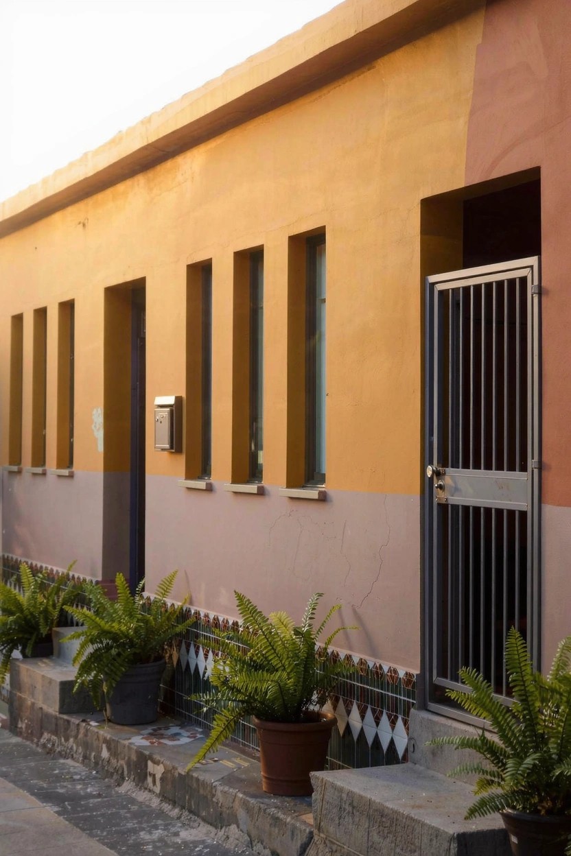
Warm yellow on the upper walls paired with terracotta below gives this house a fresh split-color look. It stands out because the colors play off each other nicely, making the facade feel modern without too much fuss. The simple narrow windows keep things clean.
Try this on stucco or plaster homes in sunny spots. It works best where you want some punch but not a full repaint. Just balance the color divide at waist height or so, and add a few pots at the base like these ferns to settle it. Skip it on super traditional houses.
Teal Accent Wall in the Patio
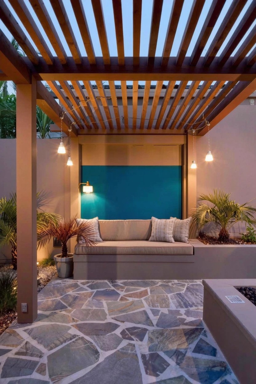
A teal accent wall like this one adds a fresh pop to a simple outdoor patio. It stands out against the neutral stucco and wood tones without taking over the space. That blue-green shade feels modern and lively, especially at dusk when the lights come on. It’s a good way to bring color outside where paint choices matter for holding up to weather.
Paint one wall in a sheltered spot behind seating or a fire pit. It works best on block or stucco for privacy, in yards with a lot of sun. Go for a semi-gloss finish to wipe clean. Skip it if your patio gets too much direct rain… might fade faster there.
Terracotta Paint on Modern Walls
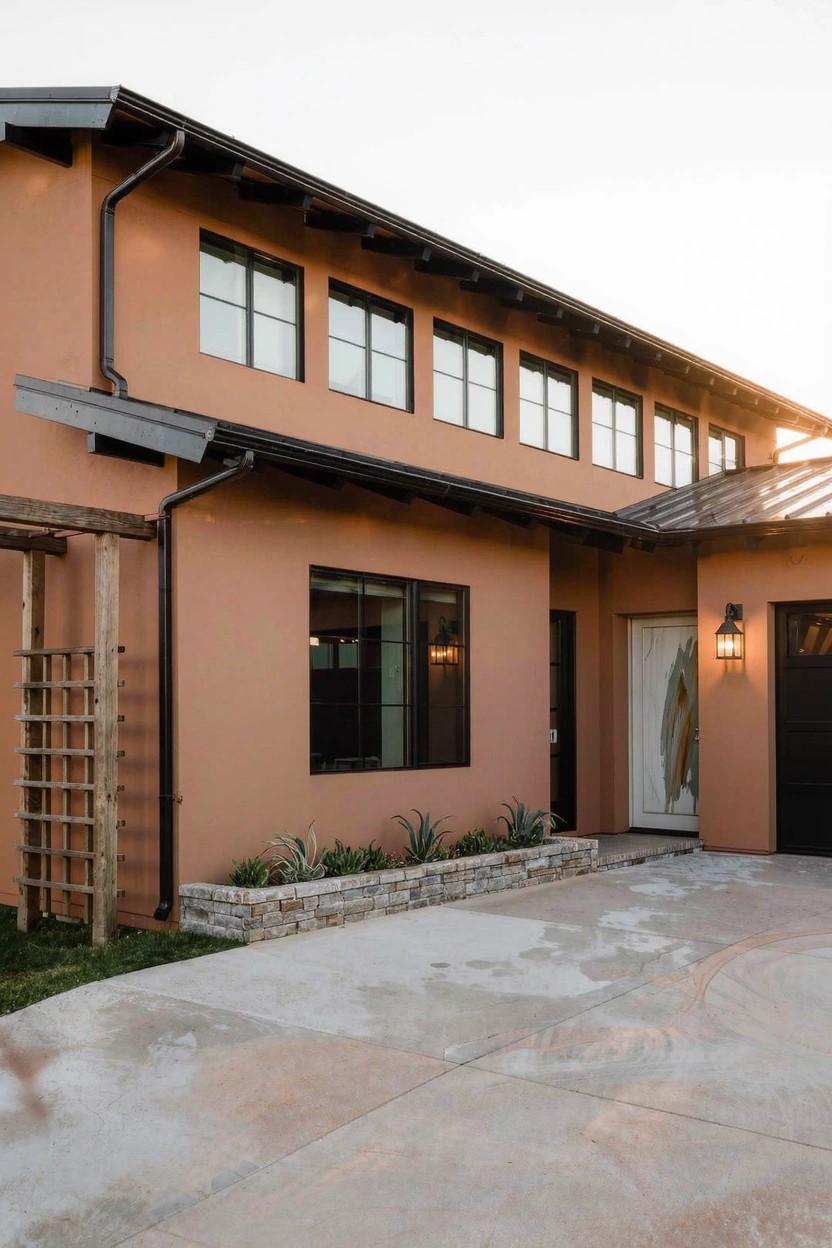
Terracotta paint gives a contemporary house that warm, grounded look without going full rustic. You see it here on the stucco walls, paired with black window frames and a dark metal roof. It picks up sunset tones nicely, especially in the late light. Folks like how it feels fresh on clean lines like this.
Try it on stucco or smooth siding where the color can show clean. It suits homes in warmer climates or spots with good sun. Just clean it regular, since dust shows more on the orange shade. A simple pergola nearby keeps the entry from feeling too bare.
Frequently Asked Questions
Q: How do I test these bold paint colors before painting the whole house?
A: Paint large sample boards or swatches right on your siding in a few spots. Walk around at morning, noon, and evening to see how light hits them. That way you catch any surprises.
Q: What if my house faces direct sun all day—will the colors fade fast?
A: Go for paints labeled with strong UV resistance. They stand up to harsh rays and keep that fresh look for years. Skip the cheap stuff.
Q: Can I pull off a dark color like charcoal on a smaller home?
A: Dark shades slim down the profile and make it feel sleek. Pair it with crisp white trim to bounce light around. And yeah, it works great on compact spots.
Q: Should I stick to neutrals or go for something unexpected?
A: Neutrals ground everything nicely if you’re playing it safe. But try a soft sage or terracotta—it wakes up the yard without overwhelming.