

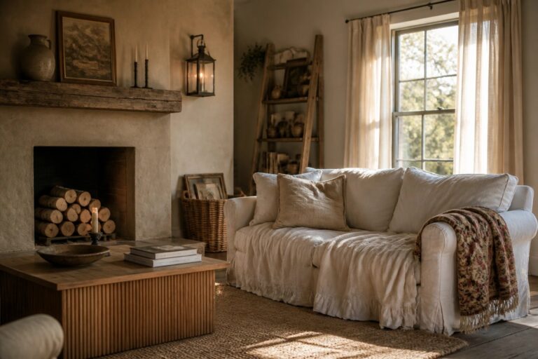
When I started updating rooms in my house, I noticed that neutral rustic tones helped the kitchen and living area feel like they belonged together even though the layouts were quite different.
Light changes everything in these spaces, so I learned to check how a color looks on the actual walls at different times of day before making a final choice.
Farmhouse textures like worn wood and linen show up more clearly once the background stays calm and consistent across the house.
Testing mattered more than I expected.
Over time I found that schemes which respect how each room is used day to day create a steadier sense of cohesion than any single bold decision.
Using Wood Tones to Pull a Neutral Room Together
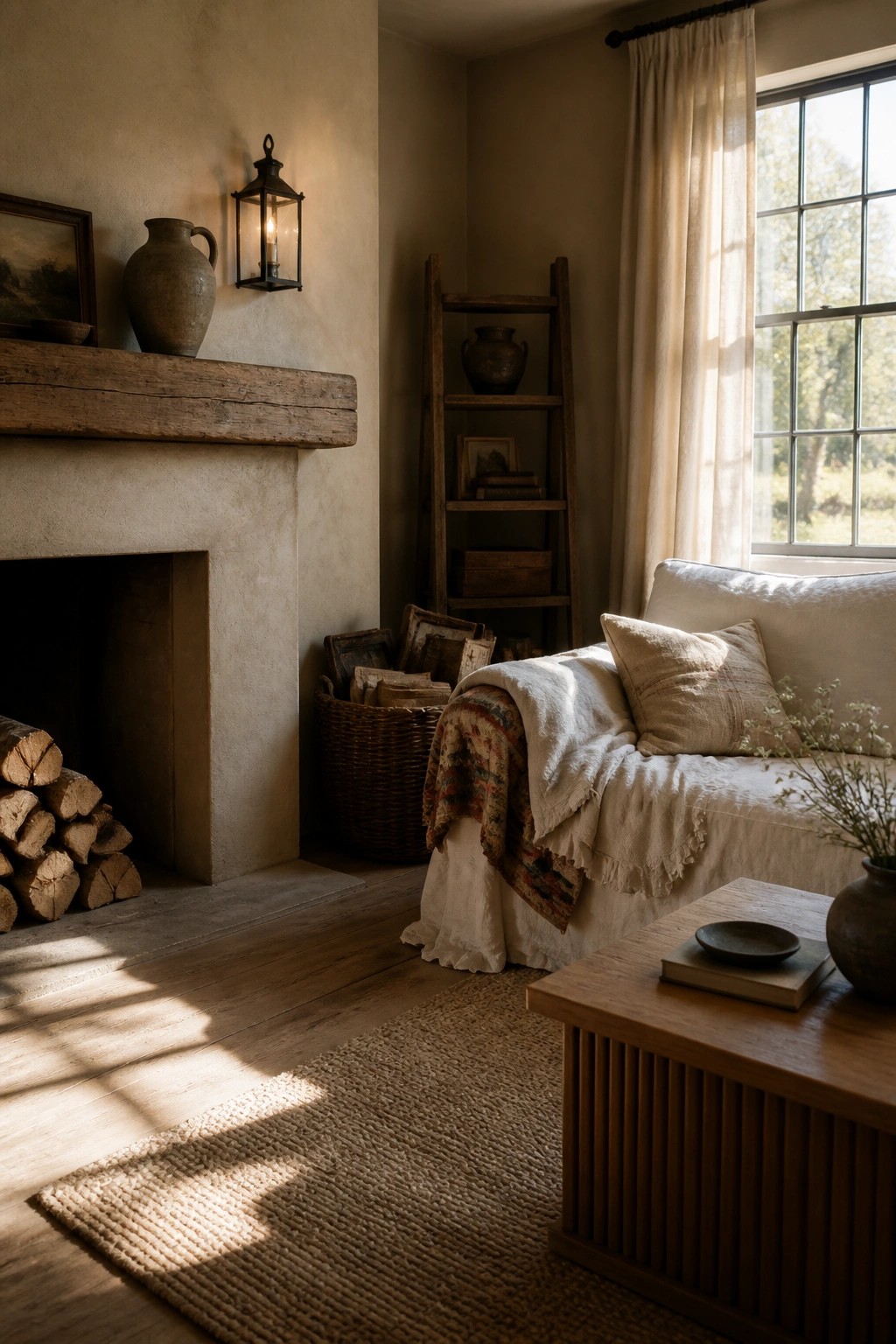
A room feels calmer when the wood tones stay in the same warm family as the walls and fabrics. Here the mantel, floor, ladder, and small table all sit in that mid-brown range, so nothing fights for attention and the whole space reads as one quiet layer.
Try the same approach in any main living area where you want it to feel settled rather than styled. Keep the larger wood pieces close in color, then let the textiles and walls stay soft and light. It works especially well in older homes that already have mixed wood finishes.
Soft Gray Cabinetry For Neutral Farmhouse Kitchens
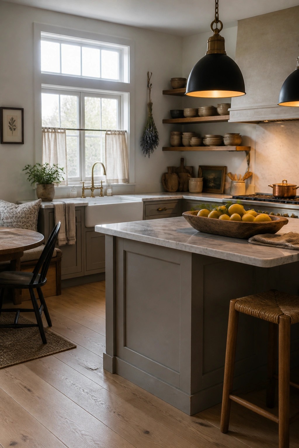
A soft gray on cabinets and the island gives a kitchen a calm, pulled-together look without going too cold. It pairs easily with wood floors and lighter stone surfaces, so the whole space feels connected rather than busy.
This color works best in rooms that get steady daylight, since the gray shifts gently and keeps the mood warm. It suits older homes or simpler layouts where you want the cabinetry to blend in instead of stand out.
Using Multiple Wood Tones In A Neutral Dining Room
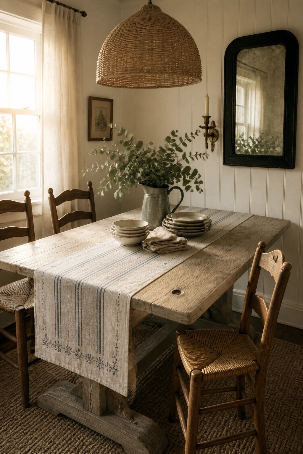
A room like this shows how different wood finishes can sit together without clashing. The table, chairs, and floor all vary slightly in color and wear, yet the space still feels calm and put together because everything stays within the same warm, muted range.
This approach works best in older homes or simple spaces where you want warmth without adding color. Keep the textiles and ceramics soft and light so the woods can do the main work. Just avoid too many shiny or dark pieces that could break the even tone.
Layering Neutrals in the Bedroom
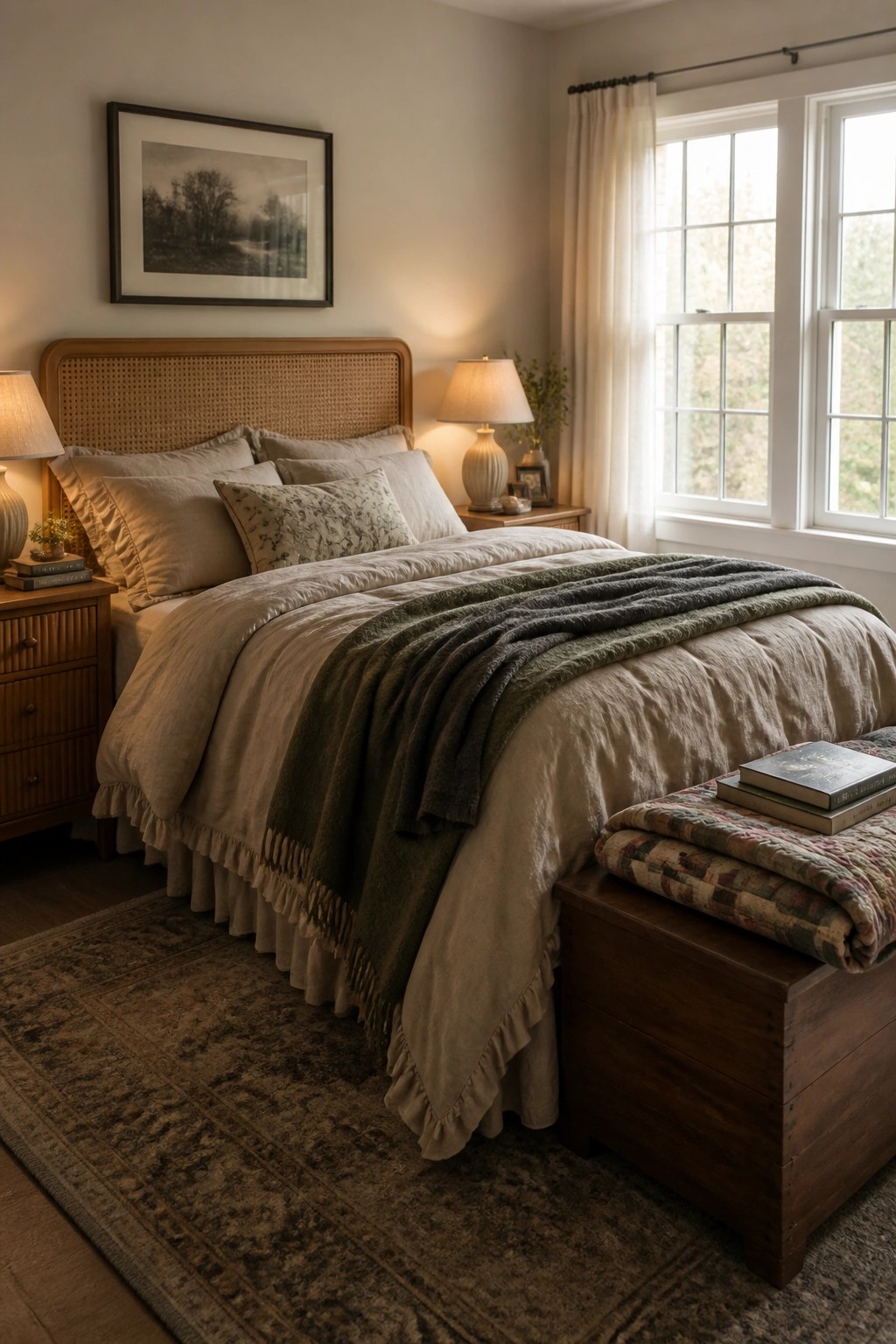
Many people like the way different neutral shades can sit together without competing. A base of warm beige on the sheets and pillows, then a darker throw across the middle, keeps the bed from looking flat while still feeling calm and pulled together.
This works best in rooms that already have wood furniture and simple walls. Start with one main neutral for the larger pieces, then bring in a second slightly deeper tone through blankets or a few pillows. It suits older homes or any space where you want things to feel collected rather than matched.
Soft Sage Walls For Neutral Rustic Farmhouse Rooms
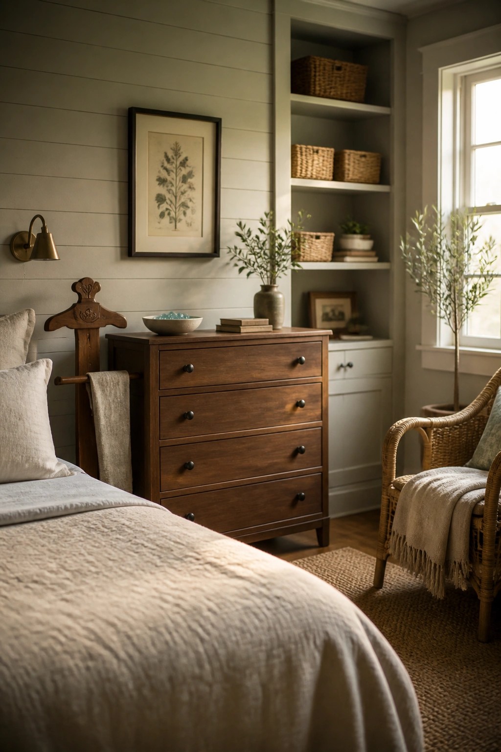
A soft sage green on the walls gives a neutral rustic farmhouse room a quiet sense of calm without pulling away from the wood and natural fabrics. It sits nicely between gray and green, so it works with both warm and cool neutrals in the same space.
This color choice suits bedrooms especially well. Keep the furniture in warm brown tones and use linen or cotton textiles in off-white shades to hold the look together without extra contrast.
Warm Neutrals with Natural Wood
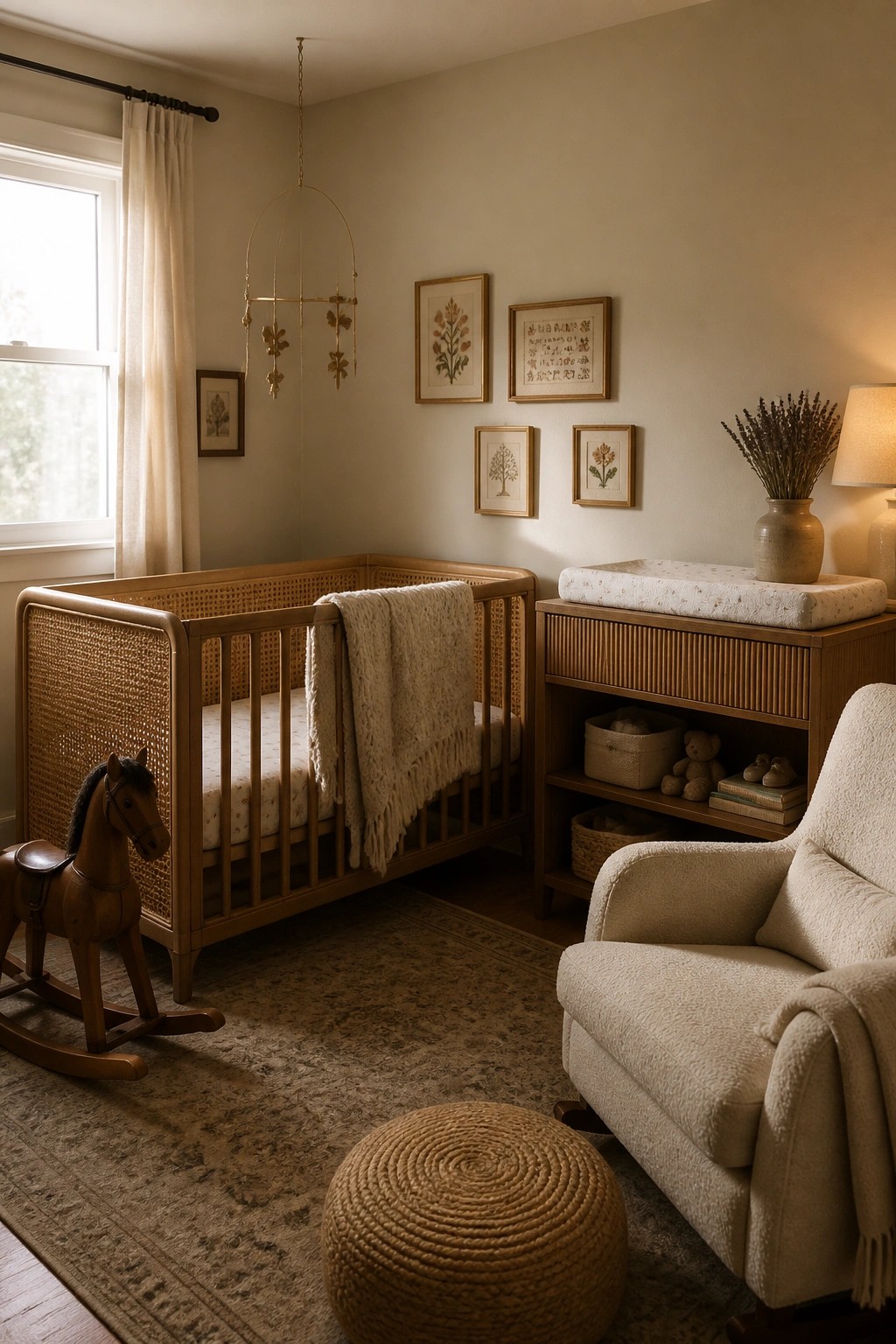
A warm neutral palette keeps a nursery feeling calm and easy to live in. The wood tones on the crib and changing table add subtle depth without pulling the room in different directions.
This works best in smaller spaces or homes that want one color story throughout. Keep the main pieces in soft beige and light brown, then bring in texture with blankets and seating to avoid a flat look.
Soft Gray Green Built Ins
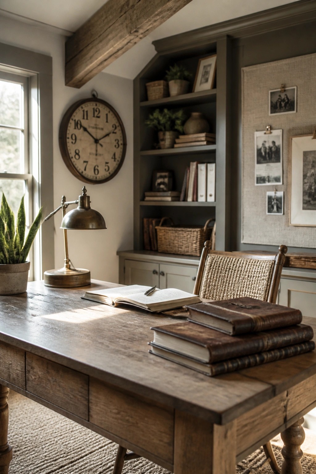
A soft gray green on built in shelves and cabinets gives a room a calm base that still feels connected to the wood tones around it. It keeps the space from looking too stark while letting the furniture and accessories stand out in a natural way.
This color works best in offices or smaller rooms where you want things to feel settled without a lot of contrast. Stick with simple wood pieces and avoid adding too many extra colors on the shelves.
Layering Neutrals With Wood Accents
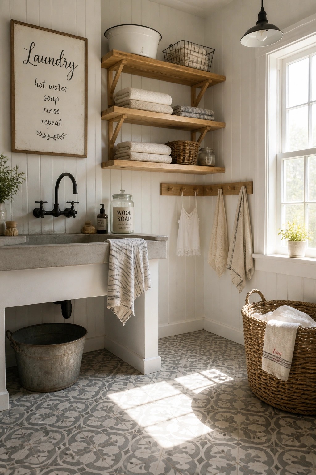
A soft mix of white walls, gray tones, and warm wood keeps a laundry room feeling calm instead of busy. The limited palette lets the natural textures of the shelves and sink stand out without competing.
This approach works best in small utility spaces where you want things to feel orderly. Stick to two or three neutrals and let the wood bring in the warmth so the room stays simple and easy to keep looking tidy.
Warm Wood to Anchor Neutral Bathrooms
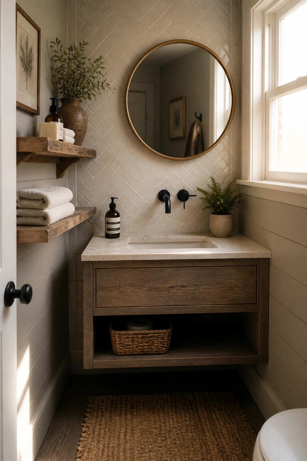
A wood vanity does a lot in a small bath when the rest of the room stays light. It brings warmth and weight to the neutral palette without needing extra color or pattern.
This approach works best in compact spaces where you want things to feel calm and connected. Stick with one wood tone and repeat it lightly on a shelf or two so the look stays simple rather than busy.
Adding Soft Green To Kitchen Cabinetry
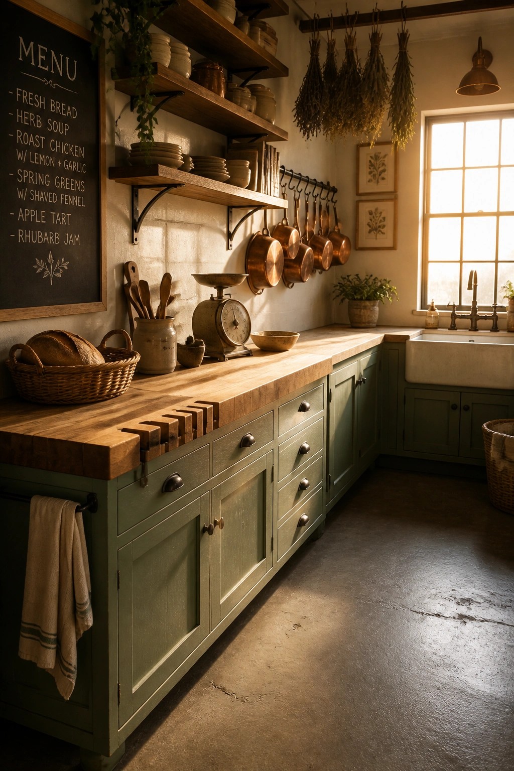
A soft green on the base cabinets gives a kitchen just enough color without making the space feel busy. It works especially well in rustic farmhouses because the tone stays earthy and pairs naturally with wood surfaces and simple hardware.
This approach suits homes that already have warm wood tones or plenty of natural light. Keep the upper storage open with wood shelves and limit other colors to neutrals so the green reads as a quiet accent rather than the main feature.
Work with a Few Neutrals and Lots of Texture
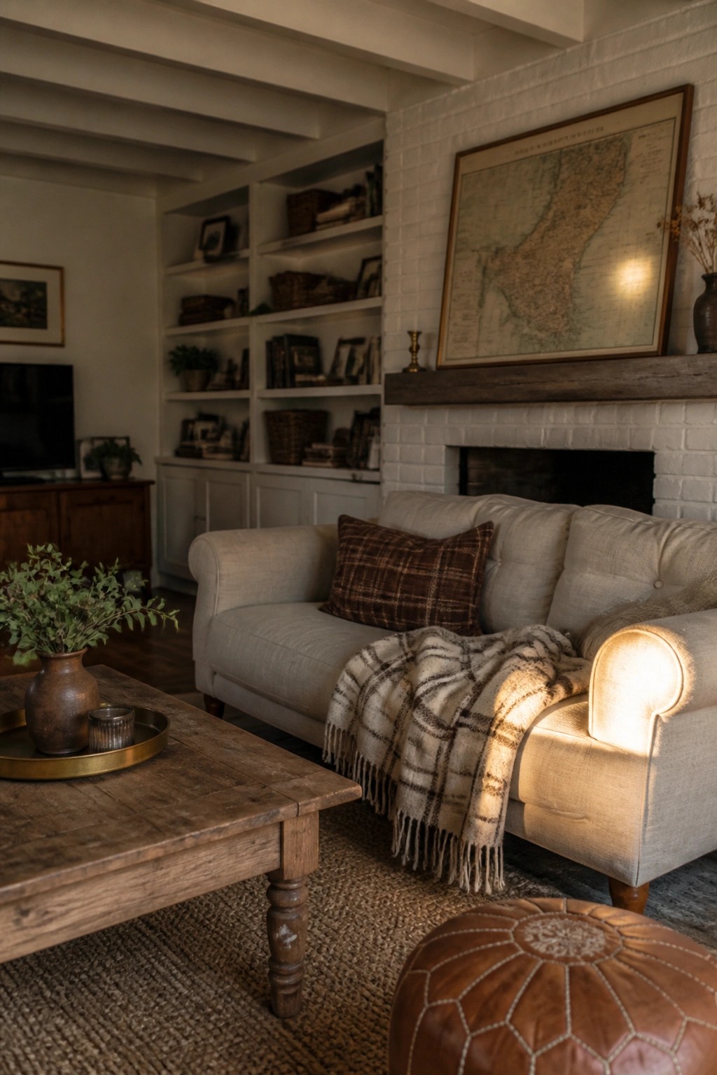
A room feels calmer when everything stays within the same few tones instead of adding new colors for interest. The light sofa, plaid throw, and leather seat all sit in the same warm range, so the eye rests instead of jumping around.
This approach works best in living rooms that already have wood floors or brick. Pick three tones max, then let the surfaces do the work, rough wood next to smooth linen or soft wool against leather. It keeps the space feeling collected without looking busy.
Muted Green Walls With Natural Wood
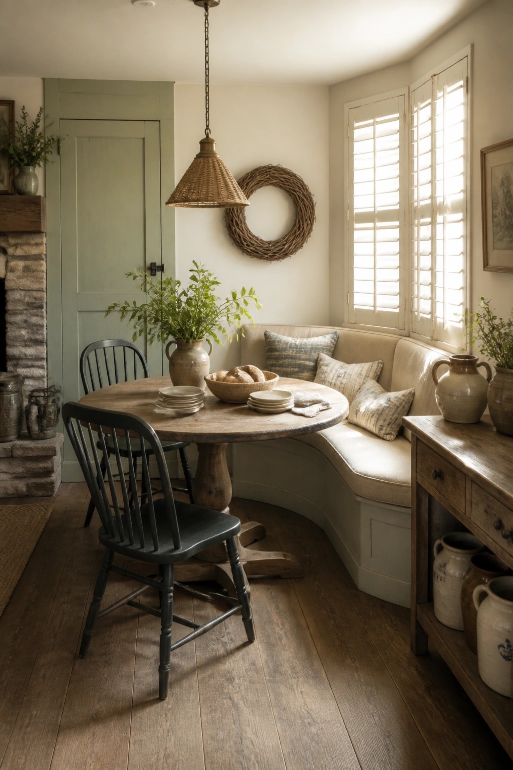
A soft green on the walls gives a rustic farmhouse room just enough color while still feeling calm and neutral. It works well because it blends with the wood tones and keeps the whole space from looking too stark or plain.
This approach suits older homes or spaces with simple trim and wood floors. Keep the other elements light, like a wooden table and neutral cushions, so the green stays the main but quiet note.
Let Wood Tones Carry the Neutral Palette
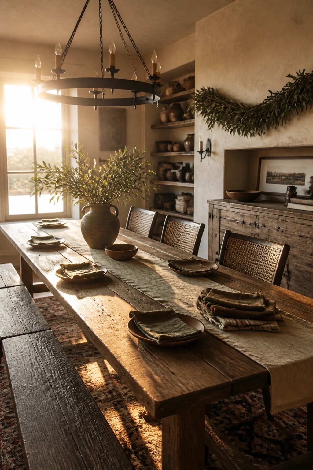
A dining room feels more settled when most of the larger pieces stay within the same range of wood tones. The table, bench, and chairs all read as one family here, which keeps the space from looking busy even with plenty of other details around.
This approach works best in homes that already have older wood floors or beams. Pick a runner and napkins in a close neutral so they blend instead of compete, and limit pottery or other accents to the same quiet palette.
Layer Texture Across a Neutral Palette
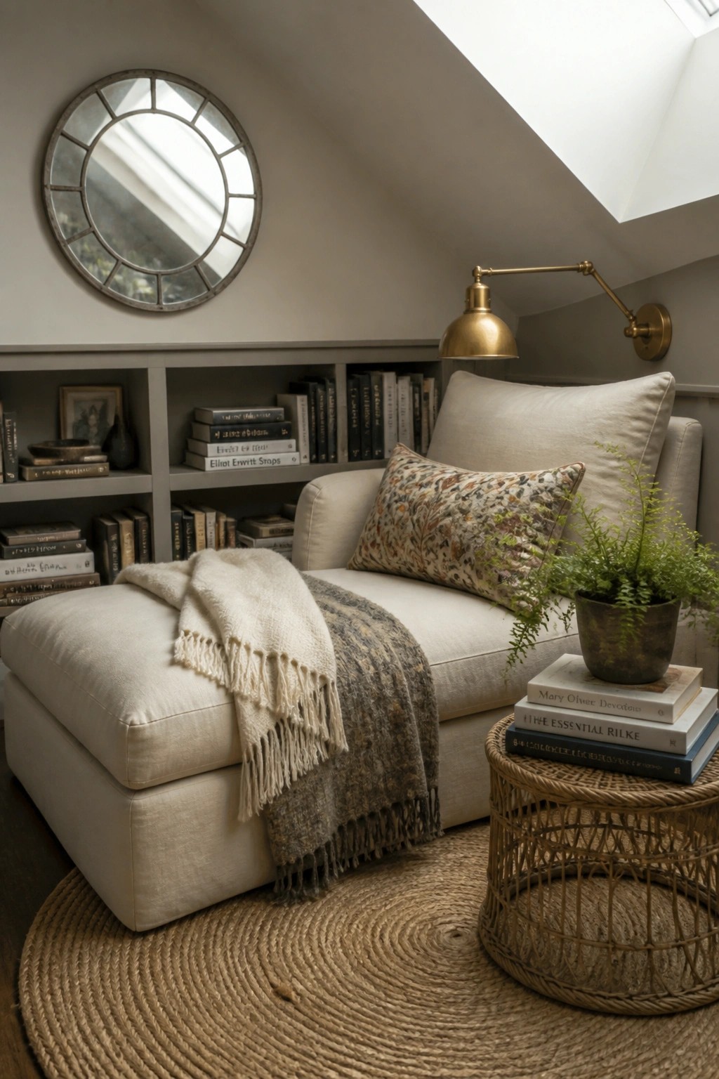
A tight neutral color scheme works best when you let different materials do the talking. Cream upholstery, a wool throw, linen pillows, and woven pieces like the side table all sit in the same soft range, so the room feels calm but never flat.
This setup suits smaller nooks or reading corners in a farmhouse where you want warmth without extra color. Keep the big pieces in one tone and bring in natural fibers on rugs, baskets, and throws to add depth. Watch the scale so nothing feels too matchy.
A Cohesive Neutral Palette For The Bath
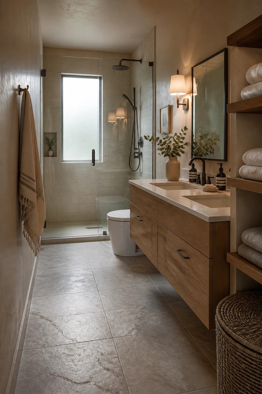
A limited range of warm neutrals can make a small bathroom feel calm and put together without much effort. The wood tones on the vanity pair with the soft beige tiles and gray floor to keep everything connected. This approach avoids the choppy look that comes from mixing too many colors in one room.
It works especially well in farmhouse style homes where you want the space to feel simple and natural. Stick to two or three base tones and let materials like wood and stone carry the interest. Watch that the undertones stay similar so the room does not feel off balance.
Neutral Tones For A Mudroom That Stays Organized
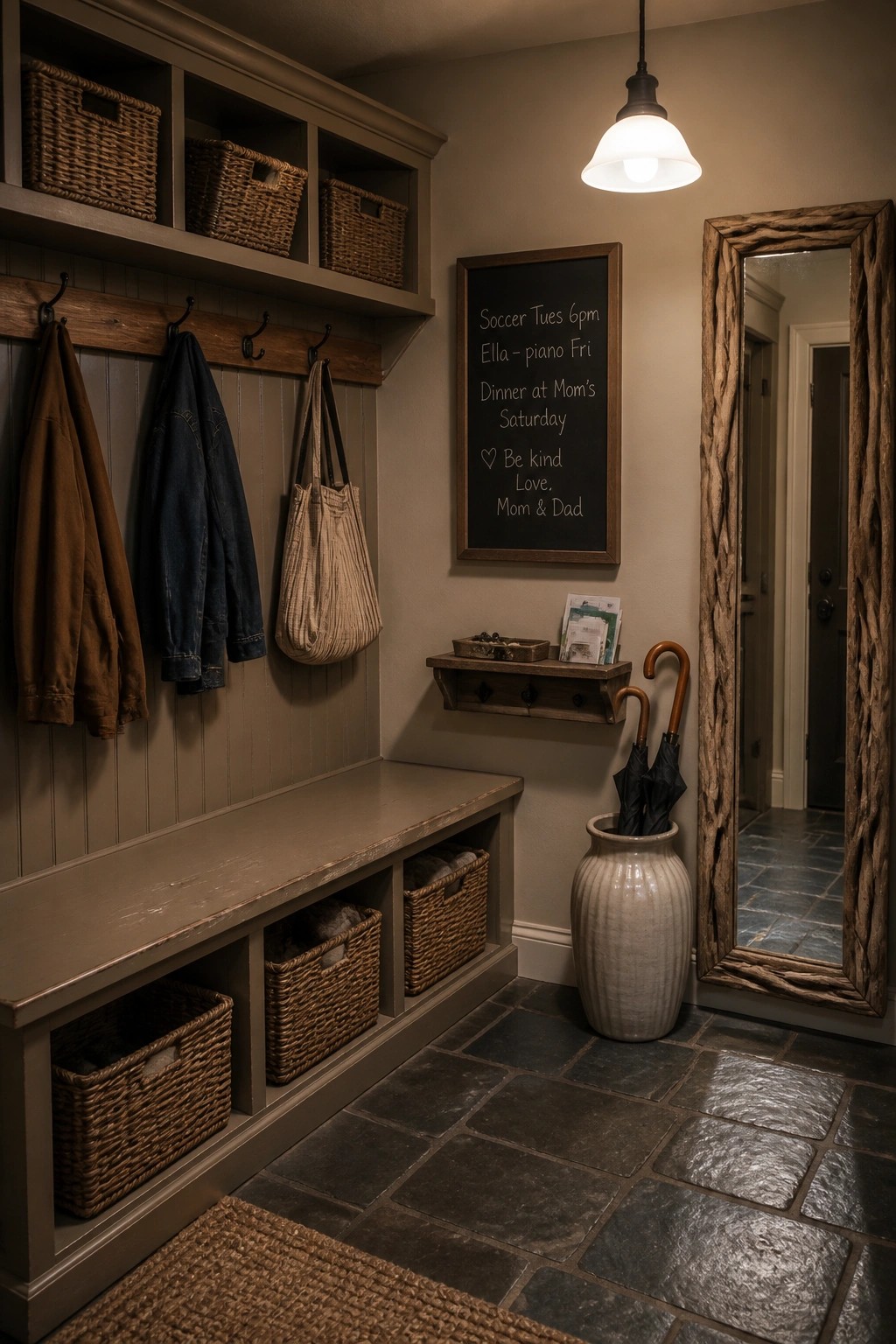
A soft gray and beige palette helps a mudroom feel calm even when it holds coats, bags, and shoes every day. The colors keep the space from looking busy while still letting the wood tones and woven textures show up clearly.
This works best in homes with kids or pets that use the back door often. Paint the walls and built-ins in the same muted range, then add baskets and hooks in similar shades so the whole area reads as one simple zone rather than a collection of separate pieces.
Open Shelving In The Pantry
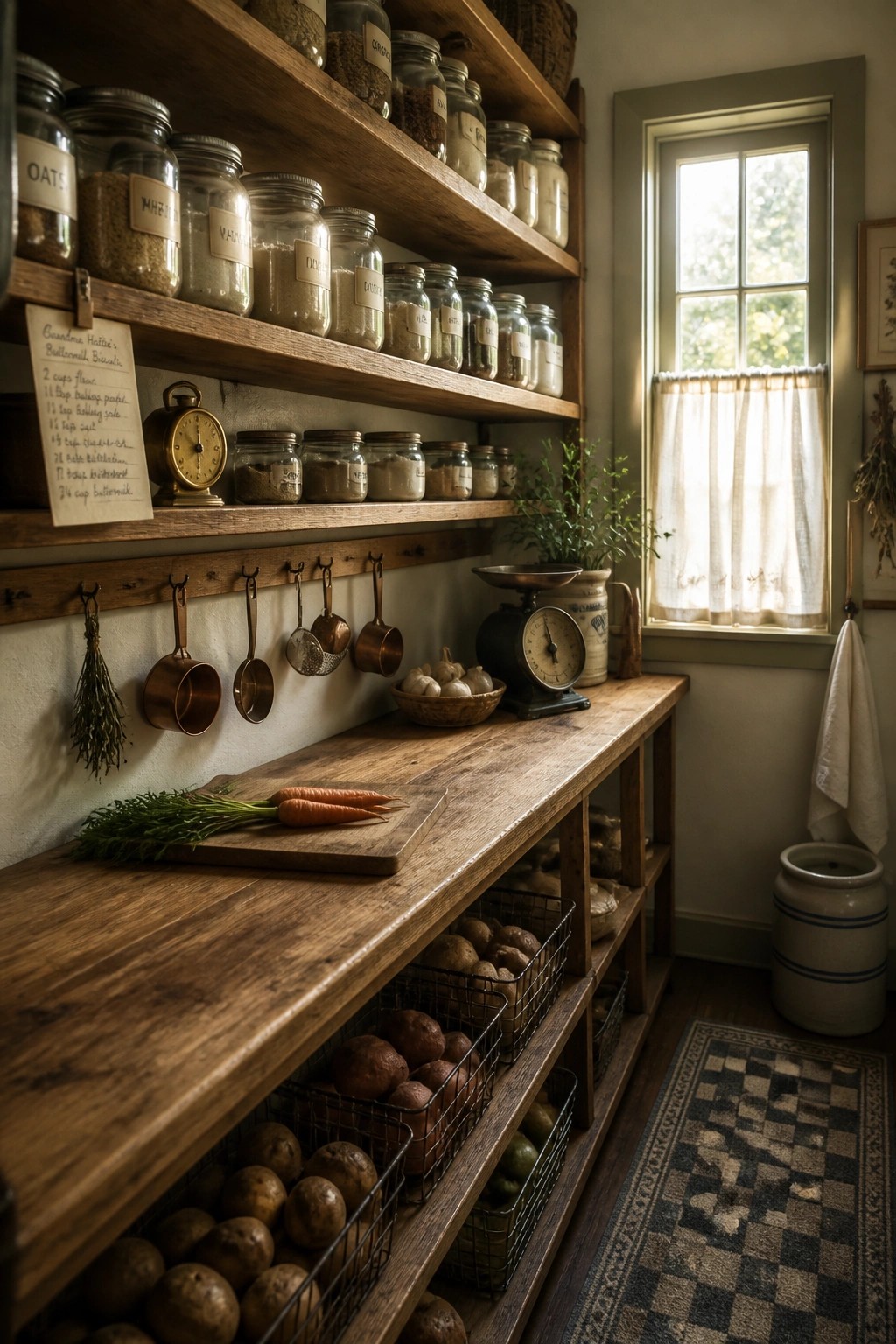
Open shelving works well in a pantry because it keeps dry goods visible and easy to grab without digging through cabinets. The wood tones and simple glass containers blend into a neutral palette without adding extra color or fuss.
This setup suits a small or medium kitchen where you want storage that feels light and practical. Stick to matching jars and clear labels so the shelves stay neat instead of looking busy over time.
Keep the Color Scheme to Neutrals and Wood Tones
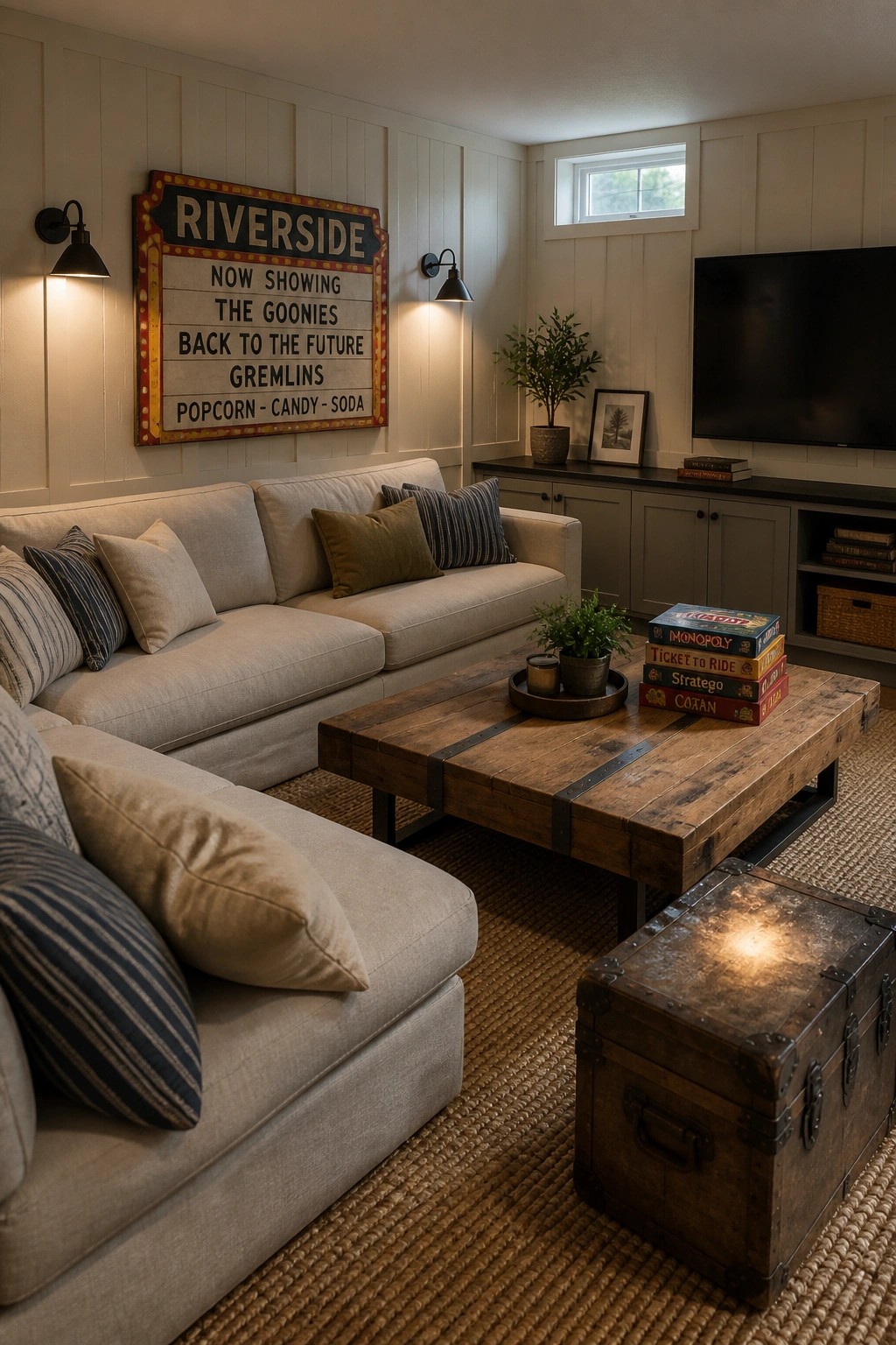
A narrow range of neutrals paired with natural wood creates a simple, cohesive look that feels relaxed rather than busy. The light walls and sofa set a calm base, while the wood table adds warmth without breaking the flow.
This approach works well in living rooms that get regular use. Pick a sofa in a soft beige or greige, add one or two wood pieces, and limit other colors to keep the room feeling pulled together.
Natural Wood Desks for Compact Work Areas
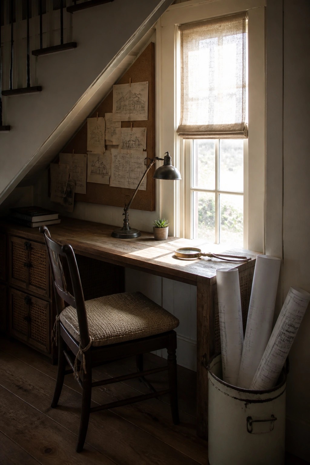
A wooden desk with a simple woven chair fits neatly under the stairs and keeps the space feeling warm without crowding it. The light finish on the wood pairs easily with other neutral tones in the room and lets the natural grain do most of the work.
This setup works best in smaller homes or farmhouse layouts where every corner needs to earn its keep. Choose unfinished or lightly stained wood and limit other materials to linen, burlap, or cane so the palette stays calm and consistent.
Warm Neutrals Make a Bathroom Feel Cohesive
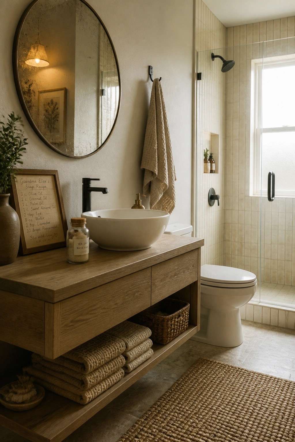
A bathroom stays calmer when you keep the colors to a narrow range of warm neutrals. The wood vanity and soft beige textiles pull everything together without extra contrast or pattern.
This works best in smaller rooms where too many tones can feel busy. Stick with the same wood tone on the vanity and floor, then use off-white walls and simple beige towels to hold the look steady.
Let Natural Neutrals Set the Tone
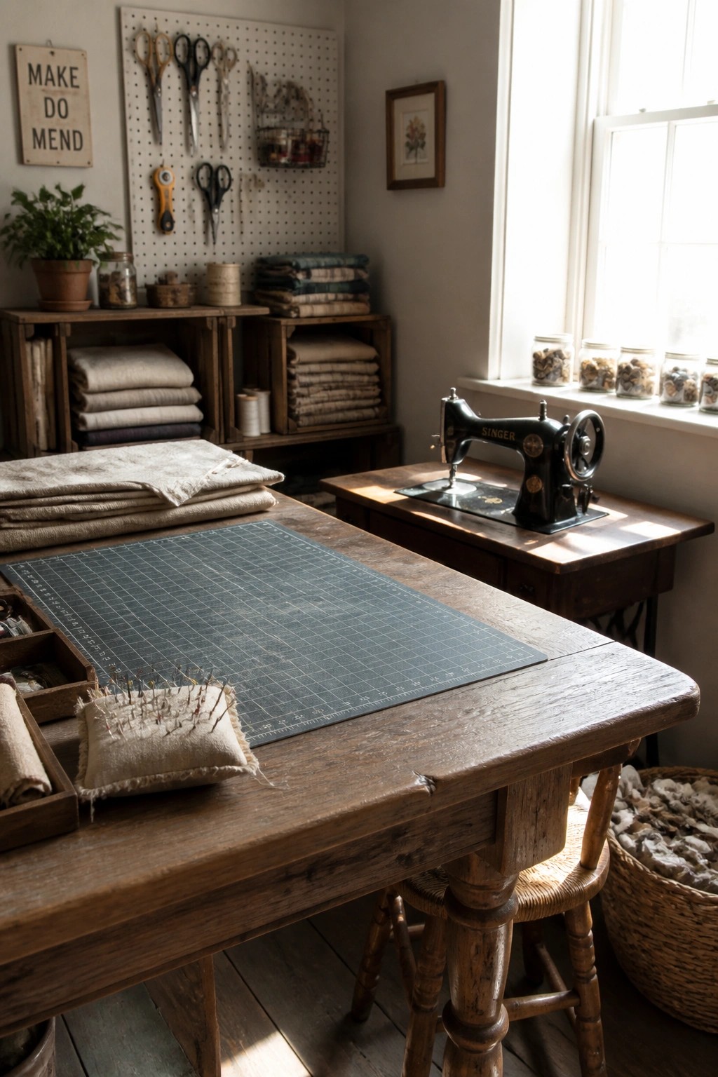
A tight range of wood tones and soft linen colors can make a workspace feel calm and put together without much effort. The wooden table and stacks of plain fabric show how the same few shades can run through furniture, textiles, and even storage pieces.
This works best in rooms that see daily use, like a sewing space or small home office. Keep the walls and larger surfaces in the same neutral family so tools and supplies do not break the look.
Choose Neutral Tones for the Bedroom
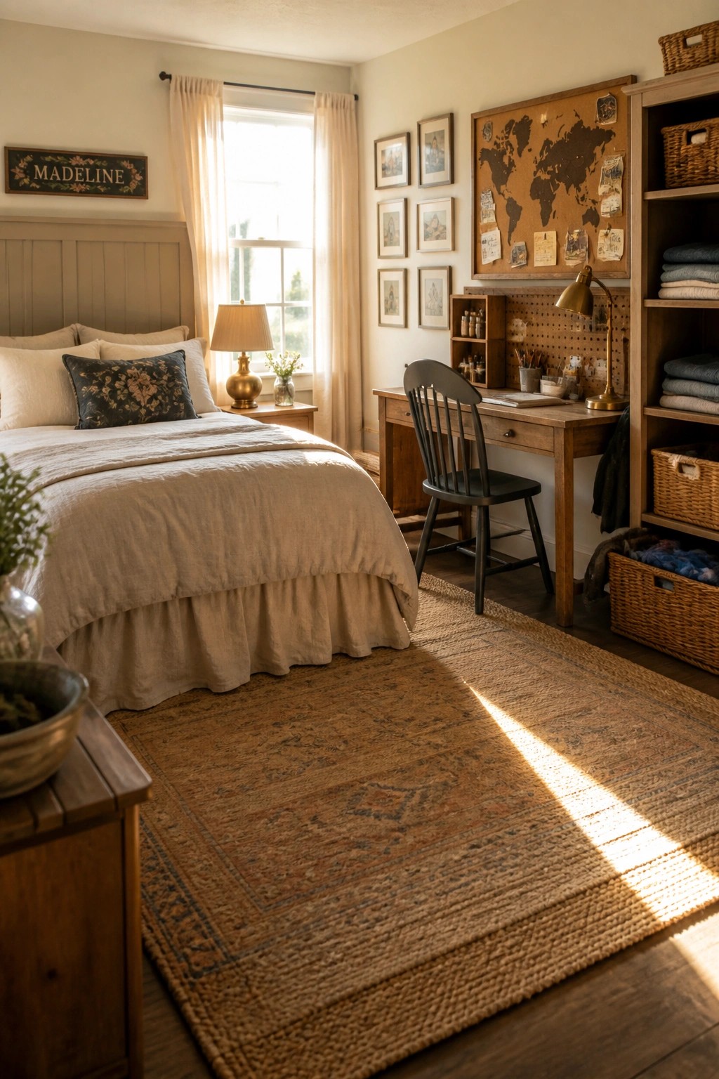
A neutral palette keeps a rustic bedroom feeling calm and easy to live in. Soft beige walls and linen bedding set a simple base that lets wood furniture and woven rugs add warmth without competing.
This works best in smaller homes or spaces that need to feel pulled together quickly. Limit the colors to creams, taupes, and browns, then rely on texture from fabrics and natural materials to keep things interesting.
Stone And Wood In The Bathroom
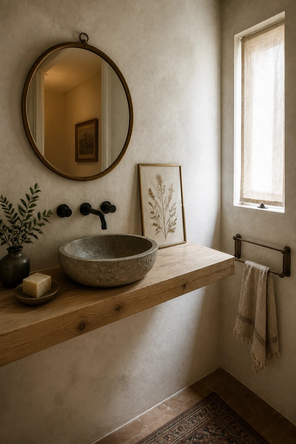
A stone vessel sink on a thick wood ledge gives a neutral bathroom a quiet, grounded look. The natural textures do the work, so the space feels finished even when the walls stay plain and the colors stay soft.
This approach suits small bathrooms or homes that lean rustic farmhouse. Keep the palette to warm whites, taupes, and beiges, then add only a few dark fixtures so the stone and wood stay the main focus.
Staying With Warm Neutrals and Wood

A limited range of creams, soft grays, and natural wood keeps a small coffee area from feeling busy. Everything sits in the same warm family, so the counter, cabinet, and seating read as one calm zone instead of separate pieces.
This approach suits older homes or open kitchen living spaces where you want the station to blend into the room rather than become a focal point. Match the cabinet color closely to the wall, then let the wood counter and a few darker accents on the hardware do the rest.
Warm Neutrals With Natural Wood
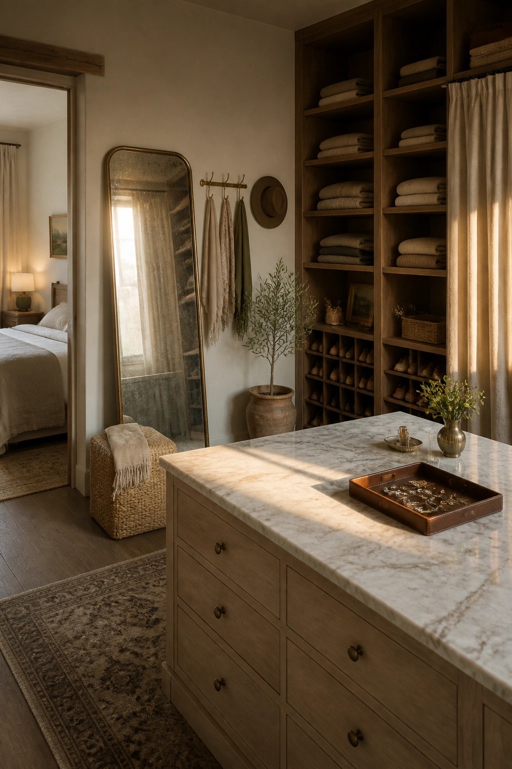
A limited palette of warm neutrals paired with wood tones keeps a room feeling calm and pulled together. The wood adds subtle variation without breaking the flow, and it works especially well when the same shades repeat across walls, textiles, and larger furniture pieces.
This approach suits older homes or spaces that already have wood trim and floors. Keep the mix simple by choosing one or two wood finishes and letting texture from woven baskets or linen do the rest.
Frequently Asked Questions
Q: My living room already has a big leather couch. Which scheme works best with that?
A: Go for warmer neutrals like soft taupe or greige on the walls. They complement leather without clashing and keep the rustic vibe intact.
Q: Do these colors work in a bathroom with tile already installed?
A: Stick to the lighter schemes to avoid making the space feel closed in. Add touches of the accent colors through towels or a shower curtain for cohesion.
Q: How often do I need to update these color schemes?
A: These neutrals stay relevant for years. Refresh with new pillows or art when you want a change.
