

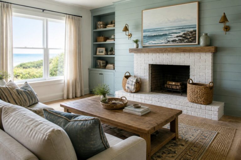
When I think about painting a coastal farmhouse the first thing I check is how the color will hold up once the furniture and natural light are in place.
Colors that seem light and easy on a chip can feel too stark once they cover four walls and meet the trim.
I usually test a couple of options on different walls to watch how they change from morning to evening.
That step saves headaches later.
The right shade brings a relaxed feel without fighting the wood floors or the view outside.
Soft Blue Green Walls For Coastal Farmhouse Rooms
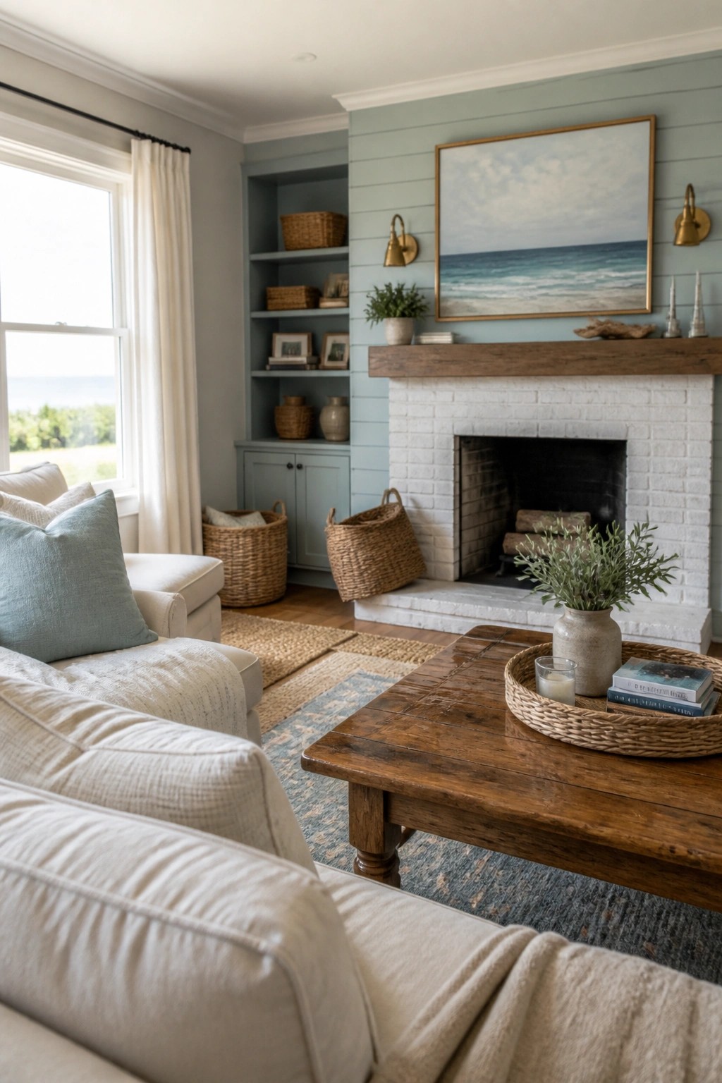
A soft blue green on the walls gives a room that easy coastal feel without making it feel like a beach house theme. It pairs well with white trim and wood tones, and it keeps the space light even when there is a big fireplace taking up one wall.
This color works best in living rooms or family spaces that get decent natural light. Try it on all four walls first, then add white upholstery and simple wood furniture so the color stays calm rather than busy.
Soft Neutral Paint For Relaxed Coastal Bedrooms
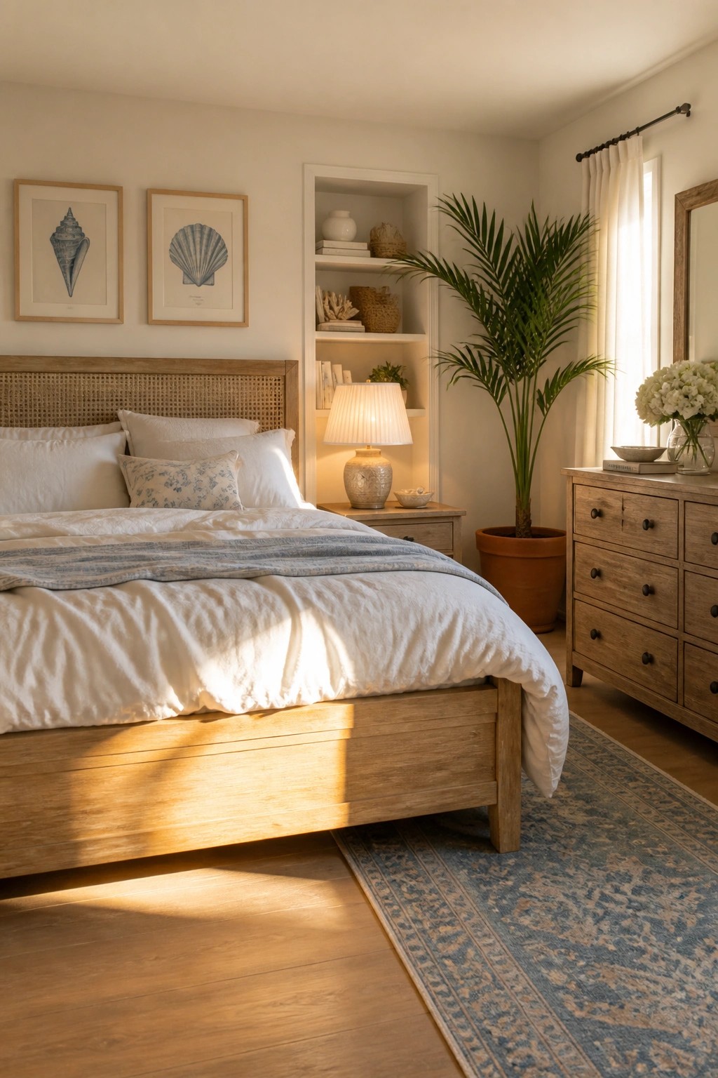
A soft neutral paint color on the walls helps a bedroom stay light and open without feeling stark. It pairs easily with natural wood and simple white bedding to create a calm coastal farmhouse feel that still feels lived in.
This choice works best in rooms with decent natural light. Keep the ceiling and trim in the same family of tones so the space reads as one quiet layer rather than a mix of finishes.
Light Green Cabinets For A Calm Kitchen
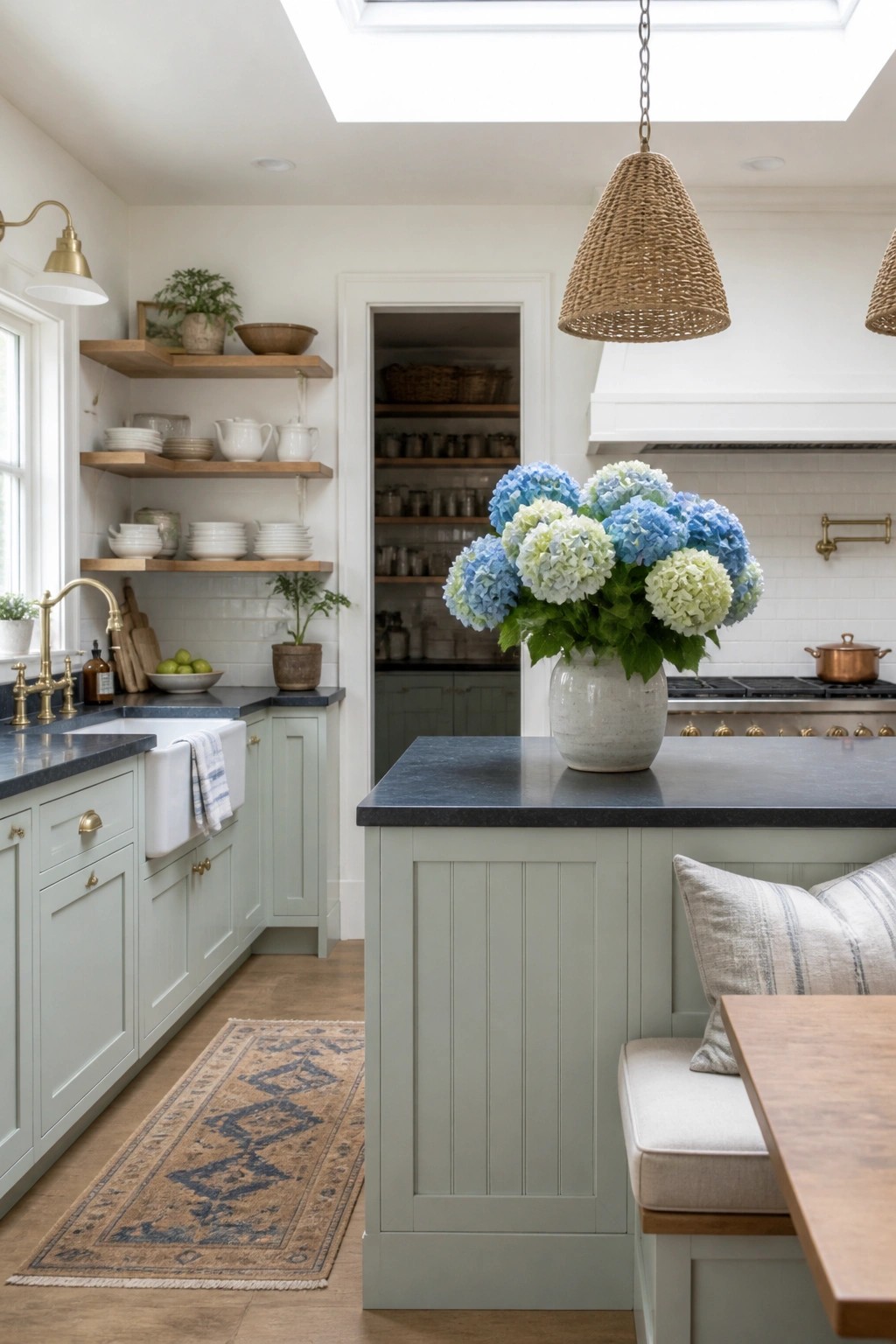
A soft green on kitchen cabinets gives the room a gentle color without making it feel heavy or busy. It works especially well in coastal farmhouse homes where you want some warmth but still need the space to stay light and open. The shade pairs easily with white walls and dark counters, so the whole room feels balanced rather than stark.
This color choice suits older homes or new builds that lean relaxed rather than formal. Keep the trim and walls bright white so the green stays soft, and use it on both base cabinets and the island for a pulled-together look. It is forgiving if the lighting changes throughout the day.
Soft Neutral Paint for Calm Bathroom Walls
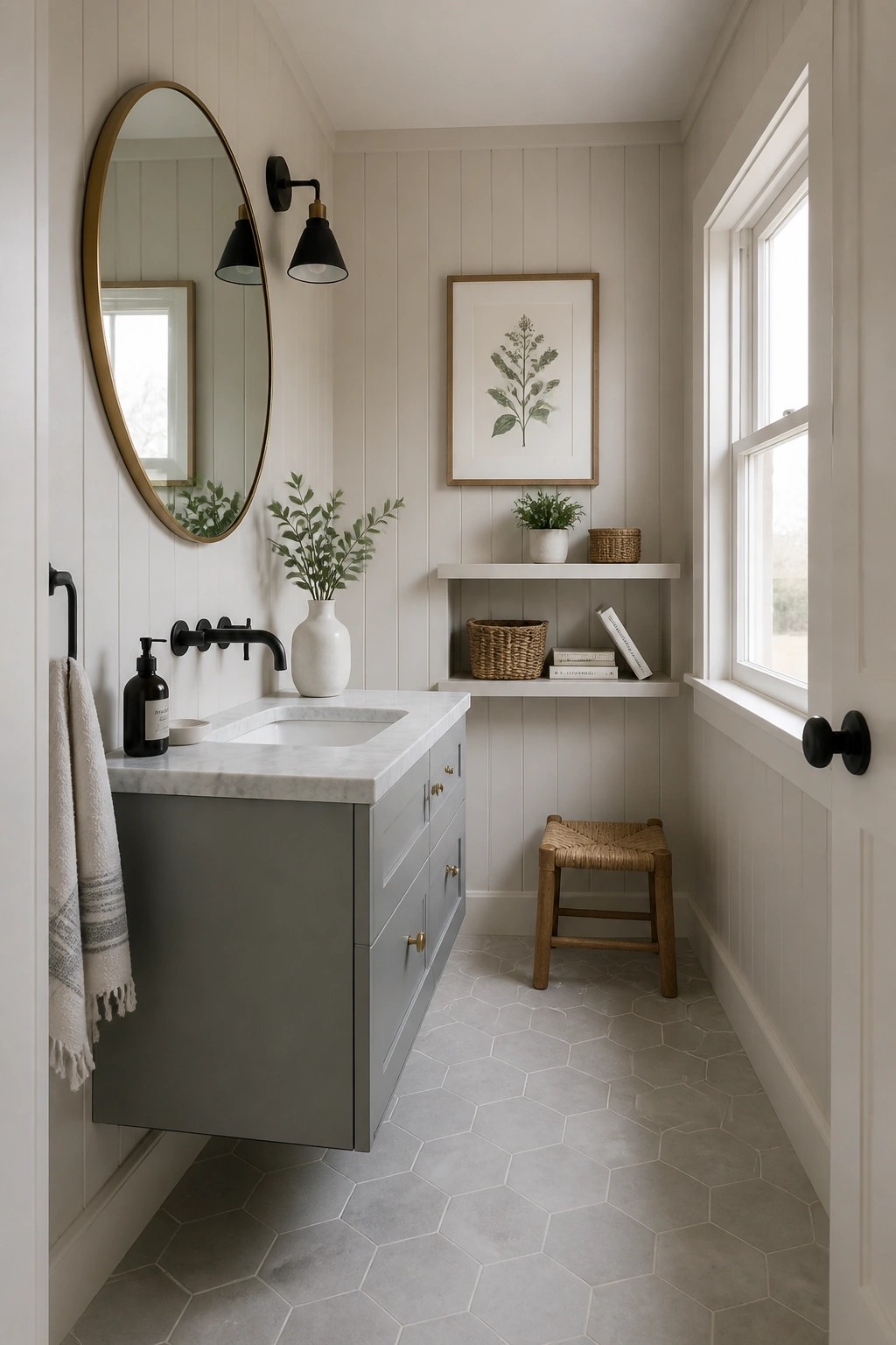
Soft neutral paint on the walls helps a bathroom feel open and easy even when the space is small. The light color bounces light around and keeps the vertical paneling from feeling heavy or closed in.
This color choice suits coastal farmhouse homes that want a relaxed look without going all white. It pairs well with a single darker piece like a painted vanity so the room stays balanced and simple to maintain.
Light Paint Colors On Walls And Built-Ins
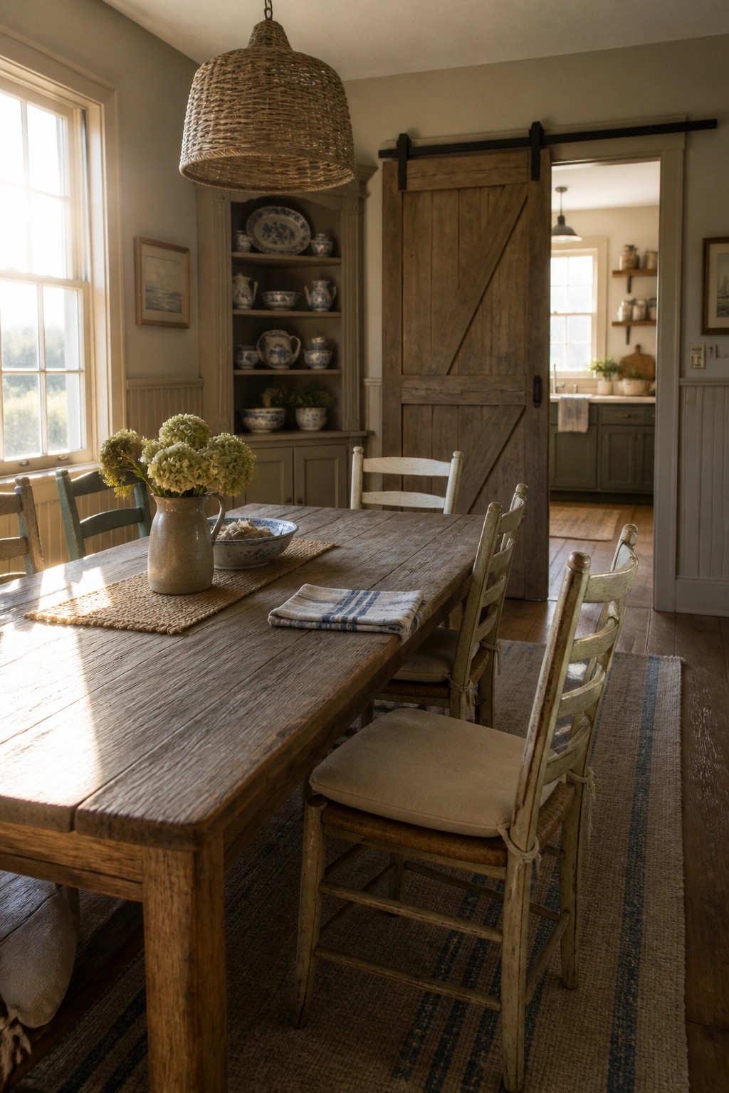
Many coastal farmhouse rooms feel calmer when the walls and built-in cabinetry share the same soft light paint color. This keeps the space from feeling chopped up and lets the wood tones and simple accessories stand out without competing.
It suits dining rooms and kitchens that already have plenty of texture from furniture and dishes. Pick a shade with a touch of warmth so the room stays inviting even on cloudy days.
Soft White Paint For Entry Walls
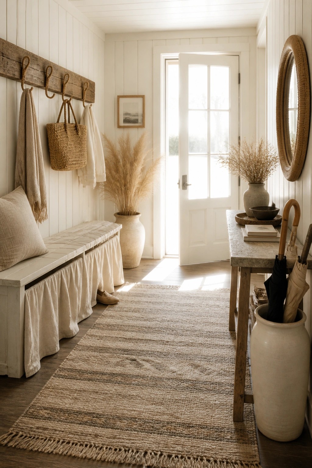
A soft white paint color on the walls helps small entry spaces feel open and calm instead of tight. It works especially well in coastal farmhouse homes where the goal is to keep things light without much effort.
This choice suits any narrow hallway or mudroom that gets some natural light. Keep the trim and ceiling the same color so the room stays simple and the focus stays on easy textures like wood and linen.
Soft Blue Green Walls
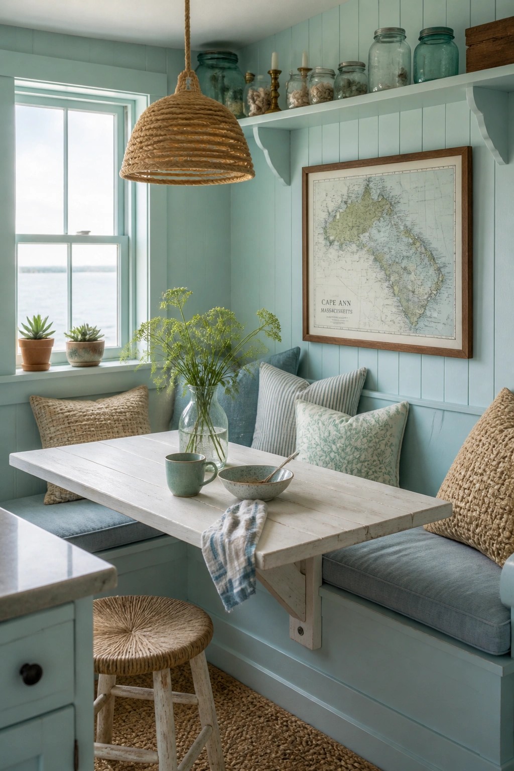
A soft blue green paint color brings a calm, easy feeling to a small dining nook without making it feel chilly. The shade works especially well on paneled walls because it catches the light gently and keeps the whole space relaxed.
This color suits homes that want a light coastal look without going full beach theme. It pairs nicely with simple wood furniture and built in seating, and it works best in rooms that get decent daylight.
Soft Blue Gray On The Walls
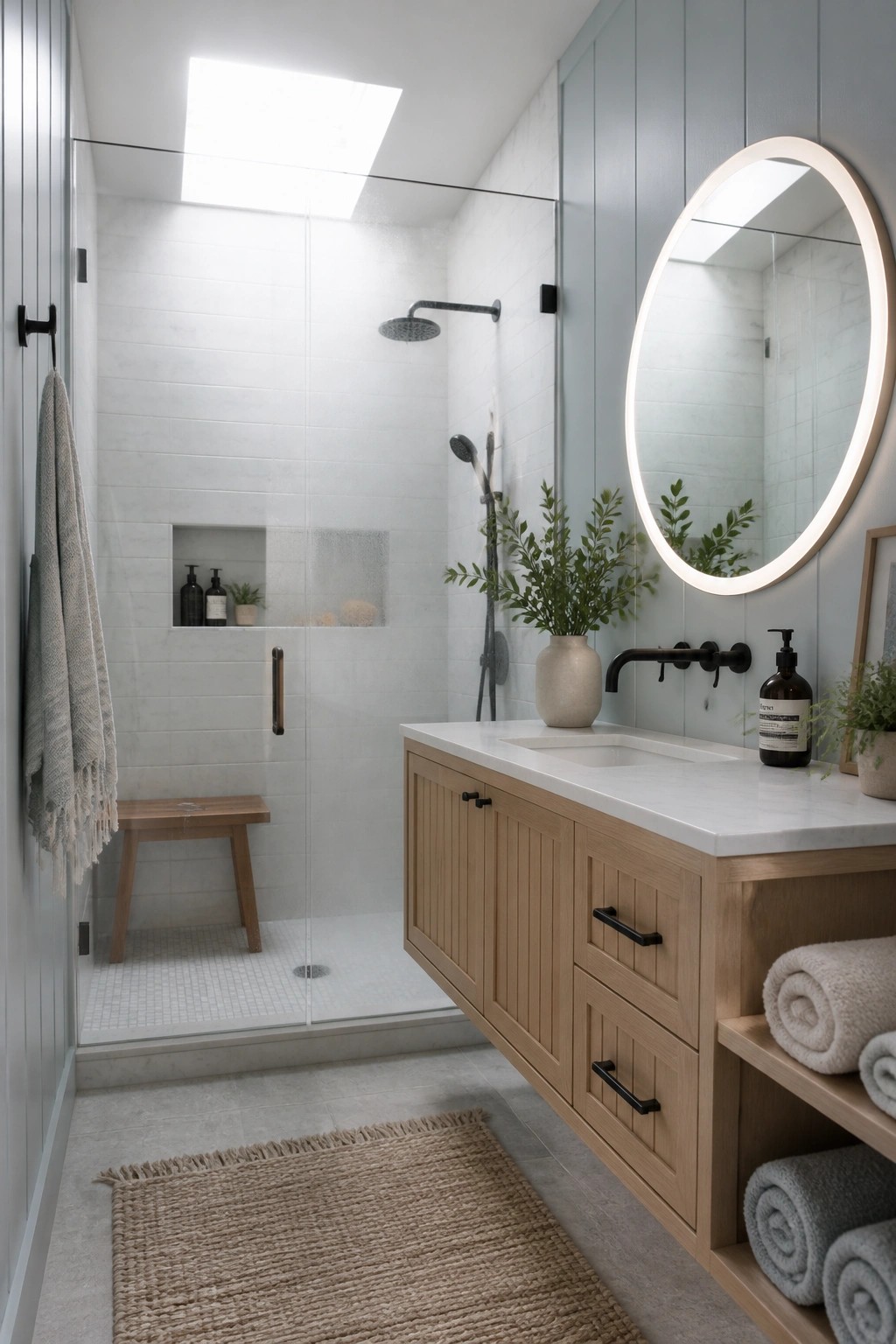
A soft blue gray paint on the walls gives a bathroom just enough color to feel relaxed while still keeping the whole space light. It works especially well when the rest of the room stays mostly white and natural wood, so the color does not overpower anything.
This shade suits coastal farmhouse homes because it brings a quiet hint of the coast without turning the room cool or dark. It works best in bathrooms that get decent natural light and pair easily with white tile and simple wood vanities.
Soft Green Walls For A Calm Room
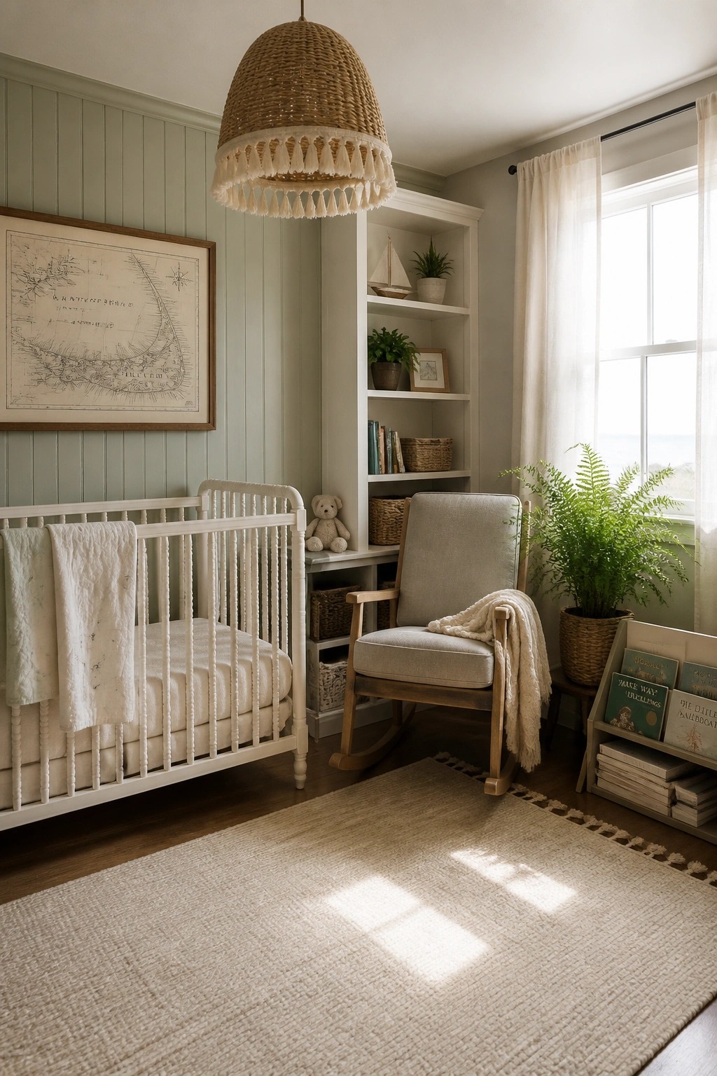
A soft green on the walls gives a room that quiet, easy feeling without making it feel heavy. It works especially well with white trim and simple furniture because the color stays gentle and lets the light move through the space.
This shade suits coastal farmhouse homes that need a bit of color but still want things to feel open and relaxed. It does well in bedrooms or nurseries where you want a soothing backdrop that does not fight with natural textures or light wood tones.
Soft Green Walls For Calm Workspaces
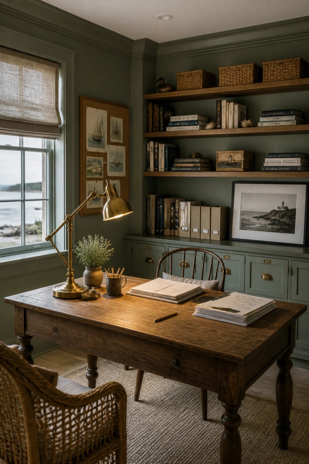
A soft green on the walls sets a steady tone in a room that needs to feel both useful and restful. It keeps the space from feeling stark while still letting the wood tones and natural light do most of the work.
This shade works well in home offices or studies where you want a coastal note without going full nautical. It pairs easily with simple built-ins and older furniture, and it holds up in rooms that get steady use.
Light Paint Colors For Laundry Rooms
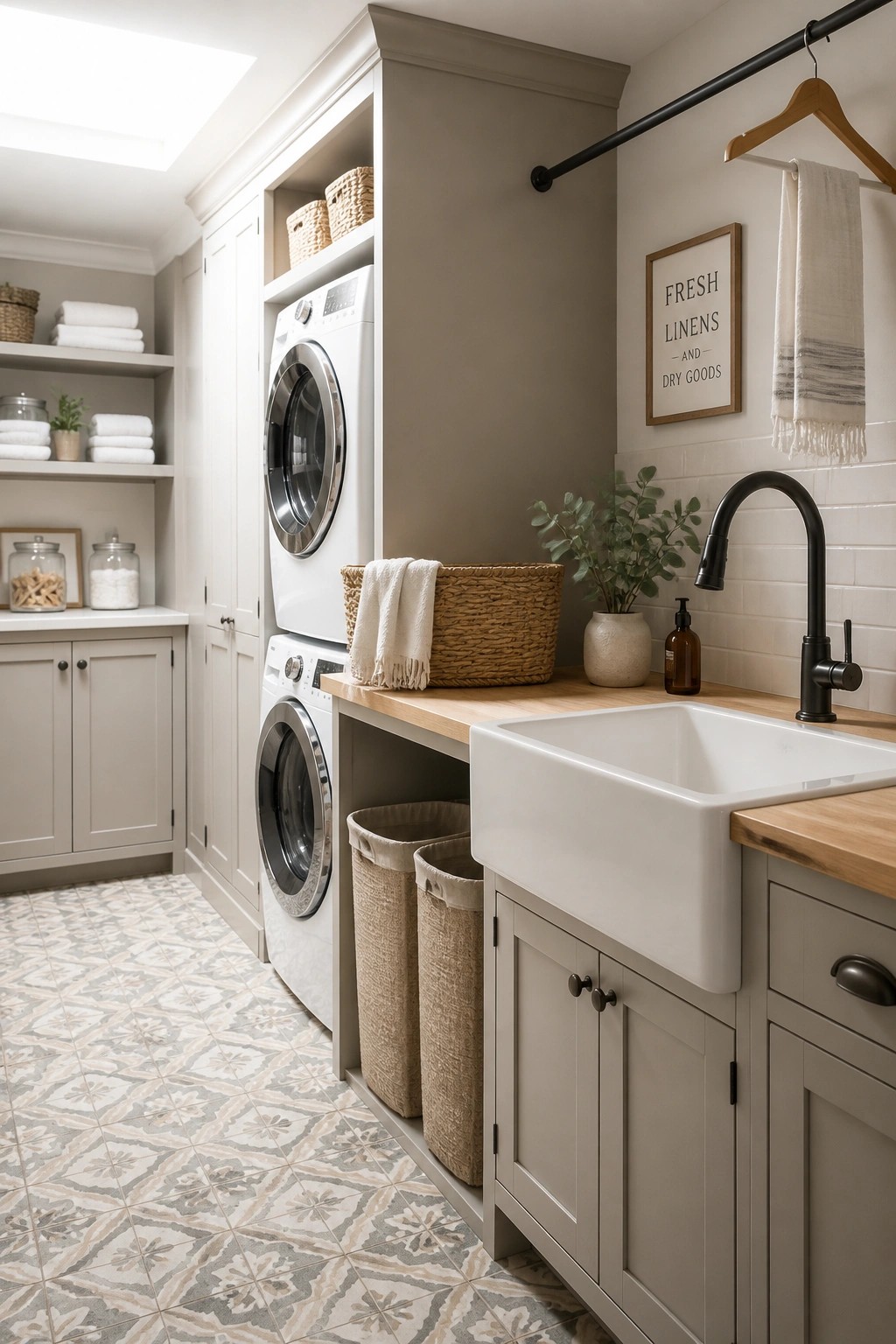
A soft neutral on the walls and cabinets can turn a busy laundry room into a calmer space that still feels practical. The gentle tone keeps everything light while avoiding the stark look that pure white sometimes creates in rooms filled with appliances and storage.
This works especially well in homes that want a relaxed coastal farmhouse feel throughout. Choose a warm off-white or light greige that coordinates with wood tones and simple hardware, and test the color in both daylight and under artificial lights before committing.
Soft Neutral Paint For Light Bedrooms
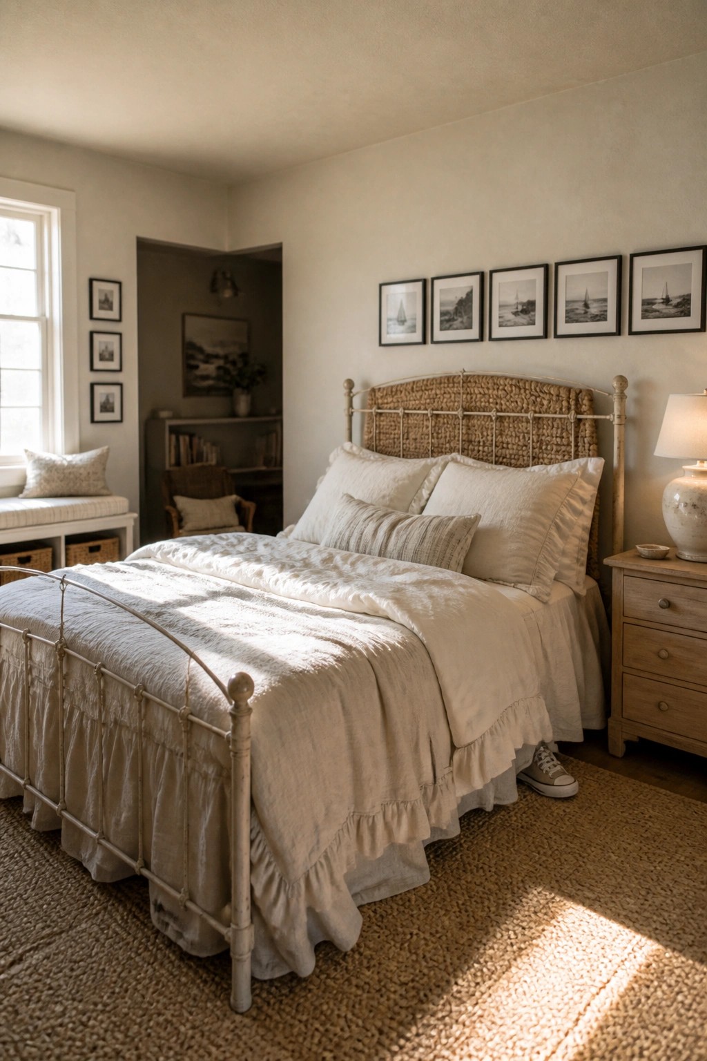
A pale neutral on the walls gives a bedroom that open, easy feeling without much effort. It keeps the space bright even on cloudy days and works well with the simple, natural materials common in coastal farmhouse style.
This kind of color looks best in rooms with decent natural light and pairs easily with white bedding and light wood furniture. It also helps the room feel larger and calmer without needing a lot of extra decoration.
Light Paint Colors for Pantry Cabinets
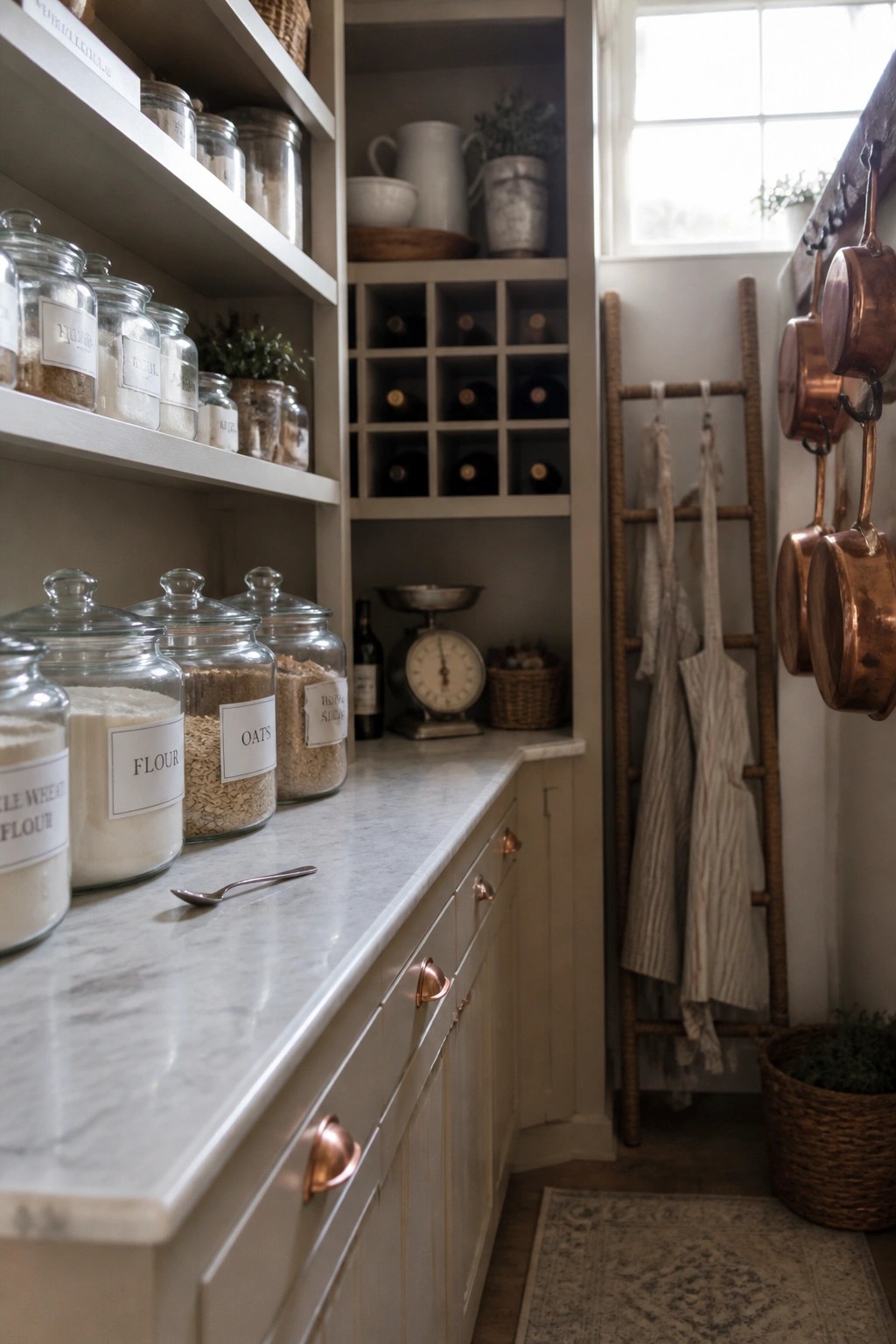
Light paint on pantry cabinets helps the whole space stay open and easy to use. The soft off-white tone keeps things calm without making the room feel closed in, especially when paired with open shelving above.
This approach works well in coastal farmhouse homes where you want storage that feels practical but still bright. It suits smaller or window-limited areas best, and it pairs nicely with simple hardware and light counters so the focus stays on the contents rather than the cabinet color itself.
Built-In Storage In Soft Neutral Tones
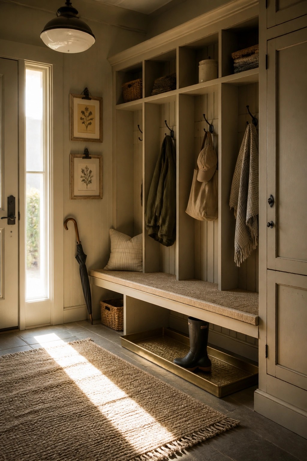
Built-ins help keep an entryway organized without crowding the space. Painting the whole unit in one soft neutral color keeps the room feeling open and calm instead of busy.
This works best in homes that want simple storage that does not fight the light. Match the paint to the walls so the bench and cubbies recede, then add only a few hooks or baskets as needed.
Soft Blue Gray Walls For Light Coastal Rooms
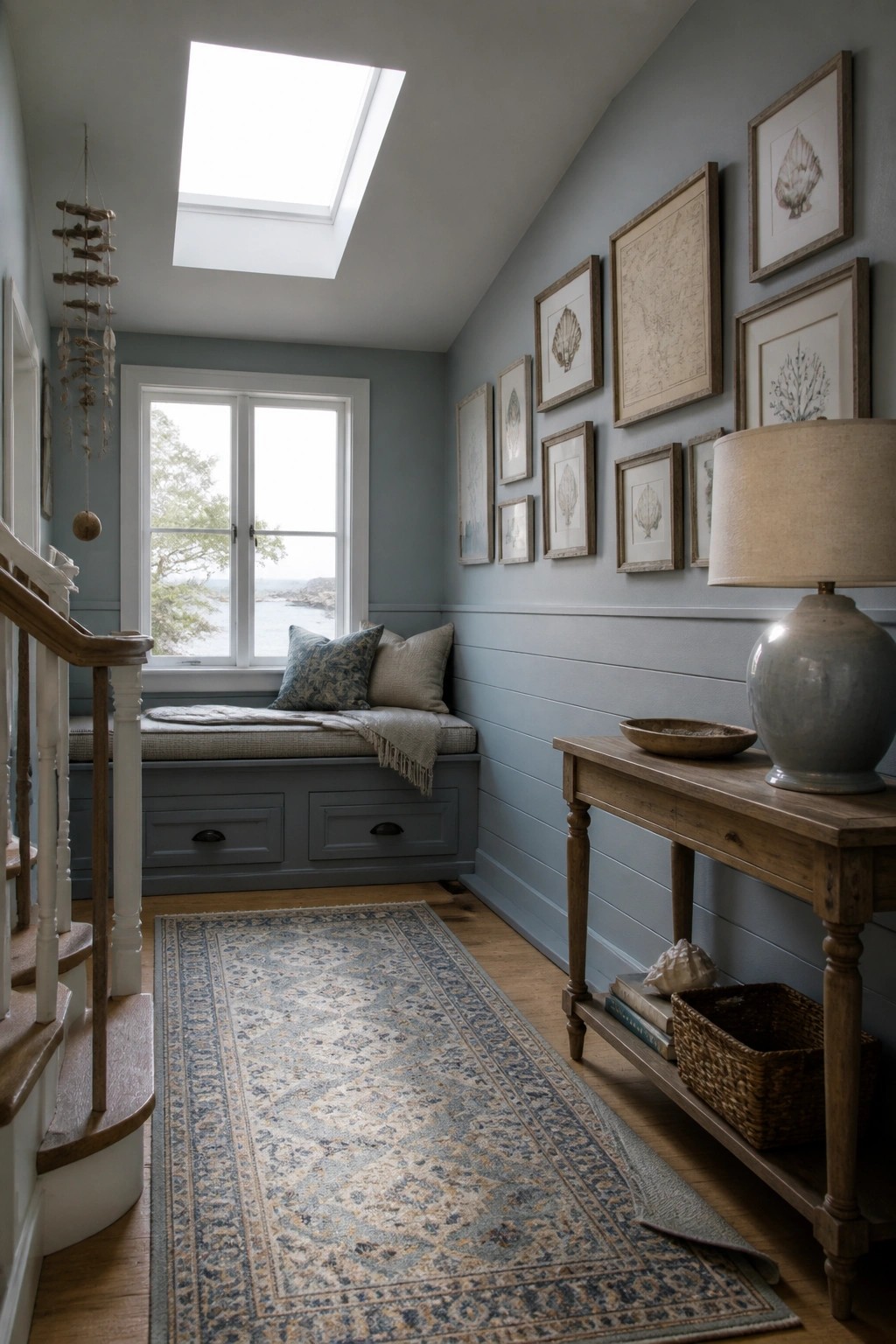
A soft blue gray paint color gives this kind of space a quiet coastal feel while still keeping things simple and farmhouse friendly. The color stays light enough that the room does not feel closed in, and it works well with white trim and wood accents.
This shade suits hallways, stair landings, or any area that needs a bit of calm without much fuss. It pairs easily with built-in seating and natural textures, and it holds up nicely in homes that get good daylight.
Deep Blue Walls For A Relaxed Living Room
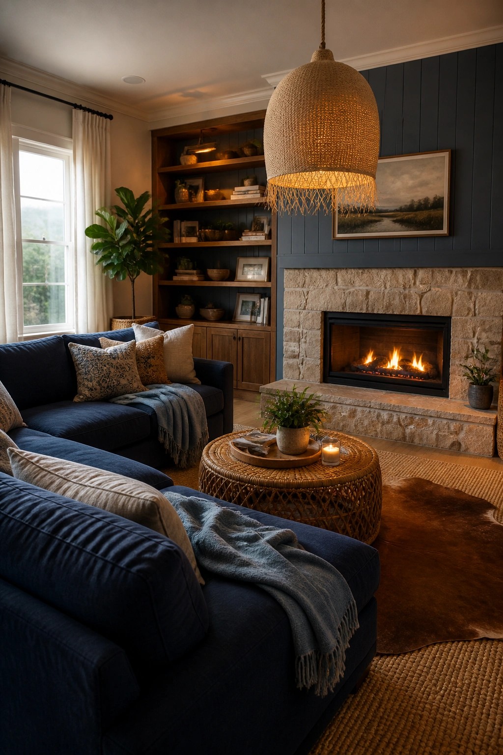
A deep blue on the main wall can give a living room that settled, coastal feel without making it feel closed in. The color works especially well when it covers both the fireplace surround and the area around built-in shelves, letting the wood tones and lighter furnishings stand out against it.
This approach suits homes that already have good natural light and a mix of textures like woven shades, stone, and linen. It helps the room feel grounded while still keeping the overall look soft and easy. Try the color on one main wall first rather than the whole room if you want to test how it sits with your existing furniture.
Light Blue Walls For A Relaxed Dining Spot
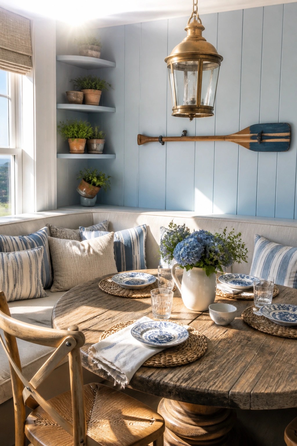
A soft blue on the walls can make a small eating area feel open and calm. It pairs well with wood tones and simple fabrics, giving the room that easy coastal farmhouse look without feeling busy.
This color works best in spaces with decent natural light and built-in seating. Keep the rest of the palette light so the blue stays gentle rather than turning the room cool.
Light Walls For A Practical Craft Room
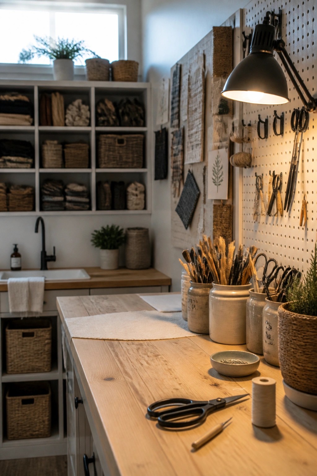
A soft light paint color on the walls helps a craft room stay calm even when it holds a lot of supplies. The pale tone lets the wood table and baskets read clearly without feeling busy.
This approach works best in rooms used for hands-on work. Keep the paint simple and matte so scuffs from daily use stay less noticeable and the space keeps its relaxed feel.
Soft Green Walls for a Relaxed Living Room
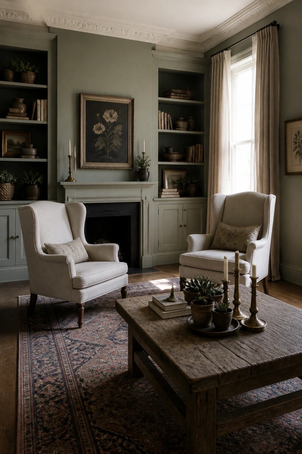
A soft green paint color works well in living rooms because it feels calm and easy without making the space feel dark. It pairs nicely with lighter furniture and wood tones, which helps the room stay bright even on cloudy days.
This kind of green suits coastal farmhouse homes that want a relaxed look. Use it on the main walls and keep trim and ceilings light so the color stays gentle rather than heavy.
Light Paint Colors For Dark Leather Seating
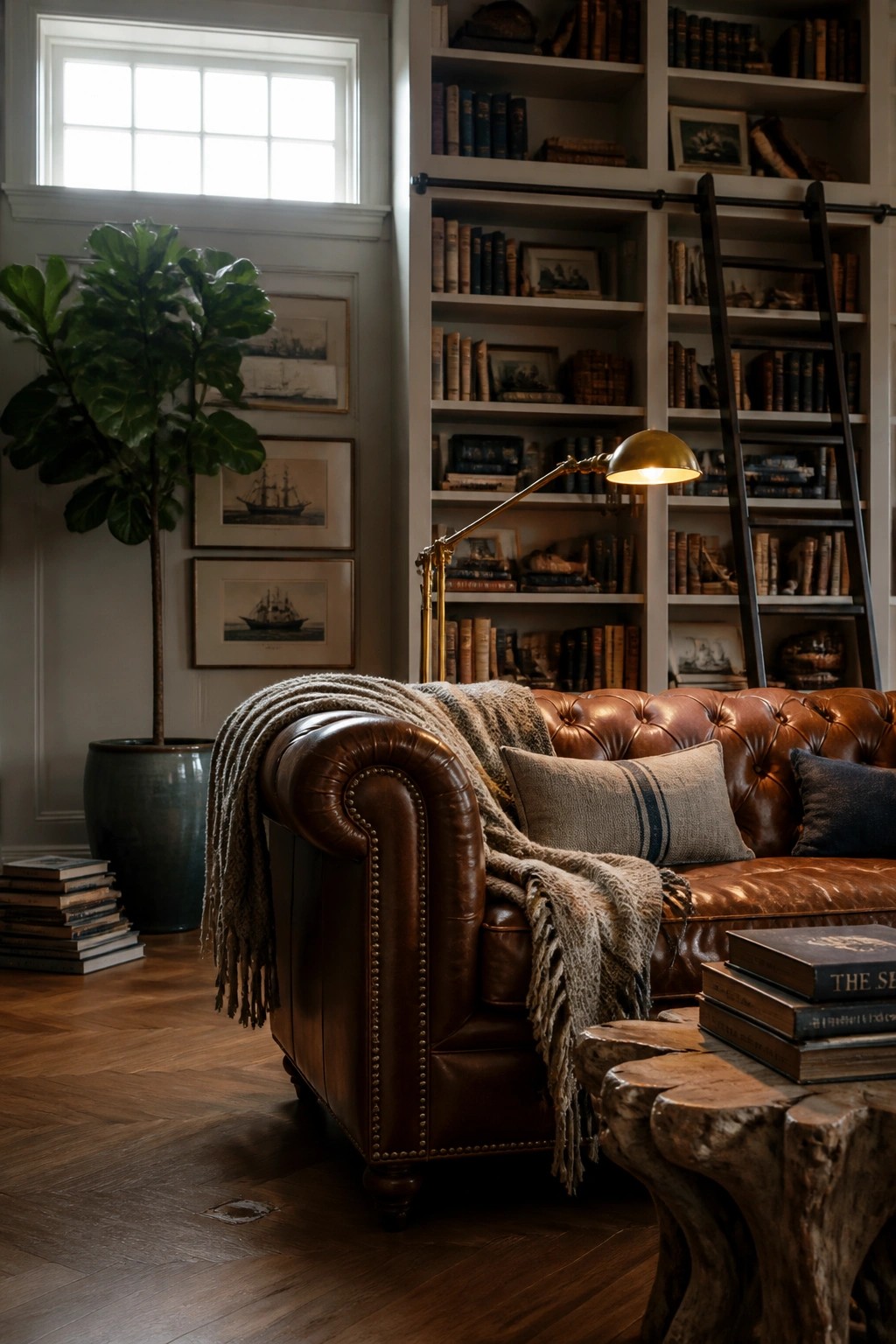
Light wall colors can help balance out heavier pieces like a brown leather sofa without making the room feel cold. In this kind of setup the soft gray tone on the walls keeps everything feeling open while the dark furniture adds warmth and weight.
This approach works well in coastal farmhouse homes that want a relaxed library corner. Stick with off-whites or pale grays and let the wood tones and leather do the rest. Avoid going too bright or the contrast can feel sharp.
Frequently Asked Questions
Q: How do I narrow down the list when several colors seem close but my walls get morning sun? A: Grab sample pots of the top two or three and paint large patches right on the wall. Check them again after the light shifts to see which one stays soft instead of turning too cool. One coat often tells you enough to commit without wasting time.
Q: What happens if my trim is already a creamy white and the new wall color feels too similar? A: Go one step lighter or add a whisper more warmth to the wall shade so the trim pops just enough. Roll it on a side wall first and live with it for a day. The slight contrast keeps the room feeling open and easy.
Q: Can I use one of these colors in a hallway that connects to darker rooms? A: Pick the palest option from the list and carry it through the hall to pull light along. It bridges the spaces without needing extra fixtures. Keep the finish consistent so the flow stays relaxed.
