

I have found that paint colors shape how a room feels once furniture and daily routines fill the space.
Modern farmhouse homes often work best with lighter tones that keep walls from closing in when wood tones and soft textiles start to layer together.
In my own house I always paint a couple of test patches and live with them for a few days because morning light and evening shadows can change everything.
These shades tend to make kitchens and living areas feel more open without forcing a complete overhaul of the existing layout.
Small choices like these matter most in the rooms you use every day.
Soft White Paint For Everyday Brightness
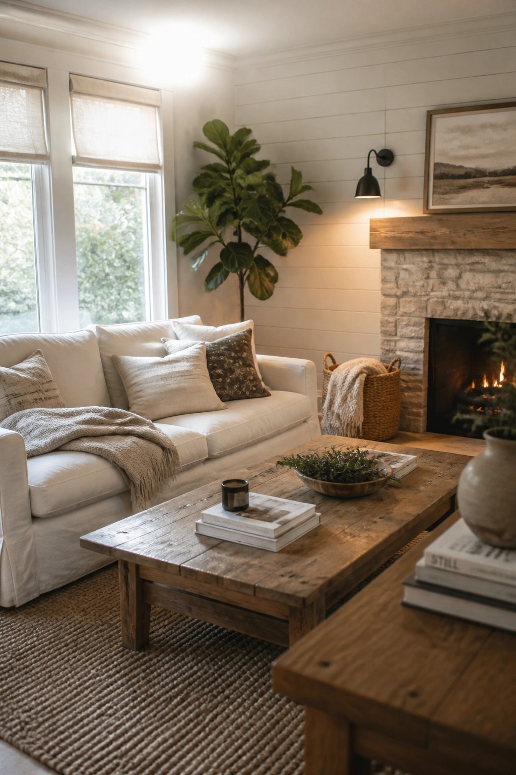
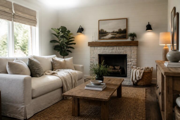
Many modern farmhouse rooms feel lighter and more open when the walls are painted a soft white. This simple choice bounces natural light around the space and pairs easily with wood tones and neutral fabrics without making the room feel cold.
It suits living areas that get steady use. Test a few pale shades on the actual wall first, since the same color can shift depending on the time of day and the wood finishes nearby.
Soft Green Paint on Kitchen Cabinets
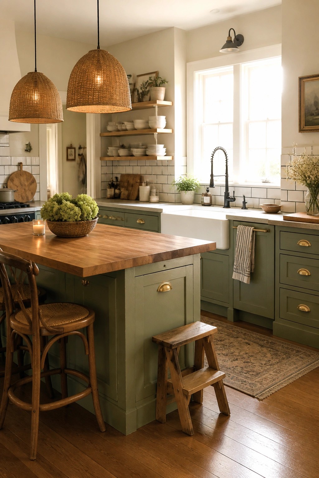
A soft green works well on cabinets when you want color that feels calm but still brightens the room. It sits nicely between warm wood tones and white surfaces, giving the space a gentle lift without making it feel busy or cold.
This shade suits modern farmhouse kitchens that get regular use. Keep the walls light and add natural wood on counters or islands so the green stays the main color without taking over. Avoid pairing it with too many dark tones, or the room can lose that easy, open feel.
Blue Gray Walls For A Bedroom
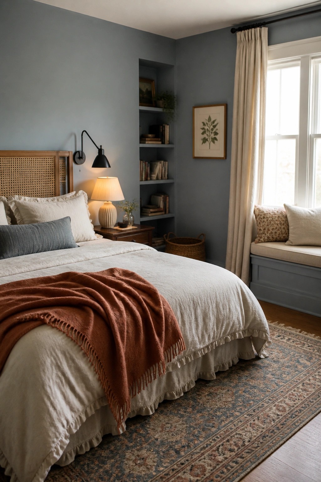
A soft blue gray works well on bedroom walls because it feels calm without turning the space dark. The color reflects light nicely during the day and gives the room a quiet background that lets bedding and wood tones stand out.
This shade suits modern farmhouse homes that want something a little cooler than beige but still warm and livable. It pairs best with white trim and natural textures, and it holds up in both small and larger rooms as long as you keep the other finishes simple.
Light Wall Colors For Wood Heavy Rooms
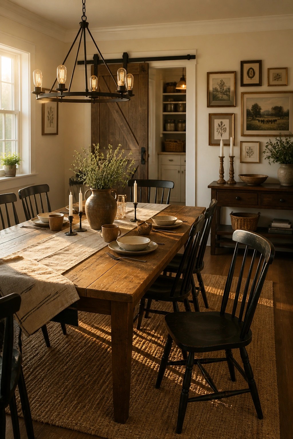
Light wall colors help balance all the dark wood that often shows up in farmhouse dining rooms. They keep the space feeling open and easy to live in every day, even when the furniture is heavy and solid.
This works best in rooms that get some natural light during the day. A warm off-white or soft cream lets the wood tones stand out without making the room feel closed in. Stick with matte or eggshell finishes so the walls stay soft rather than shiny.
Light Yellow Paint For Everyday Entries
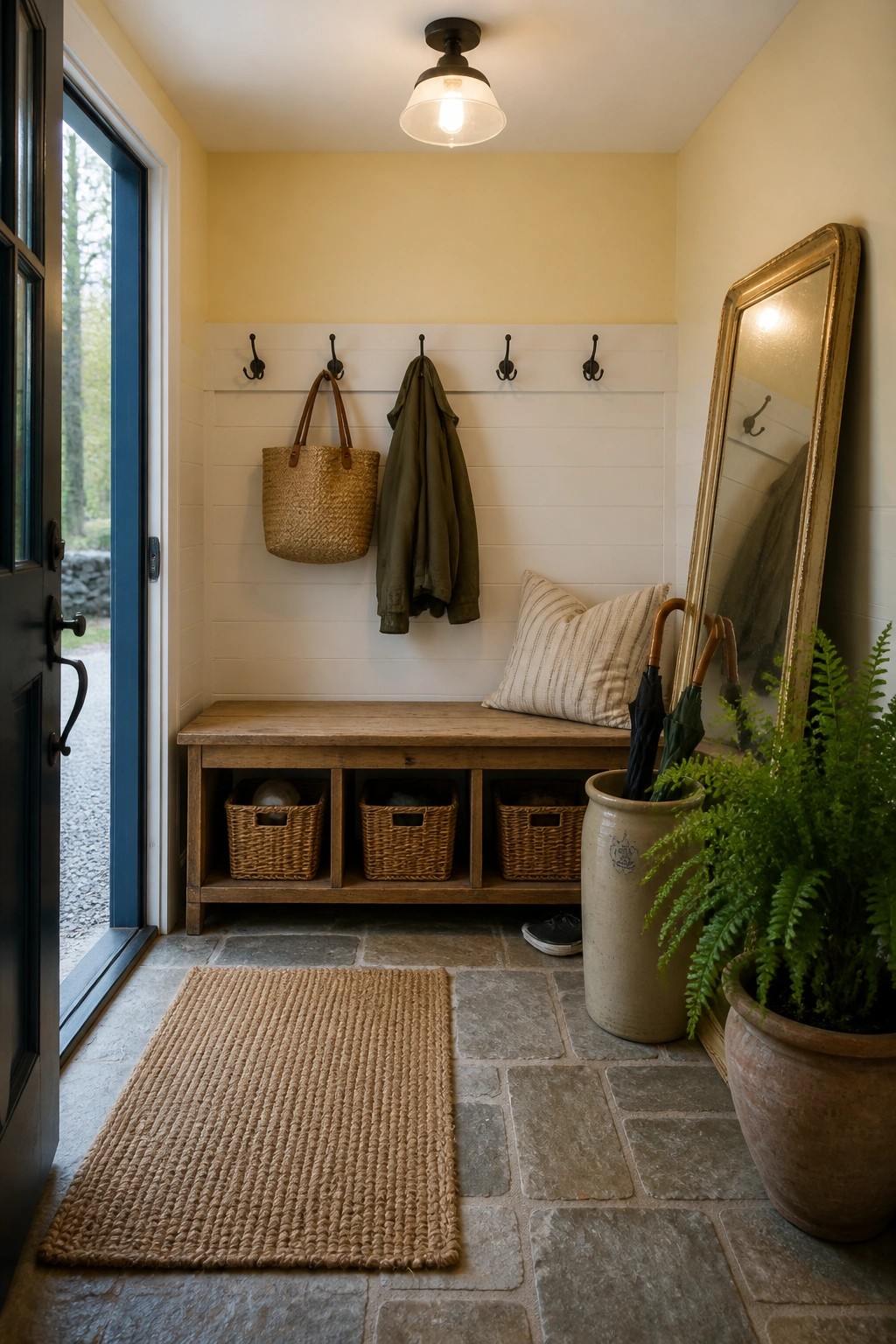
A soft yellow on the walls helps keep an entry or mudroom feeling open even when it is filled with coats, baskets, and daily clutter. The color reflects light well and gives the space a calm, lived-in feel without looking stark.
This shade works best in smaller functional rooms where you want warmth but still need the area to feel clean. Pair it with white trim and simple wood tones so the paint stays the main source of brightness.
Soft Green Paint For The Bathroom
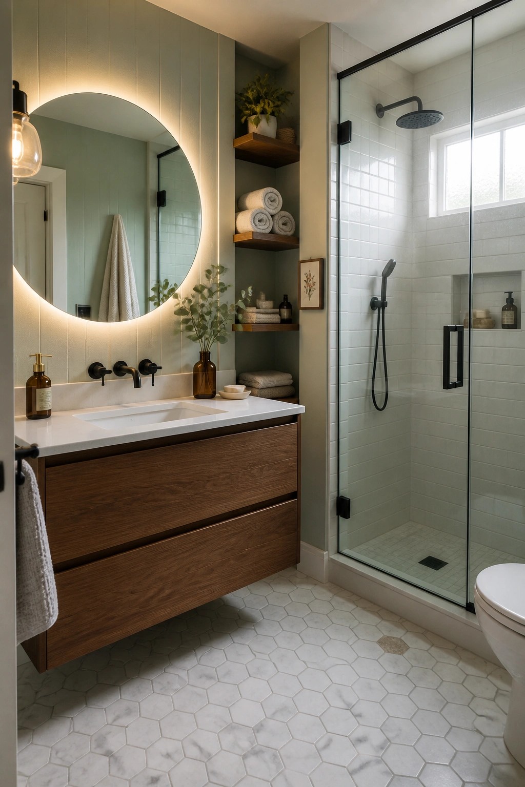
A soft sage green works well in bathrooms because it brings in a bit of color without making the space feel heavy. The muted tone keeps things calm and pairs easily with white tile and wood tones, which helps the room feel brighter during the day.
This color works best in rooms with good natural light and simple fixtures. It suits modern farmhouse homes that want a little personality in the bath but still need the space to feel clean and easy to live with. Test the paint on a large sample first, since greens can shift depending on the light.
Light Neutral Paint In A Breakfast Nook
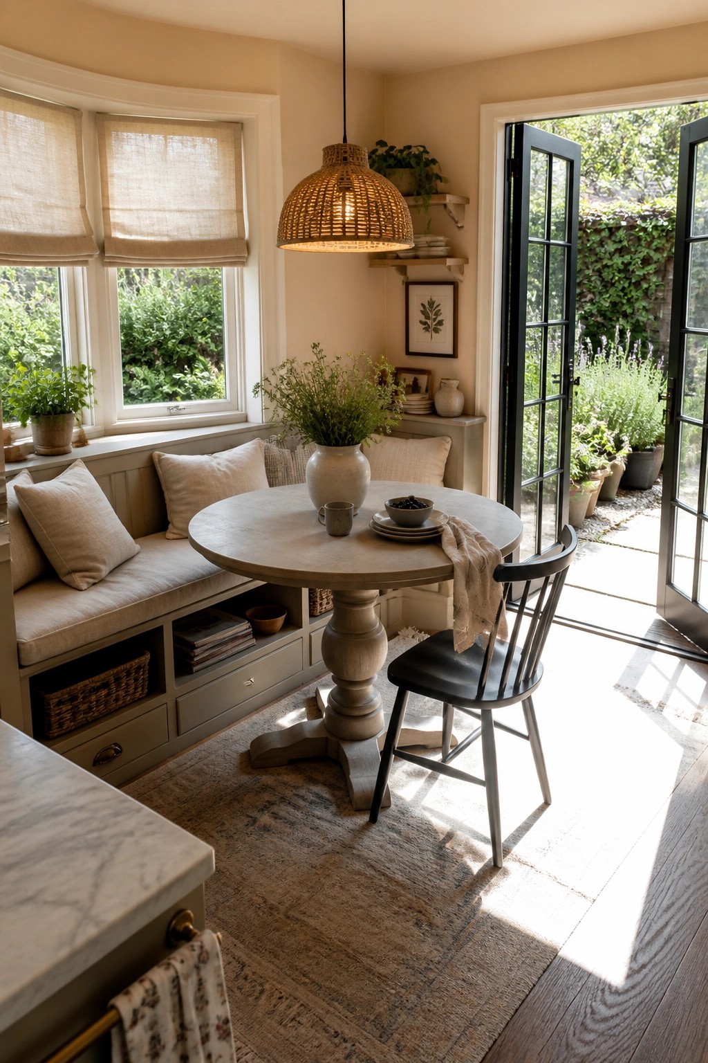
Soft beige walls help this small eating spot feel open and calm. The color bounces light from the windows across the room and keeps the built-in bench from looking heavy.
This works best in homes that get steady daylight and already have wood tones or mixed materials. Stick with the same warm neutral on walls and any painted cabinetry so the whole space stays simple and easy to live in every day.
Soft Blue Green Walls For The Laundry Room
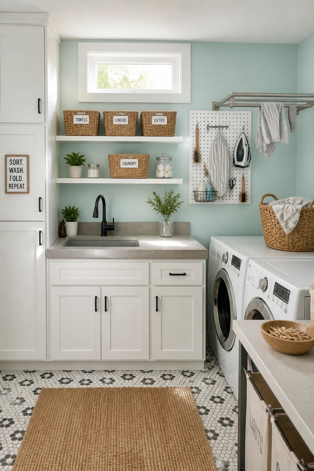
A light paint color like this soft blue green can turn a basic laundry room into a space that actually feels pleasant to be in. It reflects light well and keeps the room from feeling cramped even when cabinets and machines take up most of the wall space.
This shade works especially well in utility rooms that get steady use. It pairs easily with white cabinetry and simple hardware, and it suits homes that already favor lighter, calmer colors throughout the rest of the house.
Soft Sage Green For A Calm Workspace
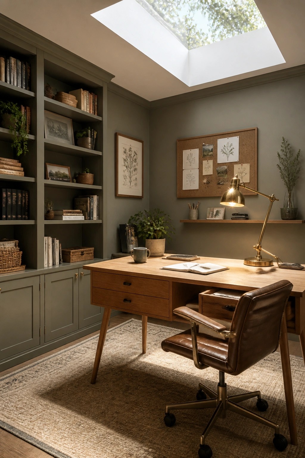
A soft sage green on the walls can make a workspace feel brighter without turning it stark. The color reflects light well while still giving the room enough depth to feel settled and easy to spend time in.
This shade works best in rooms that already have good natural light and built-in storage. It pairs simply with wood furniture and avoids the cold feel that sometimes comes with lighter grays or whites.
Warm Neutral Paint For Nurseries
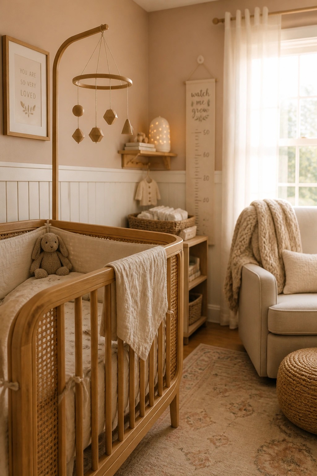
Warm neutral paint colors help a nursery feel bright without turning stark or cold. The gentle beige tone on the walls pairs with white wainscoting to keep the space calm while still reflecting plenty of natural light during the day.
This color choice works best in rooms that already use wood furniture and soft textiles. Test samples on the wall first because the shade can shift depending on how much sunlight the room gets.
Navy Cabinets With Light Gray Walls
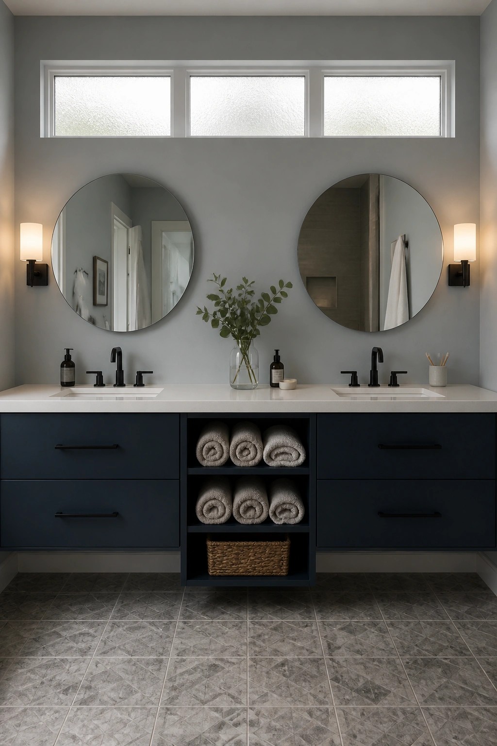
A deep navy on the vanity stands out nicely against light gray walls. The contrast keeps the space from feeling flat while still letting the room feel open and bright.
This color pairing works well in bathrooms that need a bit of weight without going too dark. It suits modern farmhouse homes that already lean toward simple lines and soft neutrals. Try it on a single vanity first if you want to test how the navy reads in your lighting.
Soft Green Walls For Everyday Calm
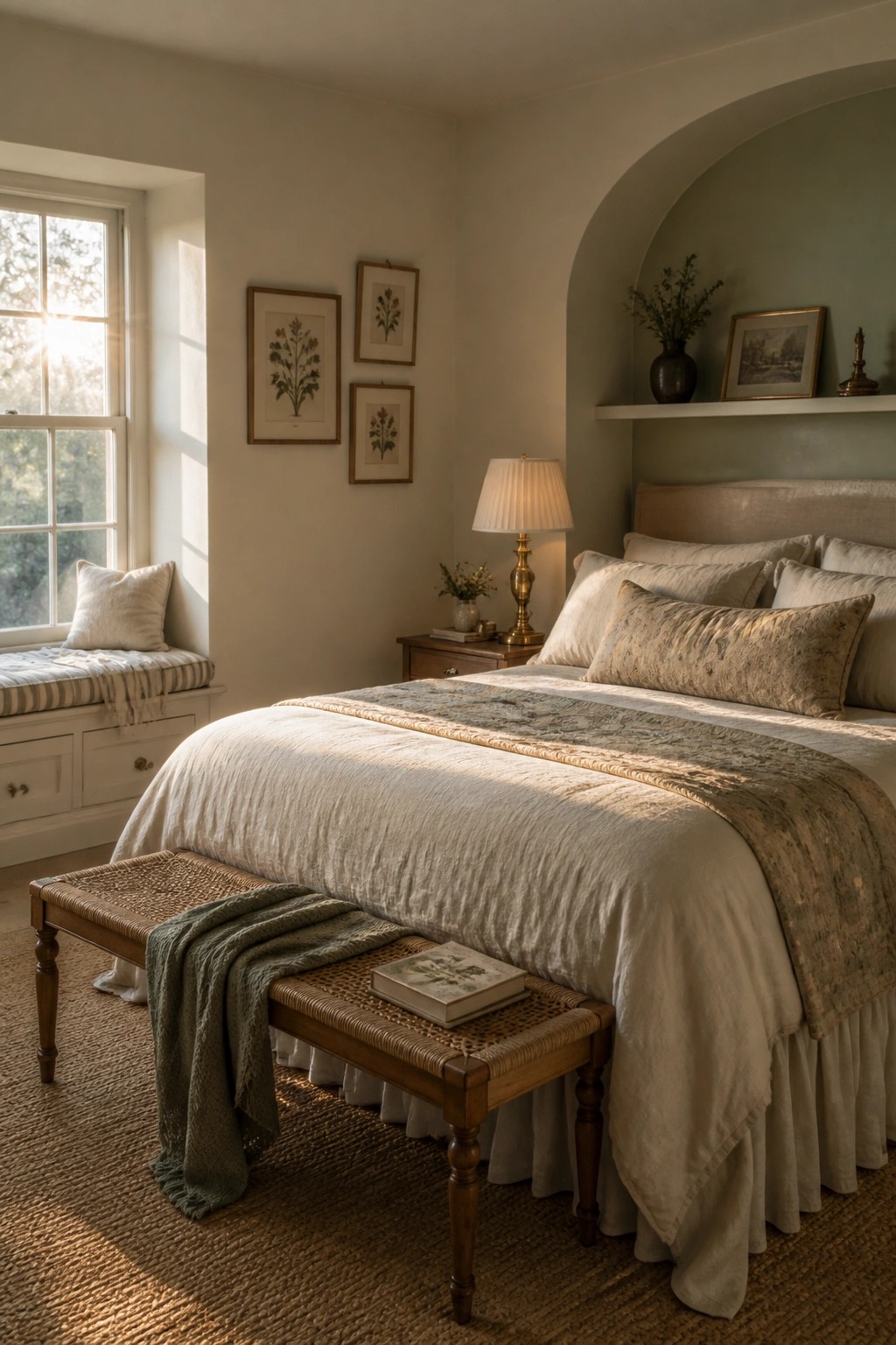
A soft green paint on a single wall gives a bedroom just enough color to feel fresh while still keeping the space light and easy to live in. It works especially well when the rest of the room stays in warm neutrals so the green does not take over.
This approach suits modern farmhouse bedrooms that need a touch of calm without looking busy. Try it on an alcove or a short wall first, then bring in simple linen bedding and wood tones to keep the overall look relaxed.
Soft Green Paint For Vanity Cabinets
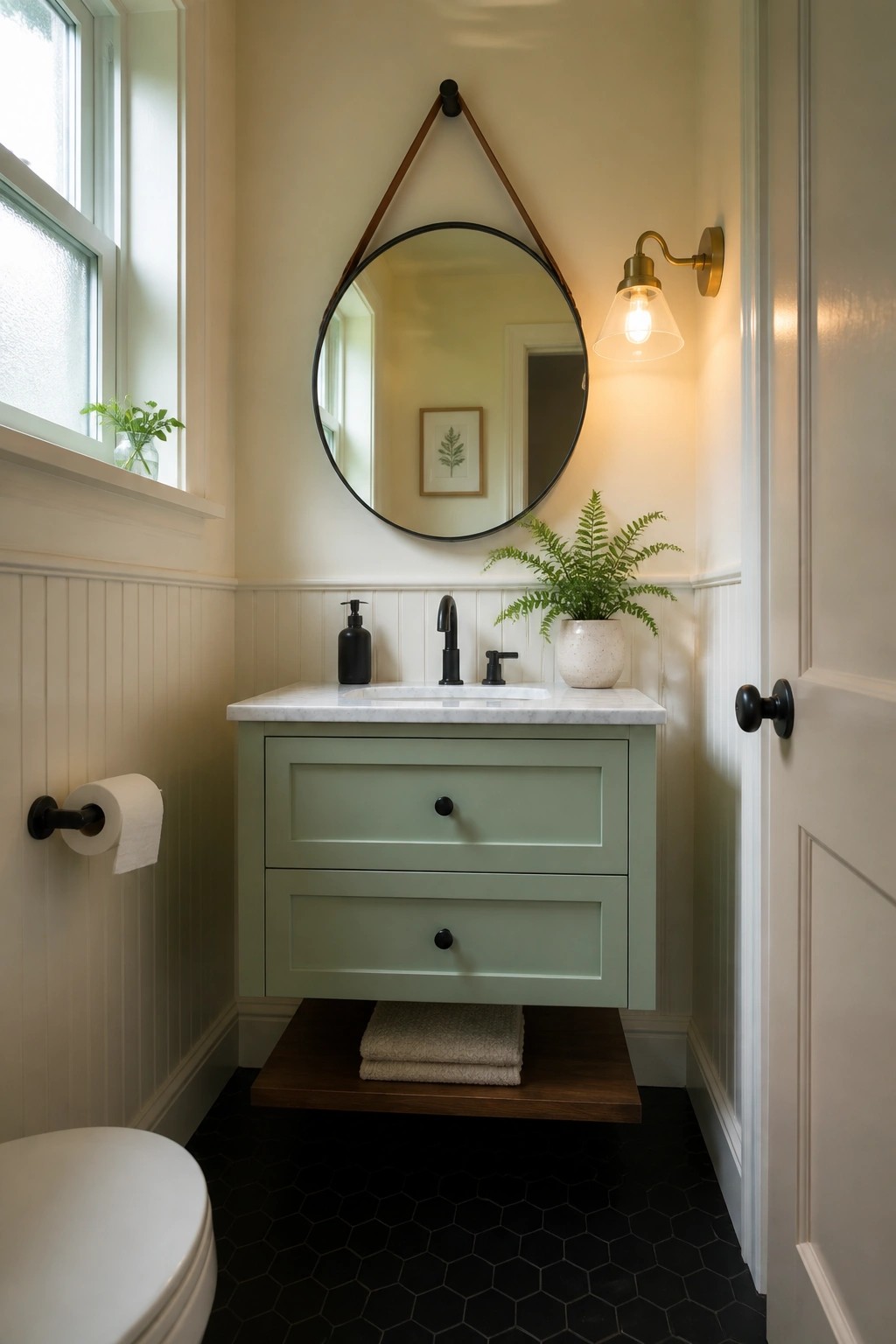
A soft green on the vanity gives the bathroom a gentle lift without making the space feel busy. It pairs well with light walls and keeps the room feeling calm and usable every day.
This works best in smaller bathrooms where you want a touch of color but still need things to stay bright. Stick with simple hardware and a light countertop so the green stays easy to live with.
Warm Paint Colors for Porch Walls
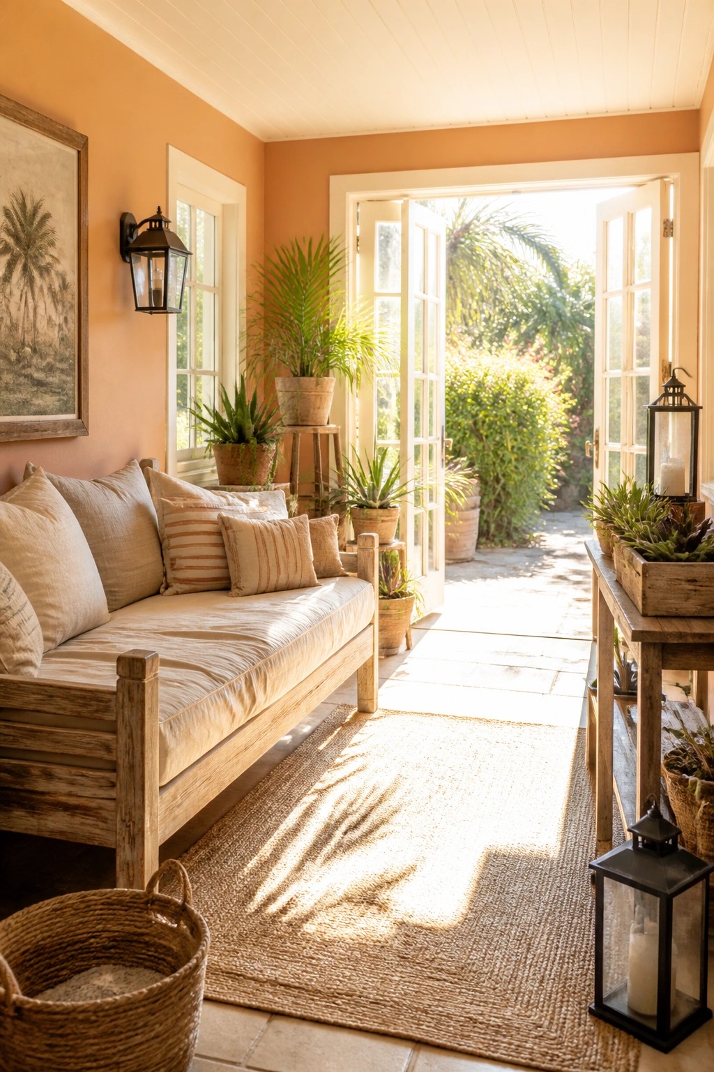
A soft peach tone on the walls gives a covered porch a brighter feel without making it look washed out. The color catches daylight and spreads it across the space, which helps the area feel more open even when the roof blocks direct sun.
This approach works best on homes with outdoor seating zones that already get good natural light. Pick a muted shade rather than a bright one so it stays easy on the eyes and pairs well with wood and plants.
Light Paint Colors For Stairwells
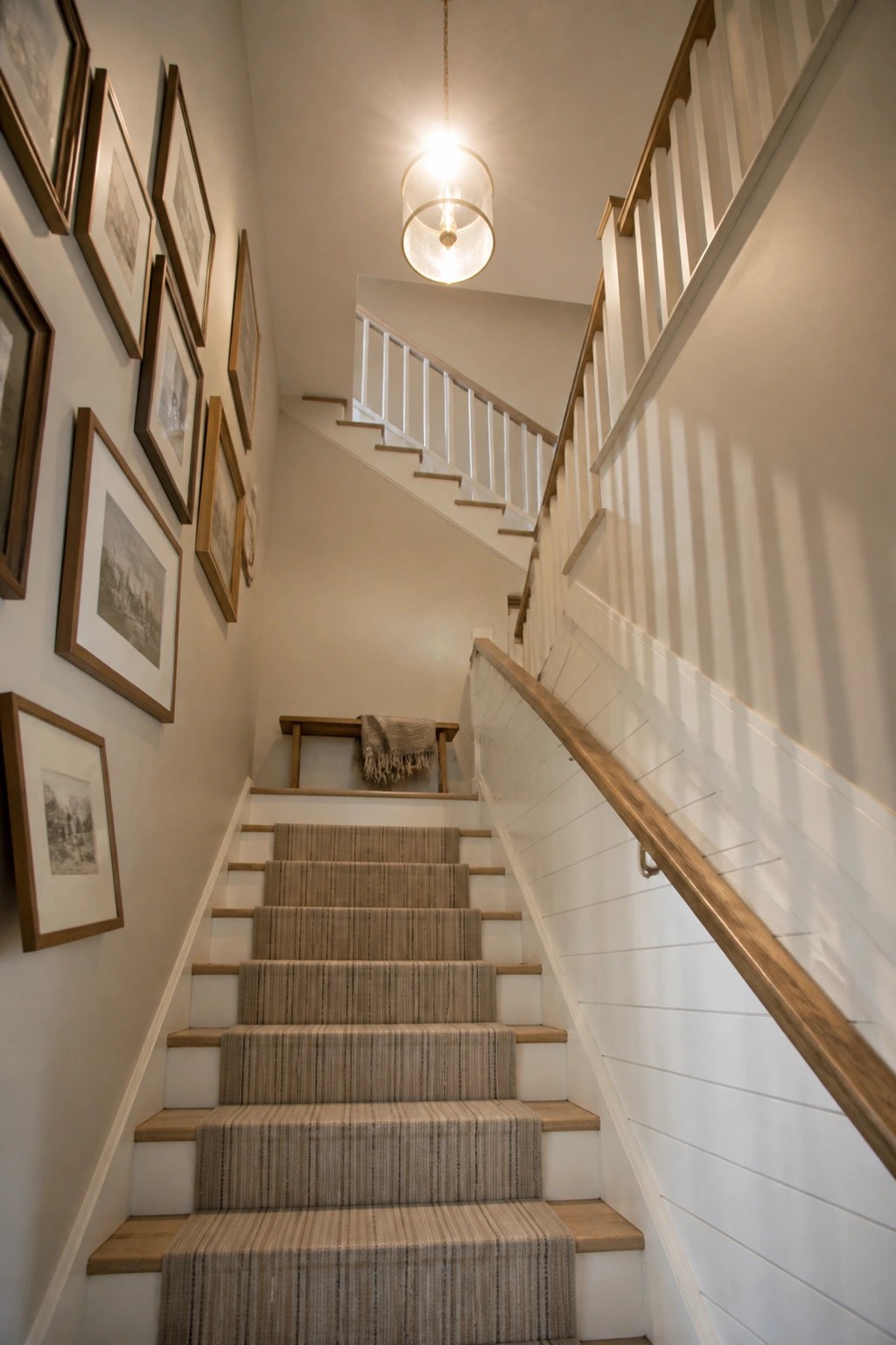
Light paint colors make a big difference in stairwells because those spaces often get limited natural light and can feel closed in. A soft neutral on the walls reflects what light is available and keeps the whole run from top to bottom feeling open instead of cramped.
This works best in modern farmhouse homes where you want the main paths through the house to stay calm and easy to move through. Choose an off-white or very pale greige with a touch of warmth so the color stays friendly rather than stark, and keep the trim crisp to hold the look together.
Soft Blue Paint For Compact Pantry Areas
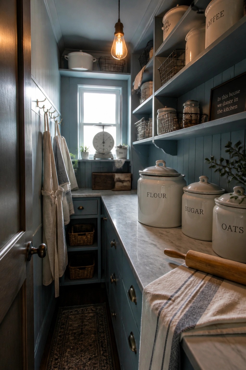
A soft blue paint color keeps small pantry spaces feeling open and calm. It works especially well when applied to both the walls and the cabinetry, giving the area a unified look that still feels bright during daily use.
This shade suits narrow kitchen storage rooms in older homes or farmhouse layouts. It pairs easily with white open shelves and simple hardware, and it holds up better than stark whites when things get a little messy.
Light Blue Green Paint For The Porch
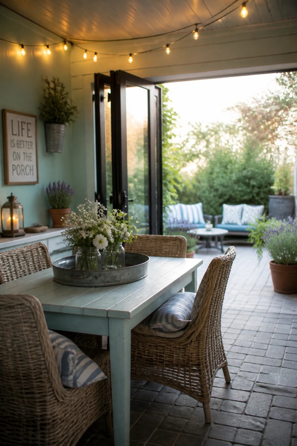
A soft blue green works well on porch walls because it catches the light and keeps the space from feeling closed in. The color stays gentle even when the doors stand open and the outdoor furniture comes into view.
It suits homes that want a simple farmhouse look without strong contrast. Use it on both walls and a main table so the color feels consistent and the whole area stays easy to keep up.
Light Neutrals For Everyday Rooms
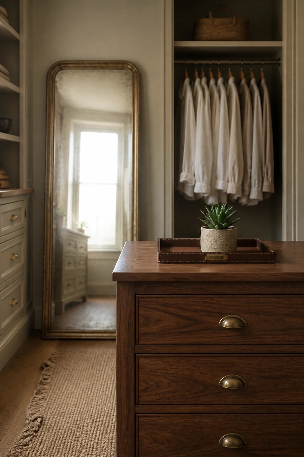
Soft light paint colors make a real difference in rooms that get used every day. They reflect whatever natural light comes in and keep the space from feeling closed off, even when the room has a lot of built-in storage.
This works especially well in dressing areas or closets where you want things to feel calm rather than cramped. A mirror placed across from a window helps spread the light further, and the overall effect stays simple and practical.
Warm Yellow For Everyday Workspaces
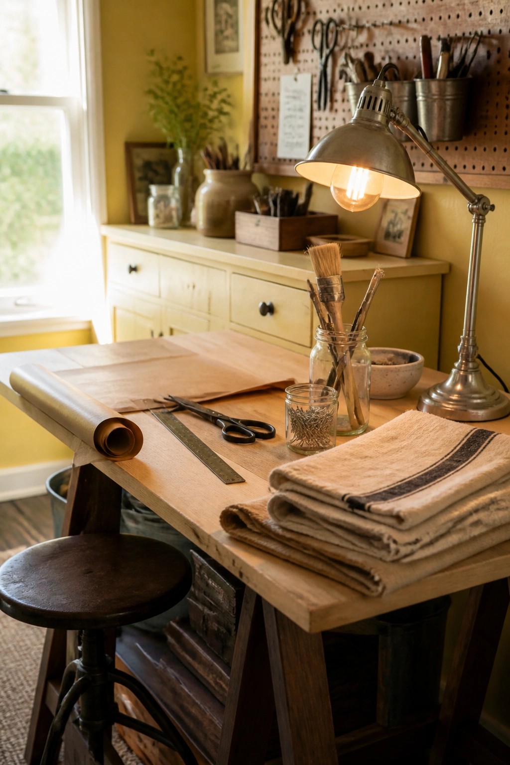
A soft yellow on the walls can make a workspace feel lighter and more welcoming even when the day is short on sunlight. It keeps the room from feeling closed in while still letting wood tones and metal pieces stand out naturally.
This color suits a craft room or small home office that gets at least some daylight. Pair it with simple wood furniture and keep larger pieces in light neutrals so the yellow stays easy to live with day after day.
Frequently Asked Questions
Q: Which color from the list works best if my living room gets only afternoon light?
A: Choose a soft white with warm undertones. It bounces what light you have without turning dull. One coat often looks flat so plan on two.
Q: How do I test a brighter shade without committing to the whole room?
A: Paint a large poster board and move it around the space for a few days. Check it morning and evening. This shows exactly how the color shifts.
Q: Will these colors still feel fresh with my dark wood floors?
A: Yes. The lighter options create nice contrast against the wood. Keep the trim crisp to tie everything together.
Q: What happens if the paint looks too cool once it dries?
A: Add a second coat with a tiny bit of yellow mixed in at the store. Most people notice the shift right away and fix it before the weekend ends.
