

I’ve noticed how a well-chosen two-tone paint job on brick can transform a house’s curb appeal, making it stand out without shouting. The contrast usually hits hardest around entryways and rooflines, where it pulls your eye up and frames the whole facade just right. A few years back, I watched a neighbor update their dated brick with soft gray lower tones and a warmer beige above, and it made their home read so much more balanced from the street. That kind of subtle shift keeps the brick’s texture alive while adding polish that lasts through seasons. You’ll find a few approaches here worth sketching out for your own setup, especially if you’re working with a traditional gable or ranch style.
Gray Siding with White Trim Contrast
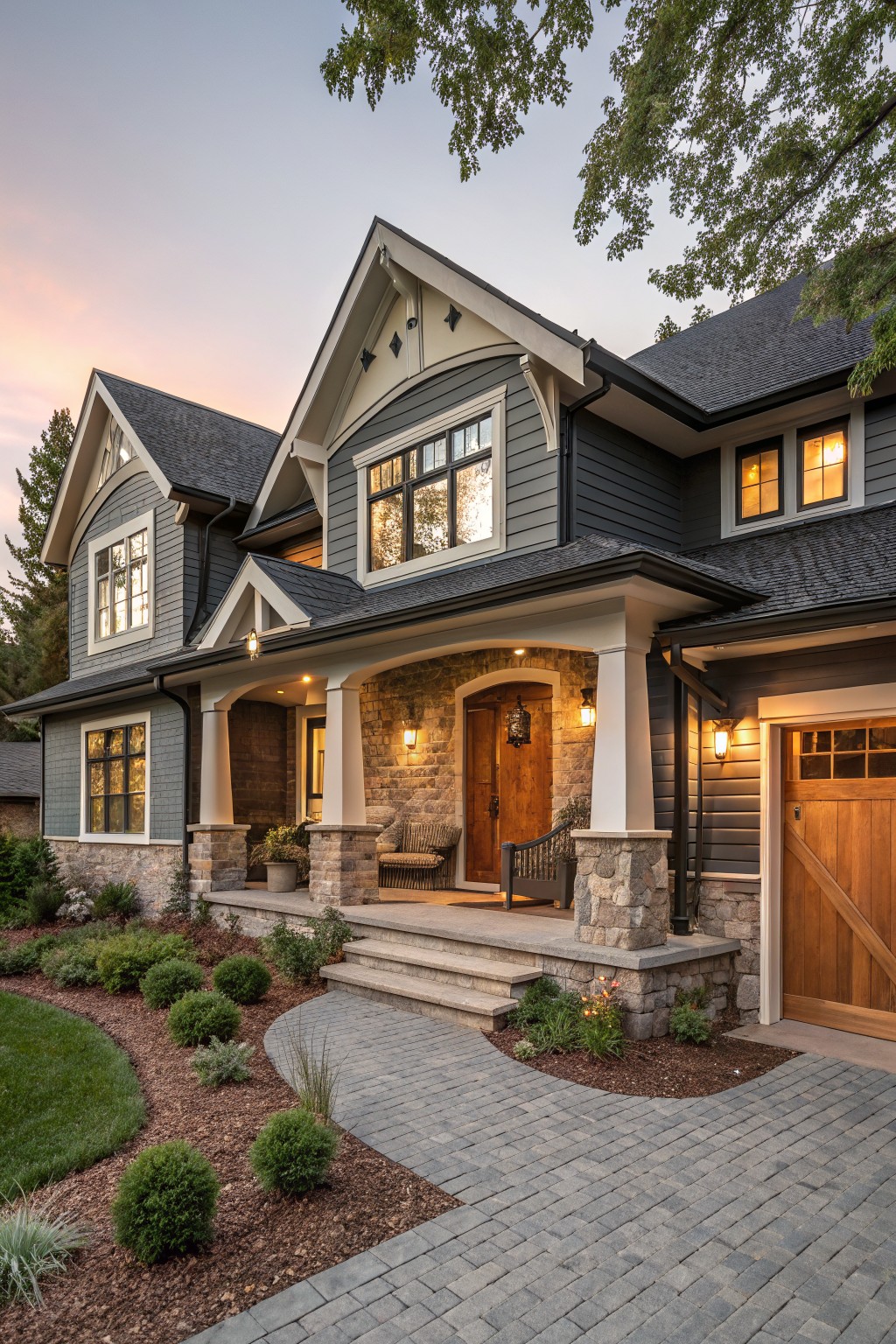
This look layers a medium gray on the main siding with darker shakes up on the gables. White trim outlines everything cleanly, from the porch columns to the window frames. The stone base ties in without stealing focus. It gives the house more depth than a single color would, especially as light fades.
Try it on homes with simple rooflines or gables. Pick grays that are close in tone so it stays calm. It suits family houses in neighborhoods with trees. Just make sure the trim paint holds up to weather, maybe use a semi-gloss.
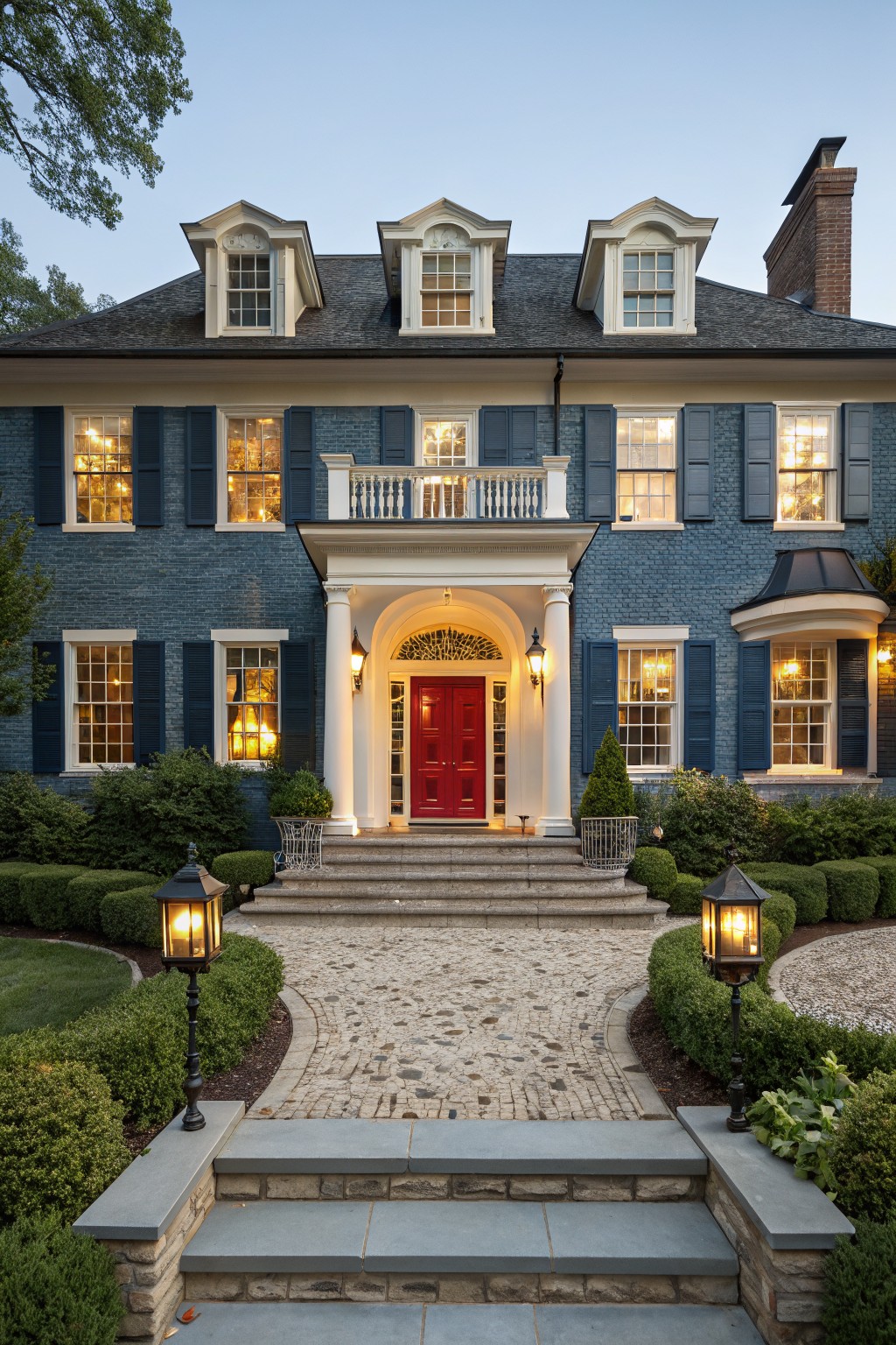
White Brick House with Navy Blue Trim
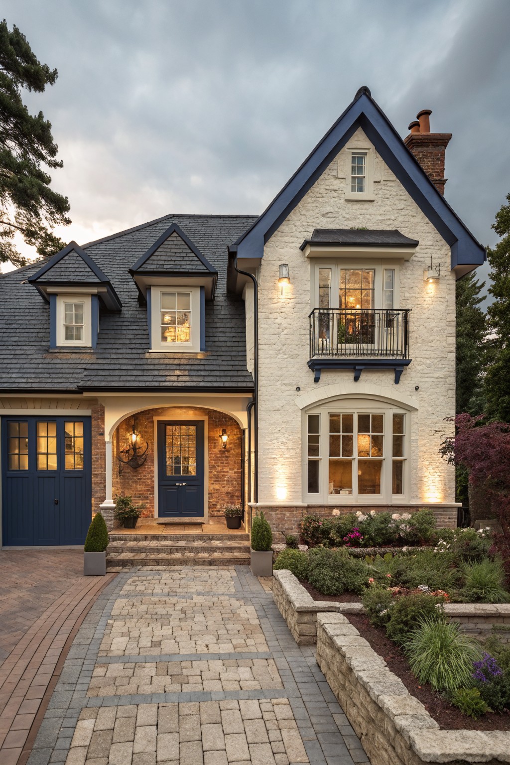
A white painted brick exterior gets a fresh lift from navy blue trim around the windows, doors, and roof edges. That dark blue pops nicely against the clean white without overwhelming the look. It keeps things classic but adds some edge, especially with a dark slate roof tying it all together. Folks like this combo because it feels put-together yet not too fussy.
Try it on a two-story home with gables or dormers, where the trim outlines the architecture clearly. It works best in suburban spots with some trees around, maybe a Craftsman or Tudor vibe. Just make sure the navy isn’t too glossy, or it might clash on sunny days. Pair it with simple planting beds out front for balance.
Light Brick House with White Porch
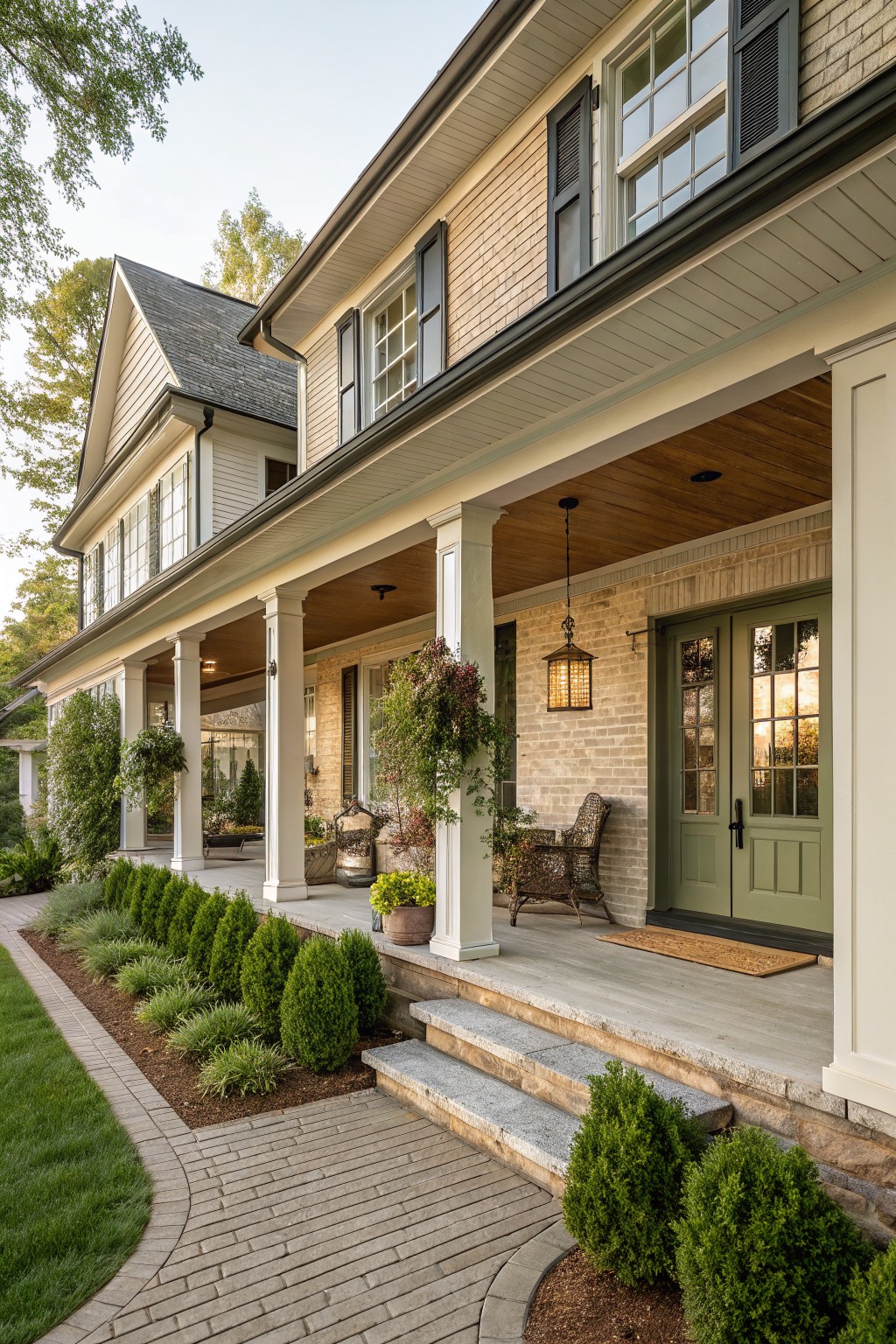
A light brick base paired with white trim and porch columns gives this exterior a simple, clean contrast. The brick keeps things grounded and textured, while the white pops against it nicely. That green door pulls in a touch of color right at the entry, making the whole front feel welcoming without much fuss.
This setup works best on two-story homes with some traditional lines, like in a neighborhood with mature trees. Keep the trim paint fresh and bright to let the brick show through. Add boxwoods or low plants along the walk to tie it to the yard, but skip heavy landscaping so the house stays the focus.
Two-Tone Brick Home with Black Entry Accents
White brick covers most of this house, but black brick wraps the entry area and garage for a sharp contrast. That switch pulls your eye right to the front door. It keeps things modern and clean without going all one color, and the steel post and wood ceiling overhead add to the simple punch.
Try this on a two-story house where the entry needs to pop. It suits lots with some mature trees nearby, like here. Just make sure the black brick matches your trim so it doesn’t fight the rest. Low-maintenance plants along the walk help tie it together.
Dark Green Painted Brick Tudor Facade
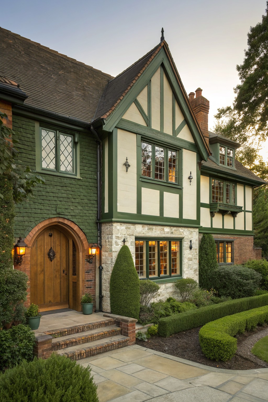
This look takes a traditional Tudor house and gives it fresh life with dark green paint on the brick sections. The green picks up nicely on the half-timbering and contrasts against the white stucco panels. It feels grounded yet polished. That arched wooden door with lanterns pulls everything together without trying too hard.
Try this on older homes with brick and stucco already in place. It works best where you want curb appeal that nods to English cottage style but stays modern enough for today. Just make sure the green is a deep shade. Lighter ones can look off after a few years. Boxwoods along the walk keep it neat.
White Siding with Dark Wood Garage
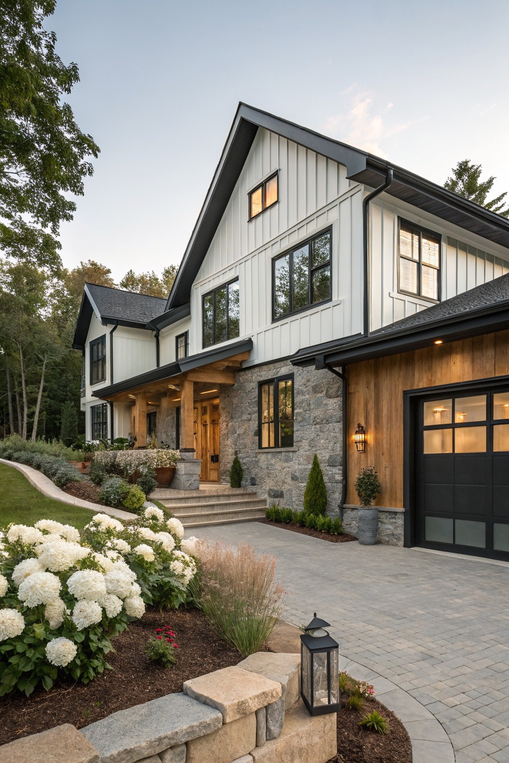
This setup uses crisp white board-and-batten siding on the main house, switching to warm cedar planks on the garage side. The black trim and roof tie it together, while a stone entry adds some heft. It gives the whole front a clean, layered look that feels modern but not cold.
Try this on homes with a simple shape, like a two-story gable front. It works best where you want the garage to blend in rather than stick out. Keep the white paint fresh, and stain the wood a medium tone so it doesn’t overpower. Avoid it on super small houses, where the switch might look busy.
Yellow and Black Painted Brick Facades
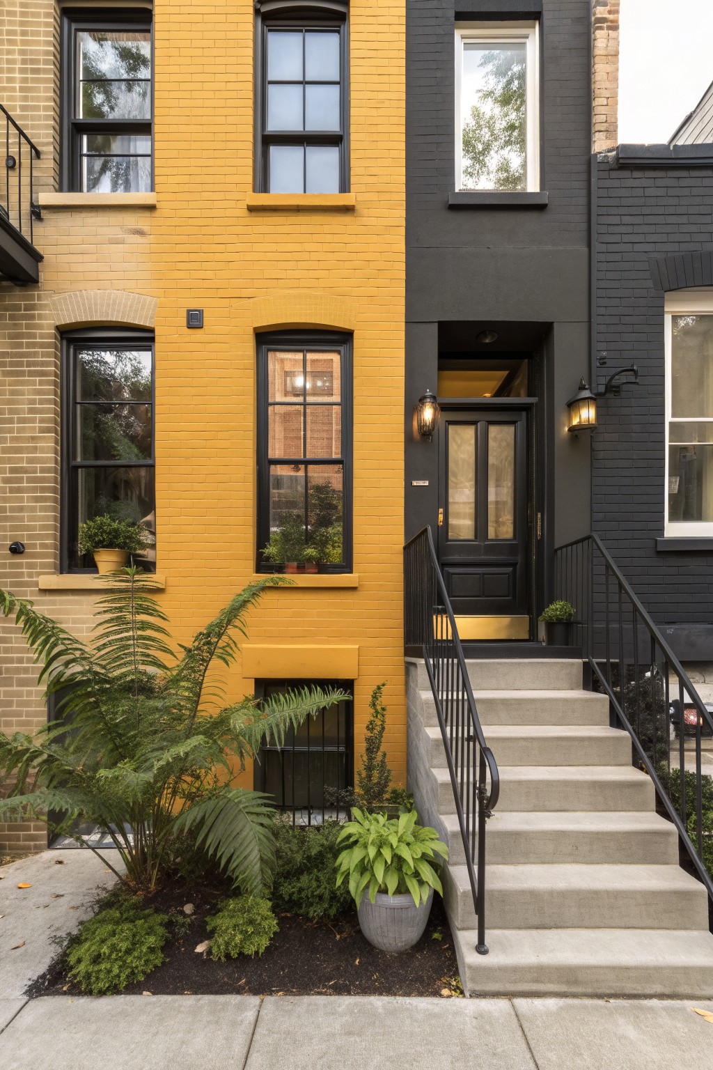
One simple way to add real punch to a row house exterior is painting the brick in strong contrasting colors like this mustard yellow next to matte black. It turns ordinary attached homes into something that really pops from the street. The yellow feels warm and sunny while the black keeps things sharp and modern. No need for fancy add-ons. Just the color switch does most of the work.
Try this on older brick townhouses in a neighborhood where houses sit close together. Pick colors that play off each other but suit your local vibe…yellow might shine in a sunny spot, black in shadier ones. Add a few plants at the base like ferns or pots to soften the edges without overdoing it. Watch the trim though. Keep it simple so the bricks stay the stars.
Light Brick with Black Window Frames
This setup uses a soft light brick base painted in a warm beige tone, then adds big black-framed windows for sharp contrast. It keeps the house feeling fresh and modern, especially with the clean roofline and simple entry. The dark frames make those large windows pop without overwhelming the look.
Try this on a two-story home where you want subtle polish. It suits neighborhoods with traditional houses, giving yours a contemporary edge. Go for wood tones on the garage door to balance it, and keep landscaping low-key so the facade stays the focus.
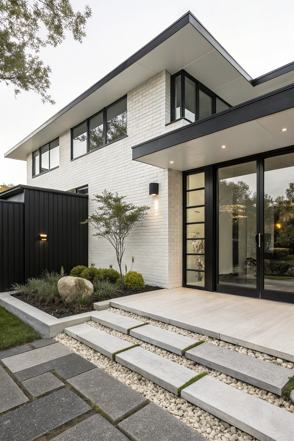
White Brick Facade with Black Cladding Contrast
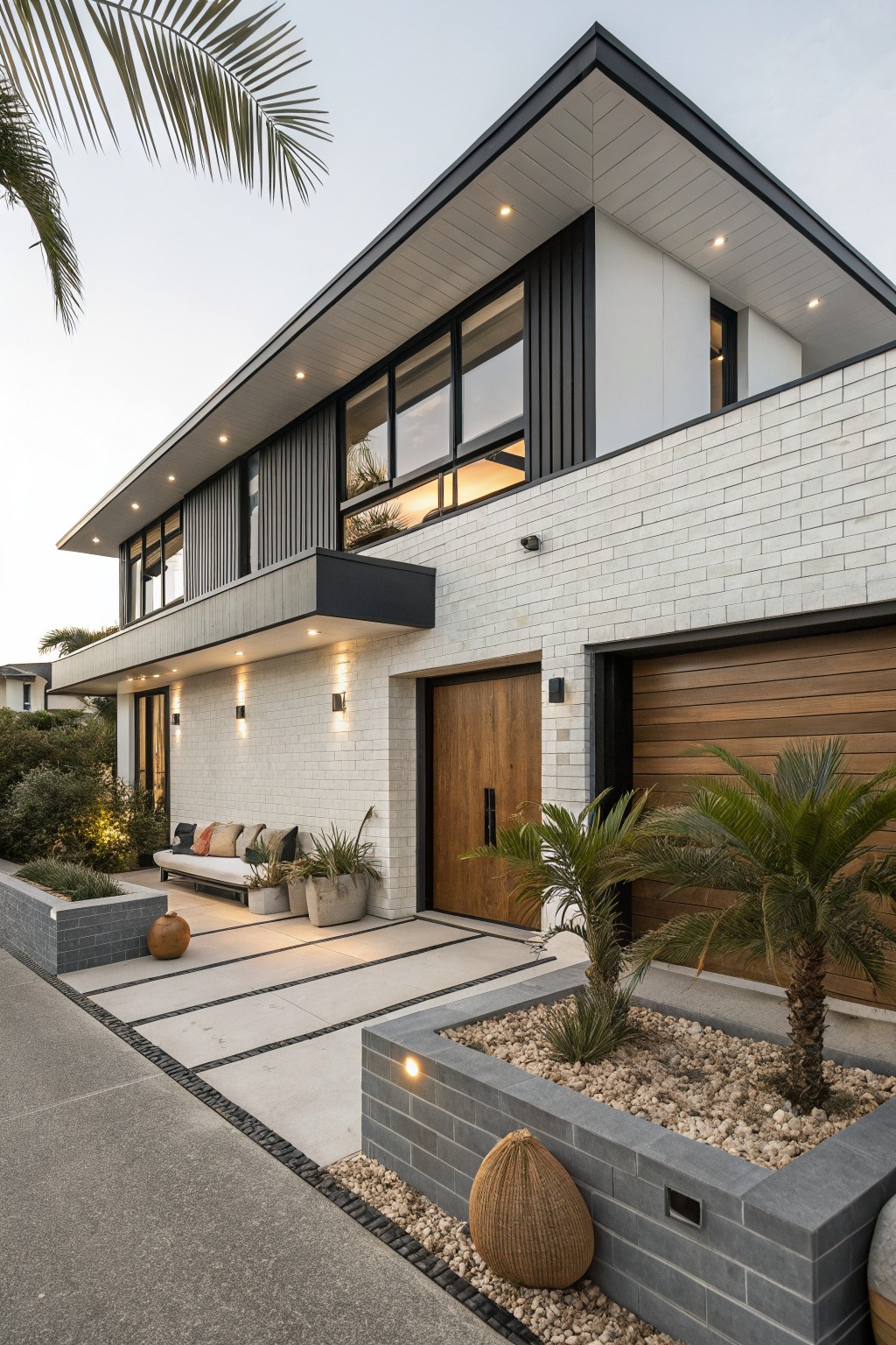
White painted brick forms the solid base of this house, while sleek black vertical cladding covers the upper sections. That simple switch creates clean lines and pulls the eye upward. The white keeps things bright and fresh against the street, and the black adds just enough edge without overwhelming the look. Wood tones on the garage door and entry door tie it together nicely.
This setup works great on modern homes in sunny spots where you want curb appeal that lasts. Paint the brick a crisp white, then add black cladding around windows or as a full upper band. It suits single or two-story designs on lots with some landscaping. Keep the cladding slim to avoid bulk, and match wood elements to warm it up a bit.
Navy Blue Painted Brick with White Trim
A navy blue paint on the brick gives this house a fresh, deeper color than plain red brick. The white trim around the windows, porch, and roof edges keeps everything crisp and clean. That red front door pulls it all together with just the right punch.
Try this on a traditional two-story home like a colonial. Pick a quality masonry paint for the brick in a shade like navy or charcoal. White trim works best unpainted or freshened up. It suits established neighborhoods where you want contrast that feels polished but not fussy. Watch the door color. Too bright might clash.
Teal Door Adds Pop to Shingle House
A teal front door stands out nicely against warm shingle siding and red brick steps. It pulls the eye right to the entry without overwhelming the simple cottage shape. The white porch trim keeps things clean, and that bit of color just makes the whole front feel more alive and personal.
This works best on older bungalows or beach houses where you want some charm but not too much fuss. Paint your door a shade like this if your siding has some warmth already. Skip it on super modern places, though. Add a bench and a few potted plants nearby to settle the look.
Two-Tone Stucco and Brick Facade
A simple way to add contrast to a brick house exterior is mixing smooth light stucco walls with warmer brick or stone accents. The stucco keeps things clean and bright while the brick adds texture around doors, windows, and corners. That back-and-forth makes the whole front feel balanced and a bit more interesting without going overboard.
This setup works best on homes with some traditional lines, like ones with arched doors or tile roofs. Paint the stucco in a soft off-white to let the brick’s natural tones stand out. Keep plantings low around the entry so they frame the contrast instead of hiding it. Just avoid too much brick or it starts looking heavy.
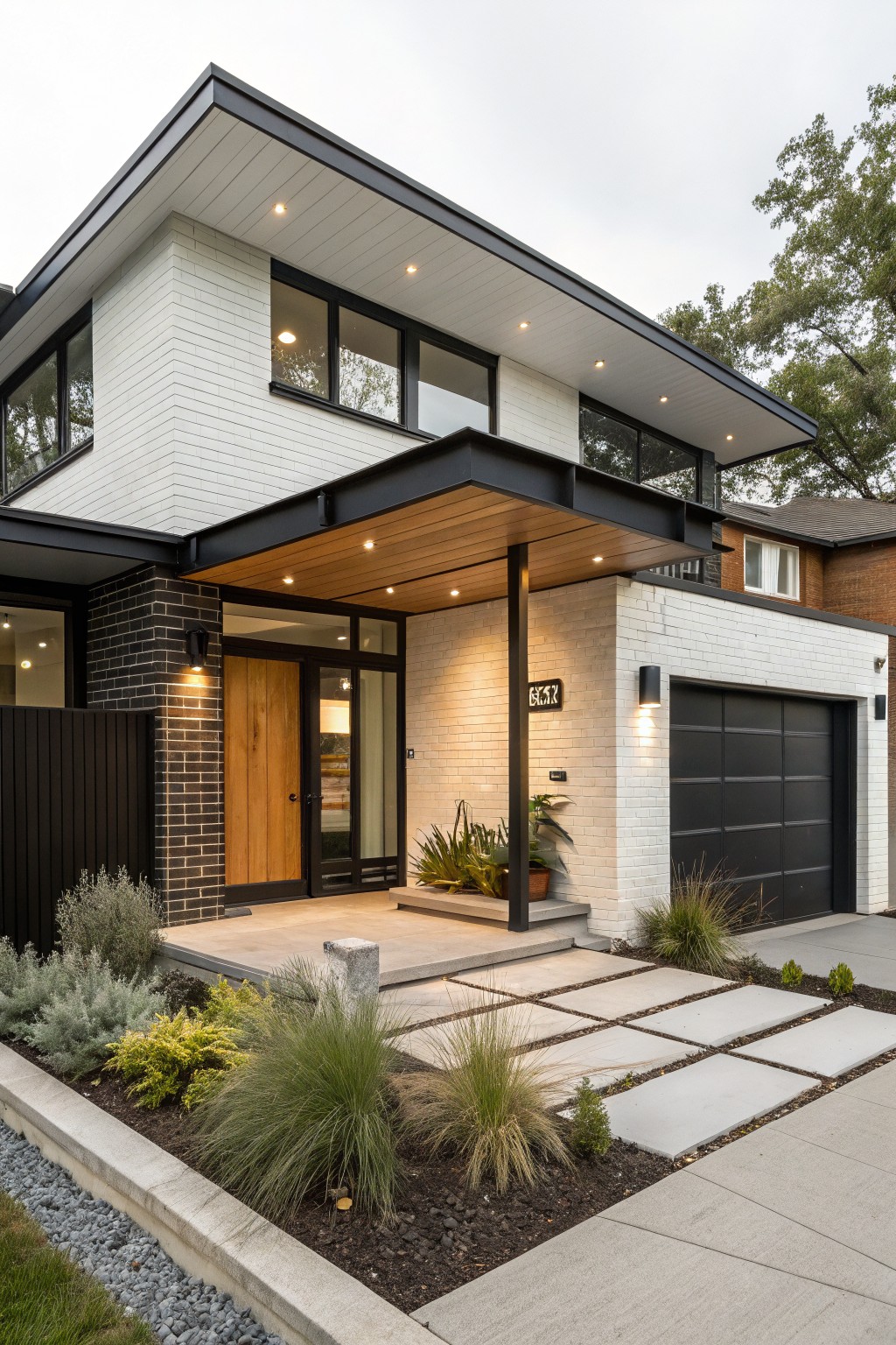
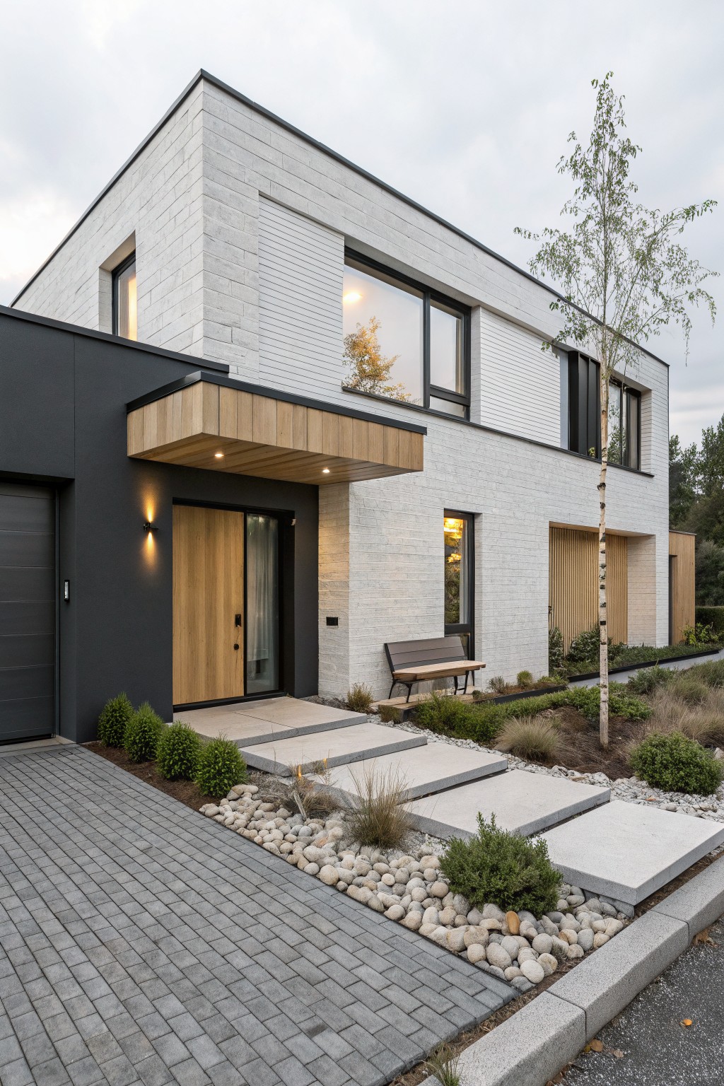
Black Cladding Sharpens White Brick Facade
White painted brick gives this house a clean, fresh base. Then black cladding on the side wall and trim adds a strong modern edge. It keeps things simple but pulls the eye right to the entry. That contrast feels crisp without being too busy.
Try this on a mid-century style home or any boxy shape. The black works best in smaller doses, like around doors and one wall. Pair it with wide glass to let light in. Just make sure the brick paint is high quality. It holds up better to weather.
White Brick with Mint Green Door and Shutters
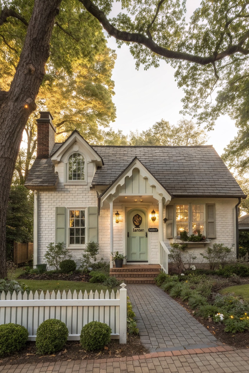
White painted brick gives a house a clean, bright base that’s easy to dress up. Here, a soft mint green front door and matching shutters add just enough color contrast to make the entry pop. It’s simple but pulls the eye right to the porch without overwhelming the look.
This works well on smaller homes like bungalows or cottages, especially where you want a nod to the garden. Pick a green that echoes nearby plants… keeps everything tied together. Skip it if your brick is super textured. Might fight the color.
White Brick Facade with Dark Lower Panels
A white brick upper facade paired with dark panels on the base and garage gives this house a clean, modern split. The wood canopy pulls it together nicely. It stands out because the white keeps things bright while the dark anchors everything down below.
This look fits boxy homes in milder climates. Use it for entryways where you want some punch without bright colors everywhere. Pick matte finishes to avoid glare, and tie in wood details on doors or trim for balance.
Two-Tone Brick and Green Siding
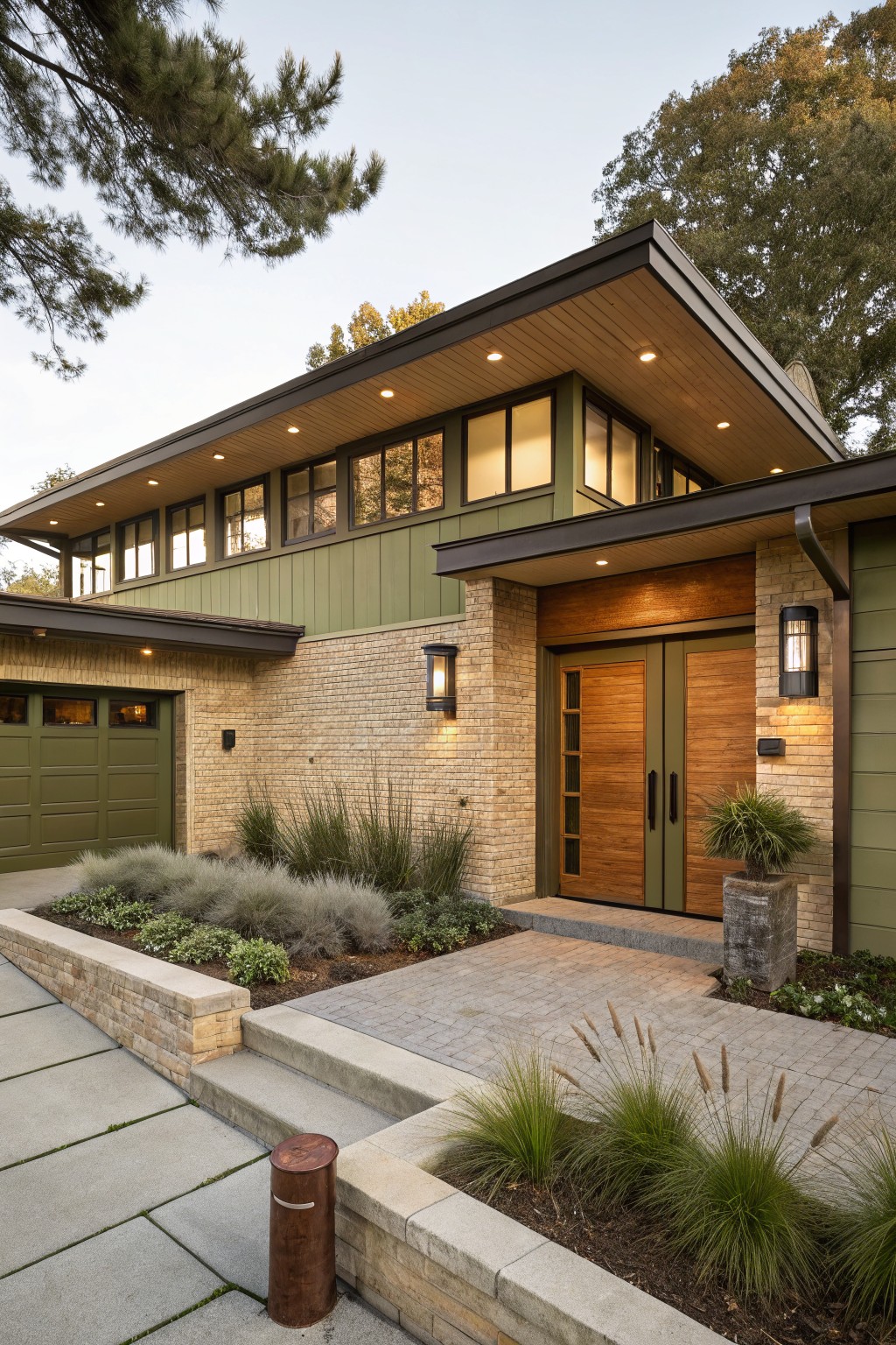
One simple way to add contrast to a brick house is painting the upper siding in a soft green while leaving the base brick natural. This setup gives the home a grounded feel down low with the warm brick tones, then lifts the eye up to the cleaner green panels. The wood door and trim in between tie it all together without much fuss.
It works best on homes with some height, like this two-story design, where the division feels natural along the roofline. Stick to muted greens so they don’t overpower the brick. Pair it with matching garage doors for a pulled-together look, and keep landscaping low around the entry to let the facade stand out.
Navy Painted Brick with Cream Entry Walls
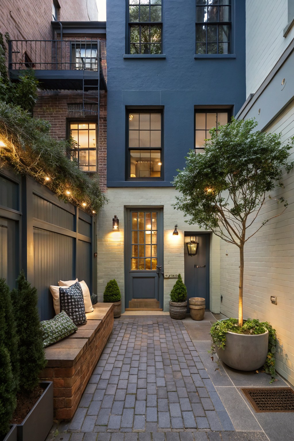
Painting one brick wall deep navy while keeping the entry side in a soft cream tone gives this courtyard exterior a clean, layered look. The dark shade adds weight and depth to the taller side, and it plays nicely off the lighter entry without overwhelming the small space. It’s a subtle way to update brick houses that feels fresh but not fussy.
This works best on narrow urban spots like rear alleys or side yards in row houses. Paint the busier or taller wall darker to balance things out, then use the cream for doors and shorter walls. Toss in string lights overhead and a bench along the fence for evenings. Skip it if your brick is in rough shape, since the colors show every bit of texture.
Pale Brick with Black Window Frames
A light pale brick gives the house a soft, timeless base. Then black frames around the big windows and doors add that crisp contrast. It keeps things simple but sharp. The dark wooden garage doors pull it all together without overwhelming the look.
This setup suits ranch-style homes or modern barns in a garden setting. Start with a pale wash on existing brick if needed. Use matte black metal frames for low upkeep. It brightens up the facade nicely, especially with some plants nearby. Just avoid glossy finishes. They can feel too shiny.
Two-Tone Black Paint and Brick Facade
This setup uses black paint on the more detailed parts of the house, like the big curved bay windows and trim, next to lighter brick on the simpler side. It pulls the eye right to the architecture and gives the whole front a clean, balanced feel. That contrast keeps things interesting without overwhelming the street view.
Try it on older homes with some curves or arches already in place. Paint just the standout features black, leave the brick as is, and add simple planting along the fence to tie it down. It suits city rows or suburbs where you want curb appeal that lasts through seasons.
Frequently Asked Questions
Q: How do I pick two colors that pop without clashing?
A: Start with your roof or trim as a guide. Pair a neutral base like soft gray on most of the brick with a deeper shade, say charcoal, on the bottom half. Swatch them outside at different times of day to see the real vibe.
Q: Does old brick need special prep before painting?
A: Power wash every inch to blast away dirt, mildew, and loose bits. Prime right after with a breathable masonry primer so the paint grips tight. Skip this and you’ll fight peeling later.
Q: How do you keep the fresh look lasting years?
A: Slap on two full coats of premium acrylic masonry paint. Freshen trim edges every couple years with a quick touch-up brush. And rinse the whole thing annually to knock off pollen or grime.
Q: Should I paint the entire house or just accents?
A: Go bold on the lower third or gable ends for max contrast. Leave natural brick on sides if you want subtle drama. This plays up your home’s shape without going overboard.