

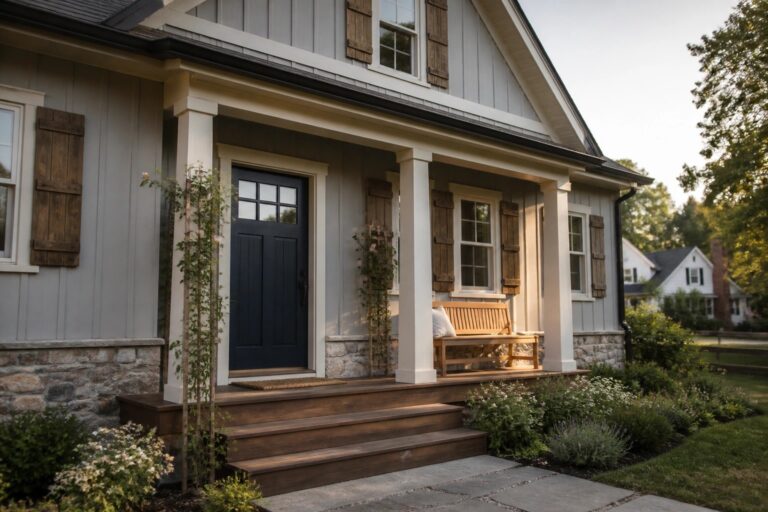
When I choose paint for an entire house the colors have to feel connected as you walk from one room into the next.
I have learned that farmhouse tones hold up better when they share the same undertone so the shift between spaces stays quiet instead of abrupt.
In my own home I always test the main wall color in the room that gets the most daylight first because that choice ends up influencing every other decision.
Watching how a color changes near windows and doorways helps me decide whether it will still feel right once the furniture and rugs are in place.
Some shades only make sense after you live with them for a week.
Using a Dark Door with Light Gray Siding
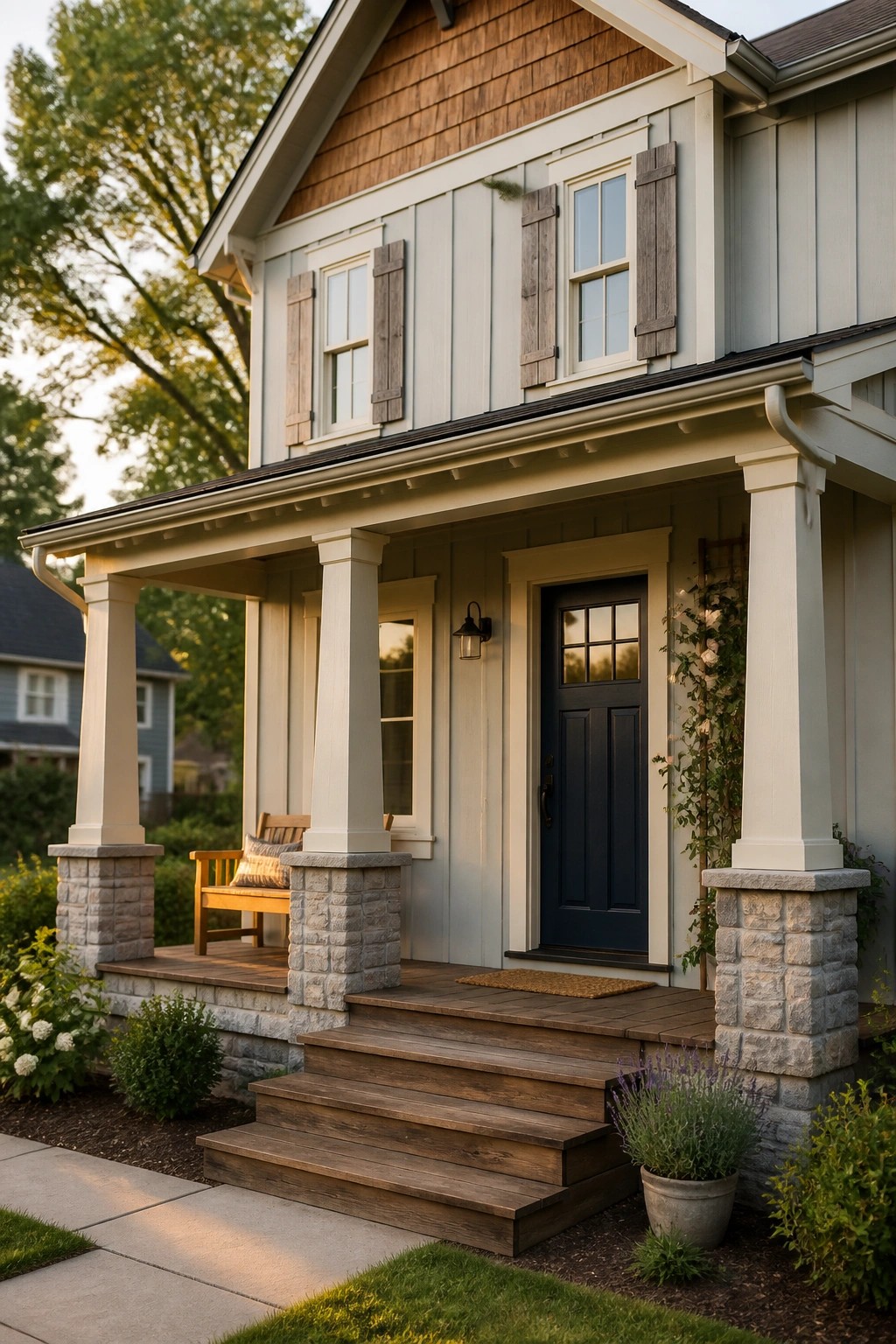
A dark front door stands out nicely against light gray siding and keeps the whole exterior from looking too flat. The white trim helps the colors stay connected rather than competing, which makes the entry feel more intentional.
This approach works best on farmhouses where the siding color stays neutral. Keep the door color bold but limit it to the door and maybe a few shutters so the rest of the house stays calm and easy to tie together.
Light Blue Ceilings for Porch Color Flow
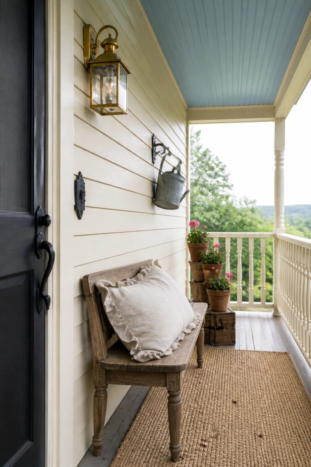
A soft blue ceiling gives the porch a quiet lift that helps the whole exterior feel connected. The pale shade works with the light siding and trim without pulling too much attention, so the space still reads as part of the house rather than something added on later.
This color choice suits farmhouses with off-white or cream walls and works best when you want the porch to feel airy but still grounded. Keep the blue on the cooler side and test it against your siding first, since warmer tones on the rest of the house can make it look off.
Keep Siding One Consistent Color
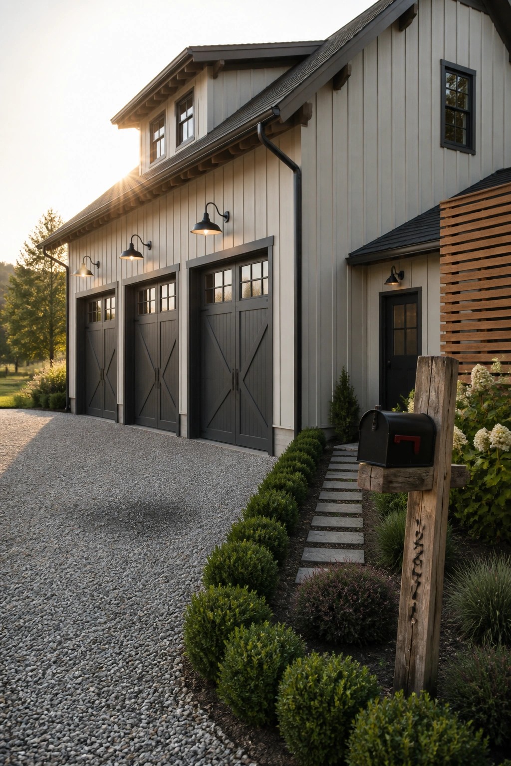
Many farmhouses feel more pulled together when the main siding stays one light neutral from end to end. This simple choice stops the house from looking chopped up, especially when there are several garage doors and rooflines.
It works best on homes that already have strong trim details. Choose a soft gray or greige that reads clean in daylight, then save the darker color only for doors and accents so the whole exterior stays calm and connected.
Match Outdoor Cabinets To The House Color
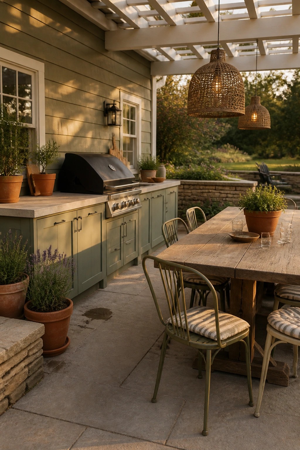
Painting the outdoor kitchen cabinets the same color as the house siding keeps the look connected instead of adding a whole new element. The soft green used here blends right into the wall behind it, so the cooking area feels like part of the house rather than something added later.
This approach works best on simple farmhouse or cottage styles where you already have a calm exterior color you like. Just choose an exterior-grade paint and make sure the cabinets get good prep so the finish holds up through weather and use.
Extend Your Main Exterior Color To Outbuildings

Many farmhouse homes look better when the shed or pool house uses the same paint color as the main house. It avoids that patched-together feel and makes the whole property read as one.
This works especially well with warm neutrals that hold up in sunlight. Start with the color you already like on the house, then test it on a small section of the outbuilding before committing.
Light Neutral Siding For Easy Flow
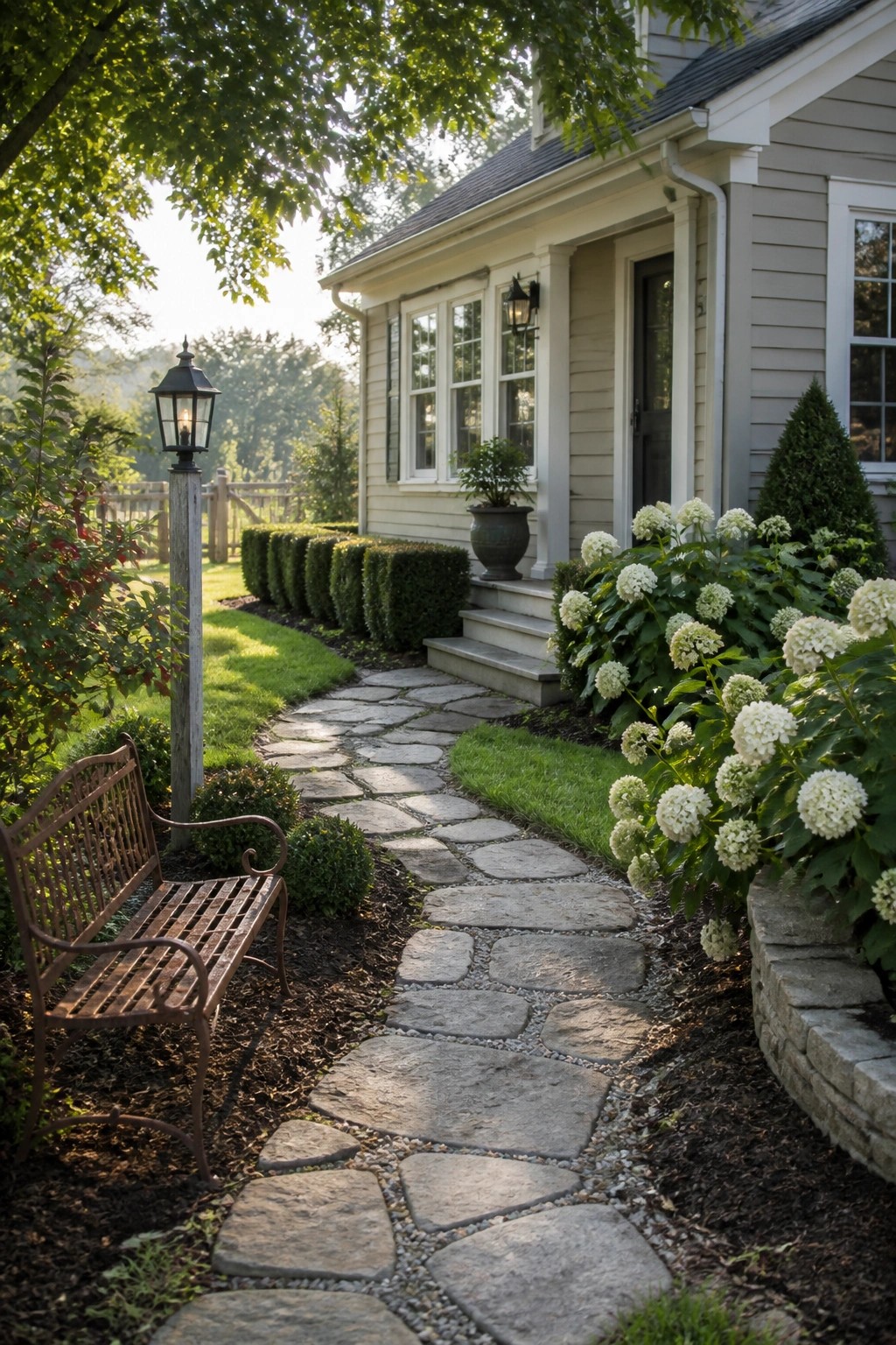
A light neutral on the siding helps the whole exterior feel connected to the surrounding landscape without fighting it. The stone path and plantings stand out more when the house stays calm and simple in tone.
This approach works best on farmhouses where you want the color to carry from the main body through the trim without extra contrast. Stick with one soft shade across the siding and keep the trim crisp to avoid breaking the line.
Green Built-Ins Pull the Room Together
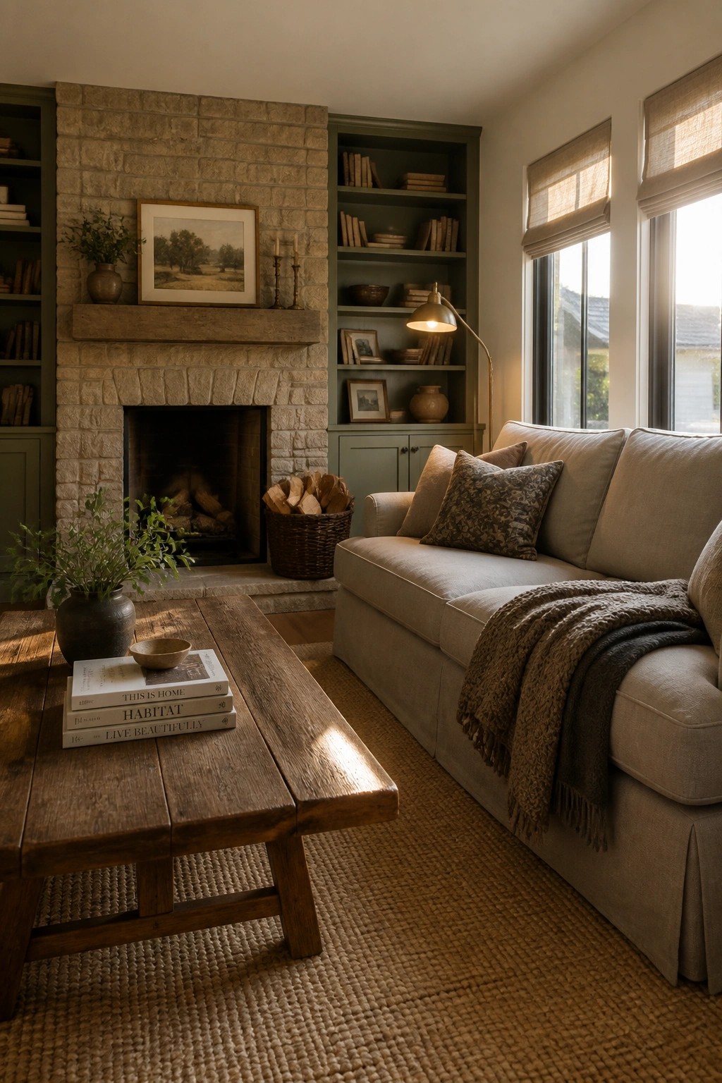
A soft green on built-in shelving and cabinetry gives the space a quiet sense of order. It works especially well next to stone because the color feels grounded without competing with the natural texture of the fireplace.
This choice suits older homes or farmhouse layouts where you want color to move through the room without making it feel busy. Keep the shade muted and test it against both the stone and your main wall color so the whole area reads as one steady palette.
Dark Paint Colors For Kitchen Islands
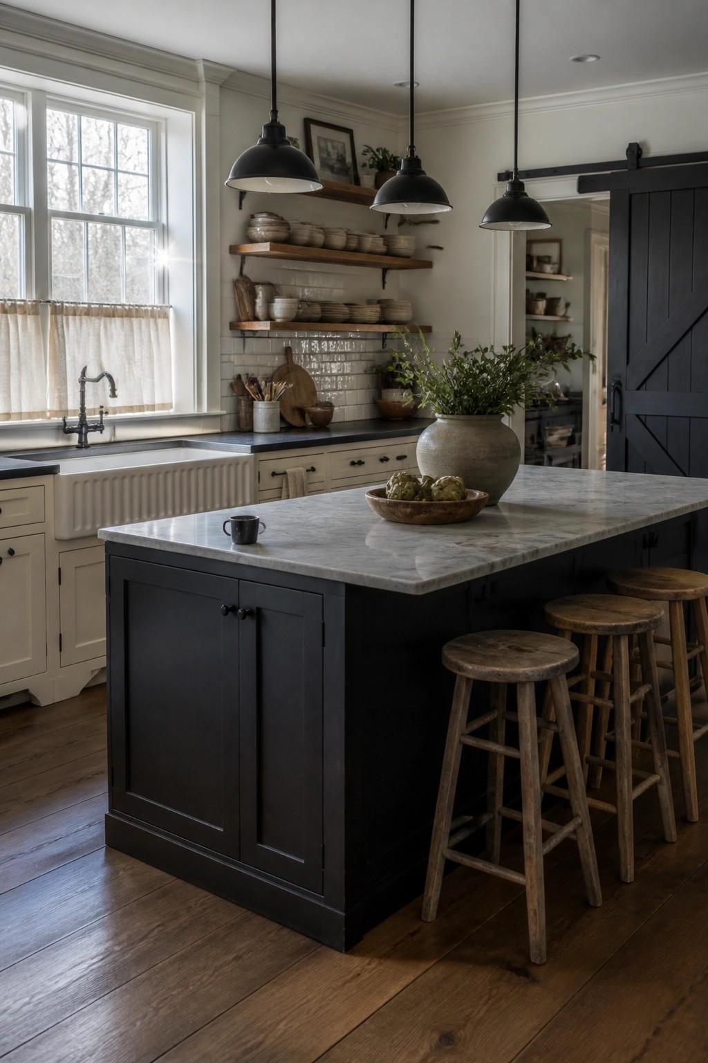
Many farmhouse kitchens use a darker paint color on the island to give the space weight and keep it from feeling too light overall. This choice creates a clear focal point while still letting the rest of the room stay connected to the lighter tones used elsewhere in the house.
The approach works best when the island color stays within the same palette as the walls and trim but sits several shades deeper. It suits older homes or new builds that want a simple, cohesive look without matching every cabinet exactly.
Soft Green Cabinetry for Cohesive Flow
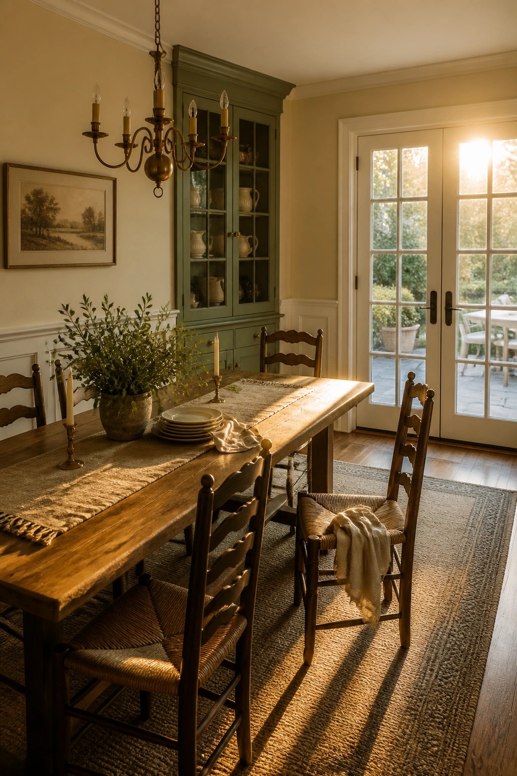
A muted green on built-in cabinetry gives a farmhouse dining room a gentle shift in color without disrupting the overall palette. The shade pairs naturally with warm neutral walls and wood tones, letting the room feel connected rather than busy.
This works best in homes that already have older cabinetry or hutches worth highlighting. Keep the green soft and slightly grayed so it reads as part of the main color story instead of a separate accent.
Built-Ins Painted The Same Color As The Walls
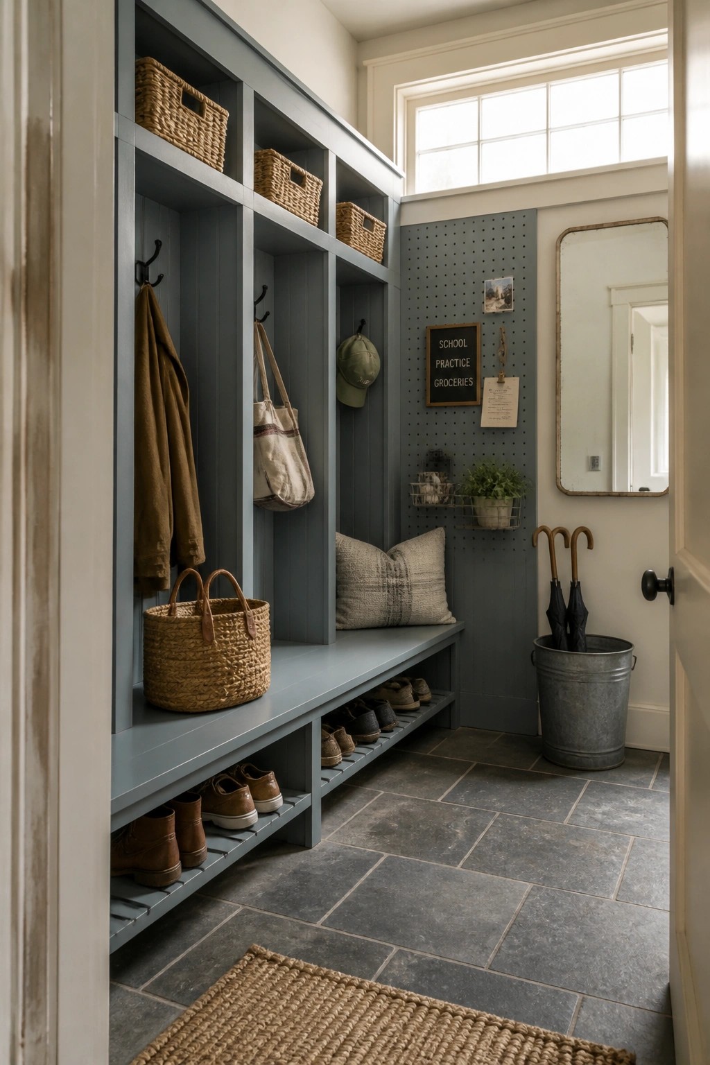
One paint color can make built-in storage feel like part of the room instead of something added later. When the bench, cubbies, and pegboard all match the wall color, the whole area stays calm and connected.
This approach works best in mudrooms or entry spaces that see daily use. Pick a color that already appears elsewhere in the house so the storage blends without standing out.
Soft Green Bedroom Walls
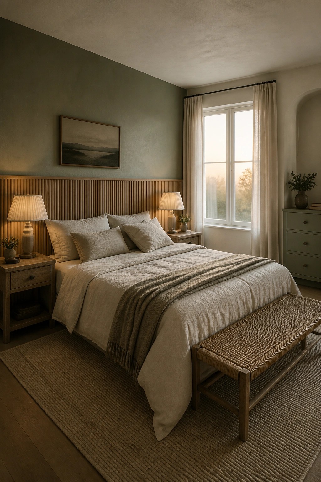
A muted green like this works well in a bedroom because it feels calm without going flat. It pairs easily with wood tones and neutral linens, which helps the color carry through other rooms without clashing.
Try it on one or two walls first if you want to test the flow. It suits older homes or simple farmhouse layouts where you need paint that feels connected but still gives each room its own quiet feel.
Soft Green Walls Over White Wainscoting
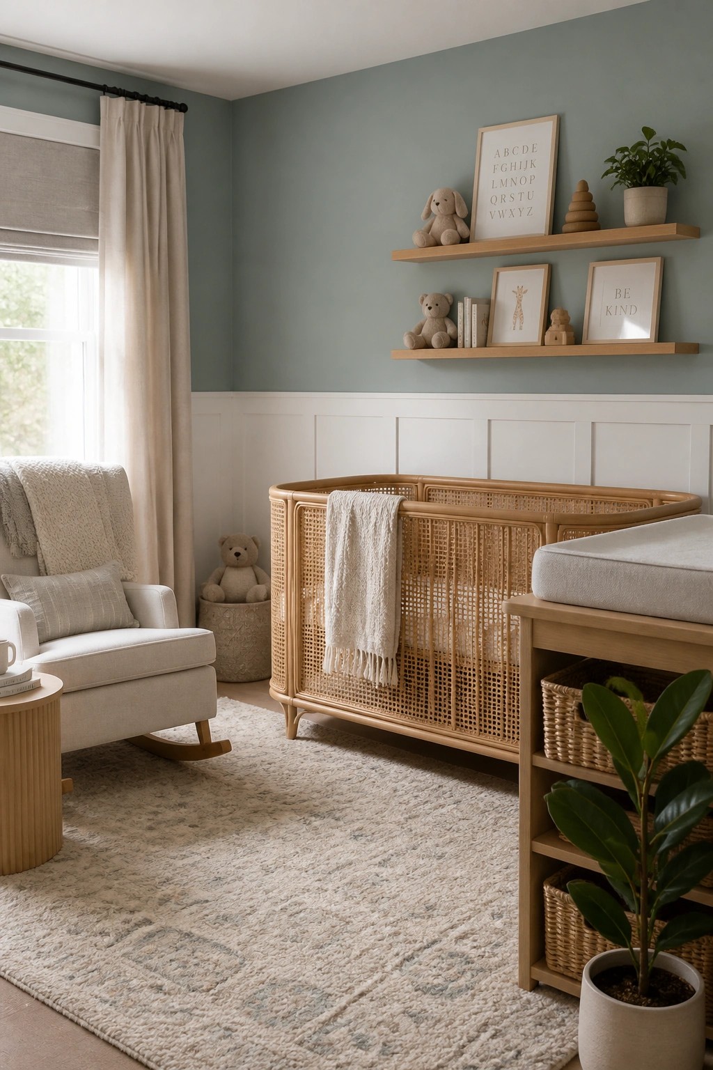
This muted sage green pairs well with the white wainscoting because it adds just enough color without making the room feel heavy. The contrast keeps things bright while still giving the space a quiet, settled look that works in a farmhouse setting.
Try the same approach in bedrooms or hallways where you want a gentle color that still ties into other rooms. Keep the green on the softer side and let the white trim run consistently through the house so the flow stays simple.
Deep Navy Walls In The Home Office
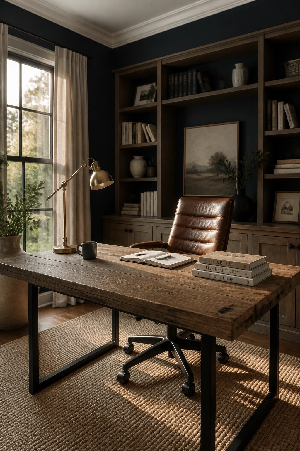
A deep navy wall color can make an office feel more finished and steady. It works especially well when the rest of the room leans on wood and leather, since those materials keep the space from going too heavy.
This approach suits farmhouse homes that already use warmer wood tones throughout. Keep the trim and ceiling light so the navy stays the main feature without closing the room in.
Use The Same Neutral On Your Vanity Cabinets
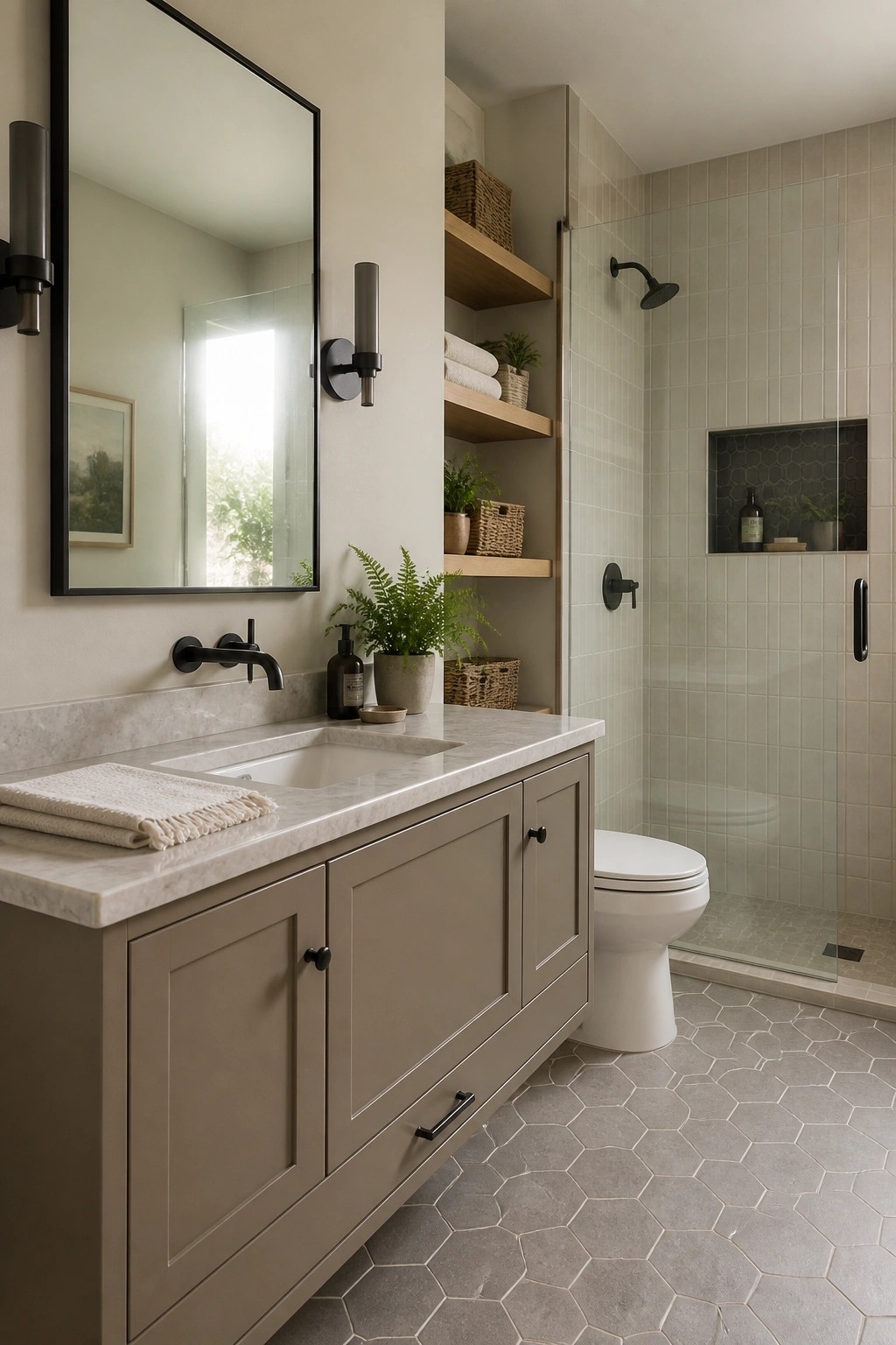
A soft neutral on bathroom cabinetry helps the room feel connected to the rest of the house instead of standing apart. In this space the painted vanity sits quietly against the walls and marble top, letting the color carry through without any extra effort.
Pick a warm gray beige or similar tone that already appears on trim or other built-ins. It works especially well in smaller bathrooms where you want things to feel calm and pulled together rather than busy. Just keep the finish consistent with what you used elsewhere so the eye moves smoothly from room to room.
Sage Green for the Laundry Room
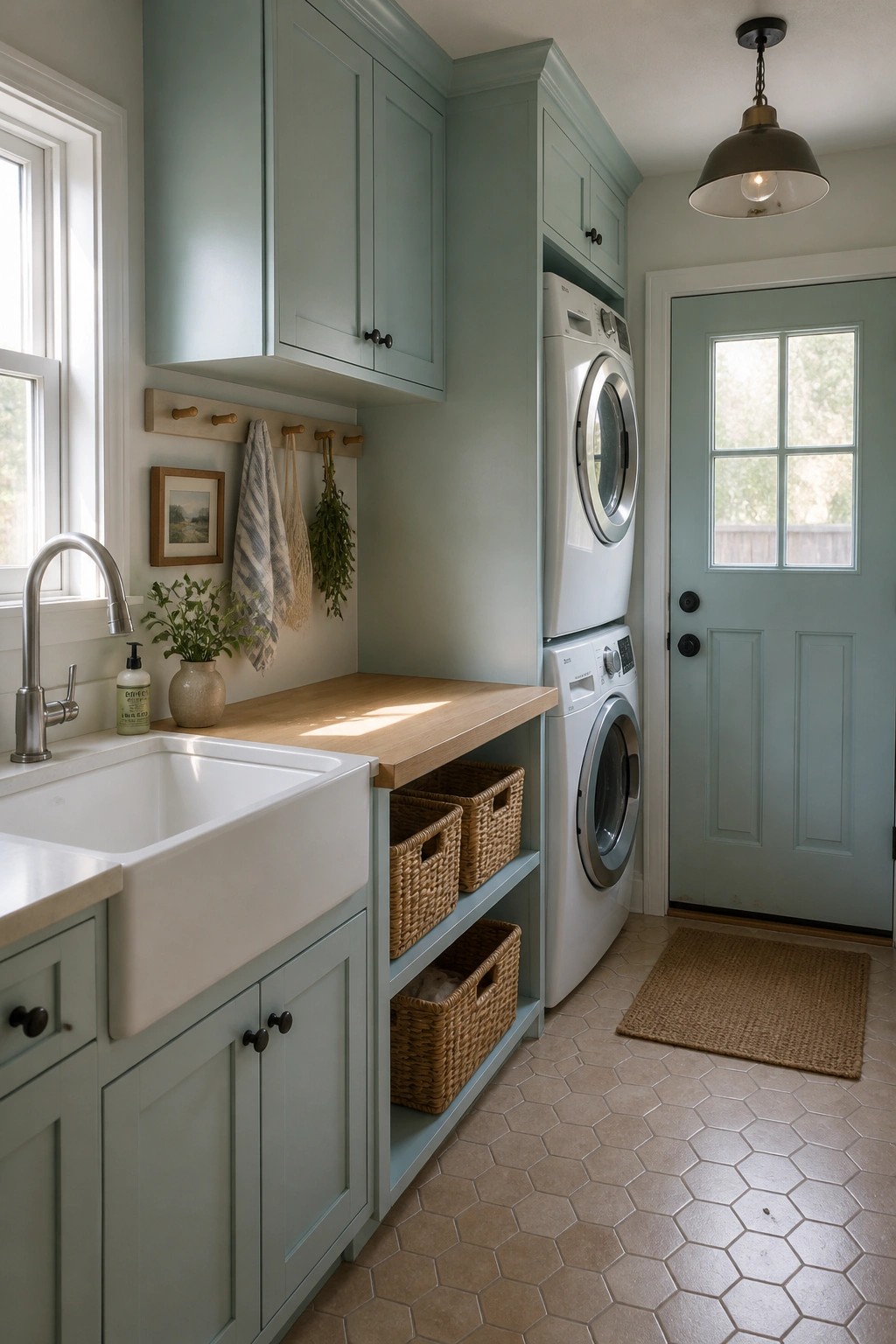
A soft sage green works well in utility spaces because it keeps the room feeling calm without trying too hard. Using the same color on the cabinets and walls helps tie everything together so the space does not feel separate from the rest of the house.
This choice suits a farmhouse that wants one paint color to carry through from main rooms into back areas. Keep the counters light and the hardware simple so the green stays the focus without competing.
Using One Warm Neutral On All The Walls
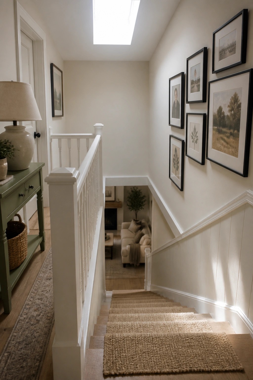
A single warm neutral paint color works well in stairwells and connecting hallways because it keeps the whole house feeling connected. The soft tone here lets light from the skylight bounce around without making the space feel cold or flat.
This approach suits older farmhouses or homes with lots of trim and wood floors. Pick a shade with a touch of warmth so it sits nicely next to white railings and still flows into other rooms without extra changes.
Carry Farmhouse Paint Colors Outdoors
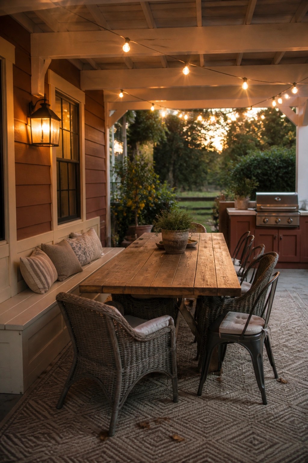
One way to keep a whole house color scheme feeling connected is to let the same tones show up on the porch. Warm wood finishes and soft neutrals on the siding and trim can guide the eye from inside to the outdoor table and seating without any jarring shift.
This works best on homes where the porch gets regular use. Pick exterior paint or stain colors that echo your main interior walls or trim, then repeat a similar wood tone on the table or built-in benches. It keeps the flow simple and avoids the need for a whole new palette just for the outside.
Extend Your Paint Colors Onto the Porch
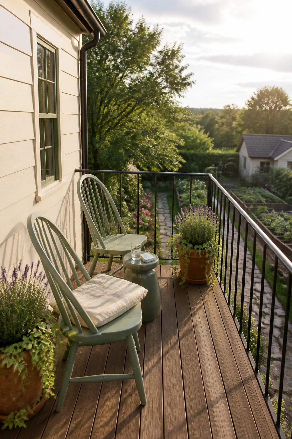
Many people pick nice colors for the inside of the house and then leave the porch or deck looking like an afterthought. Using one of the same paint colors on outdoor furniture helps the whole place feel like it belongs together.
This works best with soft farmhouse shades that hold up outside. Pick a muted green or gray you already used on trim or an accent wall and try it on a couple of chairs or a small table. It does not need to match perfectly, just stay close enough to keep the flow going from room to room and out the door.
Frequently Asked Questions
Q: How do I make sure the paint flows from the entryway into the main living areas without a sudden break?
A: Pick a warm neutral like creamy white for the entry and living room walls. Then shift to a soft gray or greige in the kitchen that shares the same undertone. Walk through the spaces with your samples to check the transition in real light.
Q: What works best if I want to use one of these colors on my open shelving or built-ins?
A: Choose a shade two steps lighter or darker than your main wall color for the shelves. This adds subtle interest while keeping the eye moving smoothly across the room. Paint a small board first so you can hold it against the walls before committing.
Q: Can these farmhouse colors still work if my furniture has cooler tones?
A: Layer in a muted green or blue-gray from the list on an accent wall. It pulls the cooler pieces into the overall scheme without clashing. Keep the larger walls in the warmer neutrals to balance everything out.
Q: How often should I repaint to keep the flow looking fresh?
A: Touch up high-traffic spots every couple of years with the original mix. Full repaints every five to seven years usually keep the colors feeling cohesive as they age.
