

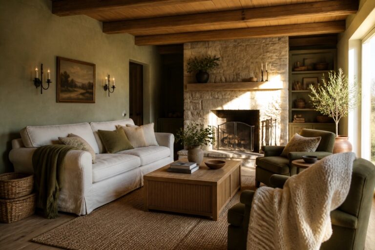
I have noticed over time that the right paint color can shift how a whole room feels once the everyday pieces are back in place.
Farmhouse interiors tend to work best when the walls stay grounded in tones that echo the wood and stone already there.
Testing a sample on the actual wall still matters more than any photo.
Colors pulled from nature often bring a steadier quality to spaces that get a lot of use throughout the day.
I like to check how a shade looks at different times of day before deciding it belongs in the main living areas.
Soft Green Walls For Rustic Rooms
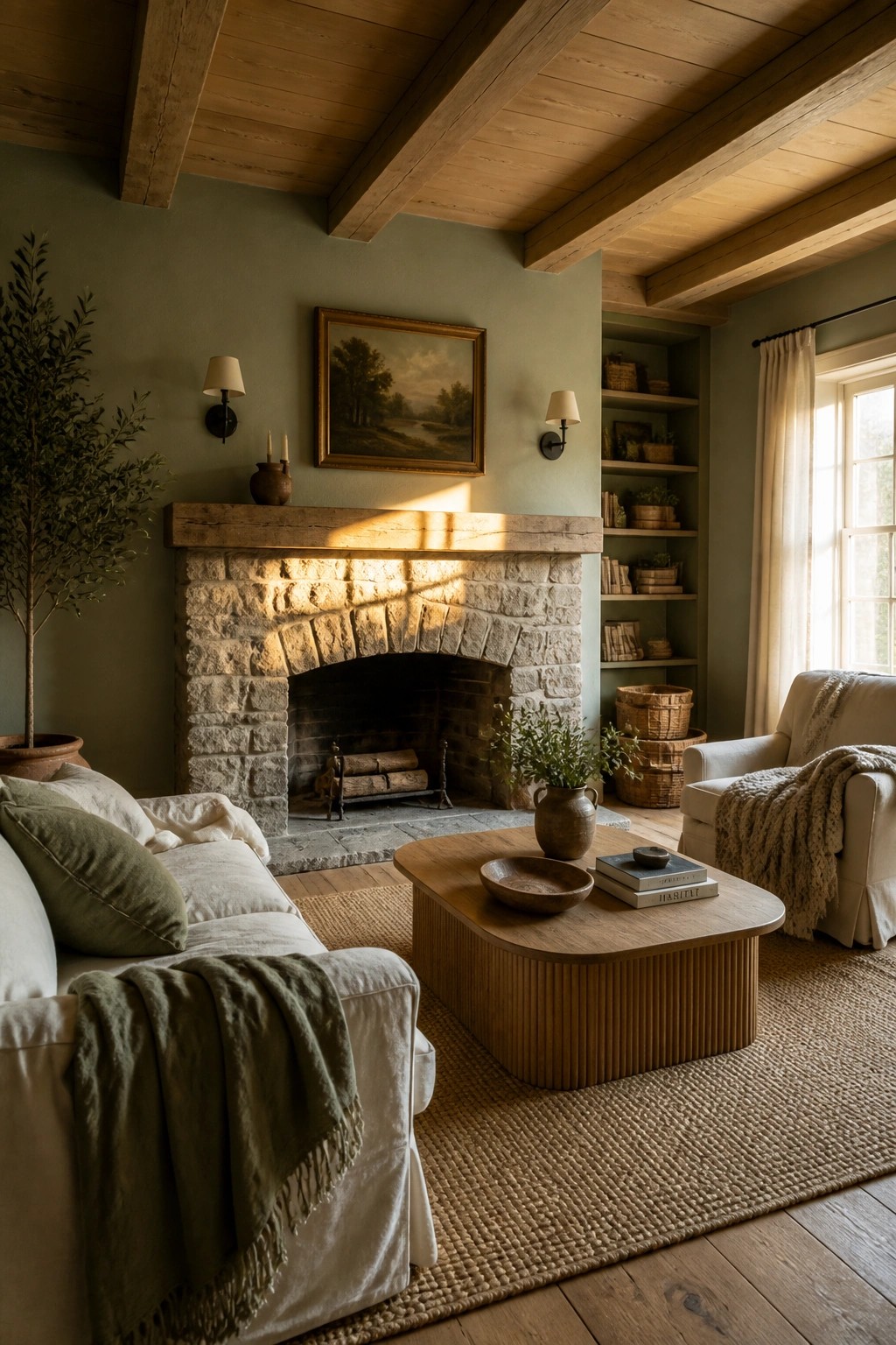
A soft green on the walls gives a room that quiet, grounded feeling without trying too hard. It works especially well with stone and wood because it lets those natural textures lead while still tying the whole space to the outdoors.
This color suits older homes or any space already heavy on wood beams and simple materials. It does best with plenty of daylight, so test a large patch first since greens shift more than you expect once the sun moves.
Earthy Tones On Kitchen Cabinets
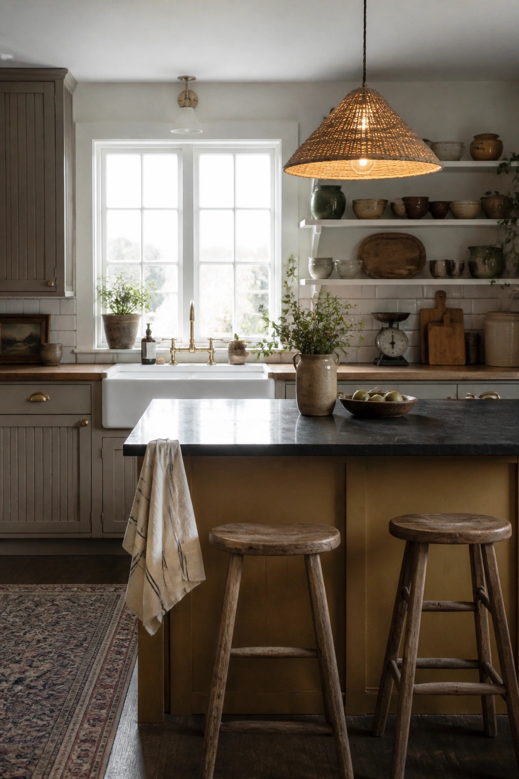
Soft muted colors on cabinetry give a kitchen that settled, lived-in look without feeling flat. The gray-green on the upper cabinets and the warm ochre on the island both pull from natural tones that sit comfortably with wood counters and stone.
These shades suit older homes or any space that already has texture from brick, plaster, or worn wood. Start with the lower cabinets or the island so you can see how the color shifts with the light before committing to the whole room.
Soft Wall Colors for Rustic Bedrooms
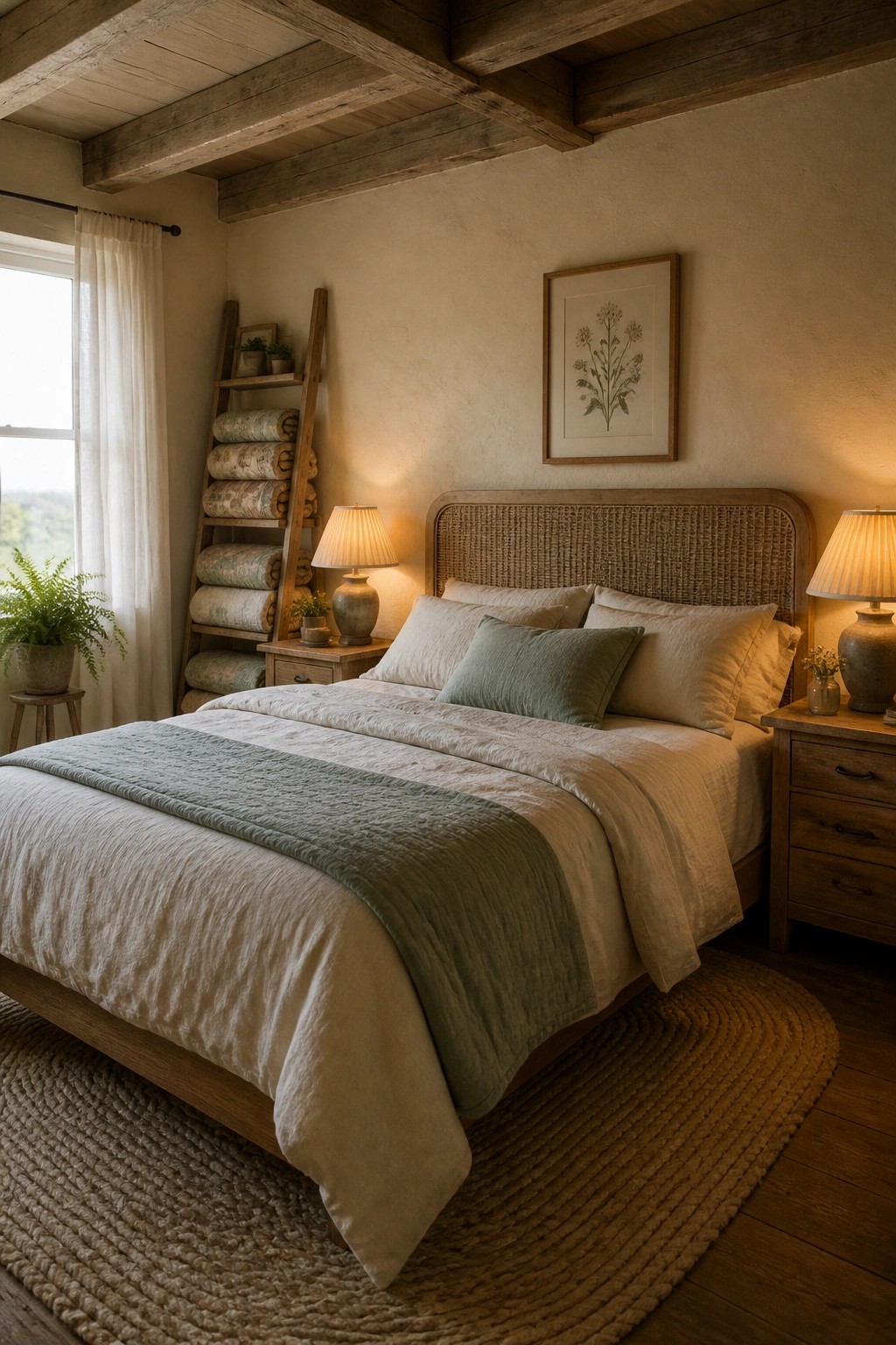
A warm, muted wall color helps a bedroom feel calm and connected to the natural materials around it. Wood, linen, and woven textures stand out more when the walls stay quiet instead of competing for attention.
This kind of paint works best in rooms that get steady daylight and already have wood furniture or soft textiles. Test a few samples at different times of day before committing, since earthy tones can shift more than you expect once the furniture is in place.
Deep Blue Paint For Dining Room Walls
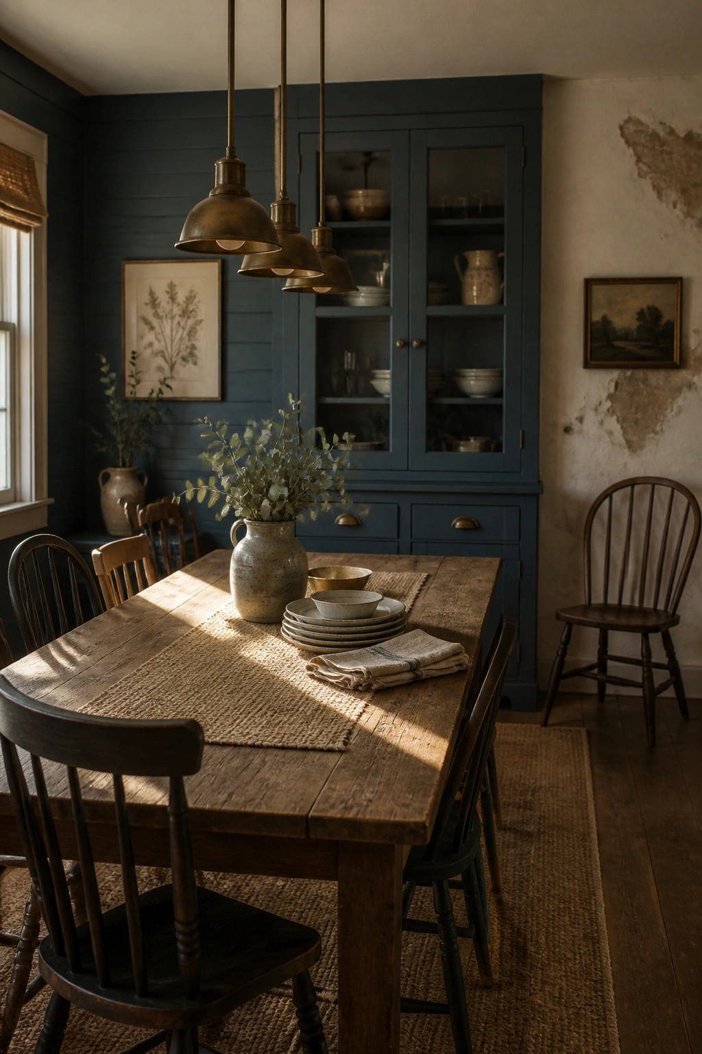
A deep blue paint color brings a quiet strength to a rustic dining room. It pairs naturally with wood tones and simple furniture while keeping the space grounded and connected to the outdoors.
This approach works best in older homes or farmhouse settings where the walls can carry some weight. Use the same blue on both the walls and any built-in cabinetry to create a calm, unified backdrop, then let natural textures like wood and linen do the rest.
Soft Green Paint For Earthy Bathrooms
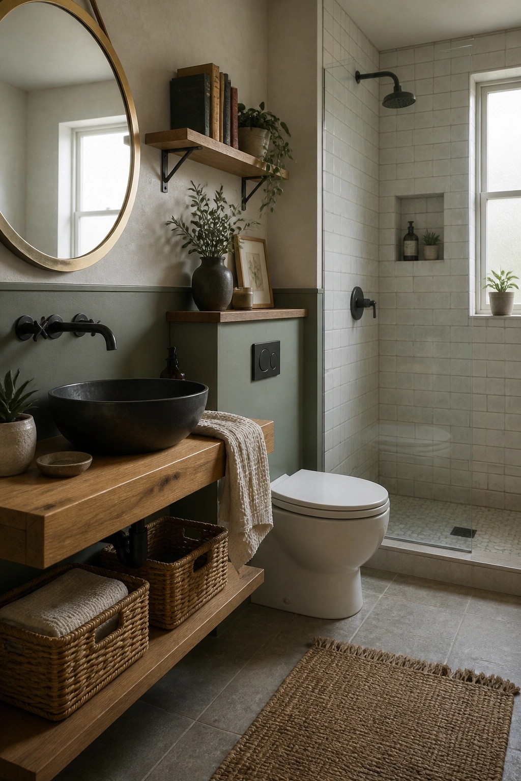
A muted green on the lower walls gives this bathroom a grounded feel that pairs naturally with wood tones and simple textures. It keeps the space calm while still feeling connected to the outdoors, which works especially well in smaller rooms where you want some color without making things feel closed in.
This approach suits older homes or any bathroom with wood vanities and woven storage. Keep the upper walls lighter to avoid a heavy look, and test the green in different lighting since it can shift from sage to deeper olive depending on the time of day.
Weathered Wood Benches For Simple Entry Storage
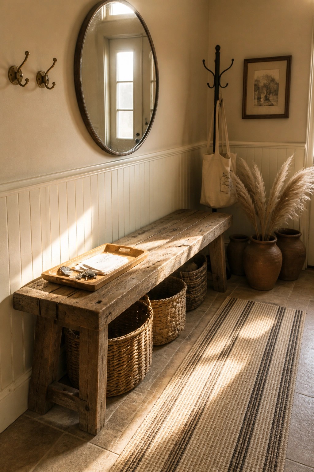
A weathered wood bench brings a grounded feel to an entry because the natural grain and worn finish add texture that feels lived in. It works especially well in farmhouse spaces that already lean on earthy tones and simple materials.
Tuck a few woven baskets underneath for shoes or bags and the bench stays useful without looking cluttered. This approach suits older homes or new builds that want storage that still shows off the wood instead of hiding it behind cabinets.
Soft Green Paint For Mudroom Built-Ins
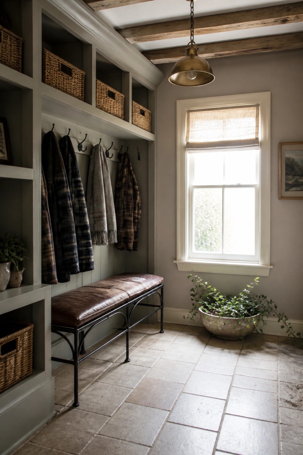
A soft green wall color works well in a mudroom because it keeps the space feeling calm even when coats and baskets pile up. The muted tone pairs easily with wood and stone without making the room feel dark or heavy.
This color choice suits homes that need a practical entry area that still feels connected to the outdoors. It works best on walls behind open cubbies so the paint shows through and helps the whole storage wall feel more settled.
Soft Sage Green Walls In A Nursery
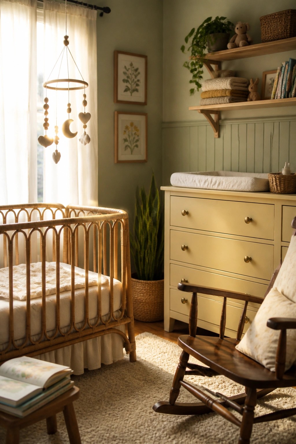
A soft sage green works well when you want a room to feel calm and tied to nature. It gives the space a quiet background that lets wood furniture and simple textures stand out without competing.
This shade suits a farmhouse home that already has natural materials like rattan or oak. Use it in a nursery or small bedroom where you want something gentle that still feels grounded rather than stark.
Deep Green Walls In A Home Office
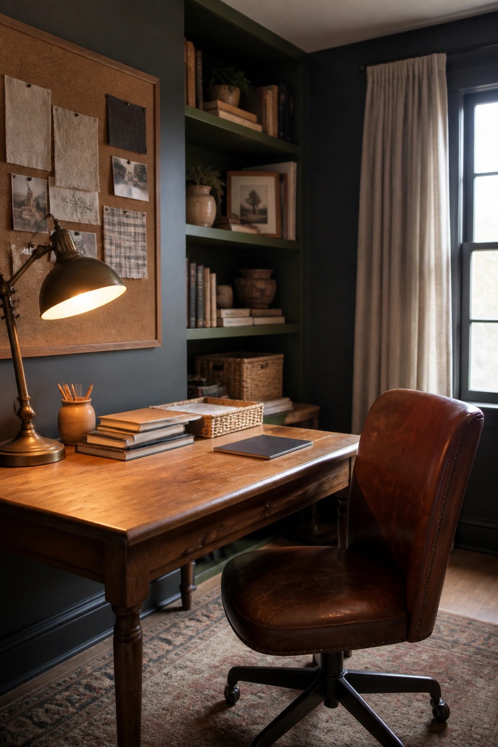
A deep green wall color can turn a simple workspace into something calmer and more connected to the outdoors. It gives the room a steady, grounded feel without needing a lot of extra decoration, especially when paired with wood furniture and natural textures.
This approach works well in smaller rooms or studies where you spend time reading or working. Keep the other walls a lighter neutral so the green does not feel too heavy, and let the color wrap just one or two surfaces.
Soft Earthy Paint For Hallway Walls
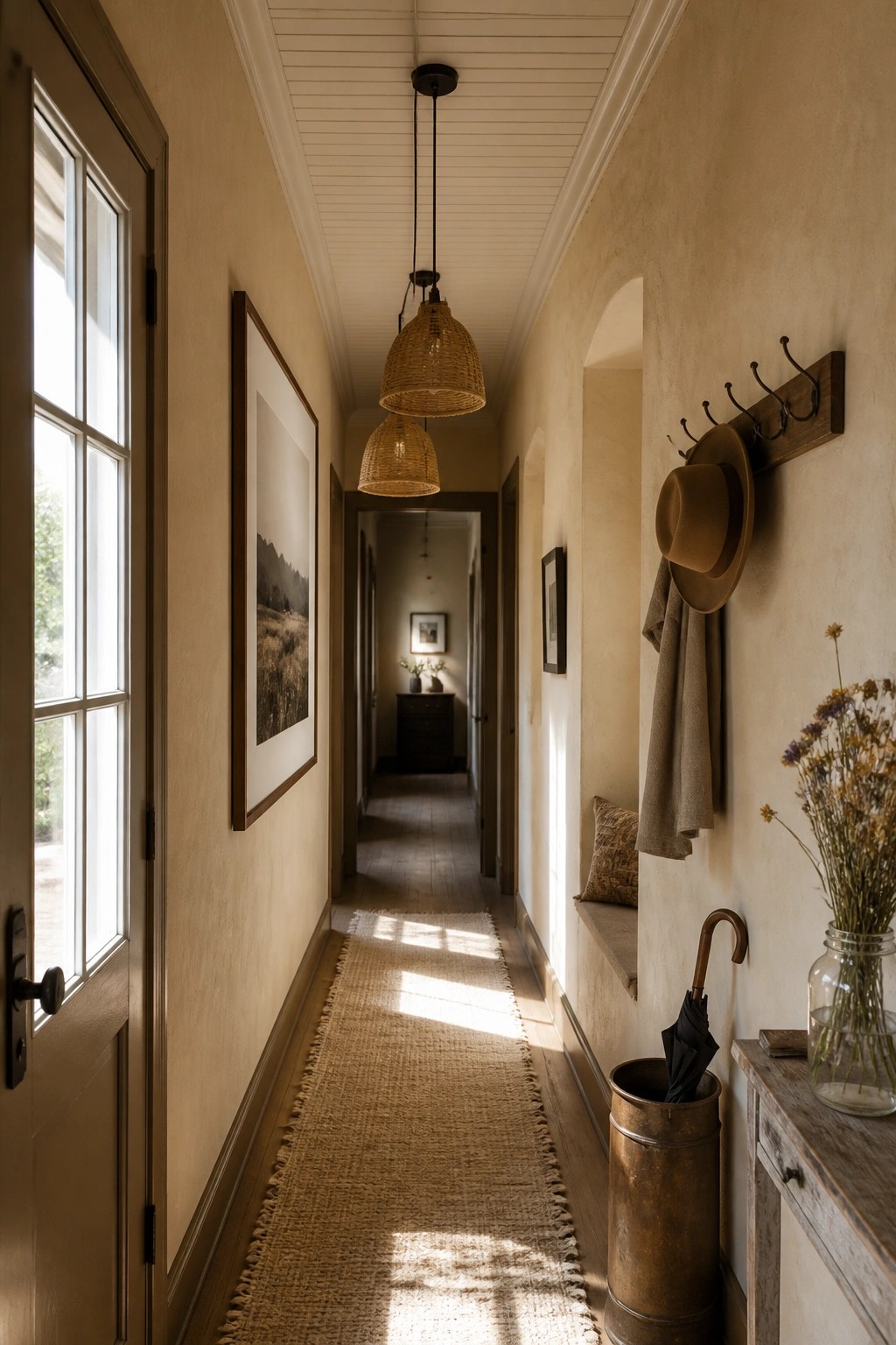
A warm neutral paint color on hallway walls can make a narrow space feel calmer and more connected to the outdoors. The soft beige tone here picks up light from the windows and creates a quiet backdrop that lets natural textures stand out without competing.
This kind of color works well in older farmhouses or homes that already have wood trim and simple finishes. It suits long hallways best when you keep the rest of the palette light and avoid too many dark accents that could close the space in.
Muted Green Cabinets For Utility Rooms
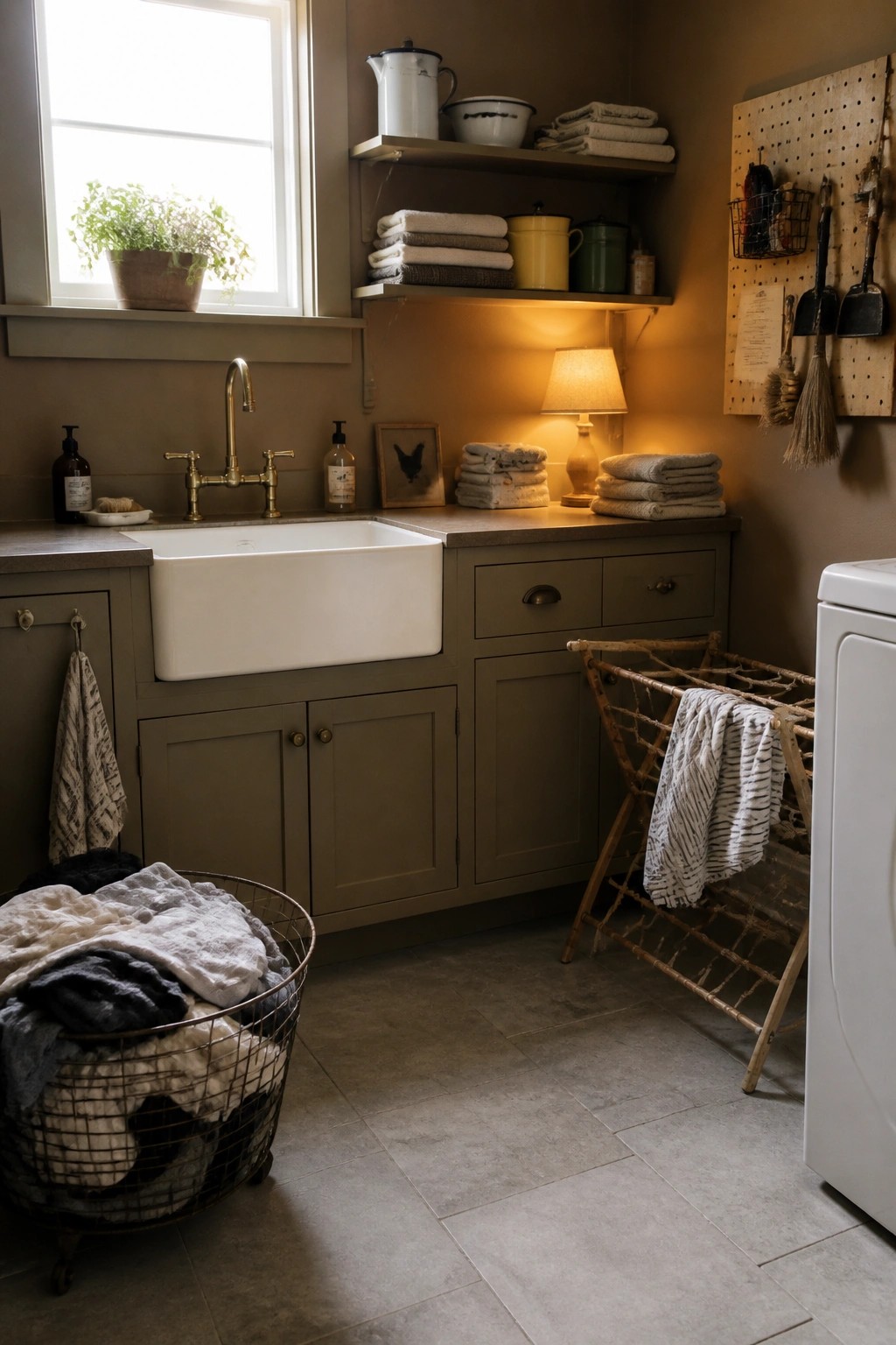
A soft olive green on cabinets gives a laundry room or mudroom a calm, grounded feel that still reads as practical. It avoids the stark look that white or gray often brings to these spaces and instead ties the room to the rest of a farmhouse home.
This color works best on lower cabinets where it can handle some wear. Pair it with warm wall tones and simple hardware so the green stays quiet rather than becoming the focus. It suits older homes or any space that needs to feel useful without looking too finished.
Terracotta Walls For Natural Warmth
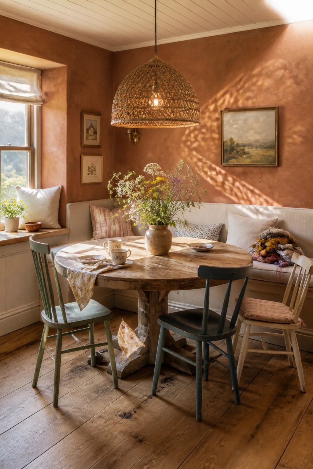
Terracotta paint gives a room that grounded, sun-warmed feeling that works especially well in rustic farmhouse settings. The color brings out the grain in wood furniture and makes simple pieces feel more settled without needing a lot of extra decoration.
It suits older homes or any space where you want the walls to feel like part of the structure rather than just a backdrop. Keep trim and ceilings light so the color stays soft instead of heavy, and let natural light do the rest.
Paint Bedroom Walls in a Warm Earth Tone
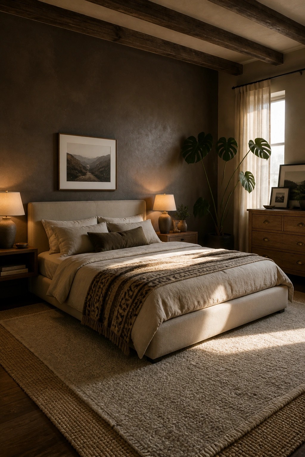
A deep brown wall color can make a bedroom feel grounded and restful without much extra effort. It works especially well in spaces that already have natural textures and soft neutrals, since the color absorbs light and creates a quiet backdrop for the rest of the room.
This approach suits older homes or any rustic farmhouse style where you want the walls to feel like part of the landscape rather than just a surface. Keep the trim and ceiling light so the brown does not close the room in too much, and test the shade in different lighting before committing to the whole space.
Earthy Green Paint On Bathroom Walls
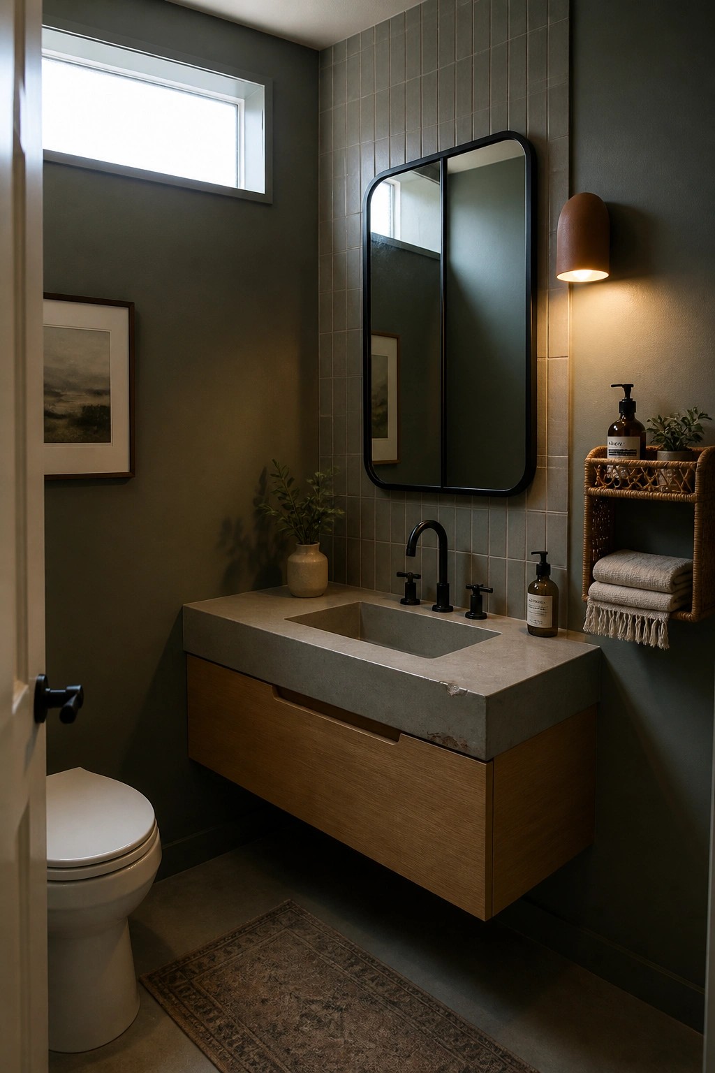
A deep green shade on the walls can give a bathroom a grounded feel that works well with natural materials. It brings in the look of moss or shaded leaves without making the space feel dark or closed in.
This color works best in rooms with some wood tones or stone surfaces nearby. Pair it with simple fixtures and avoid overcrowding the space so the walls stay the main feature.
Warm Terracotta Walls in a Bedroom
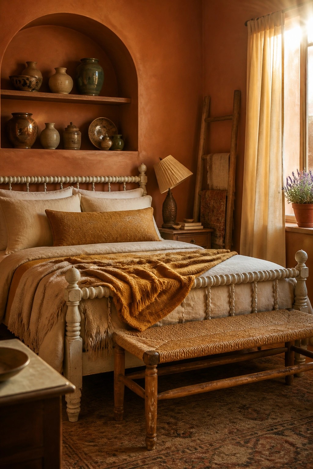
A deep terracotta paint color can make a bedroom feel grounded and connected to the outdoors without much extra effort. It works especially well in older homes or rustic spaces where you want the walls to do some of the heavy lifting instead of relying on lots of pattern or accessories.
This shade pairs nicely with wood furniture and simple linen bedding, and it tends to look best in rooms that get some natural light. Just keep the trim light and avoid overcrowding the space with too many dark pieces.
Deep Green Paint For Pantry Walls
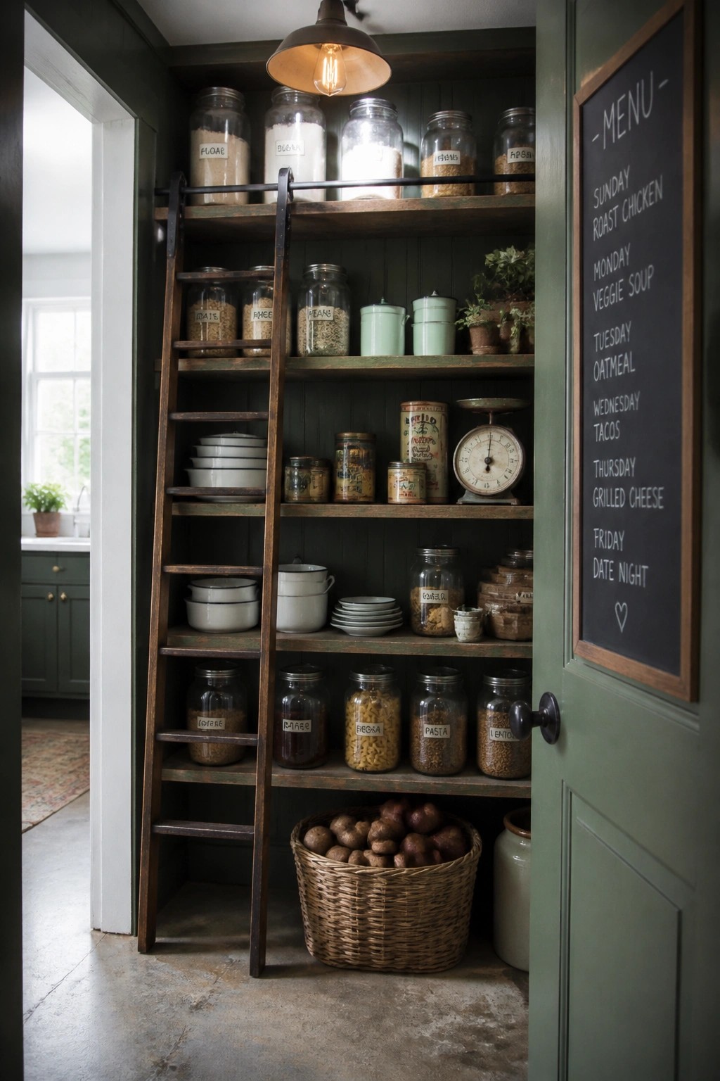
A deep green on the walls gives a pantry that grounded, natural feel without making it feel dark or heavy. The color works with wood shelving and simple storage to keep the whole space looking calm and connected to the rest of the house.
This shade suits older homes or any rustic setup where you want storage areas to feel useful rather than hidden away. Test the paint on a couple of walls first since greens can look different once the shelves are full and the door stays mostly closed.
Earthy Green Paint For Built-In Shelves
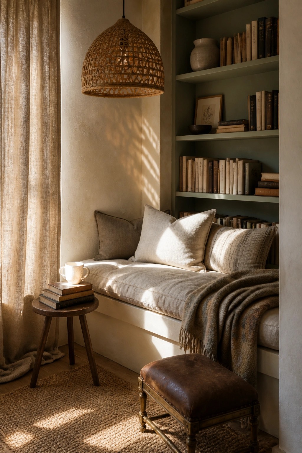
A soft green on built-in shelves helps a small reading spot feel grounded and connected to nature. The color picks up the light from the window and pairs easily with wood tones and simple fabrics.
This works best in older homes or farmhouse spaces where you want the nook to feel calm rather than busy. Keep cushions and throws in light neutrals so the green stays the quiet focus.
Warm Neutrals for Rustic Entries
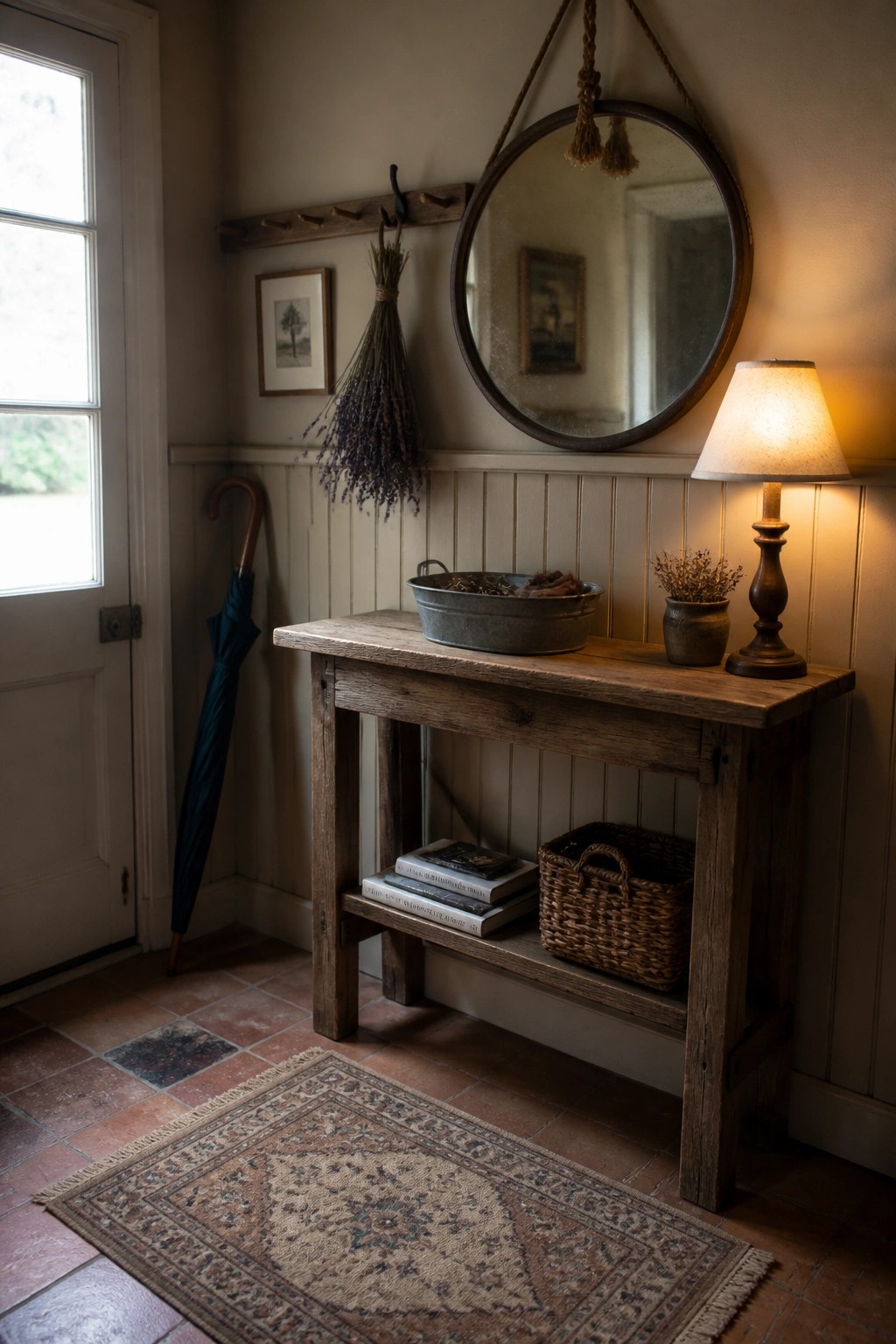
A soft warm neutral on the walls gives an entry a calm base that feels connected to the outdoors. It lets the wood tones and simple furnishings stand out without competing for attention.
This shade works well in homes with older trim or mixed wood pieces. Try samples on the wall at different times of day since these colors shift easily with the light.
Soft Sage Green For A Craft Room
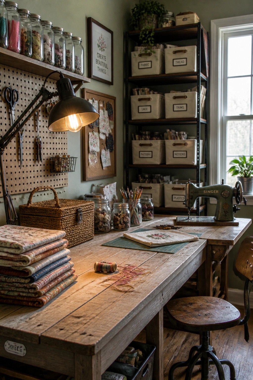
A muted green on the walls gives a craft room a steady, grounded feel without making the space feel closed in. It pairs naturally with wood tones and the bits of color that come from fabrics and supplies, so the room stays calm even when projects are spread out.
This color works best in rooms that already have plenty of natural texture like raw wood tables or pegboard storage. It suits older homes or any space where you want the walls to recede a little and let the materials in the room do the talking. Keep the trim simple and let the green stay the main background color.
Deep Blue Gray Paneling For A Home Bar
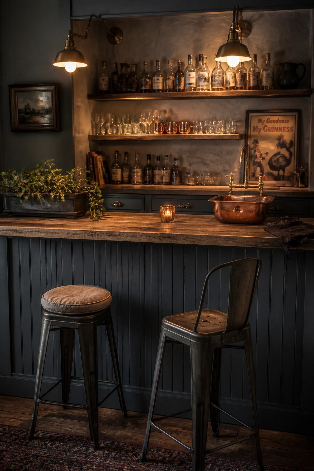
A deep blue gray on paneled walls gives a bar area that settled, almost tucked-away feel without making the space feel closed in. The color anchors the wood tones and metal details so the whole setup reads as part of the house instead of a separate zone.
This shade works especially well in rooms with existing texture like vertical paneling or beadboard. It suits older homes or farmhouse layouts where you want the bar to feel practical and lived-in rather than styled for show.
Warm Wood Built-Ins For Everyday Storage
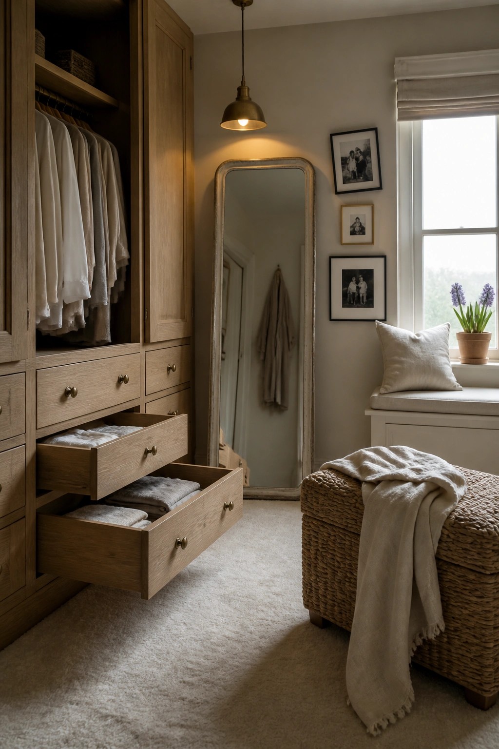
Light wood cabinetry gives a closet or dressing area a grounded feel that works well with soft wall colors. The natural tone of the wood adds warmth without overpowering the space, and it pairs easily with paint shades pulled from bark, stone, or sand.
This choice suits homes that lean rustic or farmhouse in style. Keep the walls in a muted neutral so the wood stays the main material, and limit hardware to simple aged finishes that do not compete.
Soft Green Walls For A Workroom
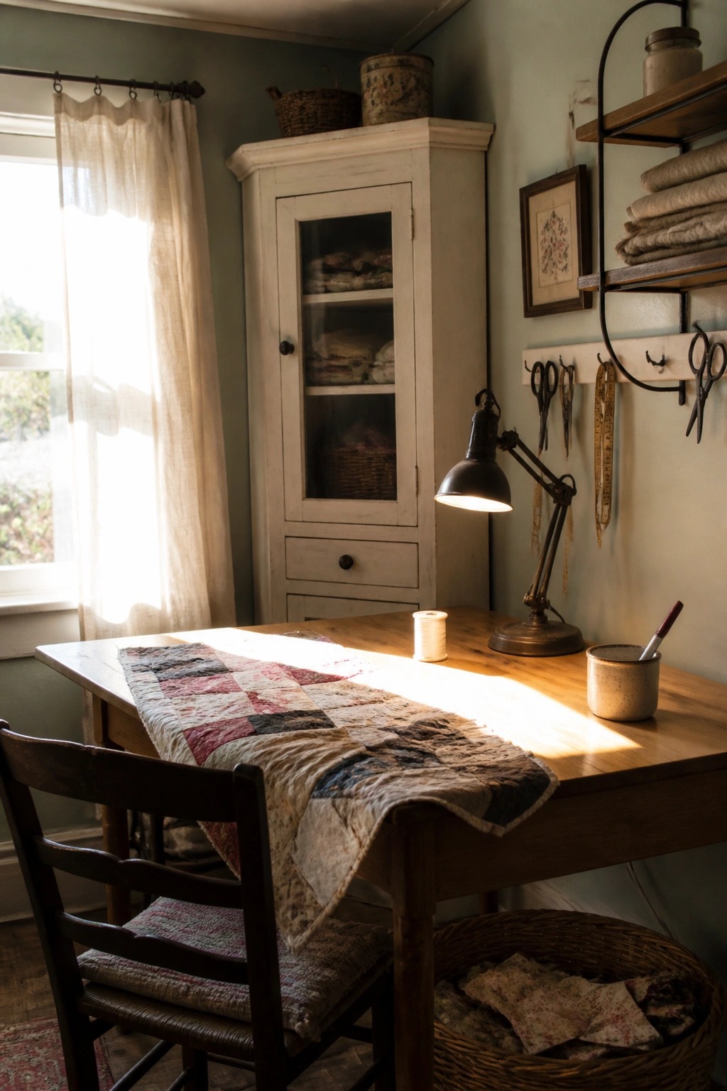
A soft green on the walls gives a room like this an easy, grounded feeling. It works with the wood tones and simple furniture without making the space feel heavy or dark.
This kind of color suits older homes or any spot that gets decent daylight. Keep the trim light and let the wood pieces stay natural so the green stays the main quiet note in the room.
Using Warm Neutrals Behind Natural Wood
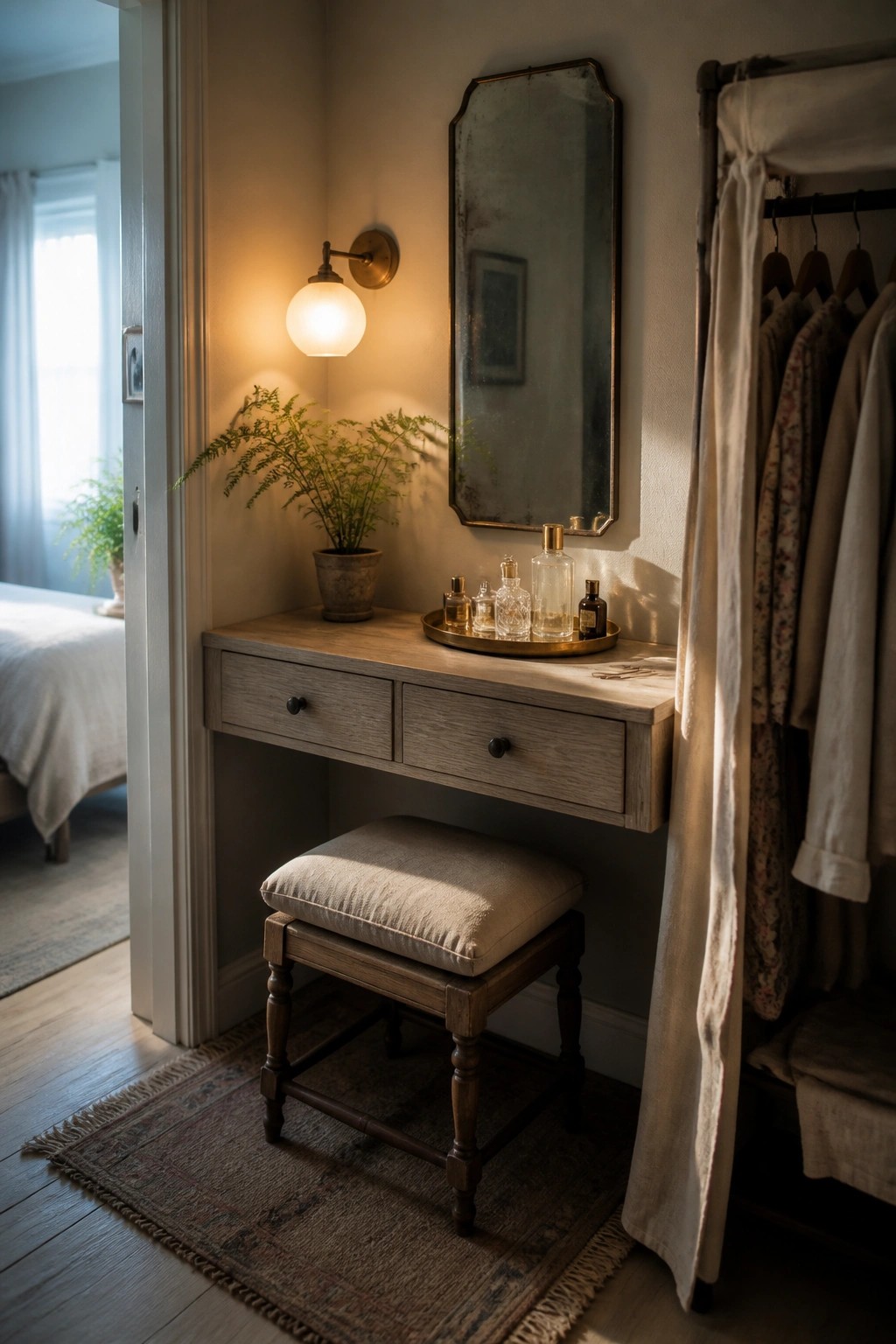
A soft wall color can make wood furniture feel more grounded without competing for attention. In spaces like this, the light wood tones stand out more when the background stays quiet and slightly warm. It keeps the whole corner feeling simple and tied to natural materials rather than trying to add too much contrast.
This approach works well in bedrooms or small dressing areas where you want things to feel calm. Stick with the same wood tone for the main pieces and let the wall color stay one or two shades lighter. Avoid adding strong patterns on the walls if the furniture already has visible grain.
Frequently Asked Questions
Q: How do I know if a color will look too dark once it’s on my walls?
A: Grab a sample and paint it on a big piece of poster board. Carry that board through the room during morning and evening light. You will see right away if the shade stays inviting or turns heavy.
Q: Can I mix two of these earthy shades in the same space?
A: Use the deeper tone on an accent wall and keep the lighter one for the rest. This keeps the room feeling grounded instead of busy. Stick to the same undertone so the colors flow together naturally.
Q: What if I want to try one on kitchen cabinets?
A: Roll it on the lower cabinets first to anchor everything. Leave the uppers in a soft off-white so the space stays open. The natural hues add warmth without making the room feel closed in.
