

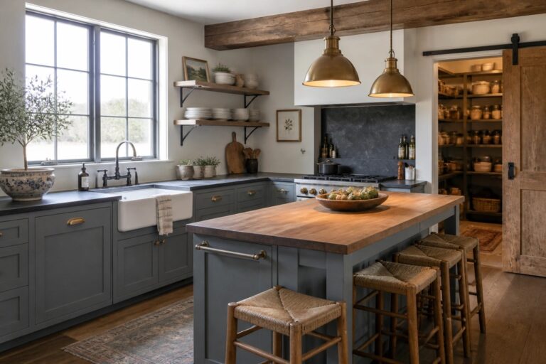
I have spent time testing paint shades on the walls of older homes that needed a refresh while keeping their original character intact.
The right color can tie together worn wood floors and newer fixtures so the space feels lived in rather than staged.
Some tones only reveal themselves once they cover a full wall.
I usually put samples on at least two different surfaces because morning light and evening shadows change how they read in the room.
That step has saved me from colors that looked balanced on a chip but felt too stark once they were up.
Blue Gray Cabinets For A Farmhouse Kitchen
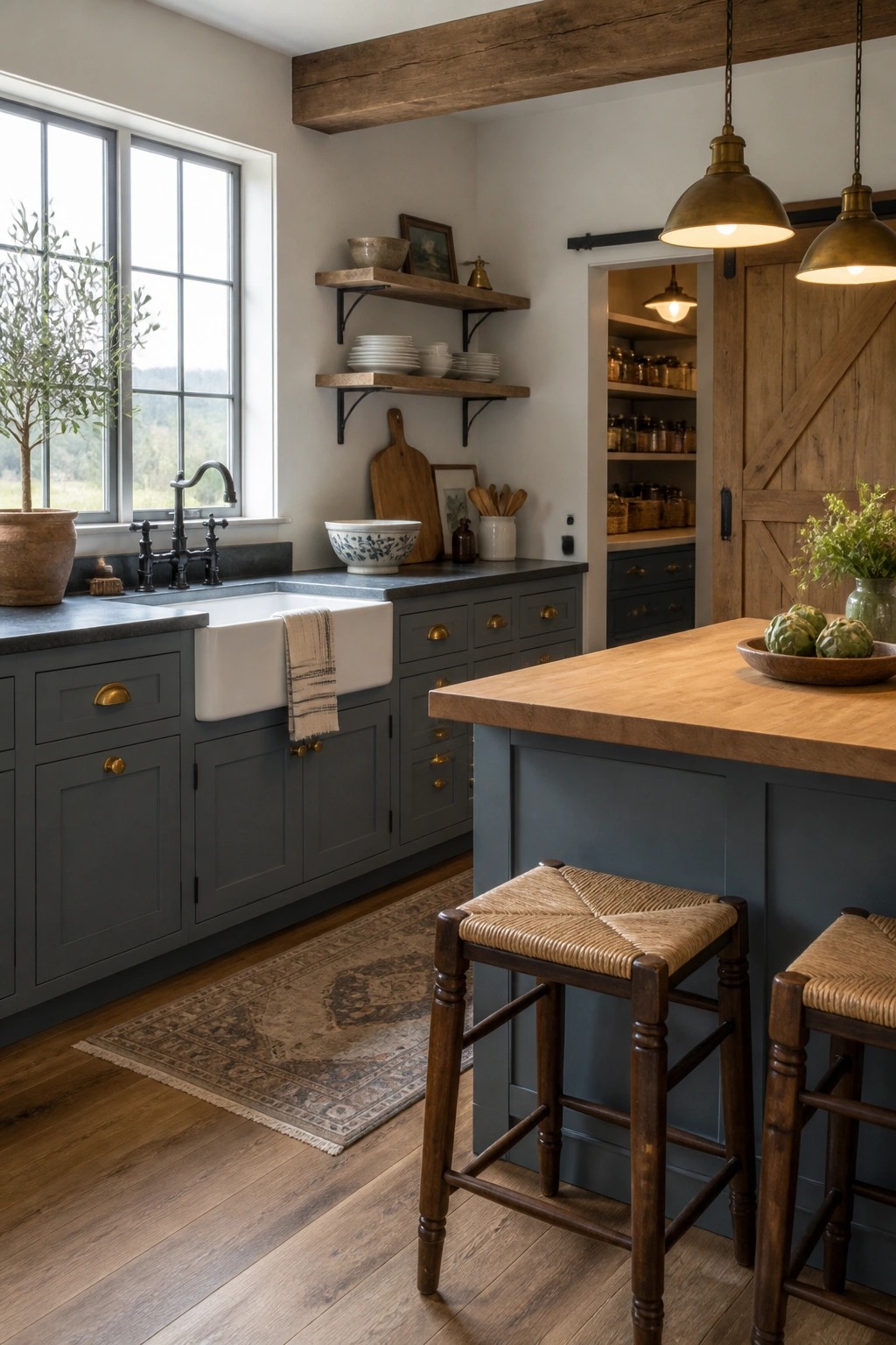
This color sits right in the middle between cool modern and warm traditional. It gives the cabinets enough depth to feel substantial while still working with wood floors and lighter counters.
Use it in kitchens that already have some wood tone or stone. It holds up well against both natural light and the shadows that come with open shelving and older beams.
Soft Green Built-Ins
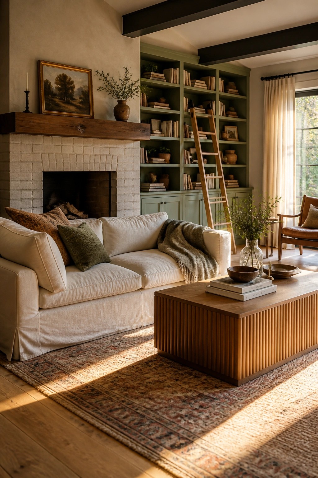
Painting built-in bookshelves a soft green gives the room a gentle color boost while still feeling grounded. It works especially well next to a white brick fireplace because the green adds interest without competing with the rustic texture of the brick.
This approach suits older homes or farmhouse style rooms that already have some wood tones and natural light. Keep the walls a warm neutral so the green reads as a quiet accent rather than a bold statement.
Warm Neutrals That Let Rustic Wood Stand Out
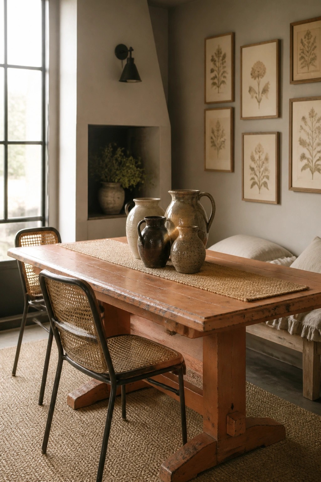
A soft neutral wall color keeps the focus on the wood and pottery instead of fighting with them. It gives older pieces room to show their texture without the walls pulling attention away.
This works well in dining areas or casual living spaces where you mix salvaged furniture with newer accents. Pick a tone with a little warmth so the room feels comfortable rather than flat.
Soft Green Walls For A Calm Bedroom
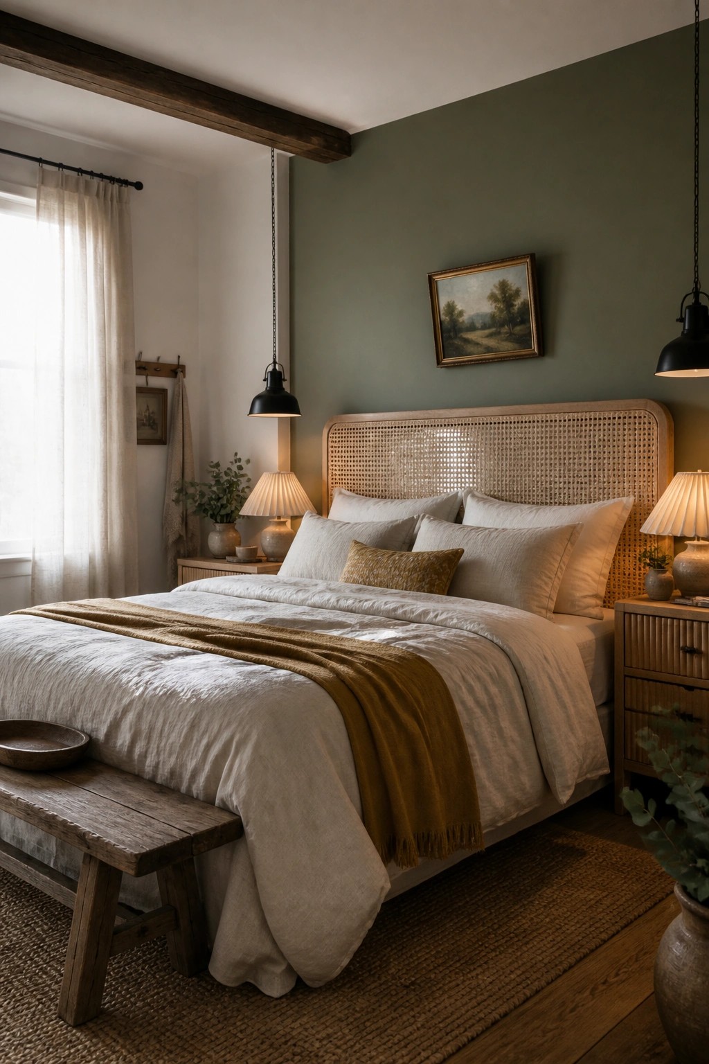
A muted green on the walls gives a bedroom that quiet, grounded feel without trying too hard. It pairs easily with wood beams, simple linens, and natural textures, which is why it works so well in a modern rustic farmhouse.
This color suits spaces where you want a bit of softness but still need the room to feel practical. Use it on one main wall if you are testing the look, and keep the rest of the room in lighter neutrals so the green stays the focus.
Dark Paint Over White Wainscoting
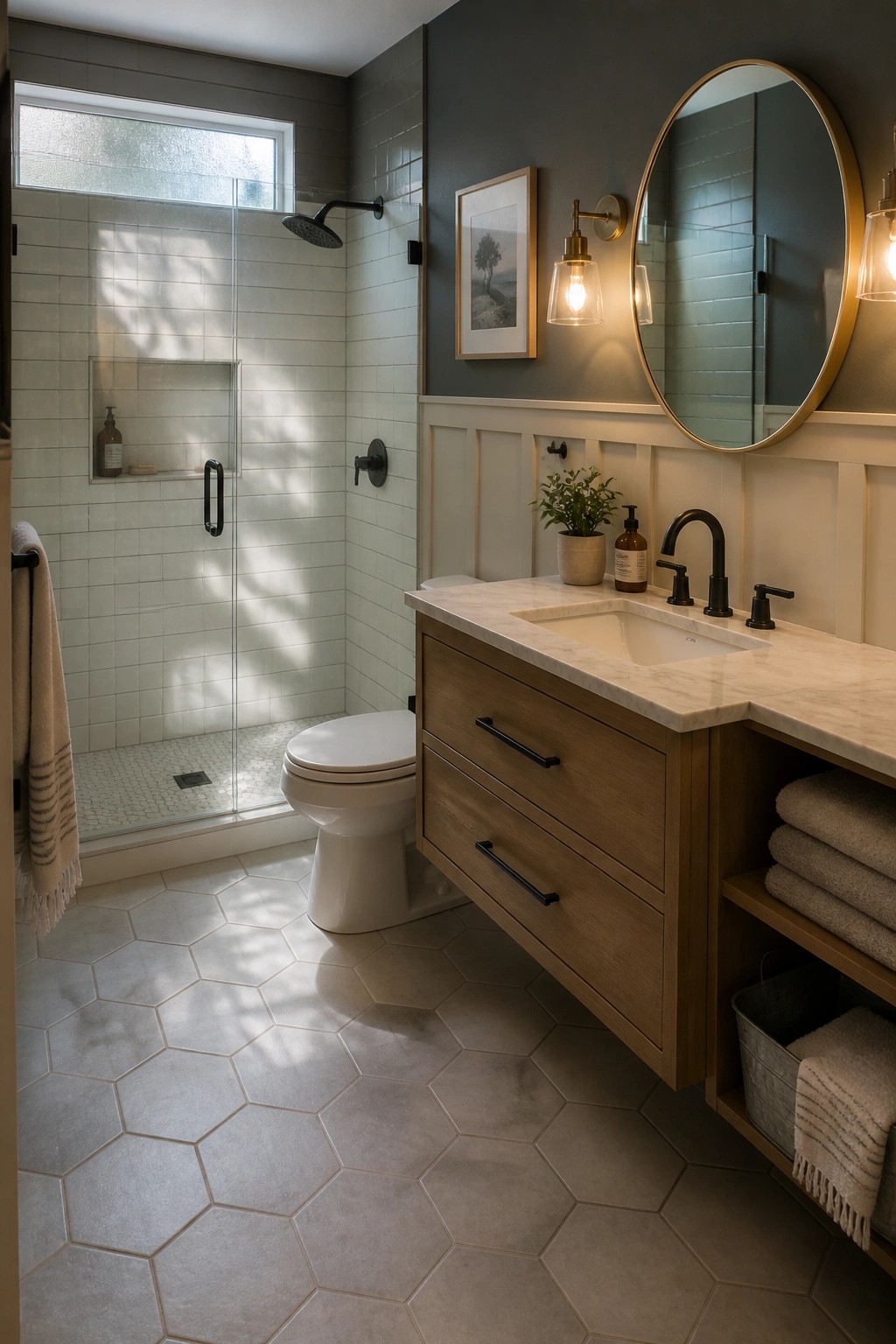
This combination gives a bathroom some weight without making it feel heavy. The darker color on the upper walls adds depth while the white wainscoting keeps the lower half light and familiar.
It works best in spaces that already have trim or beadboard. Stick with a deep gray or blue-gray paint so the contrast feels balanced rather than stark, and keep the trim crisp white to hold the look together.
Dark Paint Colors On Built-In Storage
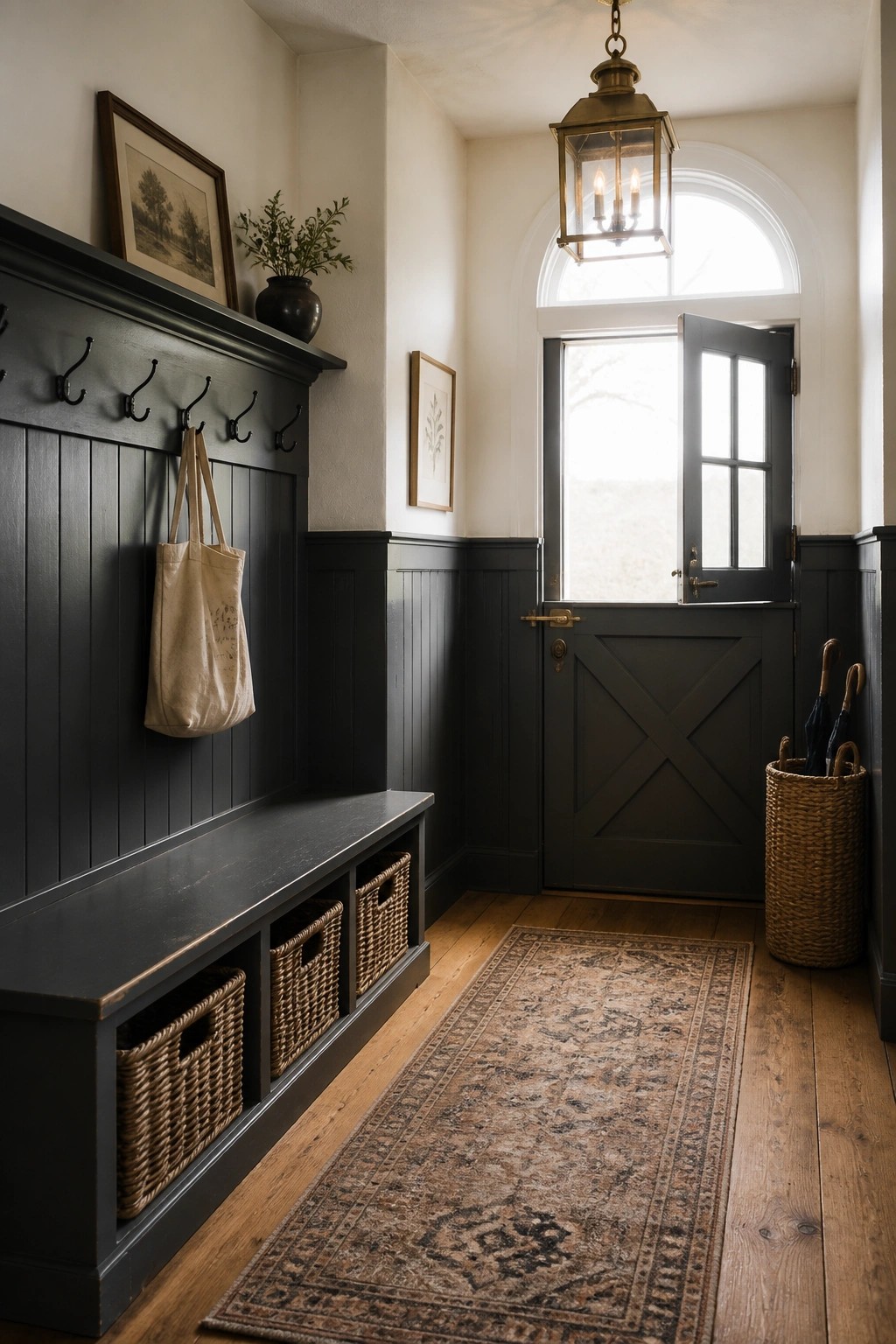
A deep paint color on built-in storage helps an entryway feel more grounded without making the whole space feel closed in. The contrast with lighter walls above keeps things balanced and lets the storage piece stand out as a practical focal point.
This approach works best in homes that already have some wood tones or natural textures. It suits smaller entry areas where you want storage to blend in rather than dominate, and it pairs especially well with simple hooks and baskets for everyday use.
Warm Neutrals On Workspace Walls
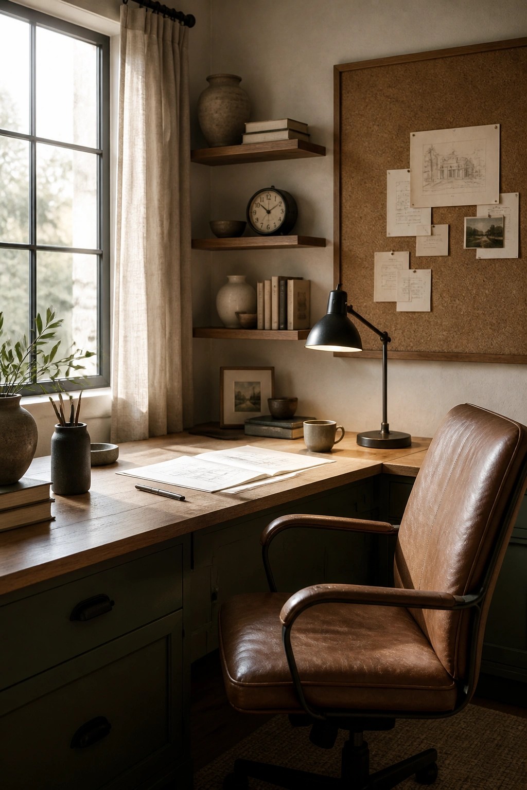
A soft neutral wall color works well in a home office because it lets the wood tones and leather pieces stand out without feeling heavy. This kind of shade keeps the room calm even when the desk is covered with papers and plans.
It suits older homes or farmhouses that need a bit of modern lightness while still feeling grounded. Try the same color on trim if you want the space to read as one quiet whole, but test it first on a large board since these tones shift with the light.
Combining Green And Charcoal On Cabinets
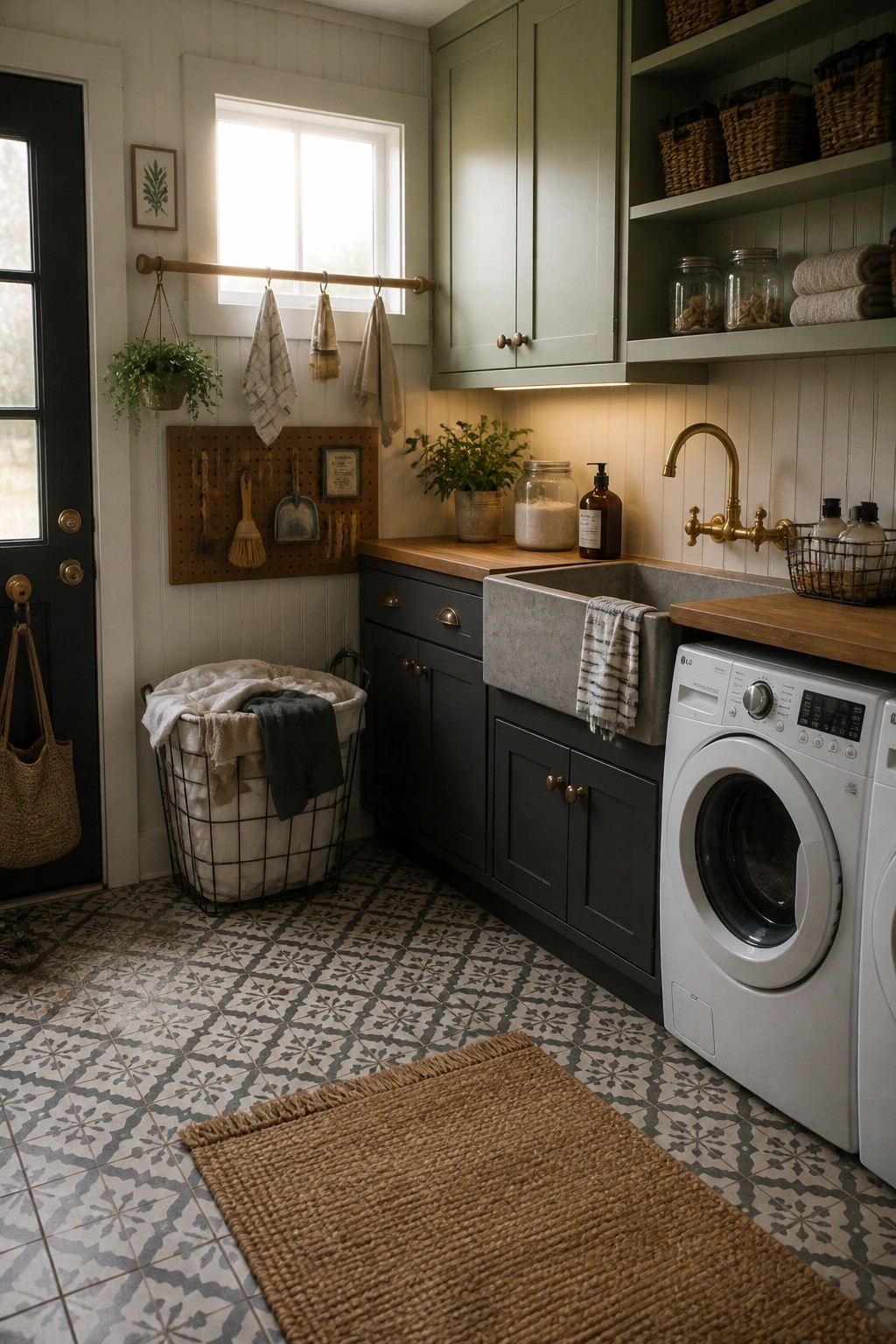
Using a soft green on the upper cabinets and a deeper charcoal on the lower ones gives a utility space more interest without making it feel busy. The contrast keeps the room practical while still looking pulled together.
This approach works best in laundry rooms or mudrooms where you already have wood counters and metal fixtures. Stick with a light wall color so the two cabinet shades can stand out clearly, and test both paints in the actual lighting before committing.
Deep Navy Paneling In The Bedroom
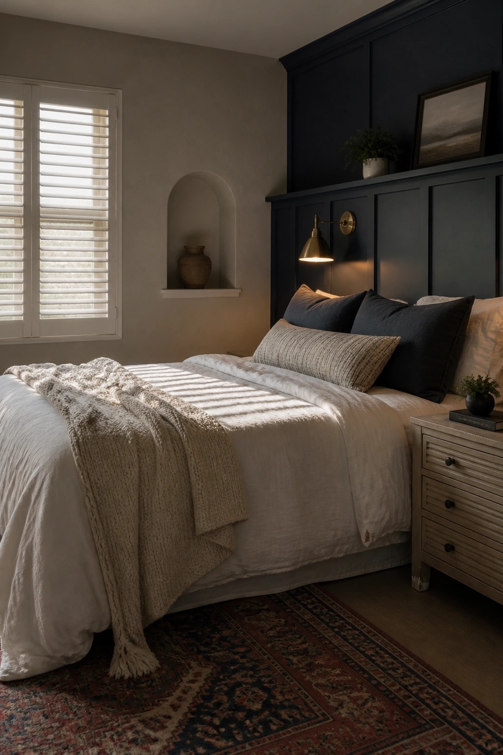
Painting traditional paneling a deep navy gives a bedroom a grounded feel without making the whole room dark. The color adds weight to one wall while the rest of the space stays light and simple with neutral bedding and walls.
This works best in farmhouse homes that already have wood trim or wainscoting. Keep other surfaces quiet so the painted paneling becomes the main feature instead of competing with too many colors or patterns.
Muted Green On Wainscoting
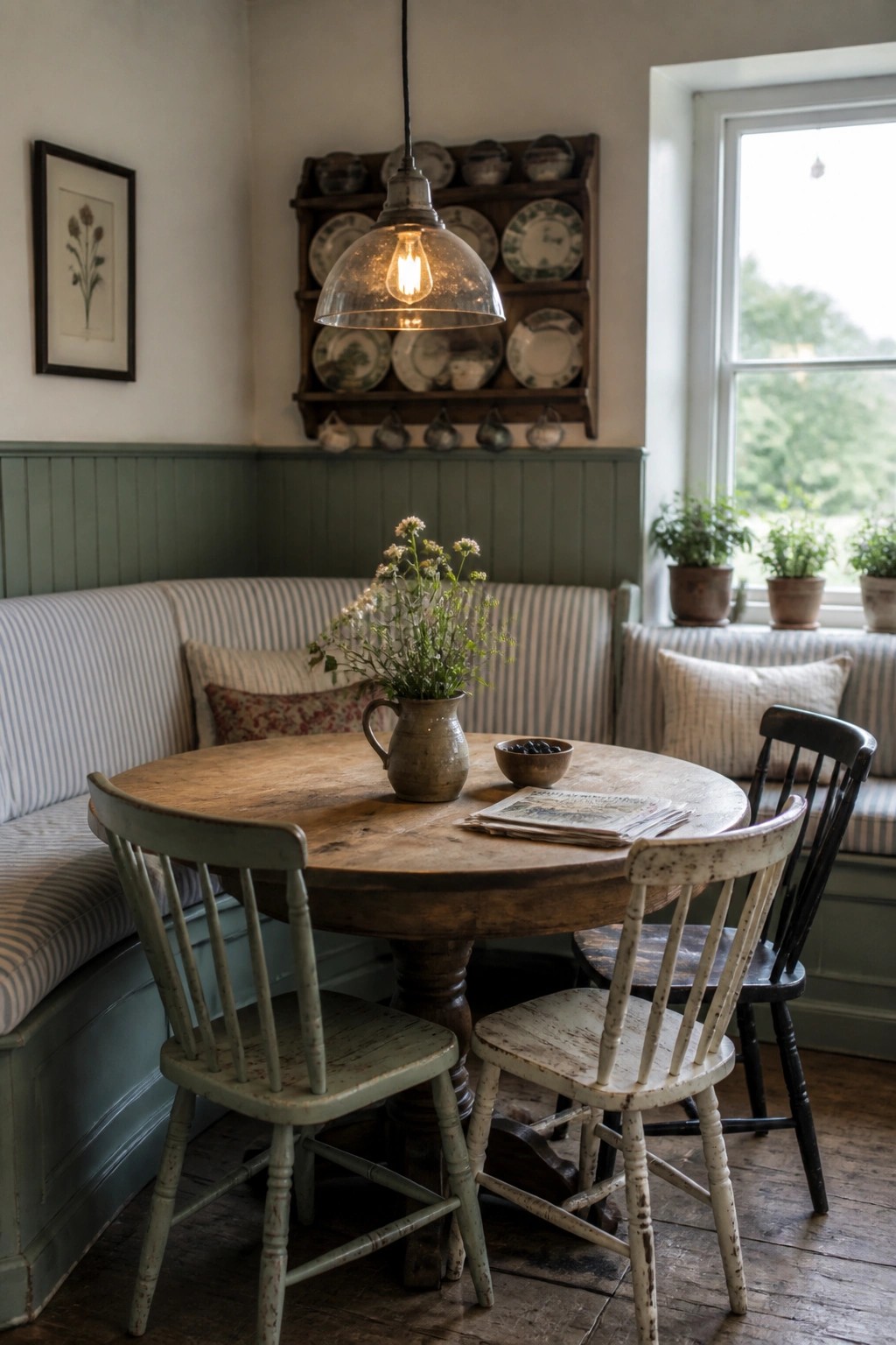
A soft green on the lower walls gives a room a calm base that works with older wood and simple furniture. It keeps the space feeling grounded while still letting the rustic pieces stand out.
This approach suits dining rooms or kitchens in homes that mix older details with newer updates. Keep the color muted so it blends rather than competes with the wood tones already in the room.
Soft Gray Built-Ins
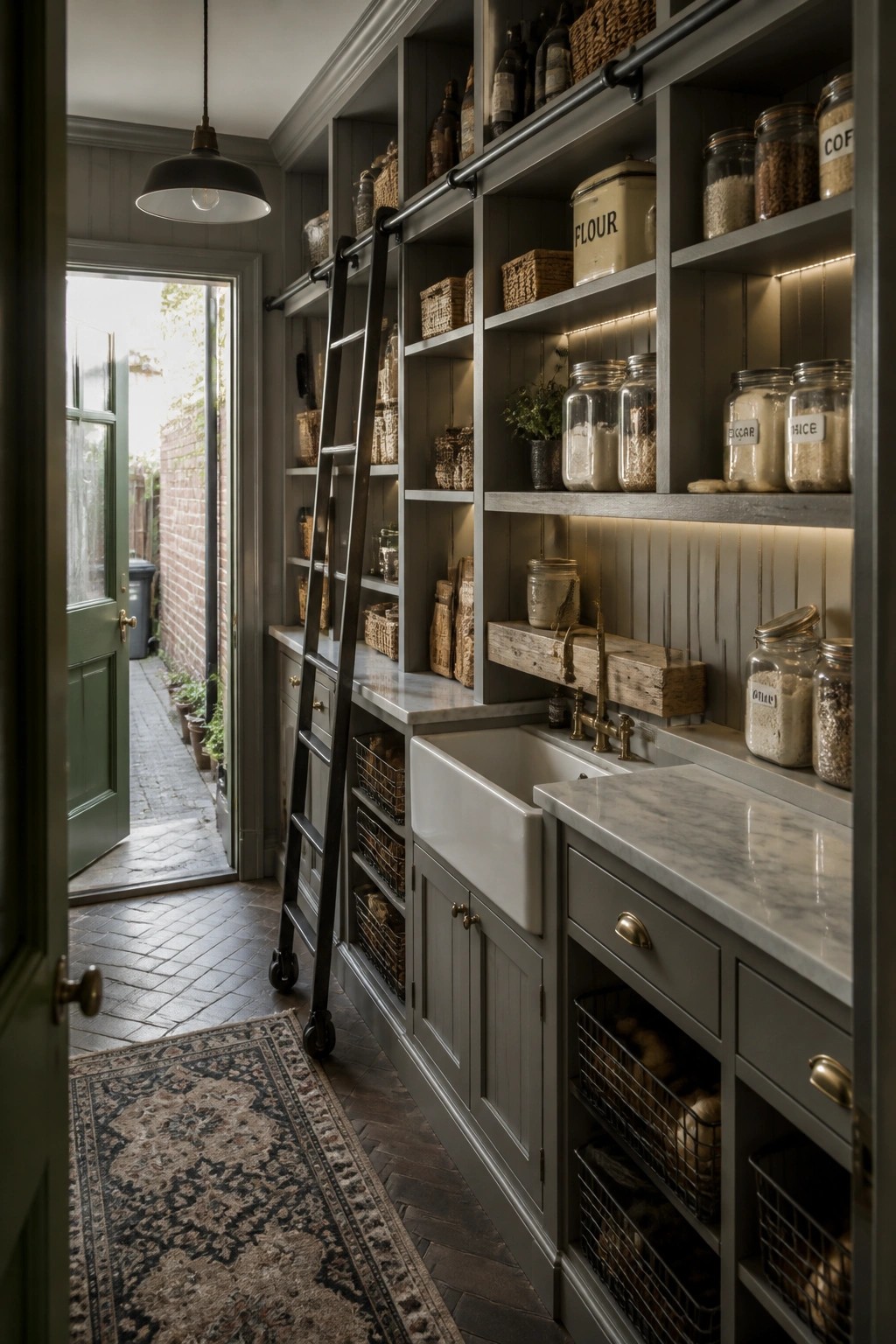
Painting all the built-ins in one soft gray keeps a busy storage space feeling calm and pulled together. The color lets the open shelves and lower cabinets read as one unit instead of a mix of separate pieces, which works especially well when you are blending older home details with newer storage needs.
This approach suits older homes that already have some wood tones or brick nearby. It gives you room for plenty of shelving without the space feeling heavy or overly rustic. Stick with a gray that has a touch of warmth so it does not fight with natural materials.
Dark Paint On Built-Ins
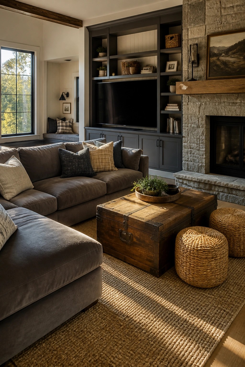
A deep paint color on built-ins gives the room weight and helps the storage feel like part of the architecture rather than something added later. The contrast with lighter walls keeps the space from looking flat while still letting the wood tones and stone around the fireplace read as warm.
This approach works best in rooms that get steady daylight so the dark finish does not close things in. Use it on cabinetry and open shelves together, and keep the surrounding walls in a soft neutral so the built-ins stand out without fighting the rest of the room.
Deep Wall Colors In The Bath
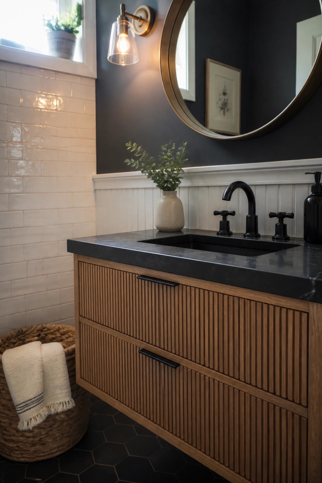
A deep wall color can give a bathroom more weight and character without much effort. In this space the dark paint grounds the white tile and wood vanity, so the room feels finished rather than plain. The contrast keeps things from looking too light and washed out.
This approach works best in rooms that already have some natural texture like wood or tile. Keep the trim and ceiling light so the dark color stays the main feature and does not close the space in too much.
Warm Neutral Paint In Wood Heavy Closets
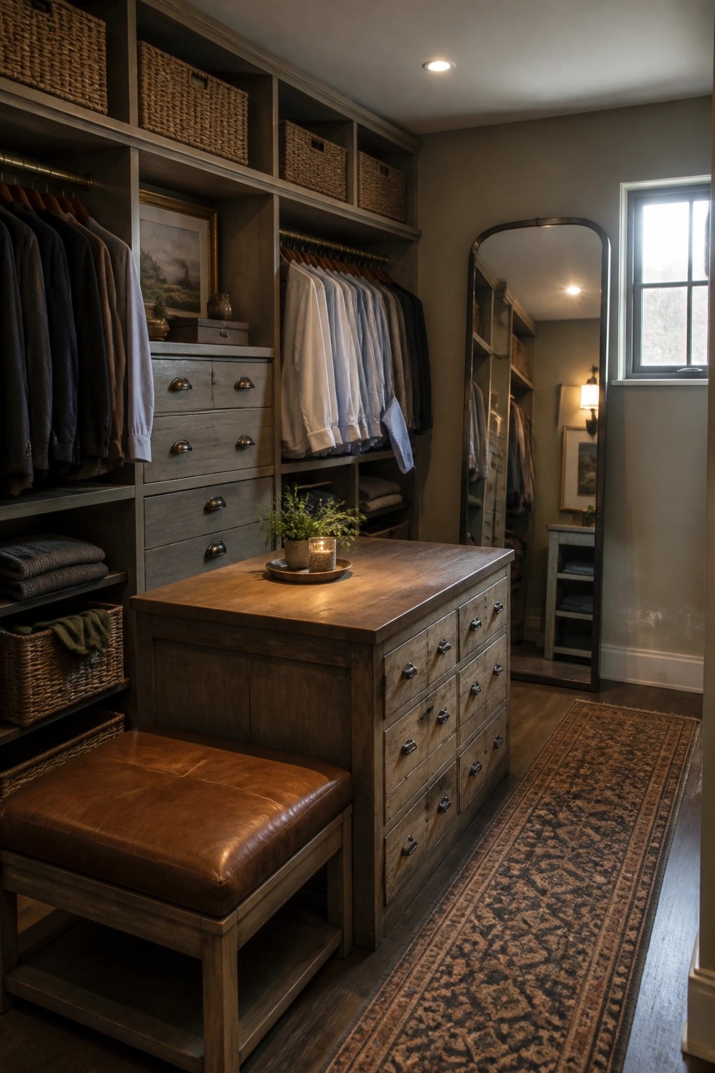
A soft warm gray on the walls helps tie together different wood tones and built-in storage without making the space feel too heavy. It keeps the focus on the natural finishes while still giving the room a calm, put-together look that works for everyday use.
This approach suits homes that already have a mix of old and new wood pieces. Stick with one wall color throughout the closet rather than adding extra trim details, and test the paint in both natural and artificial light before committing.
Terracotta Paint In Utility Rooms
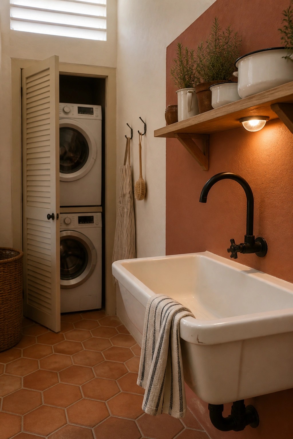
A warm terracotta wall gives a laundry space real character without much effort. The color brings depth to what is usually a plain work area and pairs easily with white fixtures and simple wood shelves.
This shade works best in rooms with natural textures like terracotta tile or open storage. It suits older homes or newer builds that want a touch of rustic warmth while staying practical.
Soft Green Walls For A Calm Backdrop
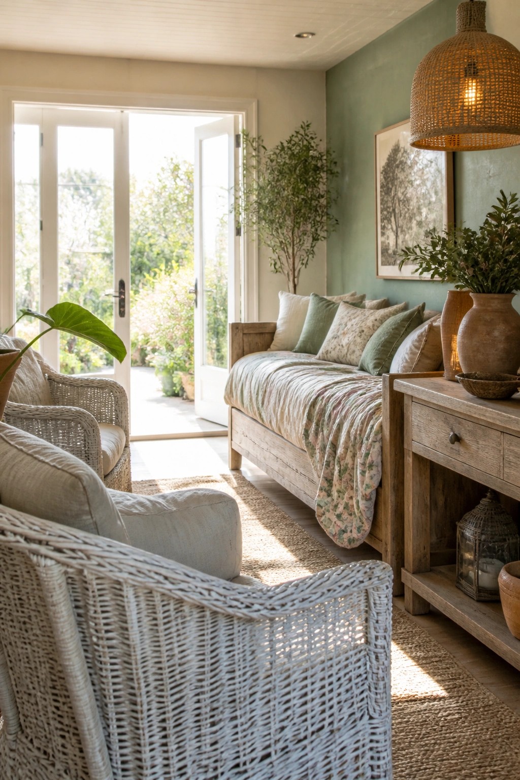
A soft sage green works well when you want a color that feels fresh but still grounded. It pairs easily with wood tones and natural textures, so older pieces and simpler furniture sit together without clashing.
This shade suits rooms that get steady daylight and spaces where you want the walls to stay in the background. Keep the trim light and let the wood and fabrics carry the warmth.
Dark Painted Cabinets In A Farmhouse Kitchen
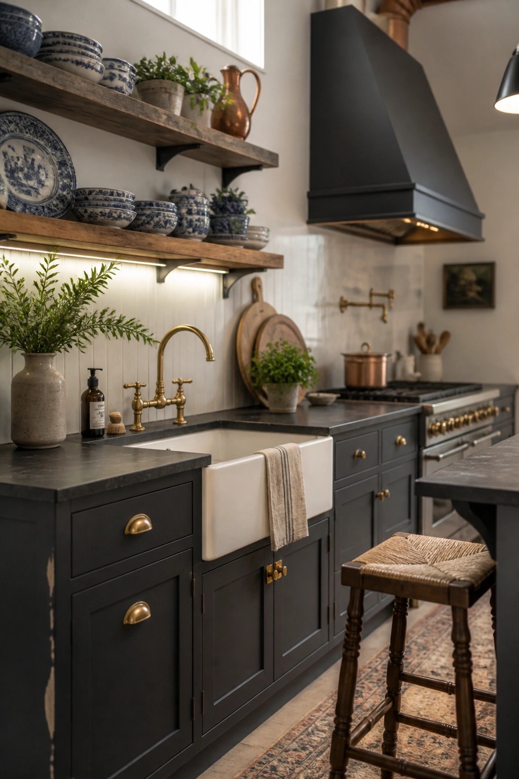
A deep charcoal or near-black paint on cabinets can give a kitchen real presence. It keeps the room from feeling too light and airy while still working with classic farmhouse pieces like a white sink and open wood shelves.
This color choice suits homes that want a bit more contrast without going fully modern. It works best when paired with brass or aged hardware and simple white walls so the cabinets stand out without overpowering the space.
Green Paint For Mudroom Cabinets
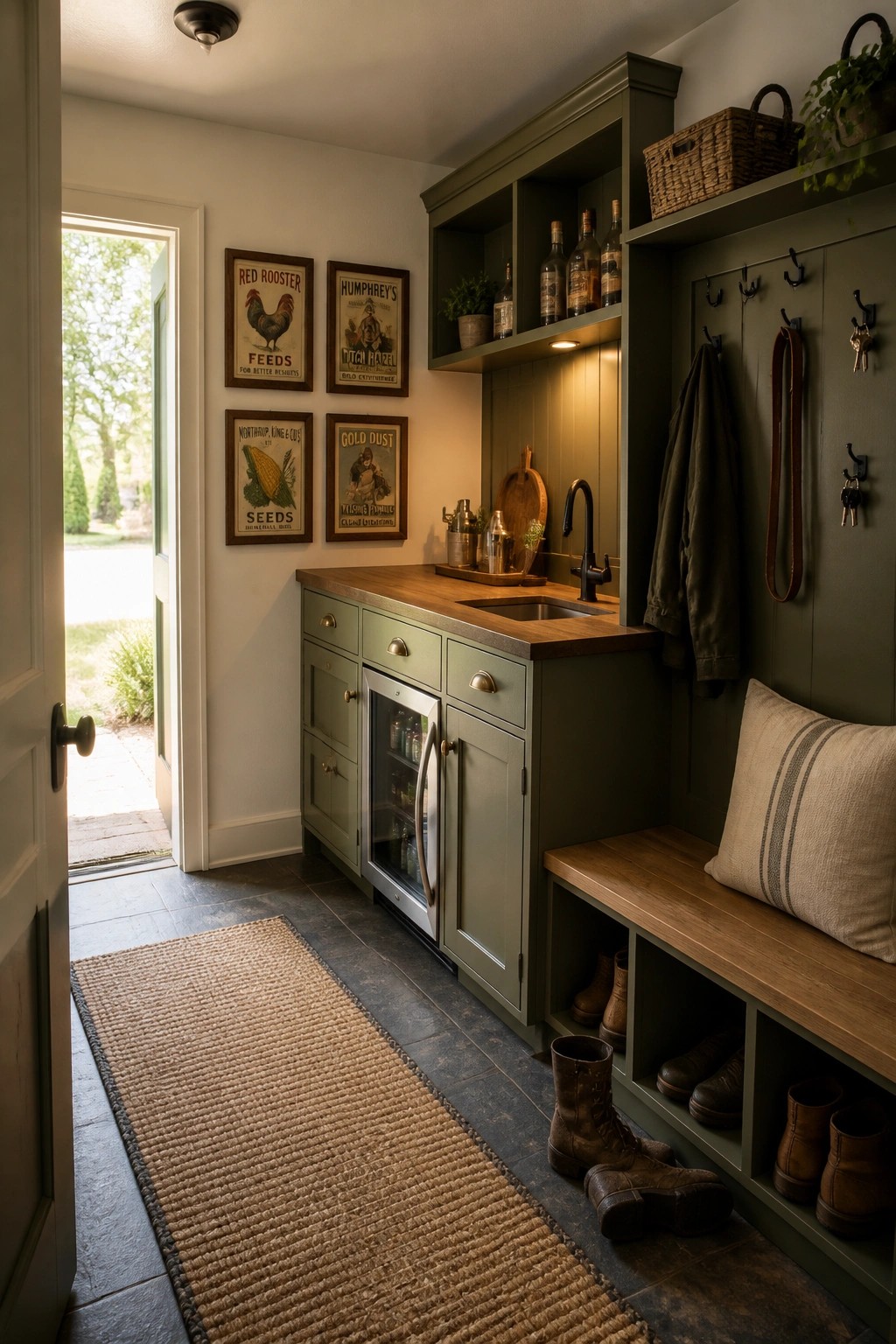
A soft green on the cabinets gives this kind of entry space a calm, practical feel without looking too polished. The color works well on built-ins because it hides everyday wear while still adding some warmth to a room that often gets heavy use.
This approach suits homes that need real storage near the door. Keep the wood tones simple on the counter and bench, and the green will hold the whole area together without extra effort.
Blue Gray Cabinets For A Balanced Farmhouse Kitchen
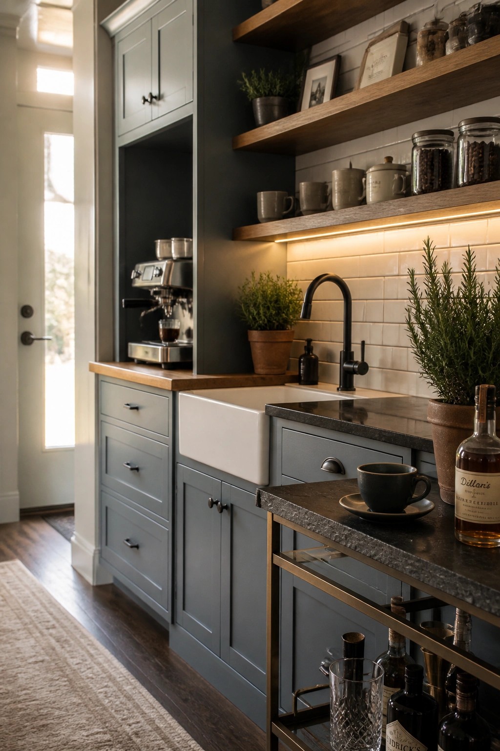
A soft blue gray on kitchen cabinets gives a room that quiet mix of old and new many people want in a farmhouse space. It feels calmer than a plain white or cream but still keeps the warmth that comes from wood counters and open shelves.
This shade works best when the rest of the room has some contrast, like a darker wall behind or a few black fixtures. It suits homes that already have mixed wood tones and simple tile, and it holds up well even when the kitchen gets a lot of daily use.
Frequently Asked Questions
Q: How do I test these colors without wasting time and paint? A: Grab a few sample pots and paint big swatches on foam board instead of the wall. Move the boards around the room at different times of day so you see how each shade plays off your floors and trim. This shows the real blend fast.
Q: What happens if my kitchen has both old beams and new stainless appliances? A: Pick a soft greige or warm taupe from the list and roll it on the walls first. The color ties the wood tones to the metal without leaning too far either way. Then add your accents last so nothing fights.
Q: Do lighter shades still give that rustic warmth in a north-facing room? A: Yes, but choose ones with a touch of yellow or clay undertone rather than pure cool grays. They pick up what little sun comes in and keep the space from feeling flat. One coat of a creamy white on the ceiling helps bounce light around too.
