

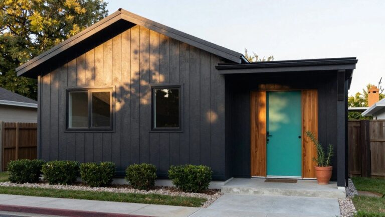
I’ve driven past enough neighborhood homes to know that the right exterior paint color grabs you first from the curb, tying together the siding, roofline, and front entry in ways that feel just right.
It changes how the whole facade reads under different lights, especially when paired with brick or wood that has its own patina.
I remember testing a soft gray on our house trim one summer, and it suddenly made the brick base look warmer and more grounded against the yard.
Colors like these hold up to weather and time, unlike the ones that fade into blandness after a season.
A few in this set are the kind worth sampling on your own place before committing.
Dark Siding with a Teal Front Door
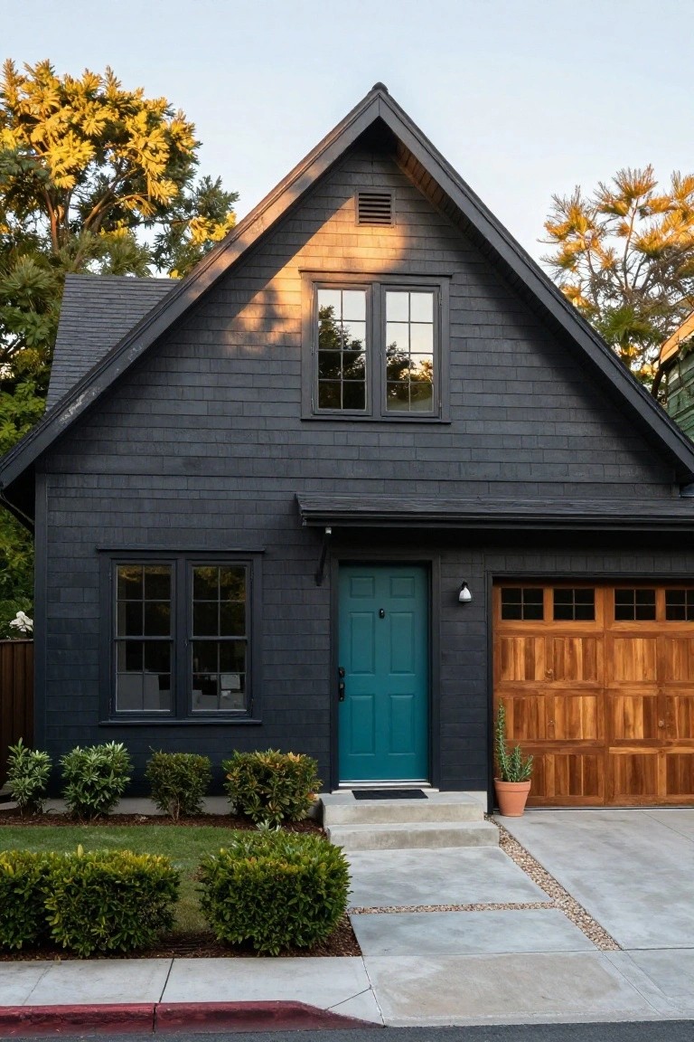
A deep charcoal siding like this sets a strong, moody base for the house. Then that teal door pops right out. It pulls your eye straight to the entry and gives the whole front a bit of life without overdoing it. The wood garage door nearby keeps things from feeling too cold.
This works great on homes with simple shapes or craftsman lines. Pick a teal that’s not too bright, maybe with some gray in it to match the siding. It suits neighborhoods with a mix of old and new houses. Just make sure the door hardware stands out a little.
Recommended Products

Ready to use, pre-mixed door and trim paint offers a fresh new look on interior or exterior metal, wood and fiberglass

Outer shell of 100% nylon satin Lined with 100% polyester brushed tricot

Use for a variety of indoor and outdoor project surfaces including wood, metal, plaster, masonry or unglazed ceramic
Crisp White with Navy Trim
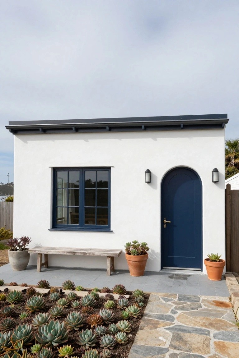
A simple white exterior like this one gets a real lift from navy blue on the door and window frames. The white keeps everything looking clean and bright, almost like it’s reflecting the coastal light. That deep navy pulls your eye right to the entry without much fuss. It’s a combo that feels modern but not cold.
You can pull this off on smaller homes or additions, especially where you want some punch up front. Go for a smooth stucco or plaster in bright white, then hit the door, trim, and maybe shutters in a true navy. It suits sunny spots best, pairs easy with plants or stone paths. Just stick to one strong blue shade to keep it from getting busy.
Warm Gray Siding for a Fresh Look
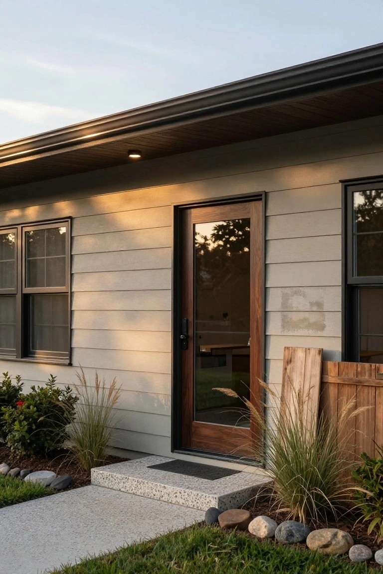
A soft warm gray like this on the siding gives a house that clean modern feel without going too cold or trendy. It picks up the light just right, especially in the evening glow, and lets the walnut door and black windows stand out nicely. Houses with this color often look bigger and more pulled together right from the street.
You can pull this off on ranch styles or simple two-stories, especially where there’s good sun. Just make sure to use a quality paint that holds color over years, and pair it with wood tones for balance. Steer clear if your area gets heavy shade. It might wash out.
Sage Green Shiplap Siding
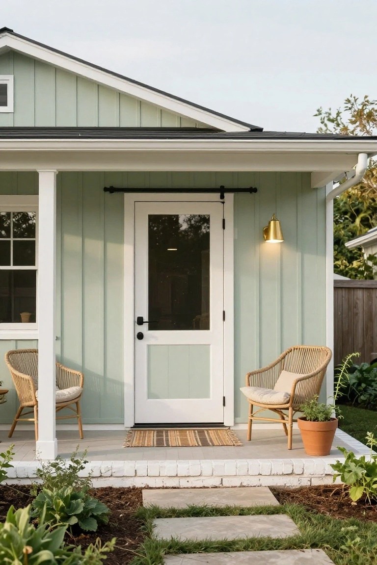
That soft sage green paint on shiplap siding gives the whole front a calm, updated look. It’s not too bright but still fresh enough to stand out from plain white or beige houses. The vertical boards add some texture that makes the color pop without much effort.
This works best on simpler homes like bungalows or modern farmhouses where you want subtle curb appeal. Pair it with white trim around the windows and porch. Skip busy details… just a few plants nearby keep it easy to pull off.
Navy Blue Siding with Orange Door
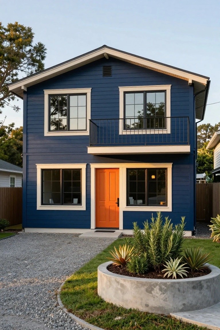
A deep navy blue on the siding makes this house stand out right away. White trim outlines the windows and roof, keeping the look clean. Then the orange front door pulls your eye straight to the entrance. It’s a simple way to mix bold colors that feel fresh but not fussy.
This setup suits Craftsman-style homes or anything with straightforward lines. It pops in neighborhoods with lots of neutrals. Pick a true navy, not too gray, and test the door shade in sunlight first. Works best where you want curb appeal without big changes.
Terracotta Stucco Walls
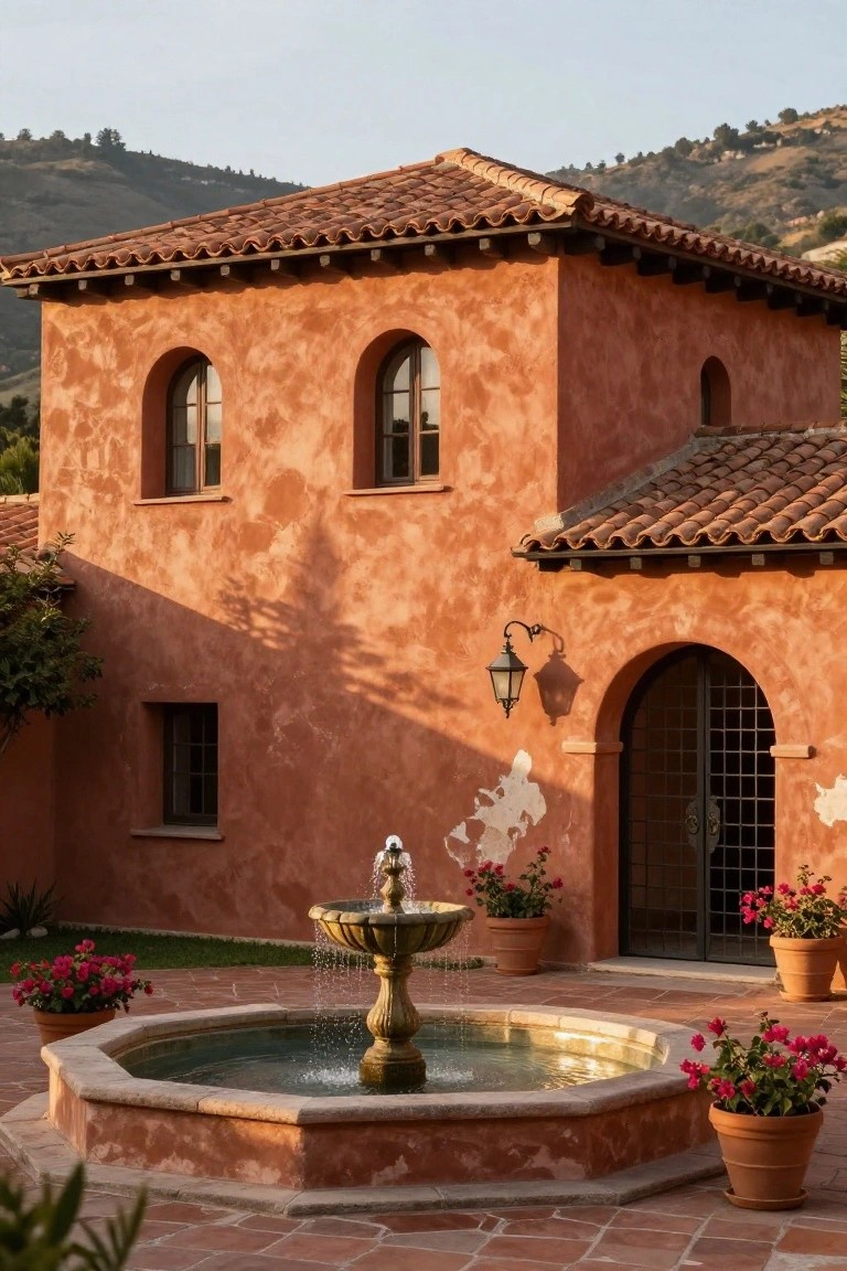
Terracotta stucco walls bring a warm, earthy glow to a home’s exterior. That soft orange shade picks up the sun nicely and ties into tile roofs or stone accents without much fuss. It gives the whole place a relaxed, lived-in look that’s hard to beat.
Try this on ranch-style homes or anything with a bit of Spanish influence. It suits sunny spots best, where the color really pops against green plants or blue skies. Keep windows and doors simple so the walls stay the star.
Sage Green Vertical Siding
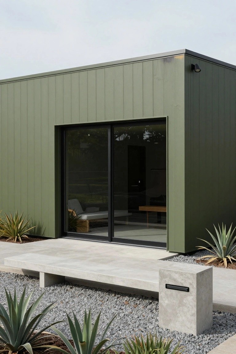
A soft sage green paint on vertical siding like this turns a simple boxy house into something that blends right with nature. It keeps the modern lines crisp but adds a bit of warmth that straight gray or white can’t match. You see it here pulling in the outdoor plants without trying too hard.
This color works best on homes with clean geometry, like mid-century styles or new builds in sunny spots. Use it on board-and-batten or shiplap panels for texture, and keep hardscape neutral with concrete benches or gravel. Skip it on super traditional houses, where it might feel out of place.
Pale Blue Exterior Paint
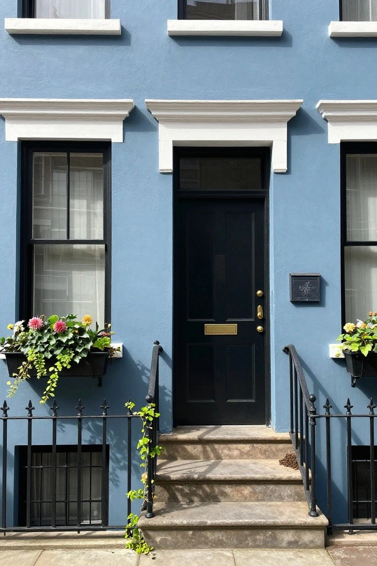
A soft pale blue like this can really wake up a traditional townhouse. It keeps the classic lines but adds a fresh coastal feel without going overboard. Notice how the black door and white trim stand out clean against it. Flower boxes bring in some color too. It’s simple but changes the whole look from the street.
This shade suits older urban homes or row houses best, especially where you want subtle curb appeal. Test it on a sunny wall first since it shifts with light. Works on brick or plaster. Skip it for super modern builds, though. Just add greenery nearby to soften things up.
Gray Brick Facades with Wood Accents
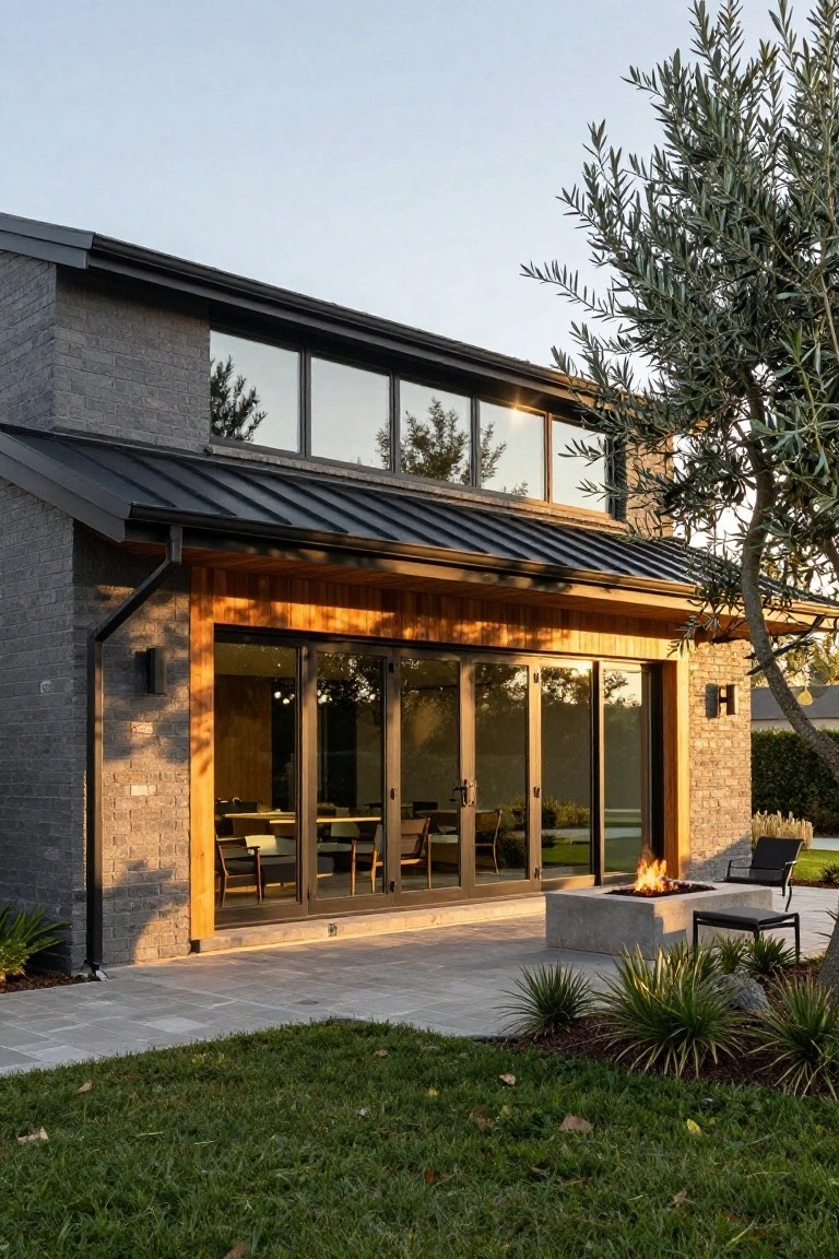
Gray brick gives a house that clean, modern base. It’s a cool tone that feels solid without being too stark. What makes it better here is the warm wood beams framing the patio doors. They pull in some natural warmth right where you need it, around the outdoor space.
This setup works well on ranch-style or contemporary homes in suburban yards. Paint or stain the brick in a medium slate gray, then use cedar or similar wood for those accents. Skip it if your lot is super shady, wood shows dirt faster there. Add black trim or roofing to keep things sharp.
Black Paint for a Sleek Facade
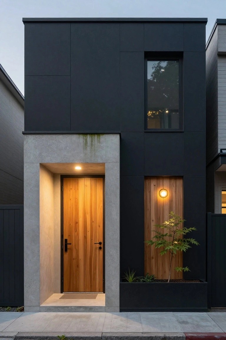
A deep black paint covers most of this house’s exterior walls. It sets a strong modern tone right away. Paired with a simple wood door and concrete entry, the look stays clean without extra fuss.
This color works best on boxy or narrow homes like this one. It hides dirt well and boosts curb appeal in city neighborhoods. Go for a matte finish to avoid glare, and add warm wood accents to keep it from feeling too cold.
Red Front Door on Pale Siding
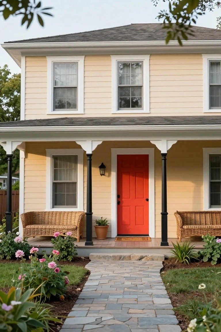
A pale yellow siding sets a gentle backdrop for any house. That bright red door changes everything though. It draws attention to the entry and gives the front real personality. The black porch columns help frame it nicely without stealing the show.
This works great on classic homes like bungalows or cottages. Go for a clean red paint that matches the door hardware. Light beiges or off-whites pair best underneath. Skip it if your siding is already dark… the contrast won’t pop the same way.
Light Taupe Siding
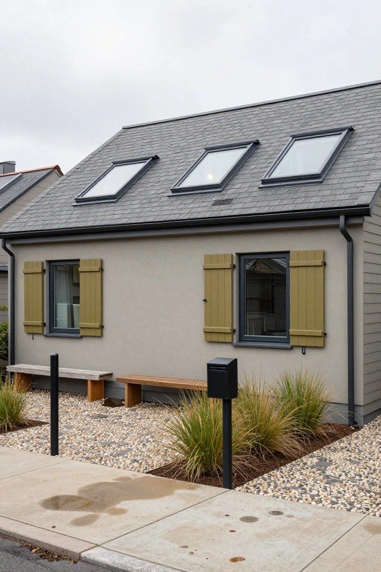
A light taupe paint on the exterior walls brings a quiet warmth to this modern house. It’s not stark white or harsh gray. Instead, it sits easy between the two, blending right into the gravel yard and nearby grasses. That dark slate roof up top adds just enough weight without overpowering things.
This color works best on homes with simple lines, like bungalows or low-slung designs. Use it where you want curb appeal that doesn’t shout. Keep accents simple too, maybe green shutters or black window frames. Avoid busier neighborhoods, though. It shines more in spots with some nature around.
Warm Beige on Textured Walls
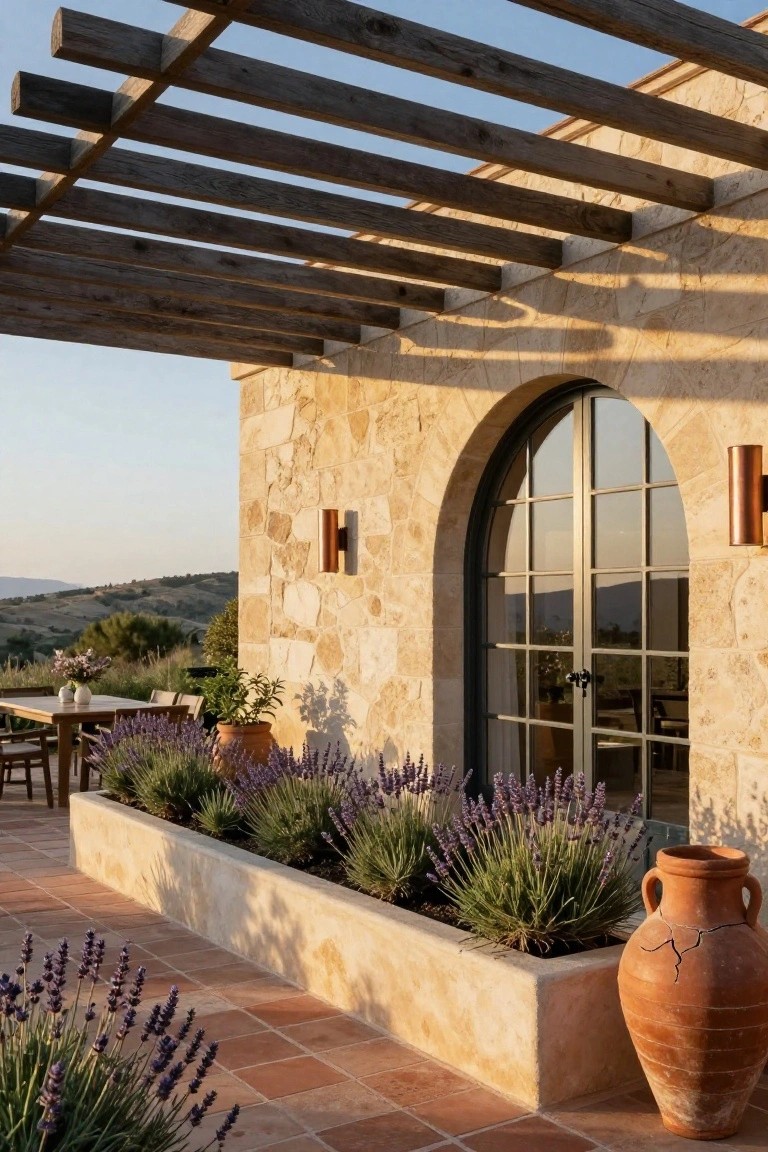
Warm beige paint like this shows up a lot on homes with a bit of texture, kind of like rough stucco or light stone. It pulls the house right into the landscape without trying too hard. You see it here on walls next to lavender plants and terracotta tiles. That color keeps things calm and ties the built parts to the plants and sunset light.
This shade works best on homes in dry or hilly areas, maybe with tile roofs or simple arches. Go for it if your place has some natural stone accents already. Just test a few samples first since it can shift with the sun. Avoid it on super modern flat facades where it might look too plain.
Bold Red Exterior Paint
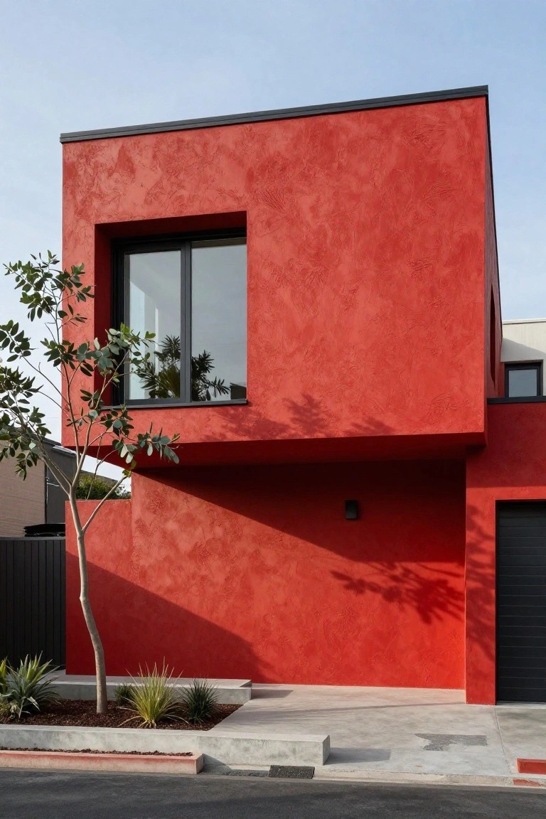
A deep red paint like this turns a plain modern box into something that really stands out. The textured stucco catches the light just right, giving the wall some natural variation without much fuss. Black trim around the windows and garage door keeps everything sharp and grounded.
This color works best on homes with simple shapes and flat roofs. It suits warmer climates where the sun plays off it nicely. One thing to watch… it might feel too strong next to softer neighbors, so test a sample first.
Light Stucco Walls with Warm Wood
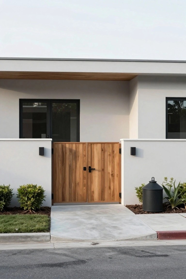
A light stucco paint like this one covers the main walls and keeps the whole front of the house feeling fresh and open. The color is neutral enough to blend with the outdoors but sets off the wooden gate and overhang nicely. That wood brings in some natural warmth without overwhelming the clean lines.
You can pull this off on ranch-style homes or any simple modern build facing the street. Stick to black frames on windows and lights for contrast. Just make sure the wood is sealed well since it sits right out front.
Soft Pink Shingles for Cottage Charm
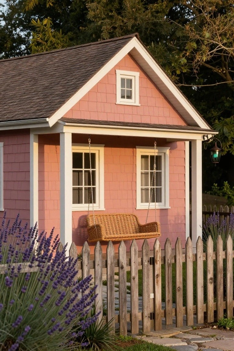
A soft pink paint on shingle siding like this turns a plain little house into something cozy and noticeable from the street. It picks up the warmth of sunset light without being too bold. The white trim keeps things crisp, and that porch swing adds a lived-in feel right away.
This color works best on smaller homes with gabled roofs or porches, especially in garden settings. Go for a muted blush shade that plays nice with green plants or wood fences. It suits older neighborhoods or country spots. One thing, test it in different lights first, since pink can shift a bit.
Deep Green Shingle Siding
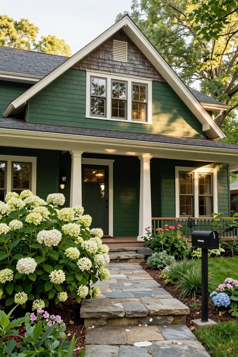
A deep green paint like this on shingle siding brings out the best in older homes. It nestles the house into its yard nicely, especially with trees around. The white trim and porch columns stand out clean against it, and that dark door adds some weight up front.
This color suits Craftsman bungalows or any traditional facade. Go for a shade with some blue undertones to keep it from going brassy in the sun. Test samples on different sides of the house first, since light changes everything.
Soft Gray Walls with Wood Accents
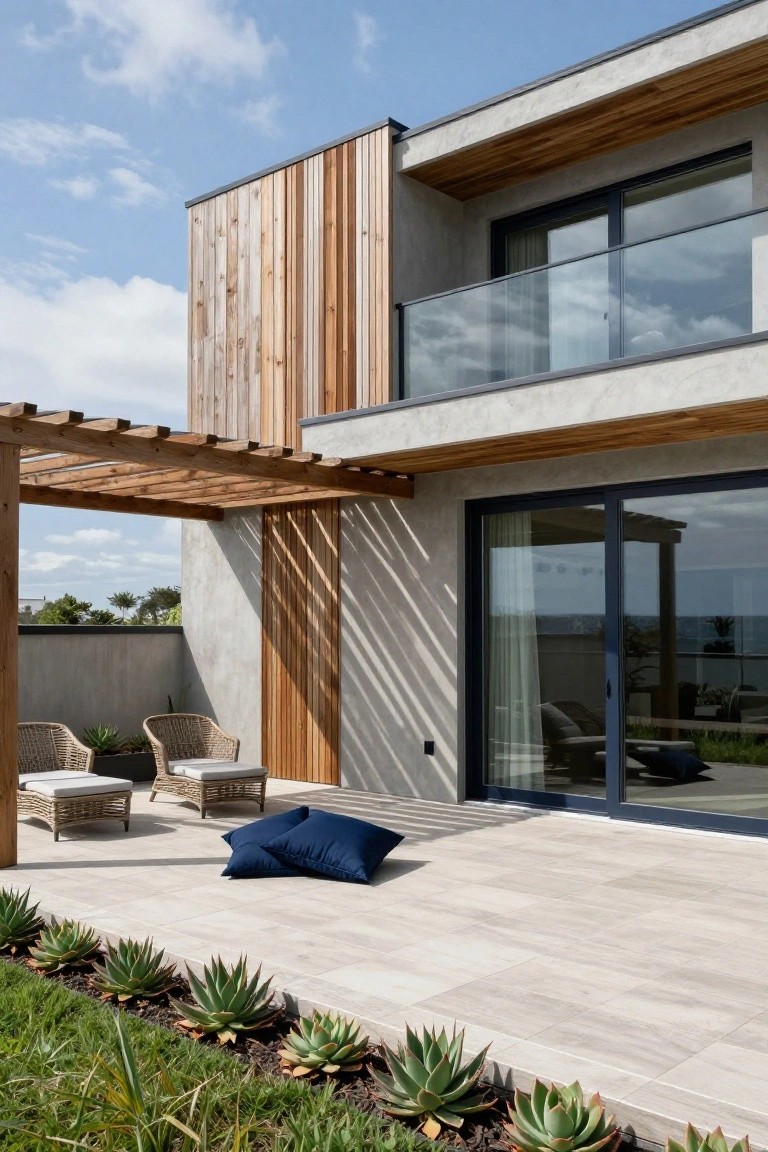
A light gray wall color like this one gives a modern house a clean, solid base. It lets the vertical wood panels pop without overwhelming the look. That wood adds just enough warmth to keep things from feeling too stark, especially against black window frames and glass. It’s a simple combo that works well in sunny spots.
Try this on homes with flat or simple lines, like mid-century updates or new builds. Paint the main walls in a soft gray with low sheen to mimic concrete texture, then add wood cladding on one side for interest. It suits coastal or urban settings best. Skip it if your house has busy trim, though, or it might blend too much.
Matte Grey Siding for Modern Curb Appeal
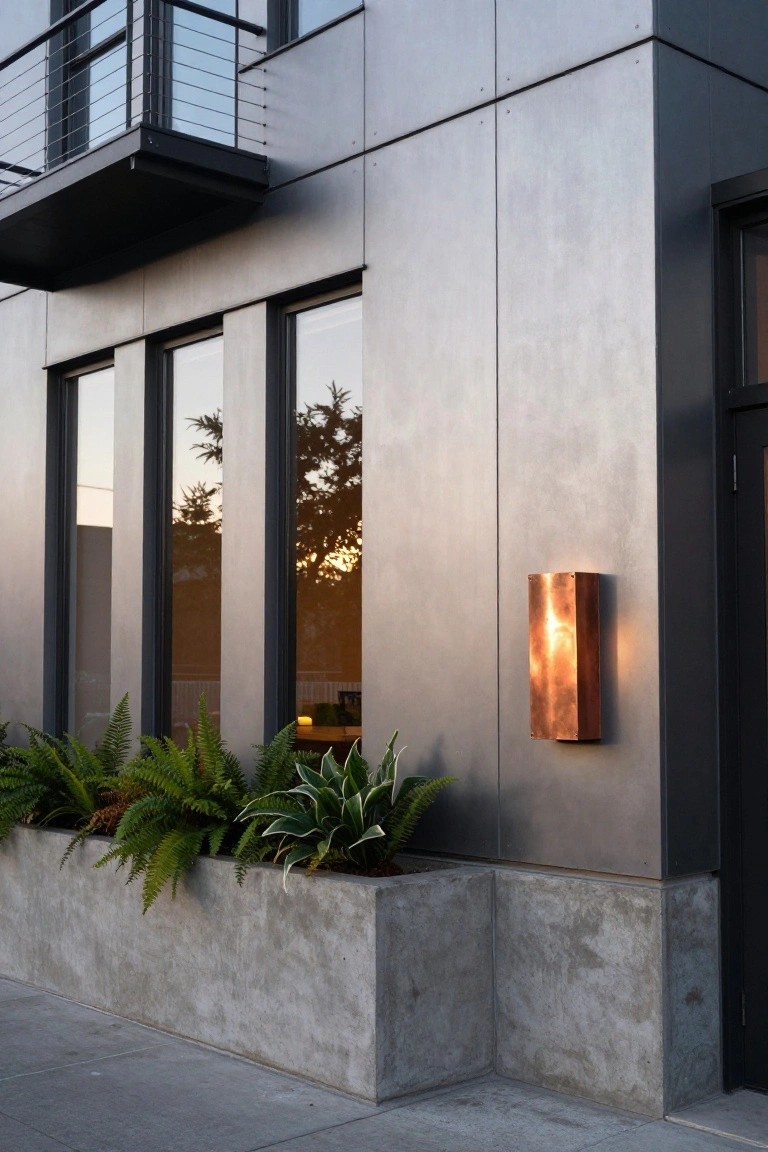
Matte grey siding like this shows up on a lot of newer homes. It gives the whole facade a clean, industrial edge that feels current but not fussy. Here, the vertical panels catch the light just right, and that copper wall light nearby pulls in a bit of warmth to keep things from going too cold.
Paint your exterior walls or siding in a similar soft grey if you have a boxy or flat-roofed house. It pairs well with black window frames and simple planters full of ferns or other greens. Skip it on super traditional homes, though. This works best where you want easy upkeep and a neighborhood standout without much effort.
Soft Sage Green House Paint
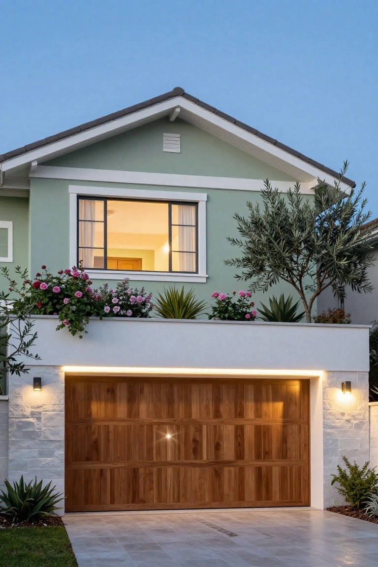
A soft sage green like this brings a fresh, calm feel to a house exterior without going bold. It works nicely against white trim and warmer wood elements, like the garage door here. That subtle green tone softens the look of stucco or siding, making the home feel more approachable and tied to nature.
You’ll want to use it on homes with simple rooflines and clean architecture, especially in warmer climates or suburbs. Test a sample first, since it shifts with light. Add some greenery nearby to echo the color, and it pulls everything together nicely.
Charcoal Black Siding
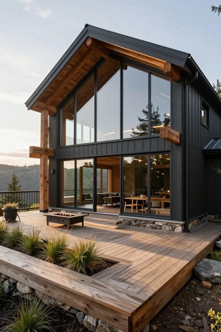
Charcoal black siding gives this house a bold, modern look that stands out against the woods. The dark paint on the vertical boards makes the natural wood beams pop, and those big glass windows let in plenty of light. It’s a simple way to make a home feel current without going overboard.
This color works best on homes with some wood details already, like cabins or A-frame styles in wooded spots. Pair it with warm timber accents and a matching deck to keep things balanced. Just make sure the trim stays light so the black doesn’t swallow the whole place.
Frequently Asked Questions
Q: How do I test these colors on my actual house before painting everything?
A: Buy sample pints of your top picks and slap large patches on the siding or trim. Check them morning, noon, and evening as the sun shifts. You’ll spot the real deal that way.
Q: My home has brick accents. Will these modern colors clash?
A: Focus on painting the non-brick parts like doors, shutters, or garage. The brick grounds the fresh color nicely. It updates the whole vibe without a full redo.
Q: Should I paint the trim the same shade as the main body?
A: Go for contrast instead. Pair a soft gray body with bright white trim, and it sharpens everything up.
Q: What if my yard is shady? Do light colors still work?
A: Light shades bounce whatever light you get and keep things airy. Darker ones can feel heavy there. Test a sample first… shady spots fool the eye.
