

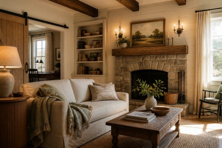
I have noticed that paint choices in a rustic farmhouse often determine whether a house feels like one continuous space or a series of mismatched rooms.
Some colors hold their warmth through morning light in the kitchen yet shift cooler in the hallways by afternoon.
Testing a few samples in place always shows me more than any swatch book can.
The tones that work best seem to balance softness with enough depth to hide everyday wear.
I usually start by checking how a color behaves on the largest wall first before committing across the rest of the house.
Soft White Paint That Highlights Stone And Wood
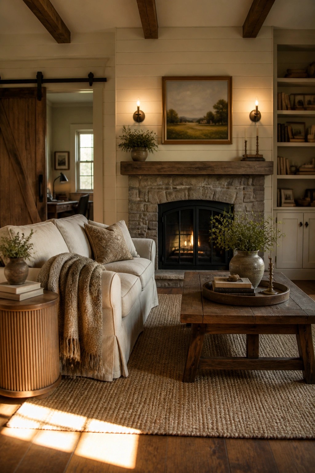
A soft white on the walls keeps a room feeling open while letting the stone fireplace and wood beams do the talking. The light color bounces what little daylight comes in and stops the heavier materials from taking over.
This works best in living rooms that already have natural textures like shiplap or a wood mantel. Pick a warm off-white rather than a cool one so the space stays cozy instead of stark.
Green Cabinets For A Cozy Kitchen
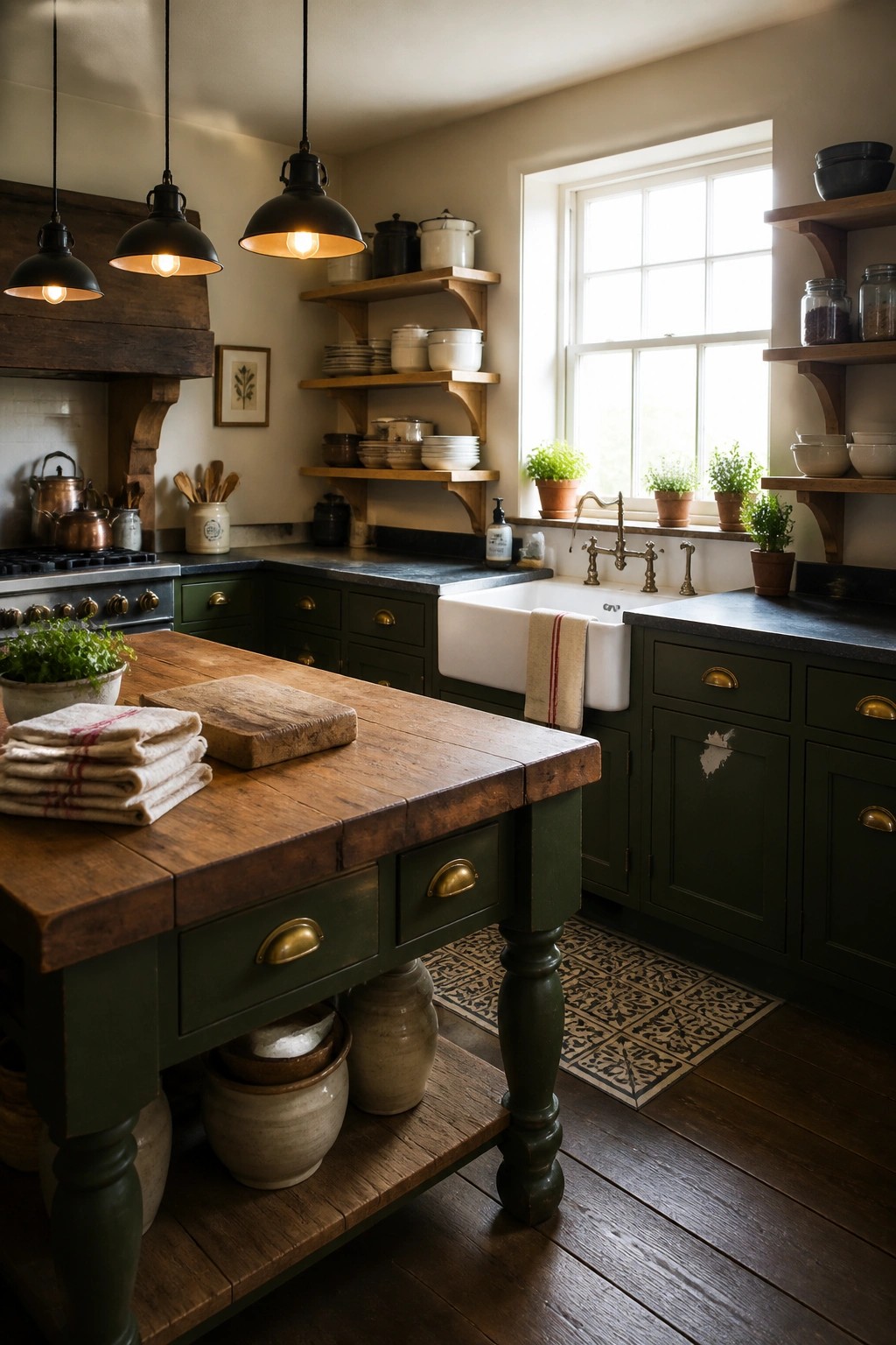
Deep green cabinets give a kitchen that settled, lived-in feeling many people want in a rustic farmhouse. The color feels rich without being heavy, and it holds its own next to wood tones and simple finishes.
Use this shade on lower cabinets or the whole run if the room gets decent light. It works best in homes that already lean on natural materials, but keep the walls light so the green does not close the space in.
Deep Red Walls For A Cozy Dining Space
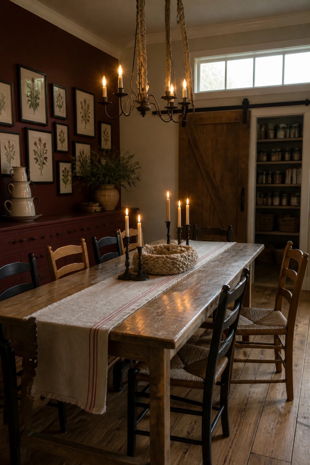
A deep red wall color brings real warmth to a dining room and makes the space feel more intimate. It works especially well when the room already has plenty of wood tones and simple furnishings that keep the look grounded.
This shade suits older homes or any space meant for long meals and evening gatherings. Keep the trim and ceiling light so the color stays inviting instead of closing the room in.
Soft Blue Gray Walls For A Cozy Bedroom
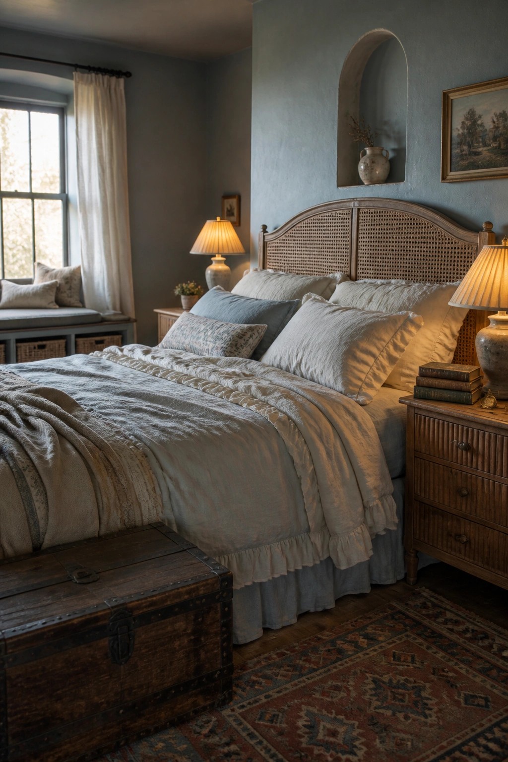
A soft blue gray paint color gives a bedroom that calm feeling without making the space feel cold. It works especially well in rustic farmhouse homes because it lets the wood tones and layered linens stand out while still keeping the room relaxed.
This shade suits spaces that get good natural light so the color stays gentle throughout the day. Use it on all four walls if you want a quiet retreat, or try it behind the bed only if the room already has strong wood details.
Soft Green Cabinet Paint For Cozy Bathrooms
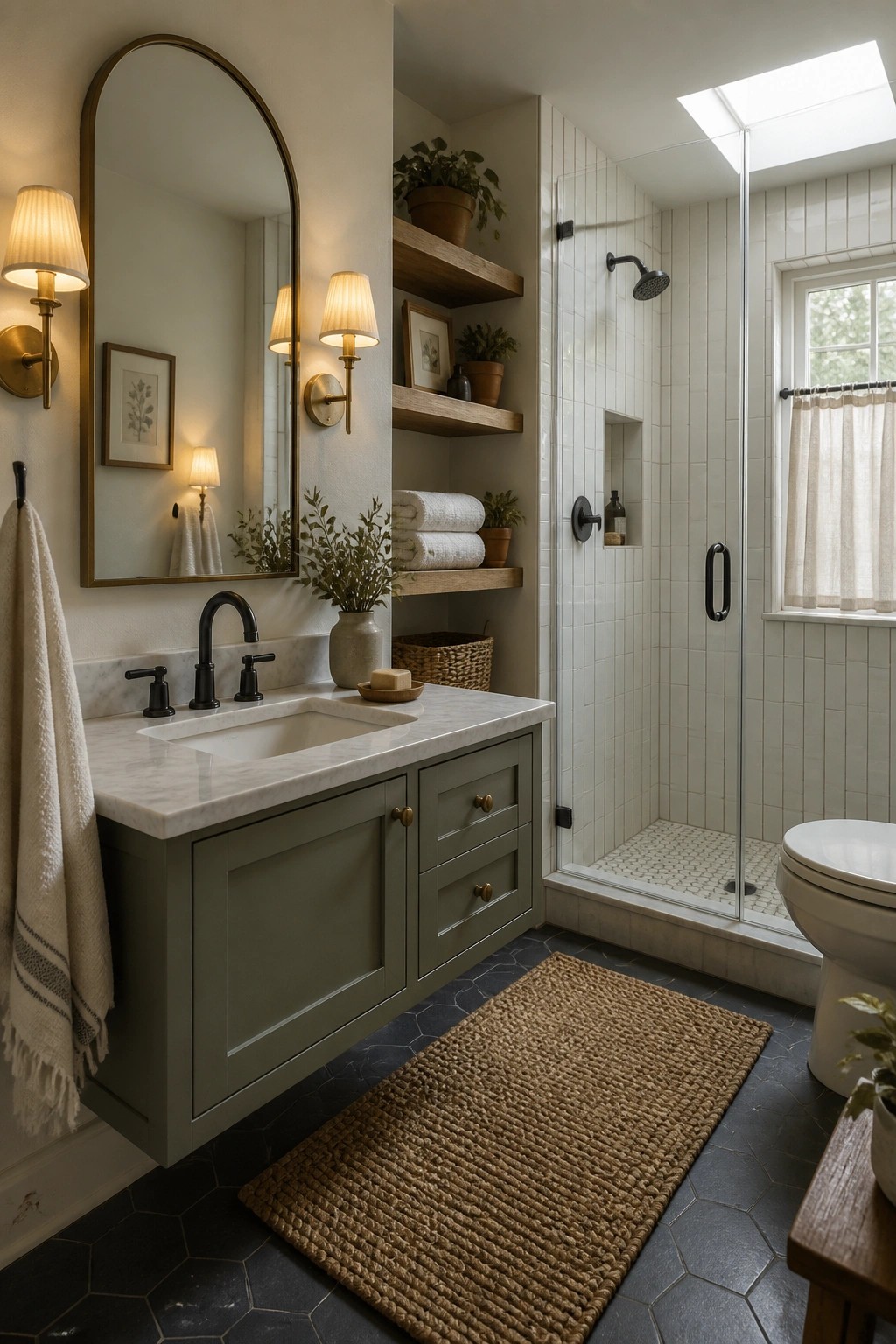
A soft green on bathroom cabinets brings a grounded, lived-in feel that works especially well in farmhouse homes. It adds color without making the space feel busy or dark, and pairs nicely with simple materials like marble tops and black hardware.
This color works best in smaller rooms where you want some warmth but still need the space to feel open. Use it on vanities or built-ins, keep the walls light, and let natural textures like woven rugs and wood shelves do the rest.
Muted Green Gray For Entry Walls
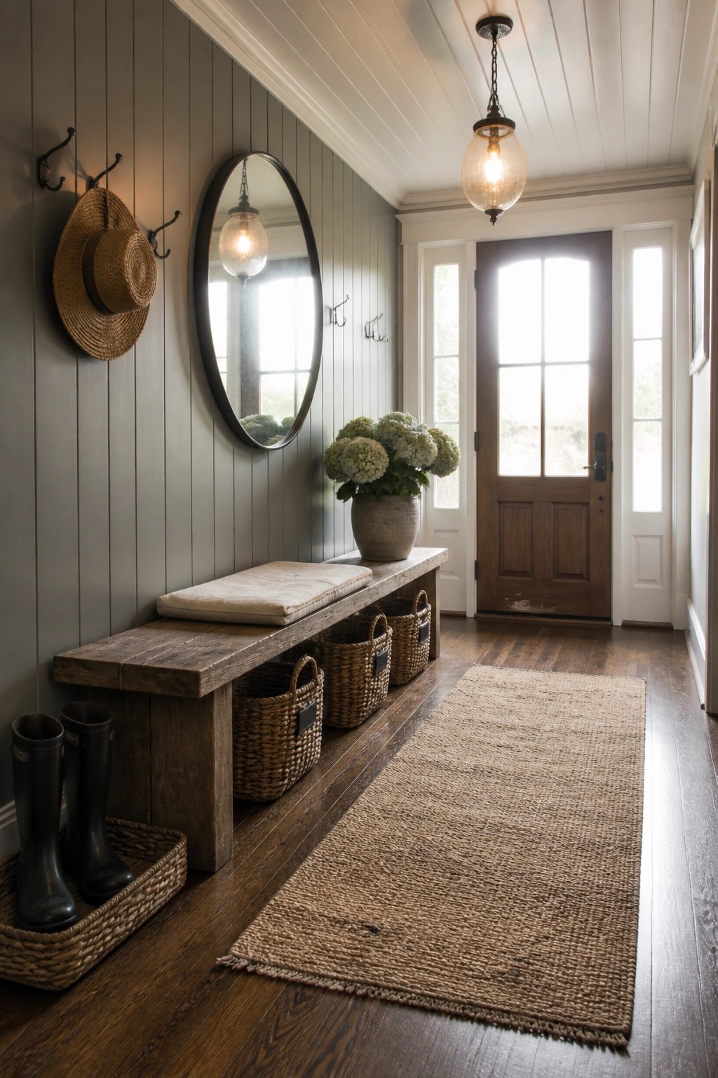
A soft green gray like this one gives an entry a grounded feel without making the space feel closed in. The color works especially well on vertical paneling because it shows off the lines while keeping the overall look simple and calm.
This shade suits rustic farmhouse homes that need something practical for a high traffic spot. It pairs easily with wood tones and natural baskets, and it holds up well when the light shifts throughout the day.
Warm Gray Cabinets In Utility Rooms
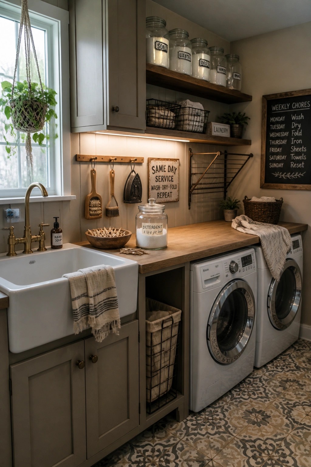
A soft warm gray on cabinets helps a laundry room feel like part of the rest of the house instead of a separate work zone. It gives the space a calm, settled look that still reads as farmhouse without turning too cold or plain.
This color works best in homes that already use similar neutrals elsewhere. It pairs easily with wood counters and white fixtures, and it stays practical in a room that gets daily use.
Deep Dark Paint for a Cozy Study
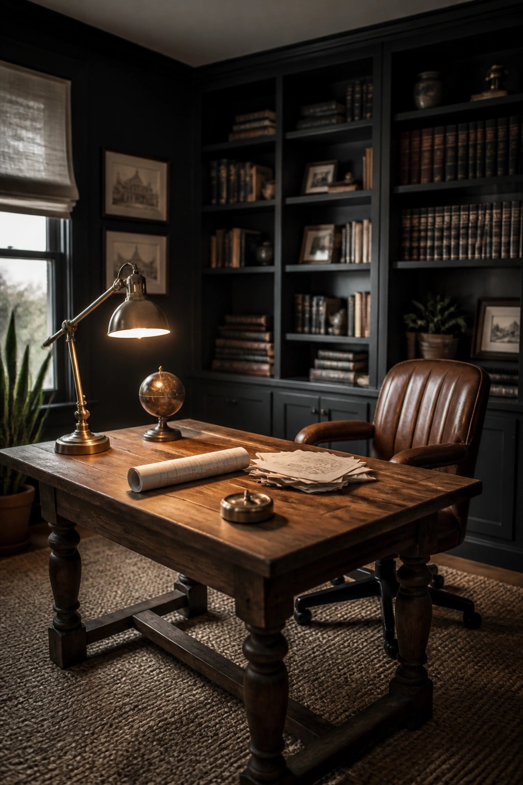
A deep charcoal or near-black wall color can turn a home office into a quiet spot that feels settled and warm. It works especially well when the room has wood furniture and built-in shelves, since the dark background makes those warmer tones stand out without feeling stark.
This approach suits older homes or farmhouse styles where you want one room to feel a little more enclosed and restful. Keep the trim simple and add a few brass or aged metal accents so the space stays balanced instead of heavy.
Terracotta on Storage Pieces
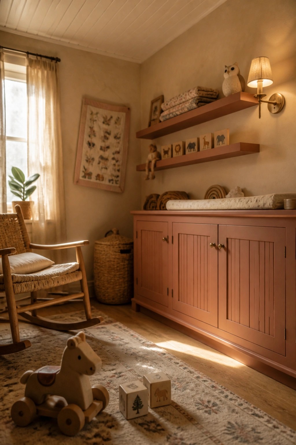
Painting a dresser or set of shelves in a soft terracotta shade gives a room a steady warmth without much effort. The color sits nicely against plain walls and pairs easily with wood tones and simple textiles.
It works best in spaces where you want a little color but still need the room to feel calm. Use it on one main piece rather than the whole room, and keep the rest of the finishes light so the terracotta stays friendly rather than heavy.
Blue Gray On Built In Seating
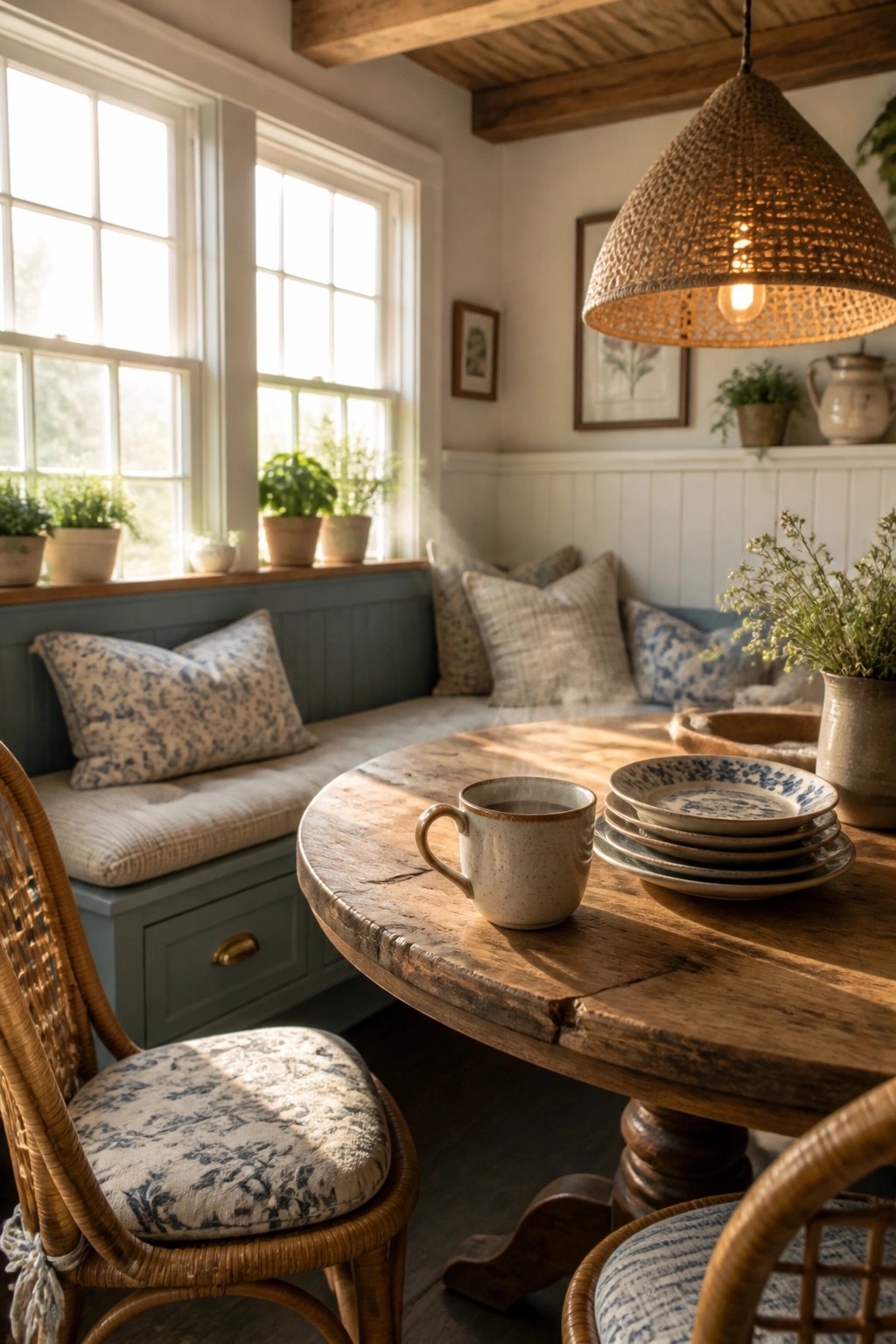
A soft blue gray on built in bench seating gives a room that calm, grounded feeling without making it feel heavy. The color works with the wood tones and white walls above it to keep things simple and easy to live with.
This shade suits farmhouse kitchens or breakfast nooks that get good natural light. Keep the upper walls light and let the blue gray stay on the lower half so it feels balanced rather than closed in.
Warm Neutral Paint For A Cozy Bathroom
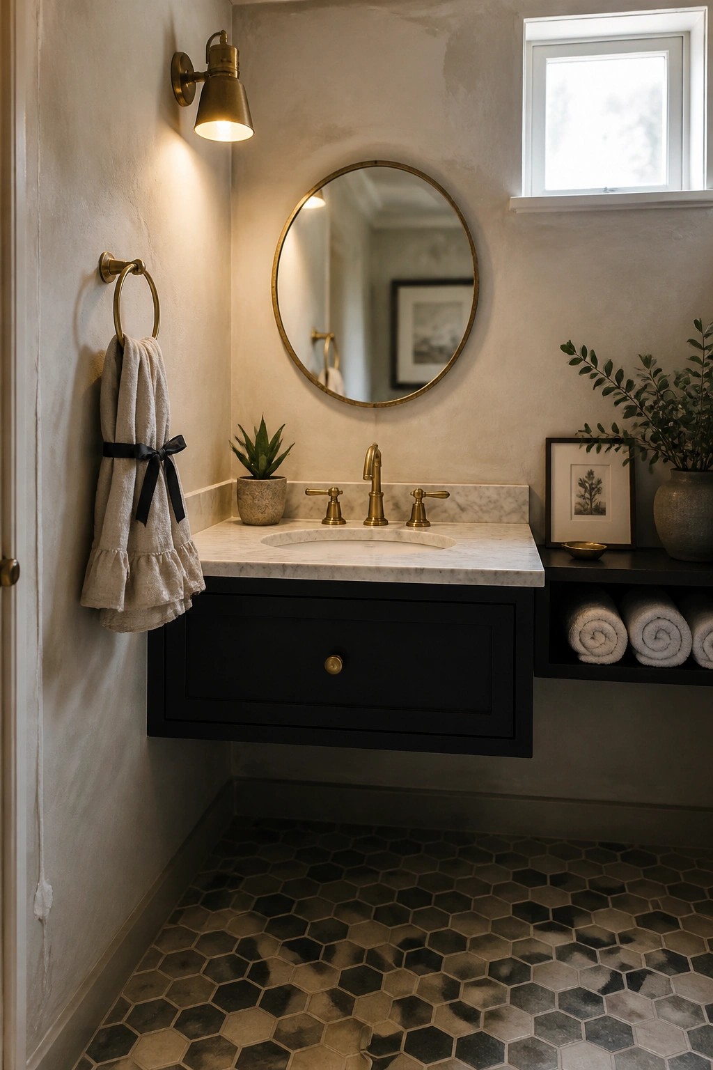
A soft warm neutral on the walls gives a bathroom that relaxed farmhouse feel without much effort. The color stays gentle on the eyes and helps the room feel calm even when other finishes like stone and dark cabinetry are added.
This kind of paint works best in smaller baths or older homes where you want warmth rather than brightness. Keep the finish slightly textured so the color feels lived in instead of flat.
Using Soft Greens on Cabinetry
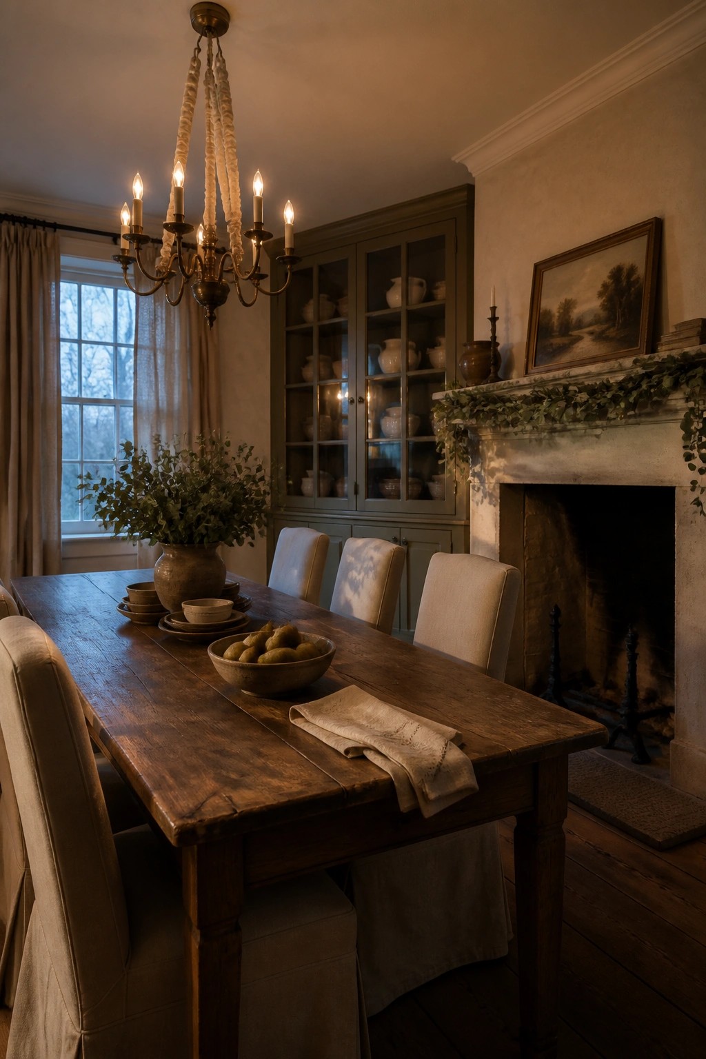
A soft sage or muted olive green on built-in cabinetry pairs well with warm wall tones. It keeps the room feeling grounded and calm while still showing the character of the wood furniture and trim around it.
This color works best in dining rooms or living spaces where you want a bit of depth without making the room feel dark. Try it on a hutch or bookcase first, then match the wall color to a warm off-white or light greige so the green stays the main focal point.
Soft Paint On Mudroom Built-Ins
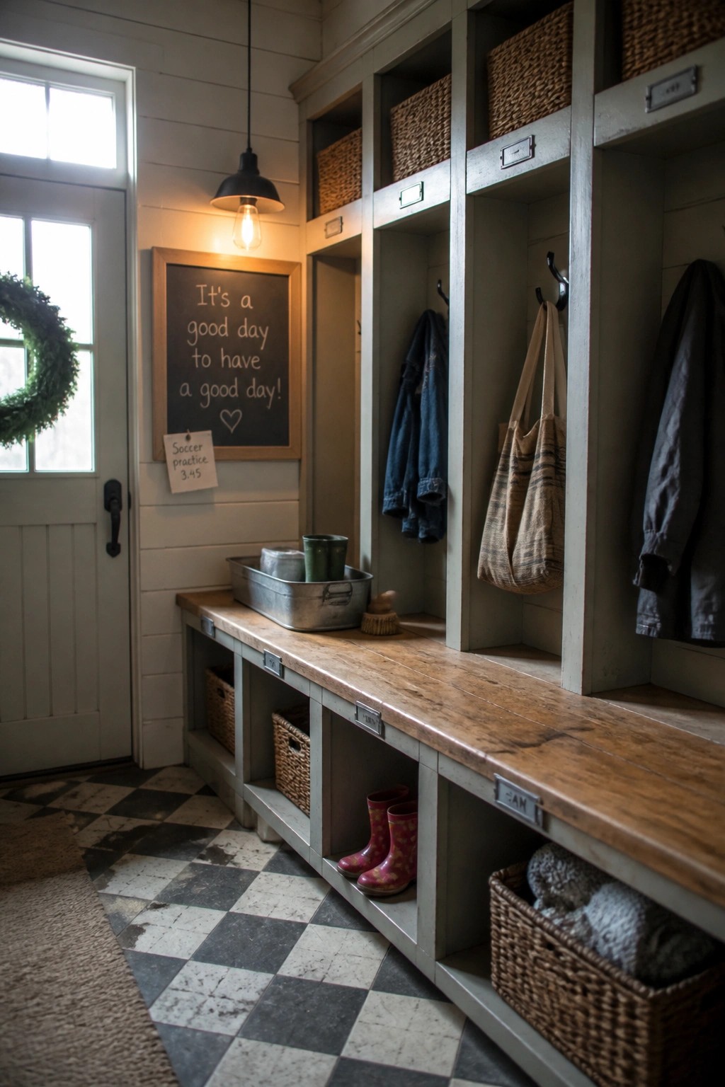
Painting built-ins in a soft muted color helps a busy entry space feel calm and pulled together. The gray-green tone on the cubbies blends with the walls while still giving the storage its own presence, which keeps the whole area from looking cluttered or stark.
This approach works well in mudrooms and back entries where you need plenty of open cubbies and hooks. Stick with the same paint on the lower cabinets and bench base so the wood top stands out without fighting the color. It suits most farmhouse homes that already use white or off-white walls.
Warm Terracotta Paint For Cozy Bedrooms
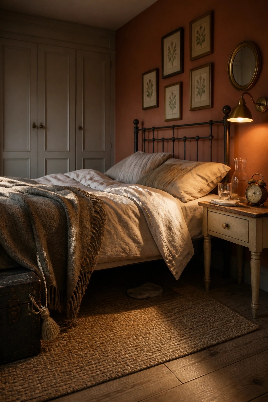
A rich terracotta shade on the walls gives a bedroom that settled, comfortable feeling right away. It works especially well when you want the space to feel warmer without adding a lot of extra layers or patterns.
This color looks best in rooms that already have some natural texture, like linen bedding or wood furniture. It suits older homes or any space where you want the walls to do most of the work instead of relying on lots of accessories.
Muted Green For Built-In Pantry Storage
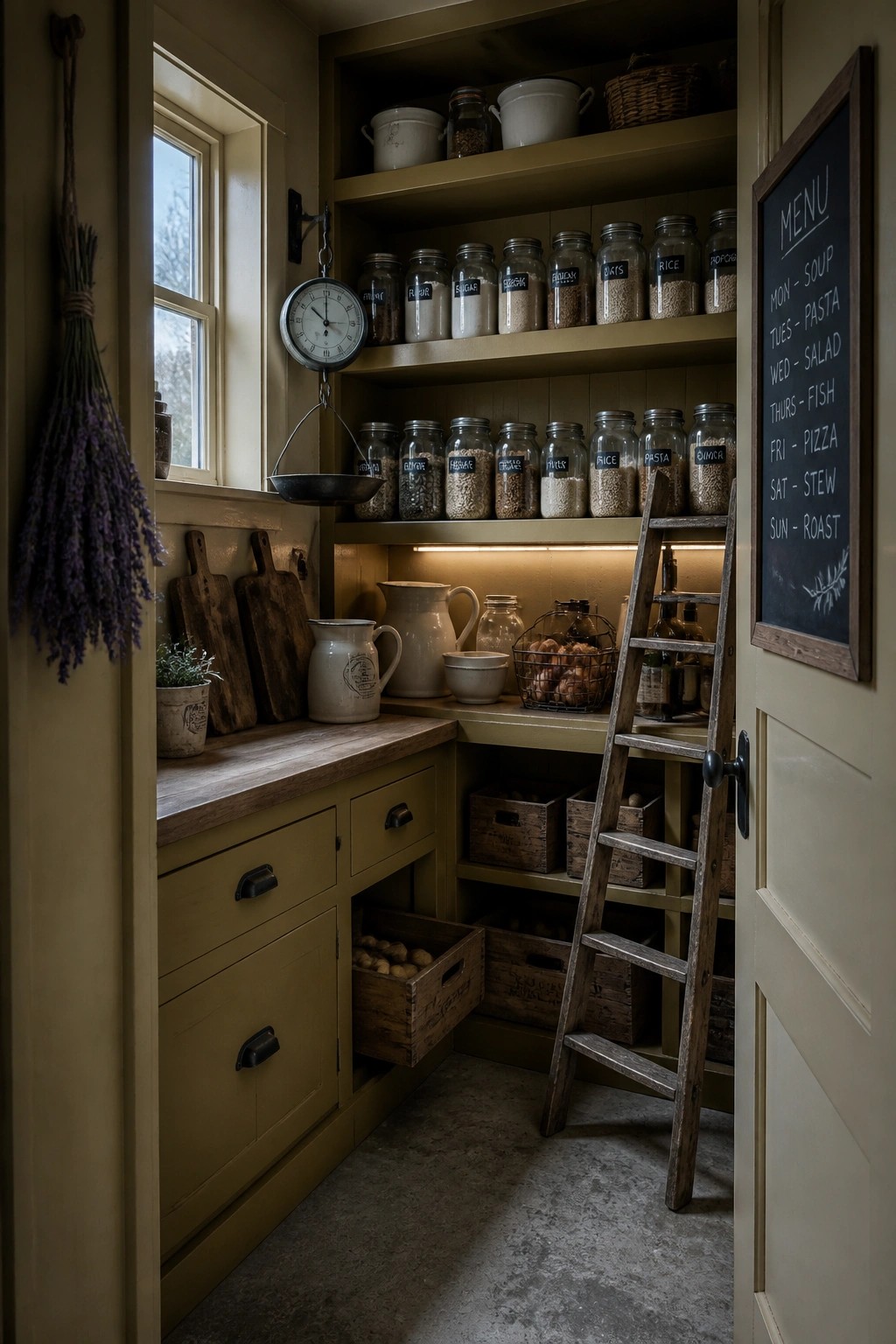
A soft olive green on cabinetry and walls gives a pantry or utility space a settled, quiet look. The color keeps the room from feeling stark while still letting the wood tones and open shelving stand out in a simple way.
This approach works best in older homes or any space where storage needs to feel part of the room rather than added on. Stick with the same green on both the built-ins and the walls so the whole area reads as one calm unit instead of a collection of separate pieces.
Warm Wall Colors For Cozy Reading Nooks
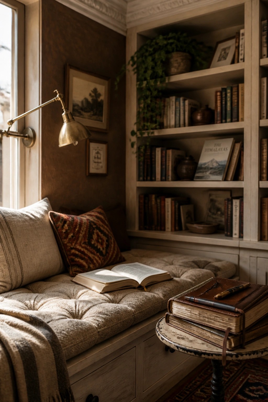
Warm brown walls can turn a simple window seat into a spot that actually feels lived in. The color keeps the built-in shelves from looking too stark and helps the whole corner feel pulled together without extra effort.
This approach works best in spaces that already have some wood tones or older trim. Stick with a muted shade rather than anything too dark so the room still feels open during the day.
Soft Blue Gray Walls In The Bathroom
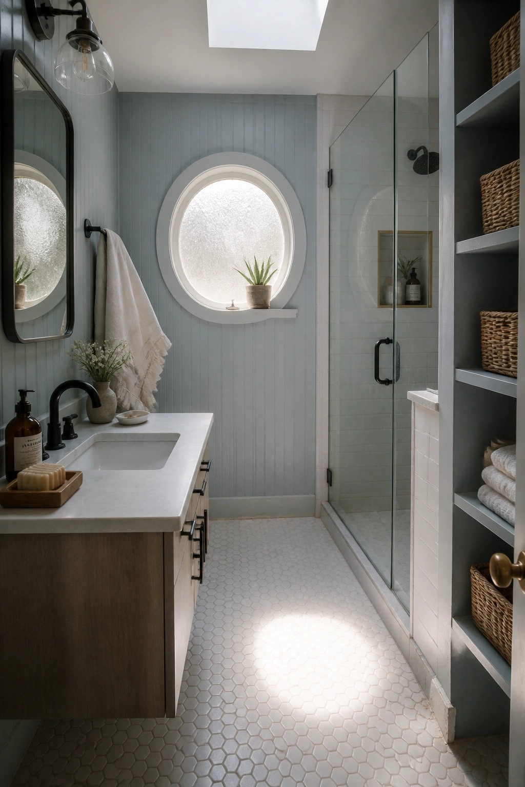
A soft blue gray works well in bathrooms because it feels calm without going too cold. The color sits nicely on vertical shiplap and pairs with simple white trim, which helps the room feel pulled together and a little softer overall.
This shade suits smaller bathrooms in farmhouse style homes where you want some color but still need the space to feel bright. Keep the rest of the finishes light and let the walls carry most of the tone.
Green Paint For Kitchen Islands
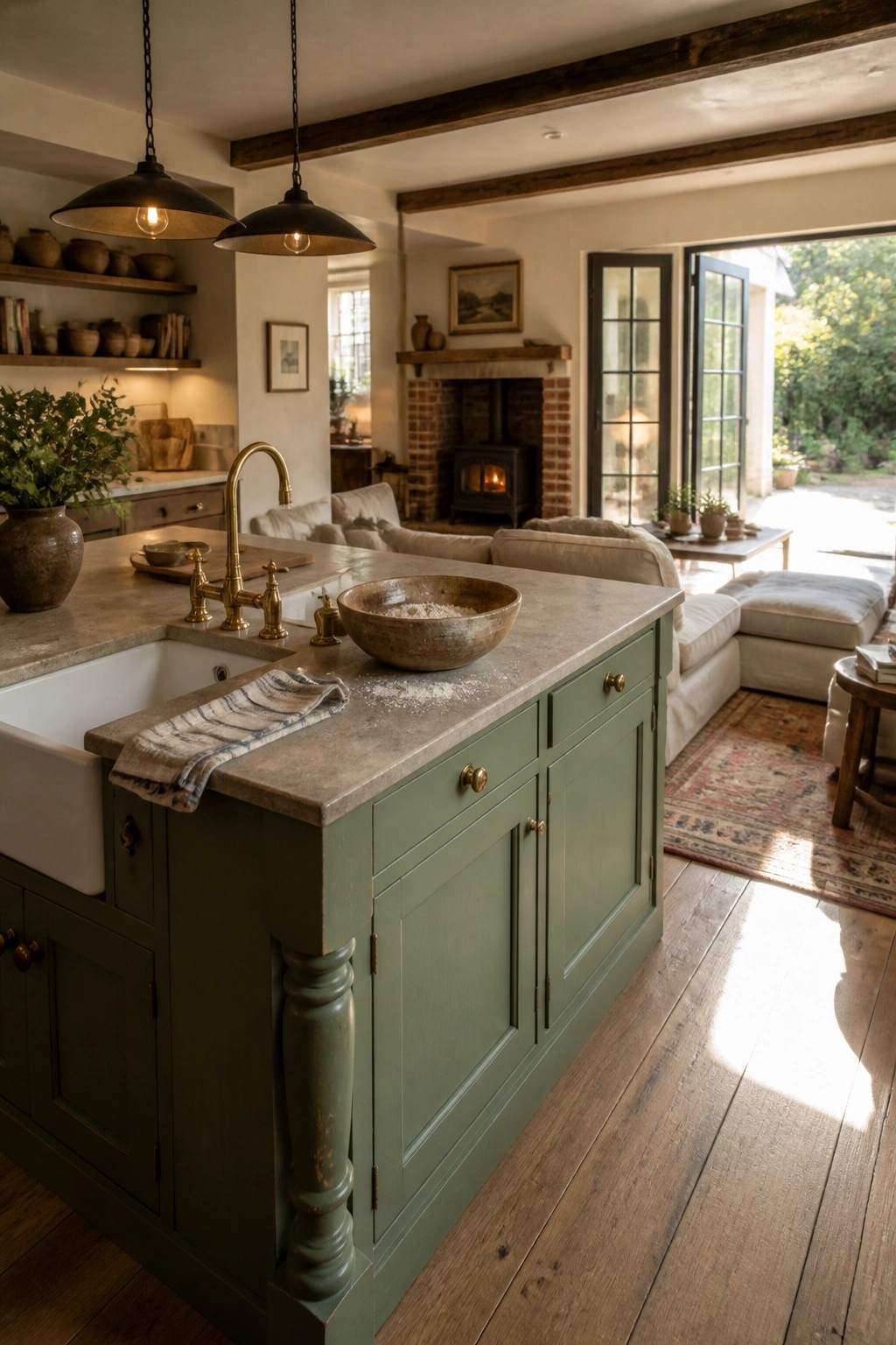
A soft green on the island base gives the kitchen a grounded feel without making the whole space feel heavy. It works especially well in open layouts where the island sits between the cooking area and the living space, adding just enough color to keep things interesting.
This approach suits older homes or new builds with simple trim and wood floors. Keep the shade on the muted side and pair it with lighter counters so the color stays calm rather than overpowering the room.
Warm Neutrals On Hallway Walls
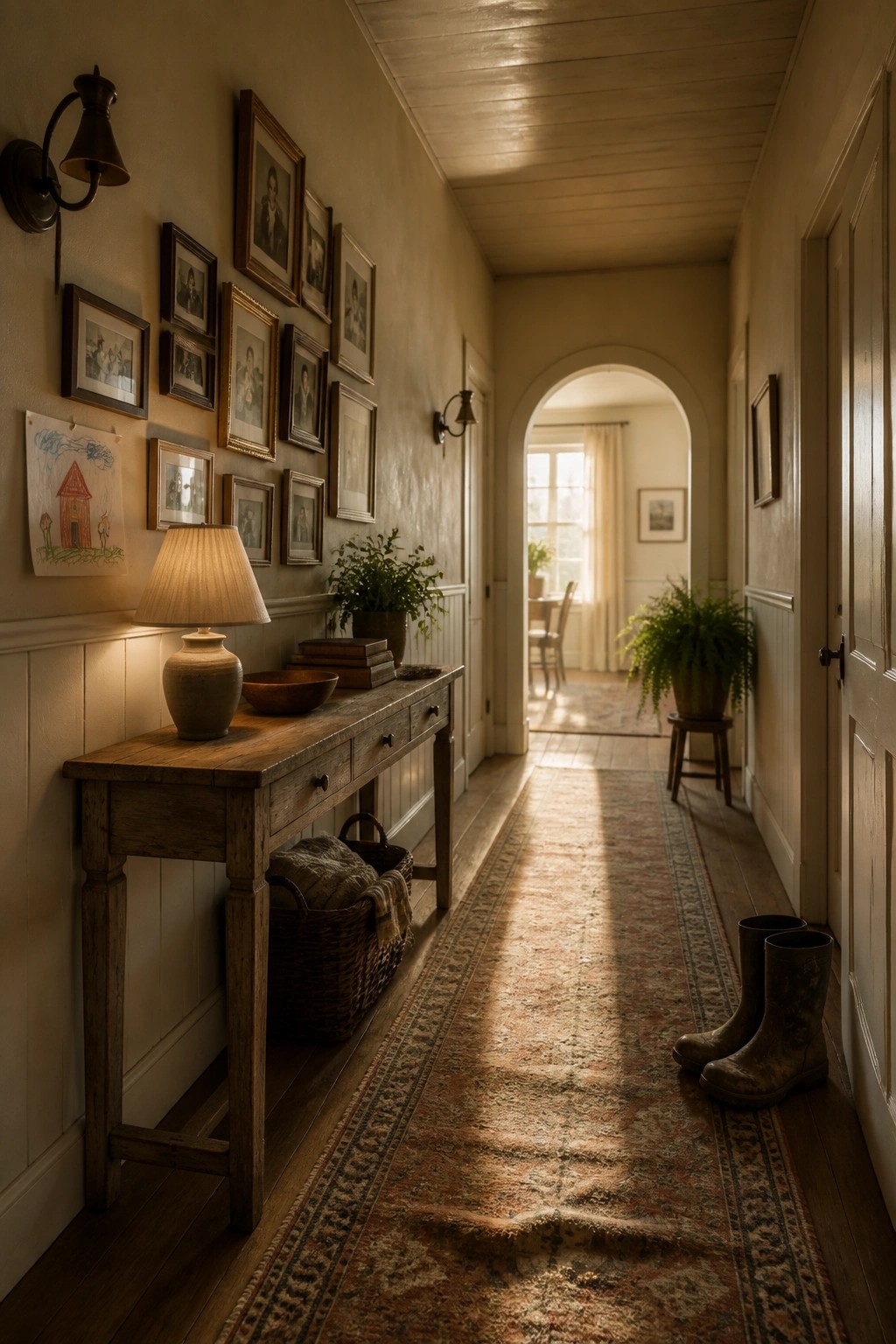
A soft warm neutral on the walls helps a hallway feel connected to the rest of the house instead of like a leftover space. It brings out the wood tones in trim and furniture without making the area feel dark or closed in.
This works best in older homes or farmhouses where you already have natural textures and simple details. Stick with a matte or eggshell finish and test the color on a larger patch first, since hallway light can shift during the day.
Using The Same Paint Color On Built Ins And Walls
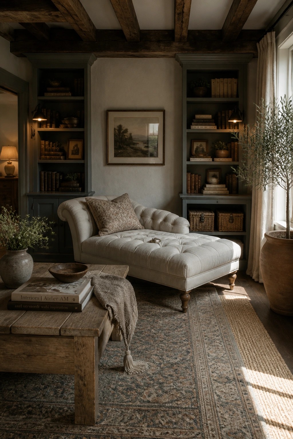
Painting built-ins the same color as the walls gives a room a calm, collected feel. The shelves blend in instead of standing out, so the eye moves easily across the space and the focus stays on books and simple objects rather than the furniture itself.
This approach works best in smaller or medium-size rooms where you want things to feel cozy rather than busy. Pick a soft, muted shade that still has enough warmth to keep the space from feeling flat, and use it on both the trim and the inside of the shelves.
Frequently Asked Questions
Q: How do I make sure the colors flow from room to room?
A: Start with one main neutral for most walls and layer in two or three accents from the list. Move between spaces to check the transition in person. This keeps the cozy vibe going without any jarring shifts.
Q: Will these paints cover old colors in just one coat?
A: Most farmhouse neutrals need two coats for even coverage over dark shades. Test a small spot first to see what your walls require. Thin layers prevent buildup and streaks.
Q: Can I use the same color on ceilings?
A: Skip that unless the shade is very light. Ceilings usually look best in a flat white to reflect light and open up the room. Save the rustic tones for the walls.
