

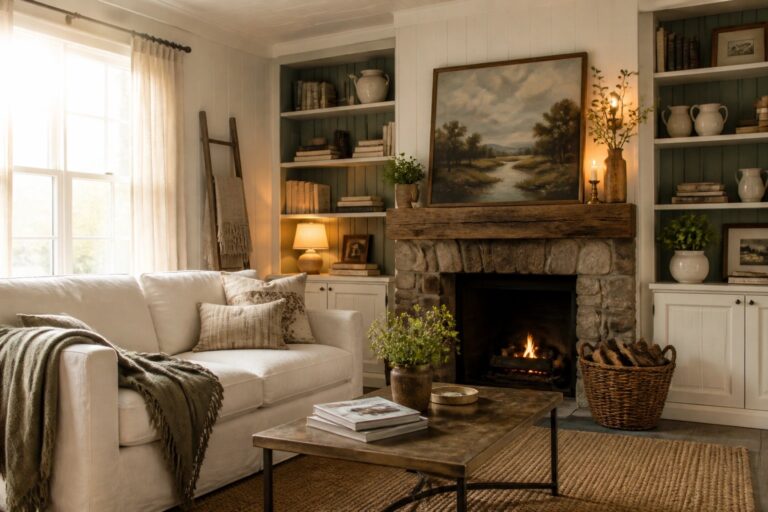
I’ve noticed that paint choices in a farmhouse often decide whether a room feels settled or still unfinished once the furniture and daily light are factored in.
The older homes I have worked on tend to need colors that sit well with existing woodwork instead of fighting against it all day long.
Testing a few shades on the actual walls usually shows what will hold up.
I keep a small notebook of the ones that felt right after a week of living with them so I can pull the same tones again in other rooms.
That approach saves time when the goal is a space that simply works without constant second guessing.
Warm White Paint for Walls and Trim
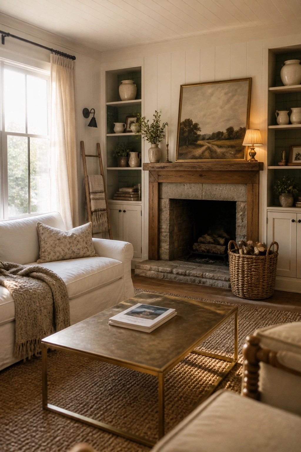
A warm white on the walls and trim gives a room that soft, lived-in look without making it feel stark. It works especially well when the space already has wood beams, stone, and natural textures that need a calm background to stand out.
This approach suits older homes or any farmhouse-style room where you want the wood and built-ins to feel like the main event. Pick a white with a touch of cream so the color stays inviting even on cloudy days. The green tile inside the shelves shows how a small contrast color can add interest without fighting the main paint choice.
Soft Green Cabinets For Everyday Warmth
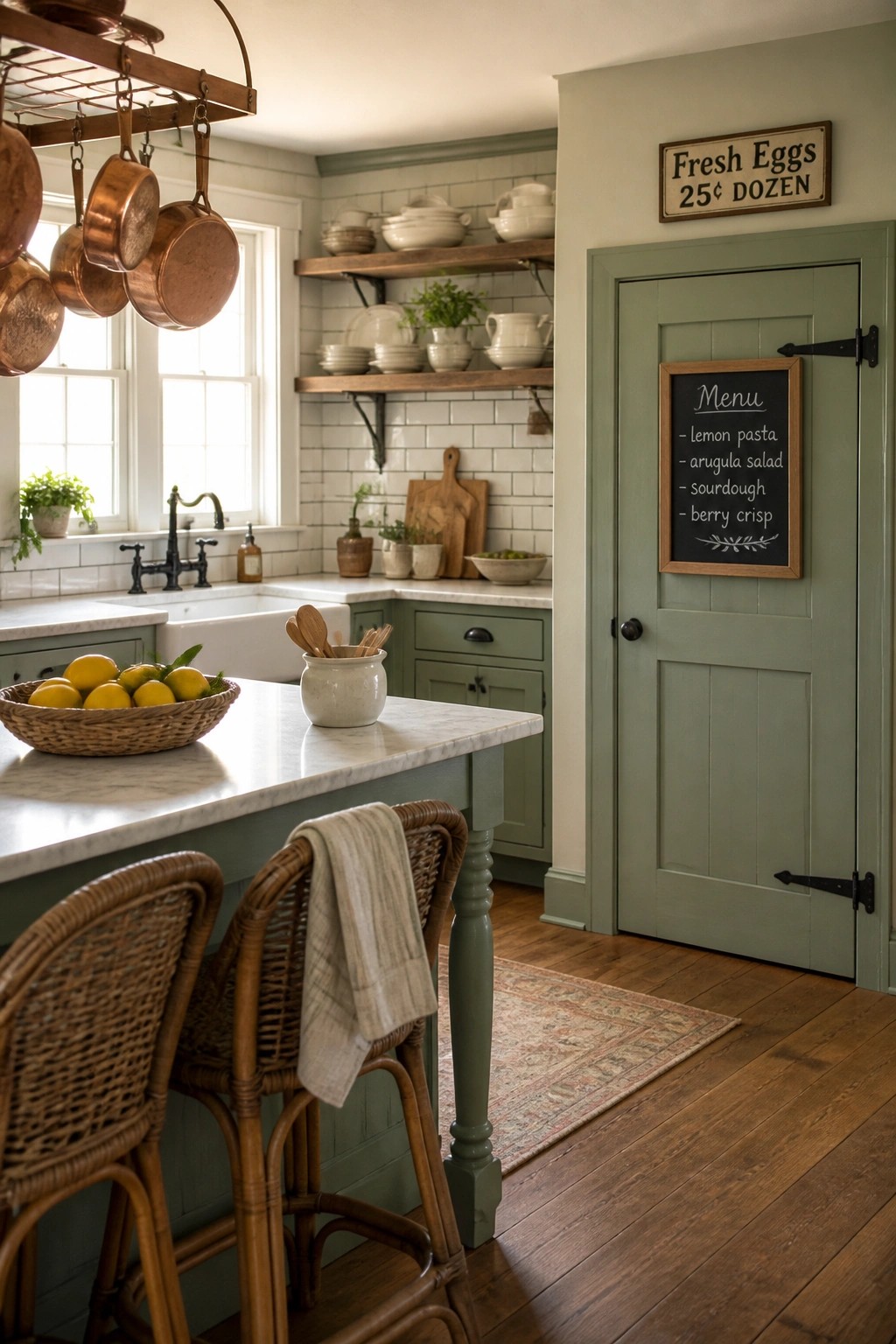
A soft green on cabinets gives a kitchen a calm, lived-in feeling without making the space feel dark or heavy. It works well when you want color that still reads as farmhouse rather than trendy, and it holds up nicely against daily use.
This shade suits homes with white or light countertops and plenty of wood tones. It looks best in rooms that get good natural light, where the green can shift gently through the day. Keep the trim and walls light so the color stays friendly rather than overpowering.
Warm Neutrals on Dining Room Walls
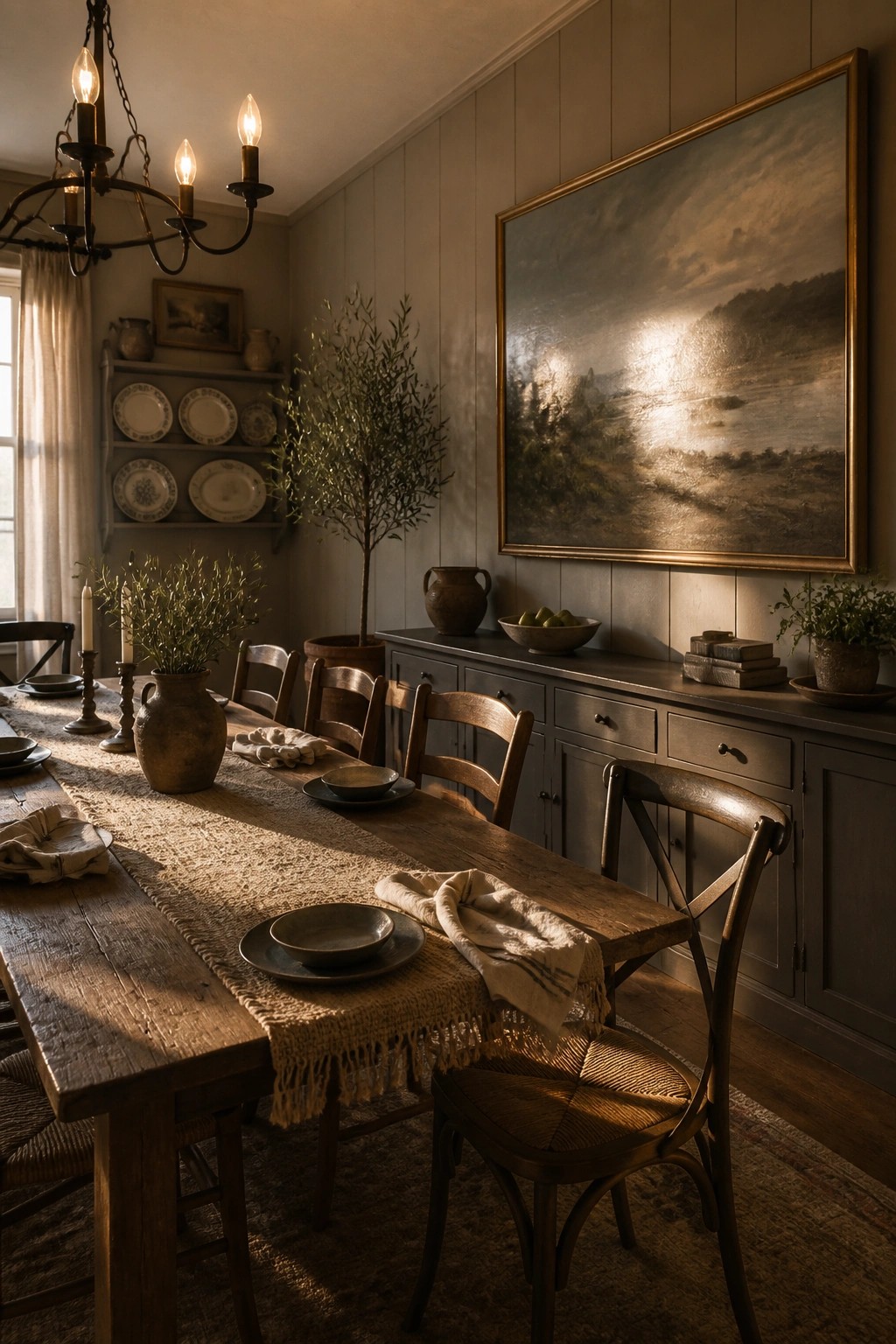
A soft gray or greige wall color helps a dining room feel calm without looking flat. It works with wood furniture and older details instead of competing with them.
This kind of neutral suits homes that want everyday comfort rather than a styled look. Keep the finish matte or eggshell so the color reads warmer through the day.
Warm Neutral Walls for the Bedroom
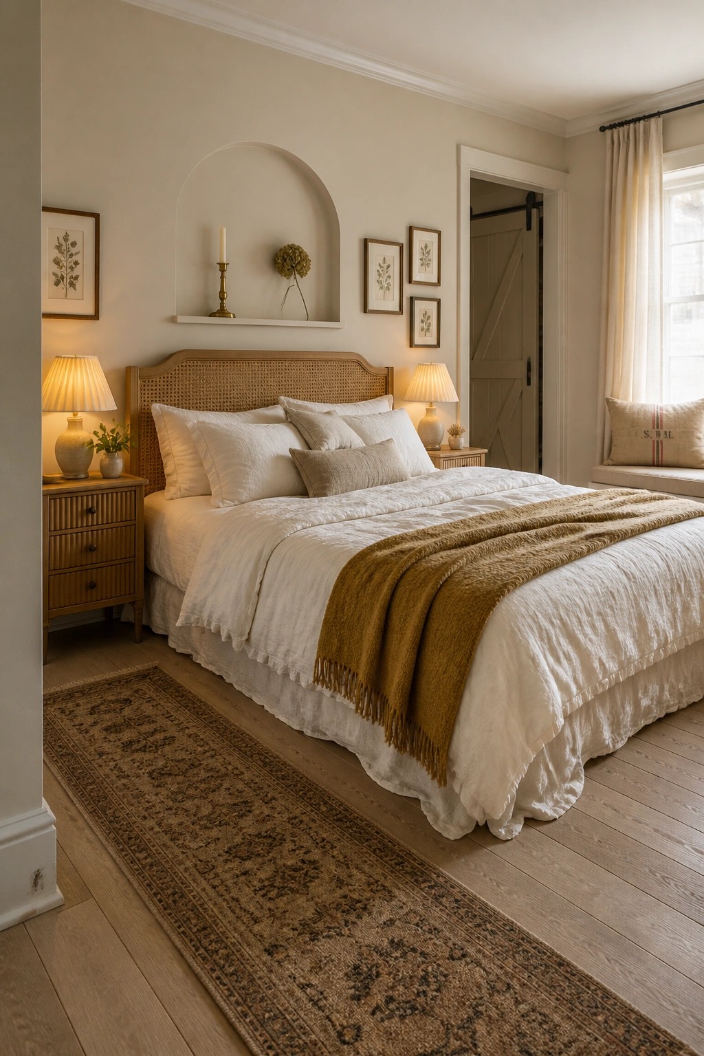
A soft warm beige on the walls gives this bedroom a calm, lived-in feel without making the space feel heavy. The color sits nicely between too cool and too yellow, so it works with both white bedding and natural wood tones.
It suits farmhouse homes that want warmth without strong color. Use it on all walls in rooms with decent daylight, and keep the trim simple so the focus stays on the gentle wall tone rather than contrast.
Matching Paint on Built-Ins and Walls
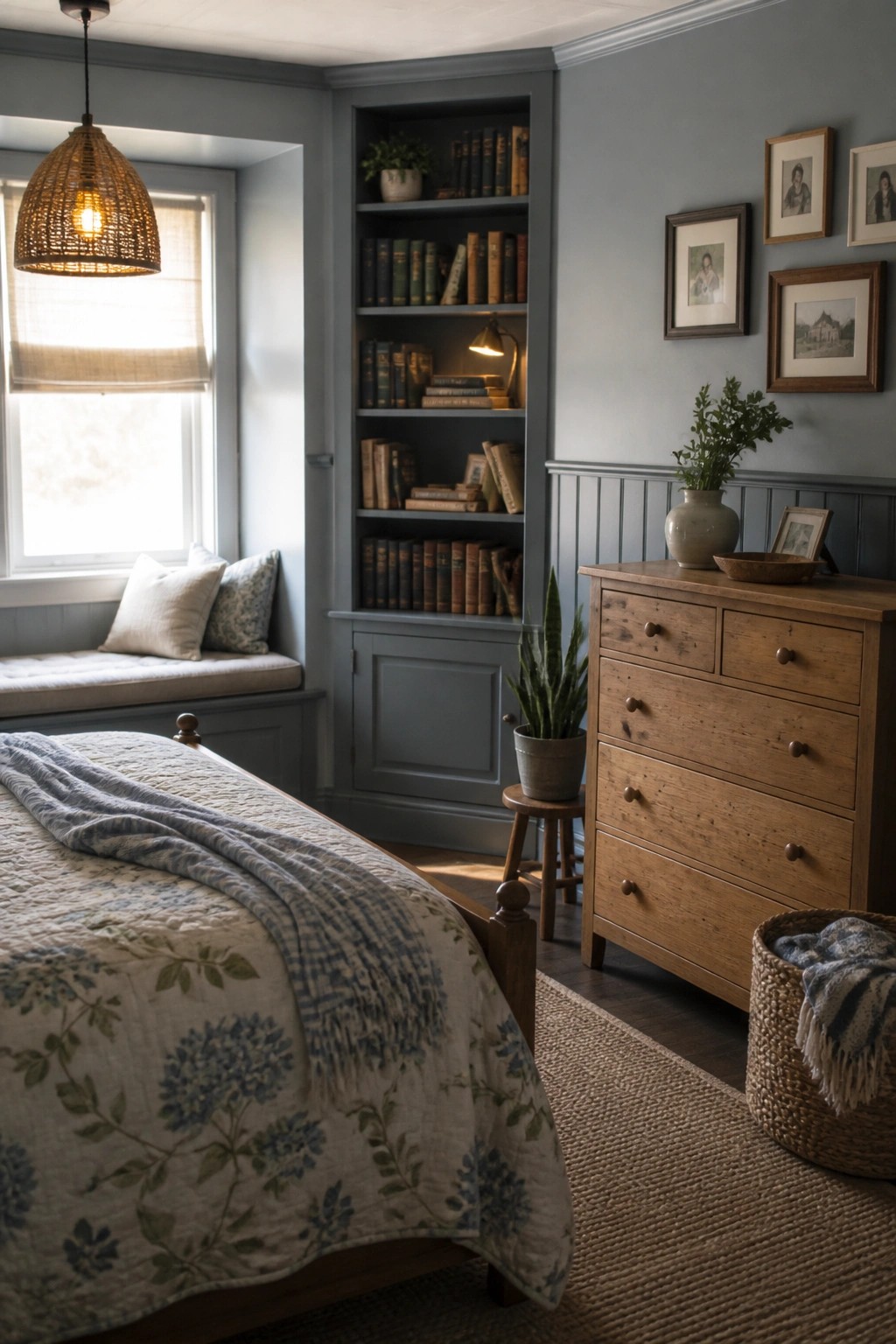
One simple way to make a bedroom feel calm and put together is to paint the built-ins the same color as the walls. The single shade creates a quiet backdrop that lets the wood furniture and textiles do the work.
This approach suits older homes or any room with recessed shelving. Pick a soft blue-gray and use it on both surfaces to keep the space feeling warm and uncluttered rather than busy.
Warm Neutrals for a Gentle Room
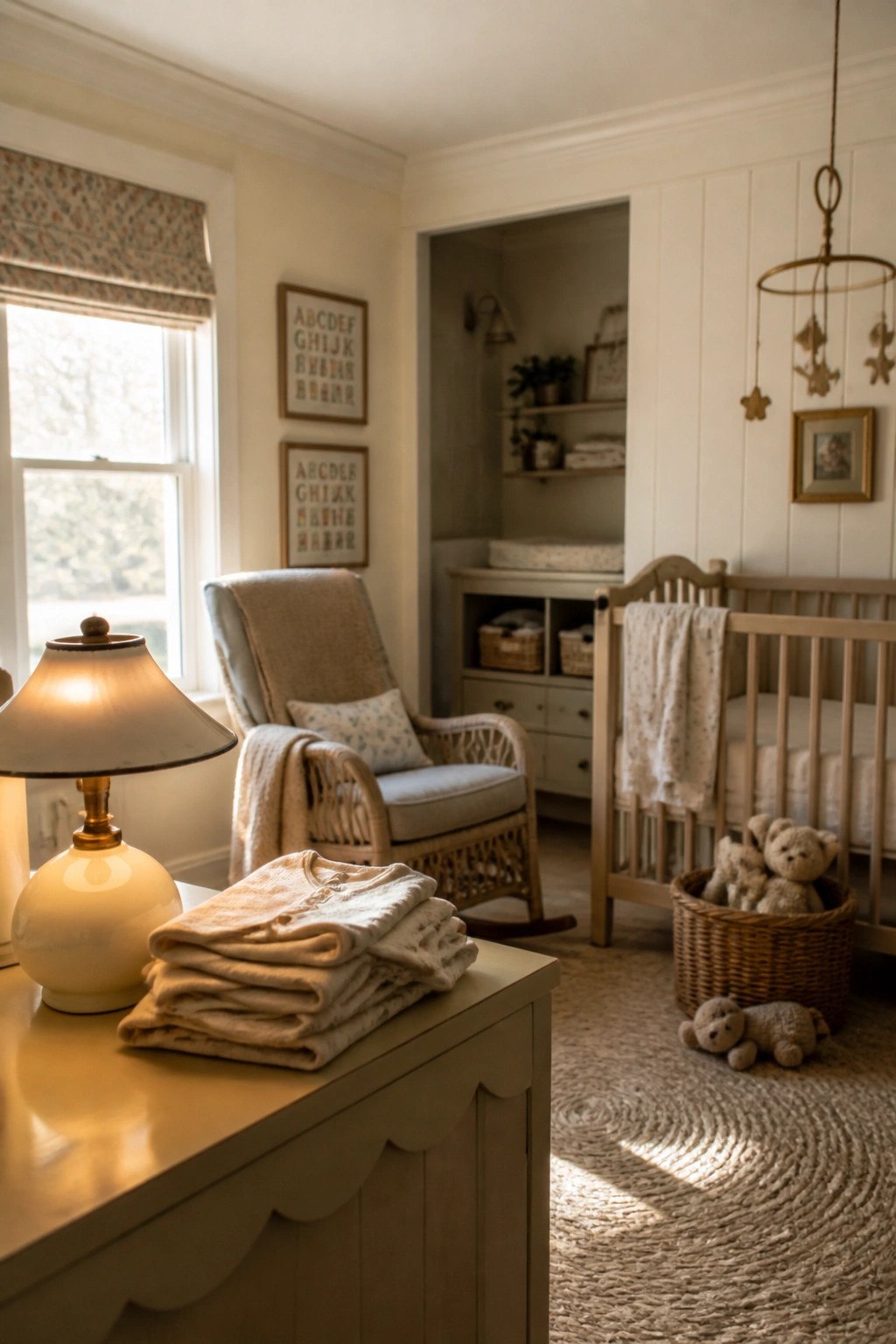
A soft warm neutral on the walls helps this kind of room feel calm without looking flat. It pairs easily with wood furniture and simple pieces, so the space stays comfortable rather than busy.
This approach works well in a nursery or any smaller room where you want things to feel quiet. Keep the trim in the same tone if you want the whole space to read as one soft layer.
Deep Navy Walls in a Farmhouse Office
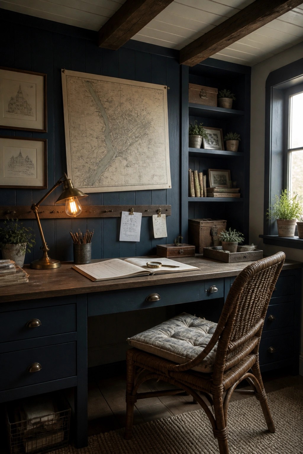
A deep navy paint color gives a workspace that settled, enclosed feeling many older farmhouses naturally have. It turns the room into a quiet spot that still feels connected to the rest of the house instead of cut off.
This shade works best on rooms with wood tones already in place, like floors or trim. It suits homes that lean traditional but need a bit more weight on the walls so the space does not feel too light or scattered.
Muted Greens for Laundry Rooms
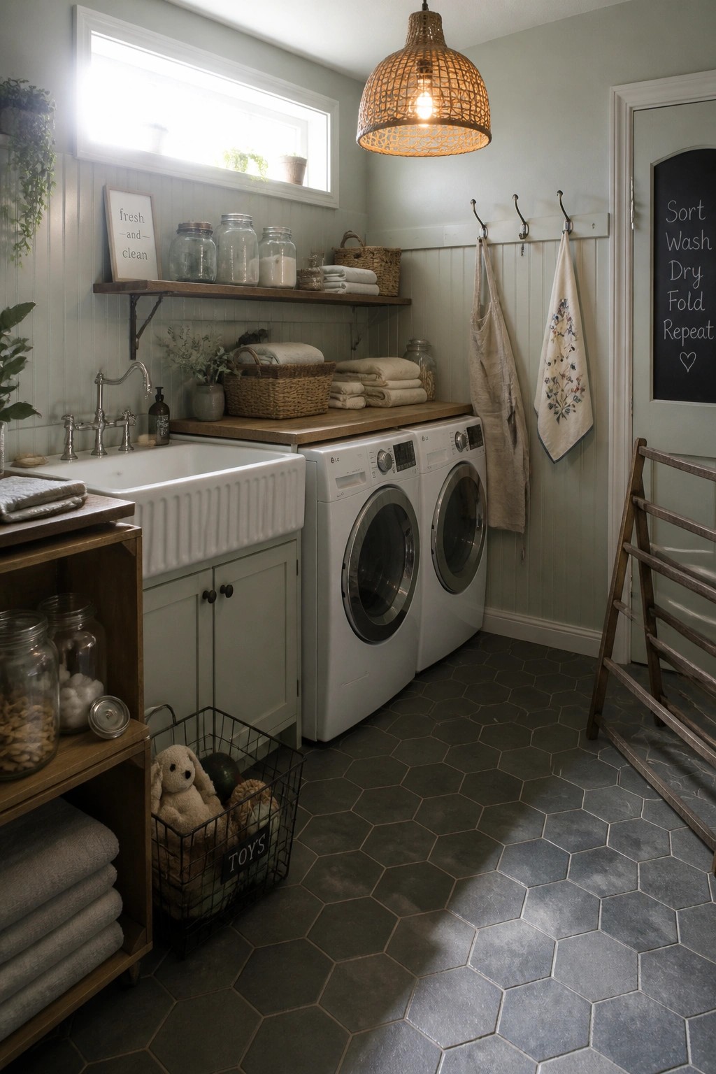
A soft muted green on the walls turns a laundry room into something that feels more like part of the house instead of a separate work zone. The color keeps things calm and helps the space blend with the rest of a farmhouse without needing a lot of extra decoration.
This approach works best in homes that already use similar greens or grays elsewhere. Stick with white or light trim and simple wood accents so the color stays easy and welcoming rather than overpowering the room.
Blue Gray Doors In The Entry
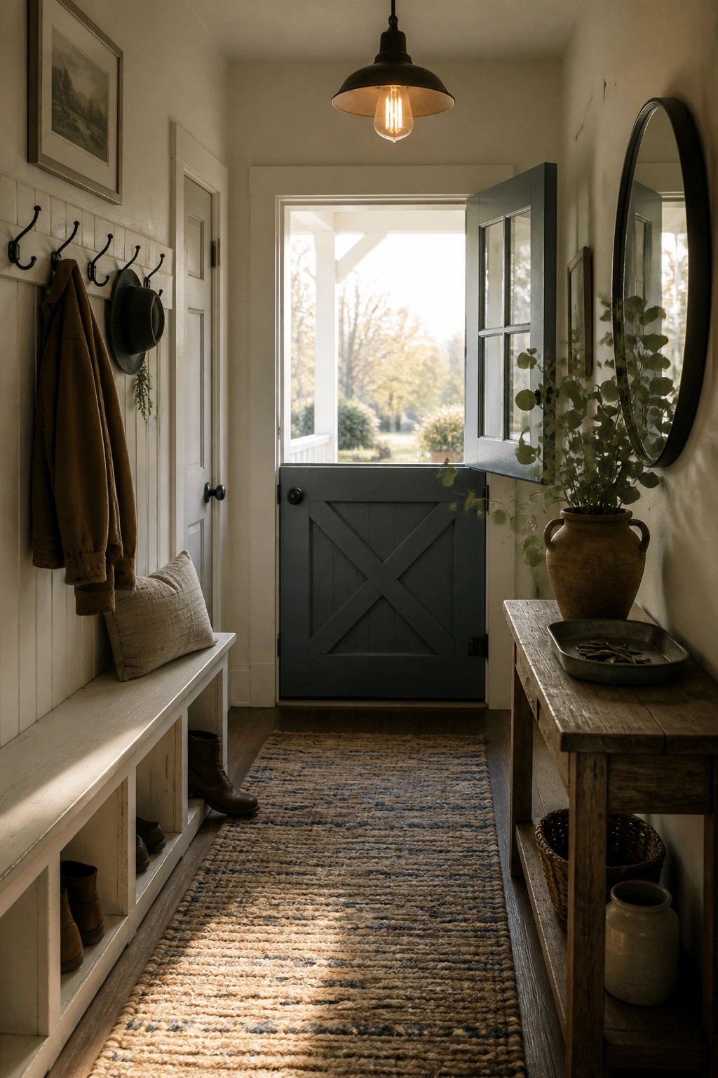
A soft blue gray on the door gives this entry a calm presence that feels welcoming without trying too hard. The color stands out just enough against the white walls and wood tones, yet it still reads as part of the overall neutral palette.
This works well in farmhouse homes where the entry gets steady light. Keep the trim white and let the door color do the work. It pairs nicely with simple storage pieces and natural textures nearby.
Warm Neutral Paint on Walls and Cabinets
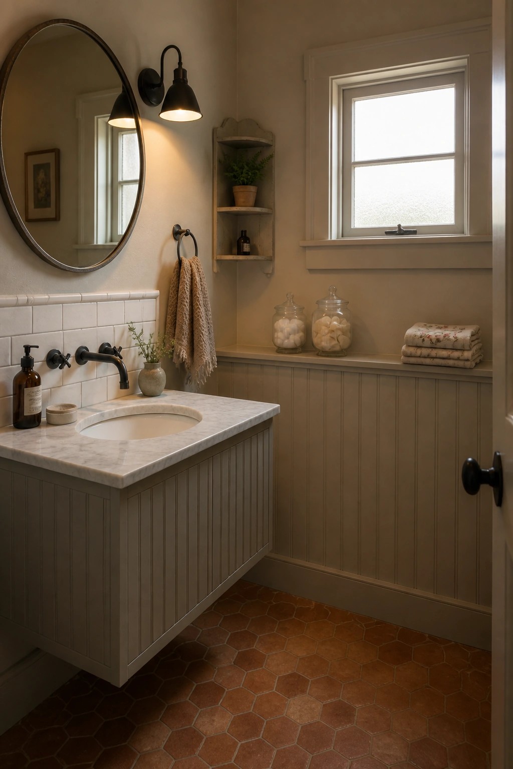
Many bathrooms feel more settled when the walls and vanity share the same warm neutral paint color. The single tone keeps the space from looking chopped up and lets the tile and floor carry more of the interest.
This approach works best in smaller rooms where you want a calm, continuous surface rather than contrast. Use the same paint on both the walls and cabinet, then add white tile or wood tones for balance.
Green Built-Ins for Kitchen Storage
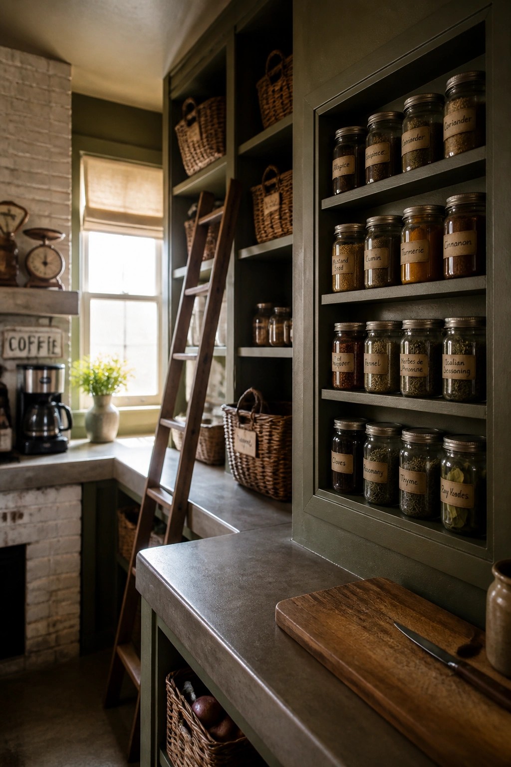
A soft green on built-in shelves can make a kitchen feel more grounded and useful at the same time. The color works with wood tones and stone counters without fighting them, and it keeps the space from feeling too stark or plain.
This idea fits older homes or simple farmhouse kitchens where you want storage that stays open but still looks intentional. Keep the shelves organized with jars and baskets so the color stays the main focus rather than clutter.
White Paint on Shiplap for Farmhouse Bathrooms
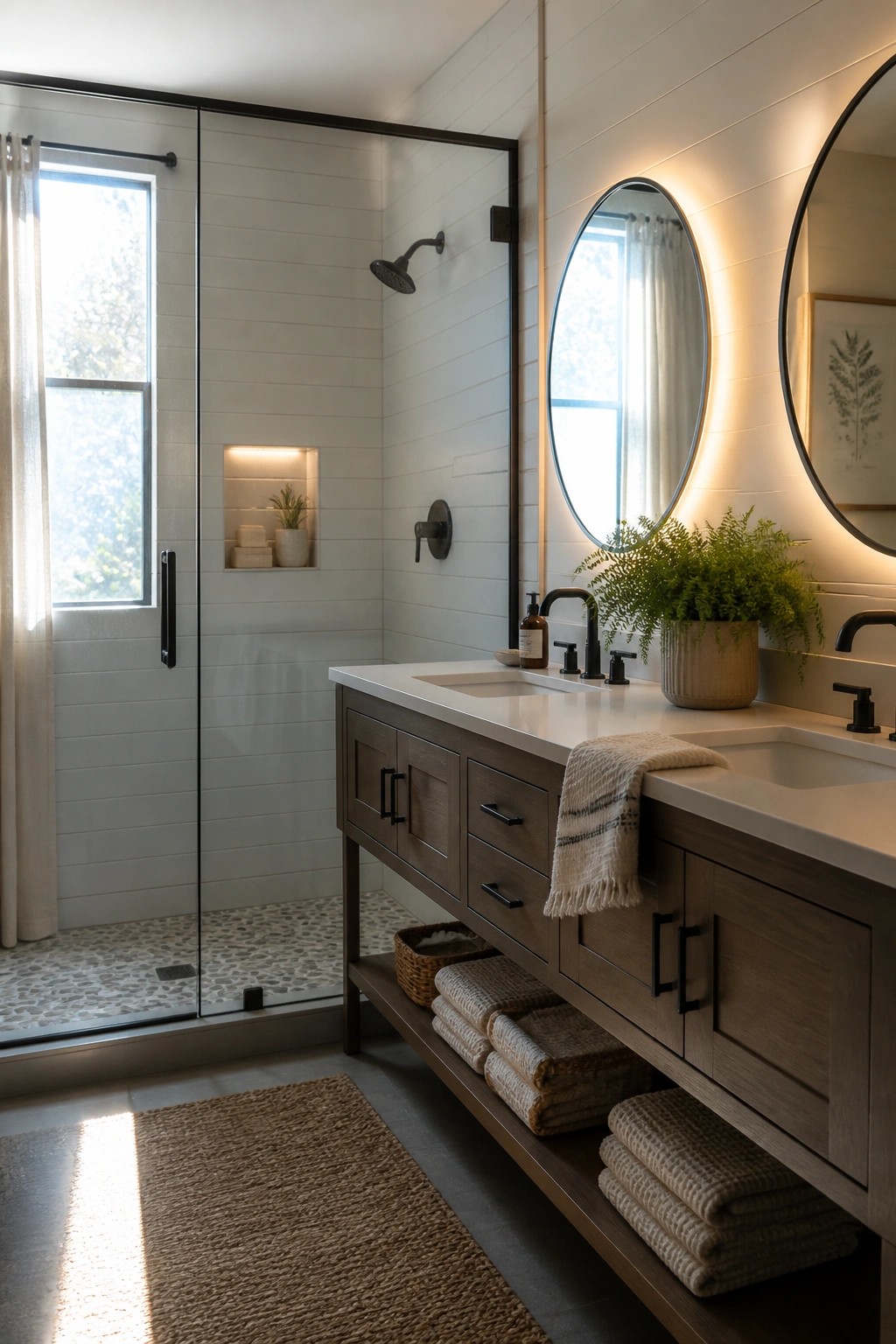
White paint on shiplap walls helps a bathroom feel open and bright even when natural light is limited. It pairs easily with wood vanities and dark hardware without looking stark.
This color choice works best in smaller baths or rooms that need to feel calmer. Use it on both walls and trim, then add warmth through wood tones and textured towels so the space stays welcoming rather than cold.
Soft Yellow Walls for a Welcoming Farmhouse Room
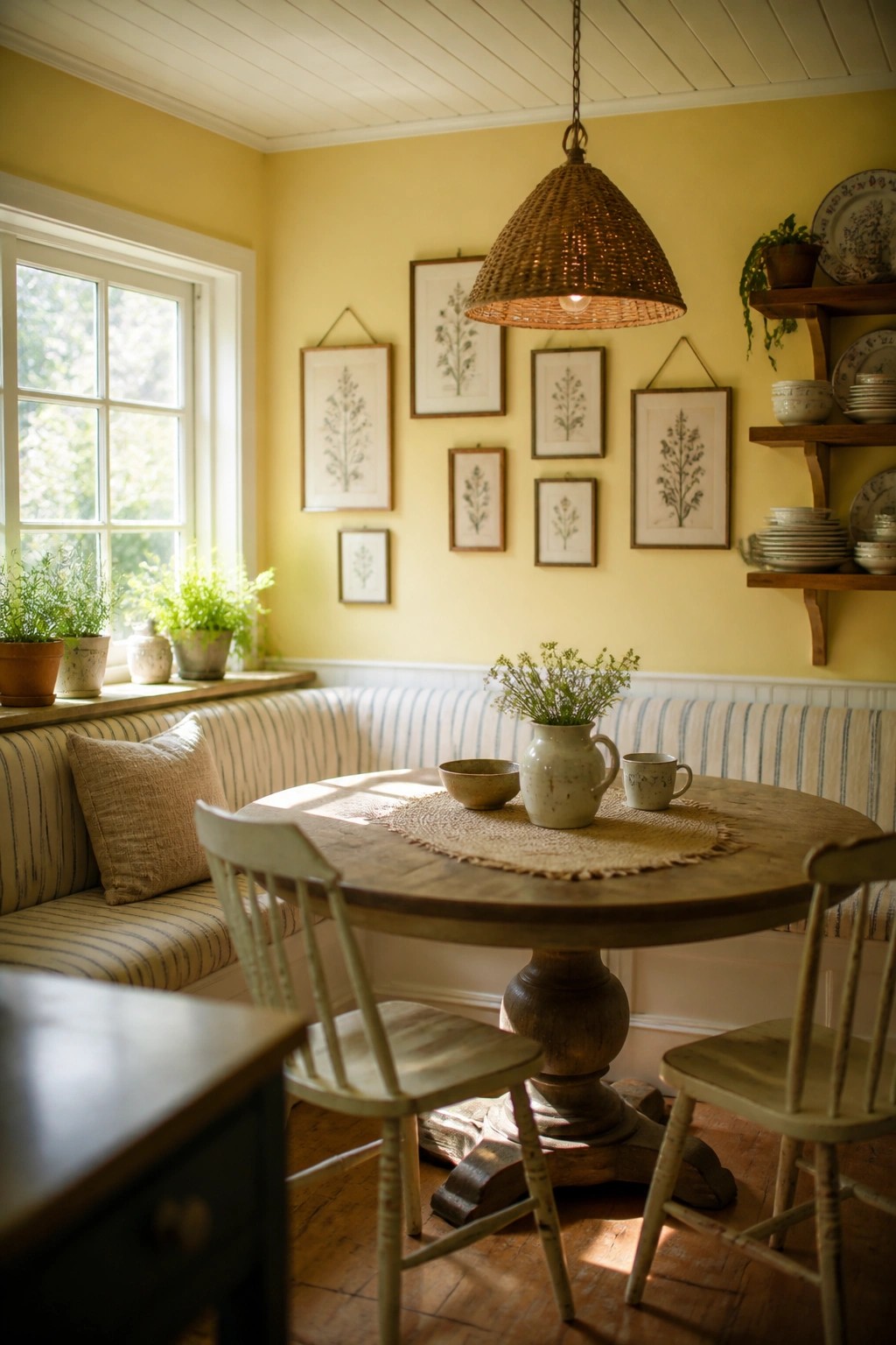
A soft yellow on the walls brings a steady warmth to a small dining spot without making it feel busy. It works especially well with wood tones and simple fabrics, and it keeps the room feeling open even when the light changes through the day.
This color suits older homes or any farmhouse-style space that gets decent daylight. It works best if you keep the trim light and let the wood furniture carry some of the weight so the yellow stays friendly rather than loud.
Soft Green Paint for Stairwells
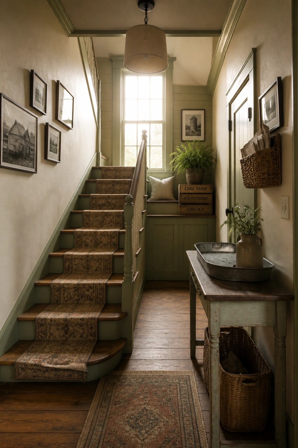
A soft green paint color works especially well in stairwells because it brings a gentle, steady feel to a space that often gets a lot of traffic. Using the same shade on the walls, trim, and stair risers helps the whole area feel connected instead of chopped up by too many colors.
This choice suits older homes with wood details and narrow hallways. Keep the wood tones warm and add simple rugs or baskets so the green stays the main focus without feeling heavy.
Soft Green Paint for Sunroom Walls
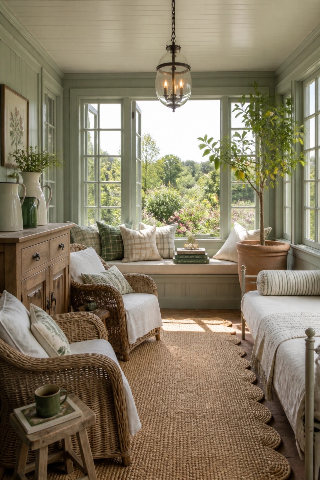
A soft green paint color can make a sunroom feel calm and connected to the view outside. It works especially well in spaces that get strong natural light, where the color shifts gently through the day and keeps the room from feeling too stark or cold.
This shade suits older homes or farmhouse interiors that need a bit of warmth without going full neutral. Keep trim and ceilings light, and let simple wood or woven pieces carry the rest of the look so the walls stay the main quiet feature.
Deep Blue Gray For Mudroom Walls
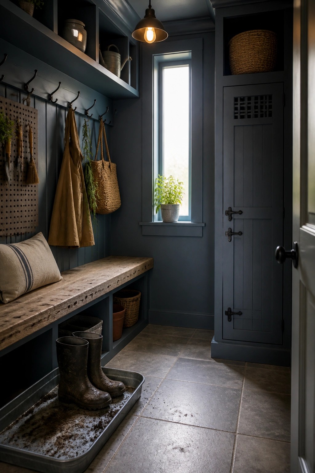
A deep blue gray brings a calm, grounded feel to a space that sees a lot of traffic. It works especially well in a mudroom because it hides scuffs and makes the whole area feel more finished without looking stark.
Paint the walls and any built in storage the same color so the room reads as one simple space. This approach suits older homes that need practical storage near the door. Keep the trim light if you want the color to feel a little softer.
Soft Blue Gray On The Walls
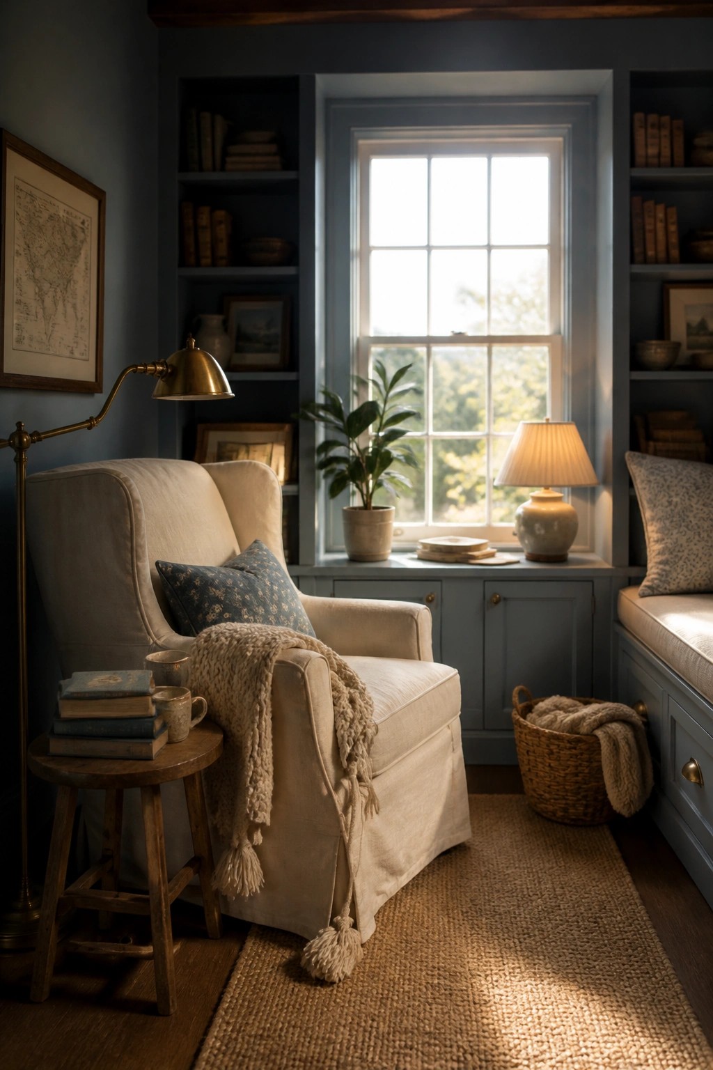
A soft blue gray gives a room a calm base that still feels warm. It works especially well in farmhouse spaces because it lets wood tones, fabrics, and simple furnishings come forward without competing.
This color suits rooms with built-in shelves or good natural light. Keep trim and ceilings light so the walls feel airy rather than heavy.
Soft Painted Cabinetry For A Workroom
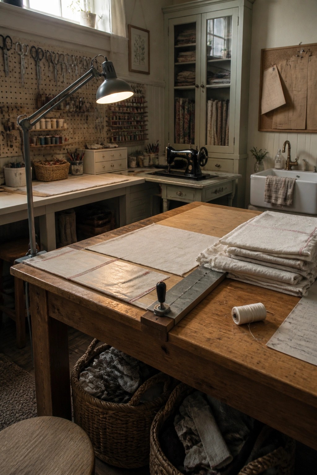
A soft painted finish on tall storage cabinets helps a busy craft space feel lighter and more welcoming. The muted tone blends with wood tones and fabric piles instead of competing with them, which keeps the room from looking cluttered even when projects are spread out.
This approach works well in any room that needs plenty of closed storage but still wants a calm backdrop. It suits older homes or farmhouse styles where you want the cabinetry to feel built in rather than added on. Just keep the color light enough that it does not darken the space on cloudy days.
Warm Terracotta on Lower Walls
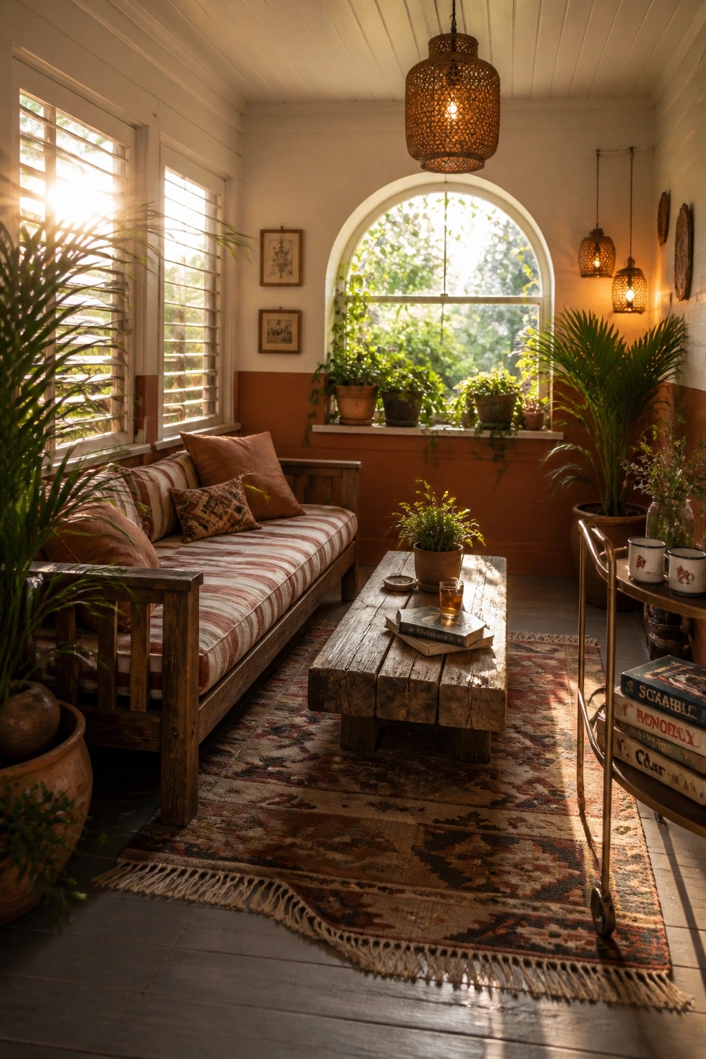
A warm terracotta shade on the lower walls gives a room an easy, grounded feel that works well with white trim and wood furniture. It adds just enough color without overwhelming the space or making it feel heavy.
This approach suits sunrooms, casual sitting areas, or any spot where you want a welcoming farmhouse look. Use a flat or eggshell finish and test the paint on a small section first, since the color can shift quite a bit with changing light.
Soft Greens On Built In Storage
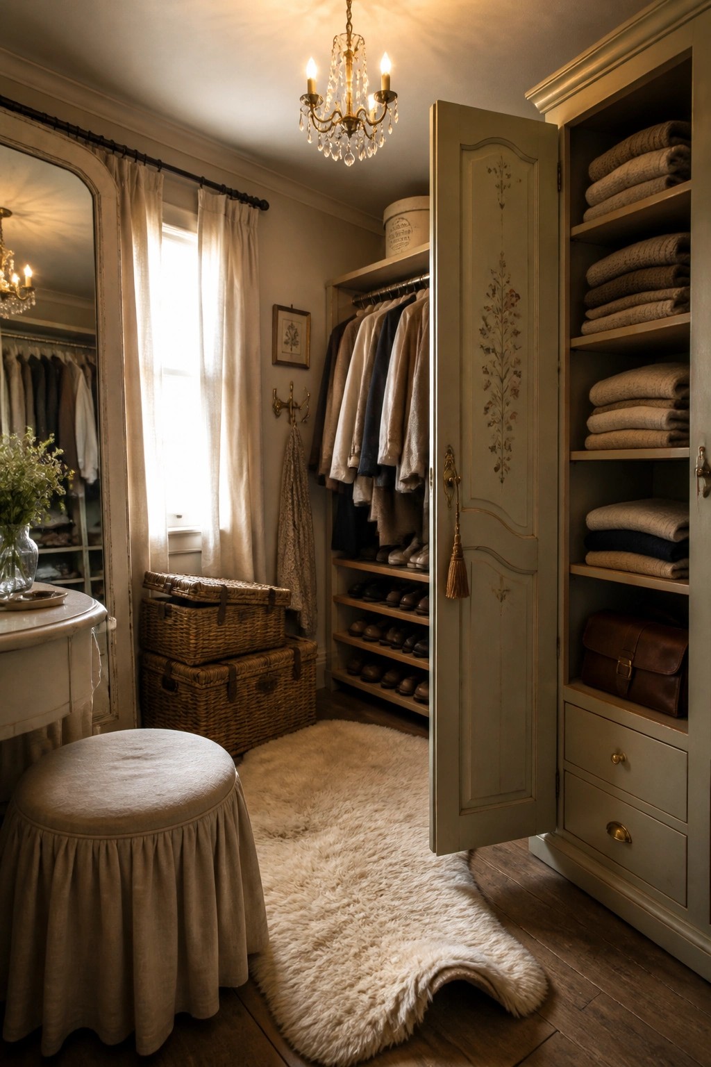
Many people reach for a soft green when painting closet cabinetry because it keeps the space feeling calm without going too cold. The color adds just enough warmth to make a storage area feel like part of the home rather than a purely practical zone.
This works best in older homes or farmhouse style rooms where you want the built ins to blend with wood tones and natural textures. Test the shade on a large sample first since greens can look different once the doors are closed and the lighting changes throughout the day.
Warm Neutrals That Work Across Rooms
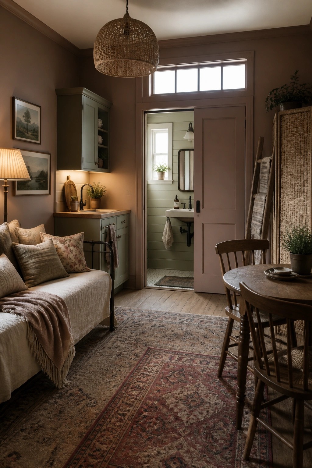
Many older homes feel calmer when the same soft neutral runs through connected spaces instead of switching colors at every doorway. A single warm shade on the walls helps the rooms read as one steady background rather than separate boxes.
This choice suits farmhouses that have open sightlines or small adjoining rooms. Stick with a muted greige or light taupe that leans slightly warm, and carry it from the main living area through to any visible side rooms so the whole space feels pulled together.
Frequently Asked Questions
Q: Which of these colors hides everyday scuffs best in a hallway? A: Go with the deeper beige or greige options from the list. They mask small marks without showing every touch. Lighten up the space with brighter trim if it starts feeling dark.
Q: How do I make sure the paint color feels warm next to my old wood floors? A: Test a sample board against the floorboards in the afternoon light. The right shade will bring out the wood’s natural tones instead of fighting them.
Q: Can I paint just one accent wall with a bolder color from the article? A: Yes, pick a slightly deeper tone and keep the other walls neutral. This adds interest without overwhelming the room.
