

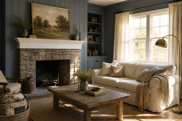
I often notice that farmhouse blues work best when they balance the warmth of wood tones and the simplicity of the overall layout in a room.
When the shade is too bright it can make a space feel less settled even if it matches the style on paper.
In my experience the ones that hold up are those that soften the room rather than dominate it once the furniture and everyday items are in place.
People tend to overlook how the ceiling height and window placement affect the way any blue reads from one end of the house to the other.
Try samples on multiple walls before committing.
Blue Gray Paint On Walls And Built-Ins
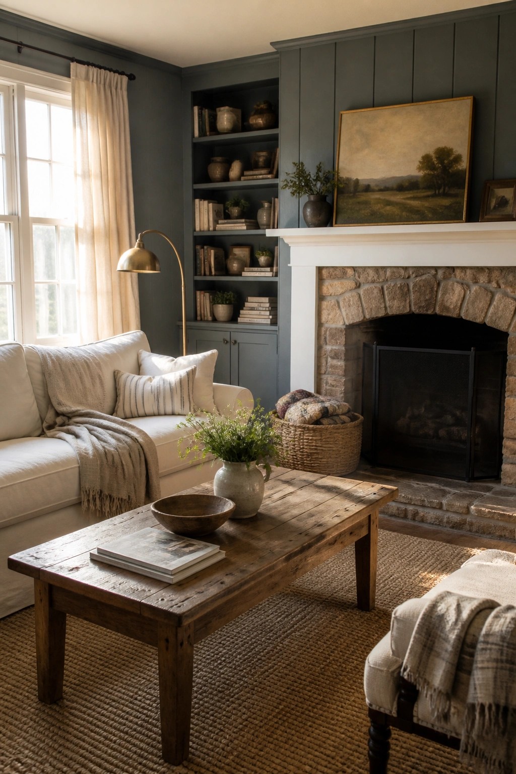
Painting the walls and built-ins the same blue gray shade is one of the simplest ways to create a calm, cohesive look in a farmhouse living room. The color wraps the space without breaking it up, which keeps things feeling quiet and settled.
This approach works best in rooms that already have some architectural detail like shelves or a mantel. It suits older homes or new builds that lean traditional, and it helps the room feel a little softer overall. Just test the color in different lights first, since blue grays can shift more than you expect.
Mixing Two Blue Shades in the Kitchen
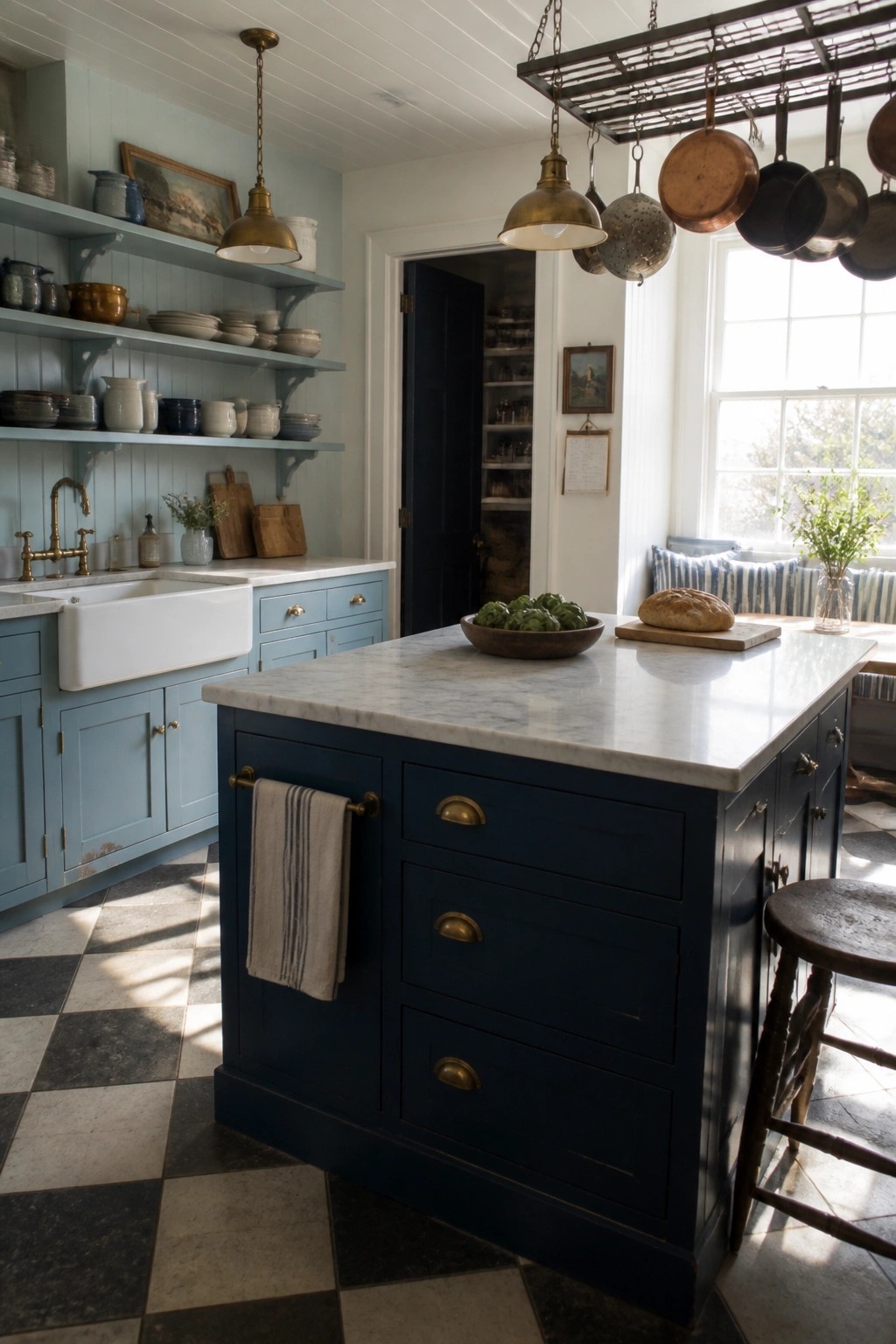
Many kitchens feel more interesting when the cabinets are not all the same color. A softer blue on the wall cabinets paired with a deeper navy on the island creates a quiet contrast that still reads as calm and classic.
This approach works best in spaces with good natural light so the darker shade does not feel heavy. It suits older homes or farmhouse layouts where you want the island to stand out without adding bold patterns or extra trim.
Blue Paneling For Bedroom Walls
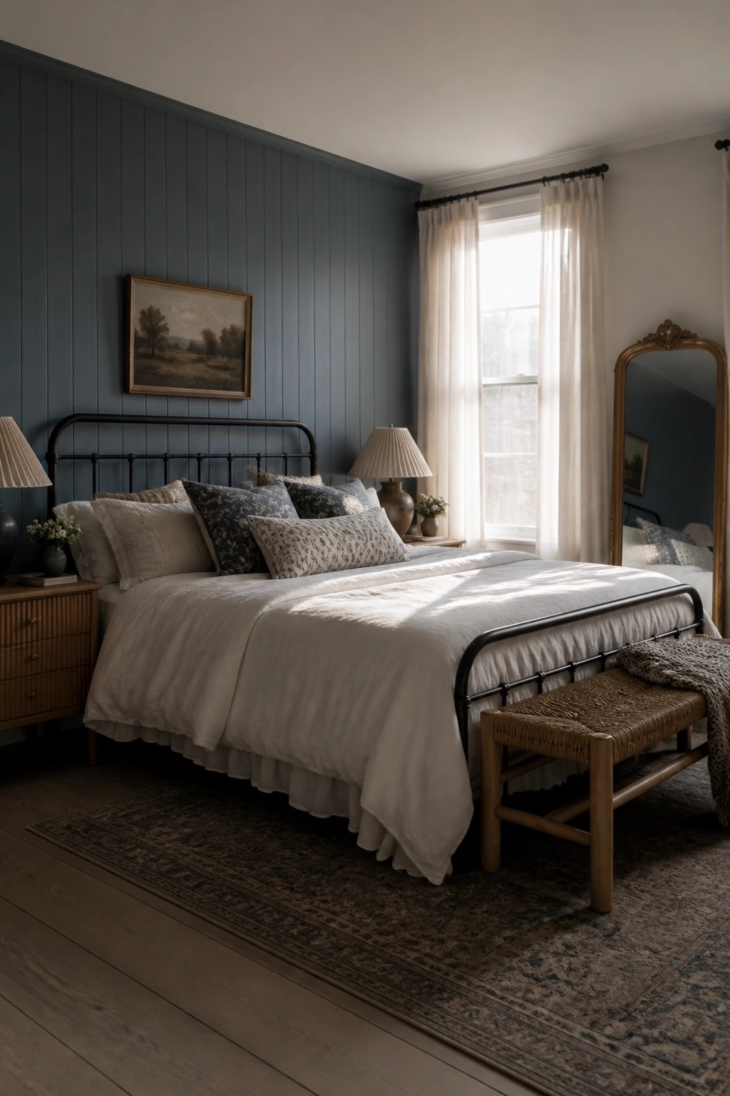
A deep blue on vertical paneling brings a calm, settled look to a farmhouse bedroom. The color feels classic rather than trendy, and the paneling adds just enough texture to keep the walls from looking flat.
This approach works well in rooms that get steady daylight. Keep the rest of the space simple with white bedding and darker metal furniture so the blue stays the main focus without overpowering the room.
Blue Painted Cabinetry for Bathroom Storage
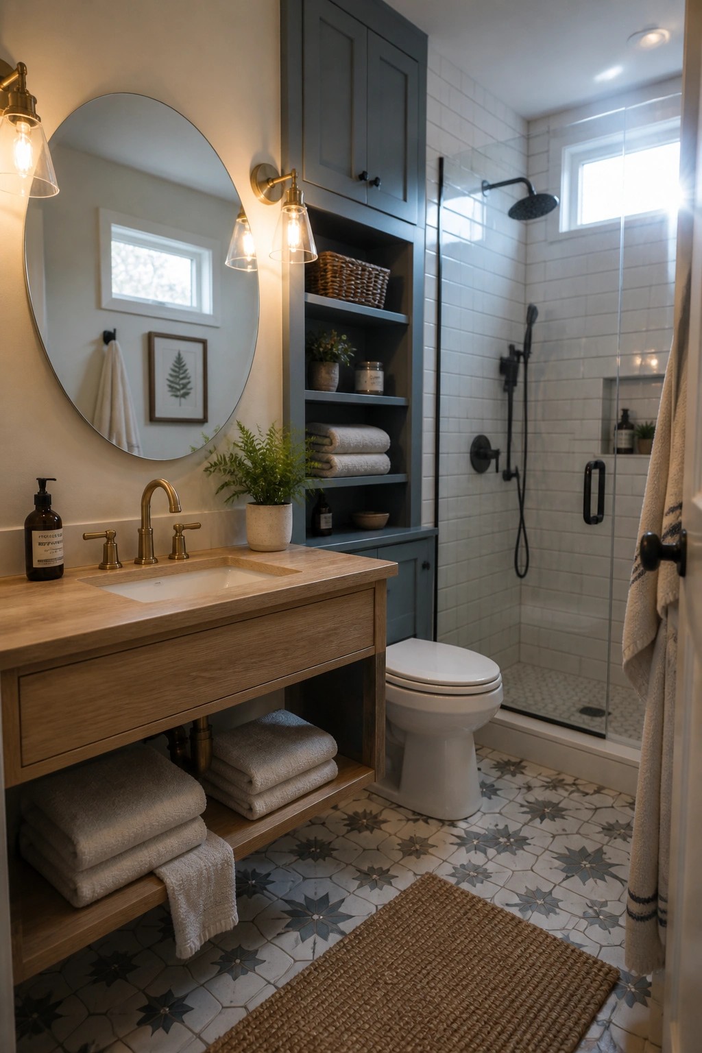
Blue painted cabinetry works well in a bathroom because it adds color without making the space feel busy. The soft tone keeps things calm and pairs easily with wood and white surfaces that already show up in many farmhouse homes.
Try this approach in smaller baths where you want storage that does not crowd the room. Stick with a muted blue on both closed doors and open shelves so the color feels consistent and the whole area stays simple.
Blue Wainscoting For A Calm Dining Room
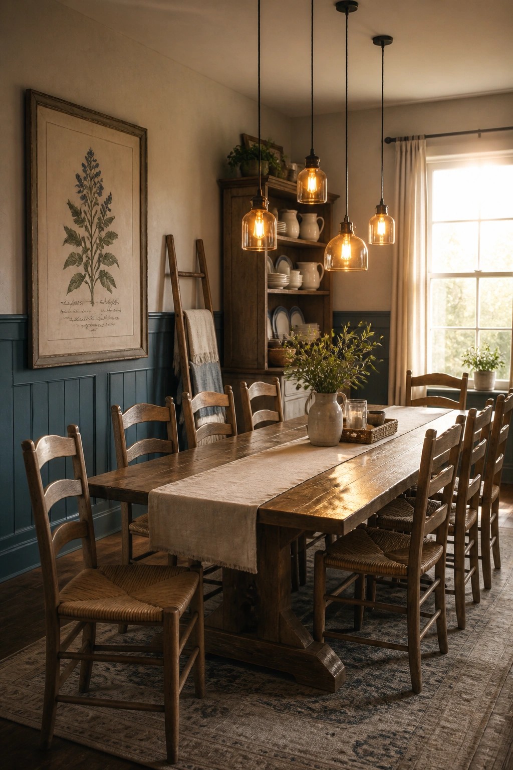
Blue wainscoting on the lower walls gives a dining room a steady, grounded feel without making the space feel heavy. It works especially well in farmhouse settings where you want a bit of color but still need the room to stay relaxed and welcoming.
This approach suits homes that already have wood tones and simple furnishings. Keep the upper walls light and let one or two larger pieces of art break up the blue so the color does not take over.
Blue Paint For Mudroom Walls And Built-Ins
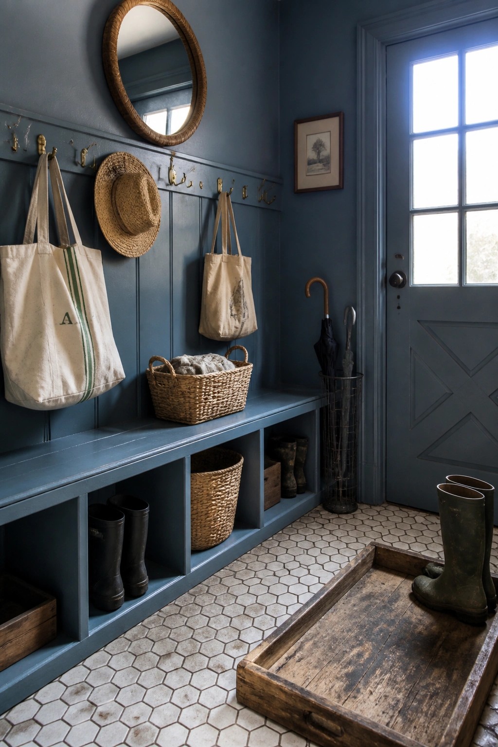
Painting the walls and built-ins the same deep blue can make a mudroom feel calm and finished. It turns a busy drop zone into something that looks intentional instead of just practical.
This approach works best in homes that need real storage near the door. The color hides scuffs from boots and bags, and the open cubbies keep things off the floor without adding extra furniture.
Blue Cabinets In The Laundry Room
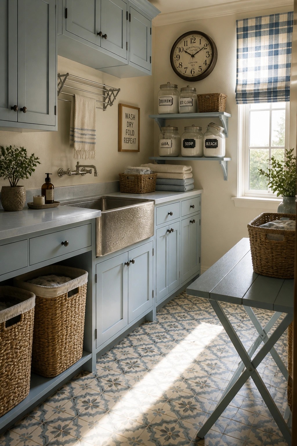
A soft blue on the cabinets gives a laundry room a steady, calm look that still feels practical. The color keeps the space from feeling purely functional while staying easy to live with day after day.
This works well in farmhouse homes where the laundry area sits off the main rooms. Stick with a muted blue that leans slightly gray so it stays classic instead of trendy, and pair it with simple hardware and light counters.
Deep Blue Built-Ins For A Calm Study

Painting built-in shelves and cabinets a deep blue creates a quiet backdrop that helps a room feel settled. The color works especially well in spaces meant for reading or working, where you want some depth without making things feel heavy.
This approach suits older homes or farmhouse-style rooms that already have wood trim and simple furniture. Keep the rest of the space light with natural wood tones and avoid crowding the shelves too much.
Soft Blue Walls For The Nursery
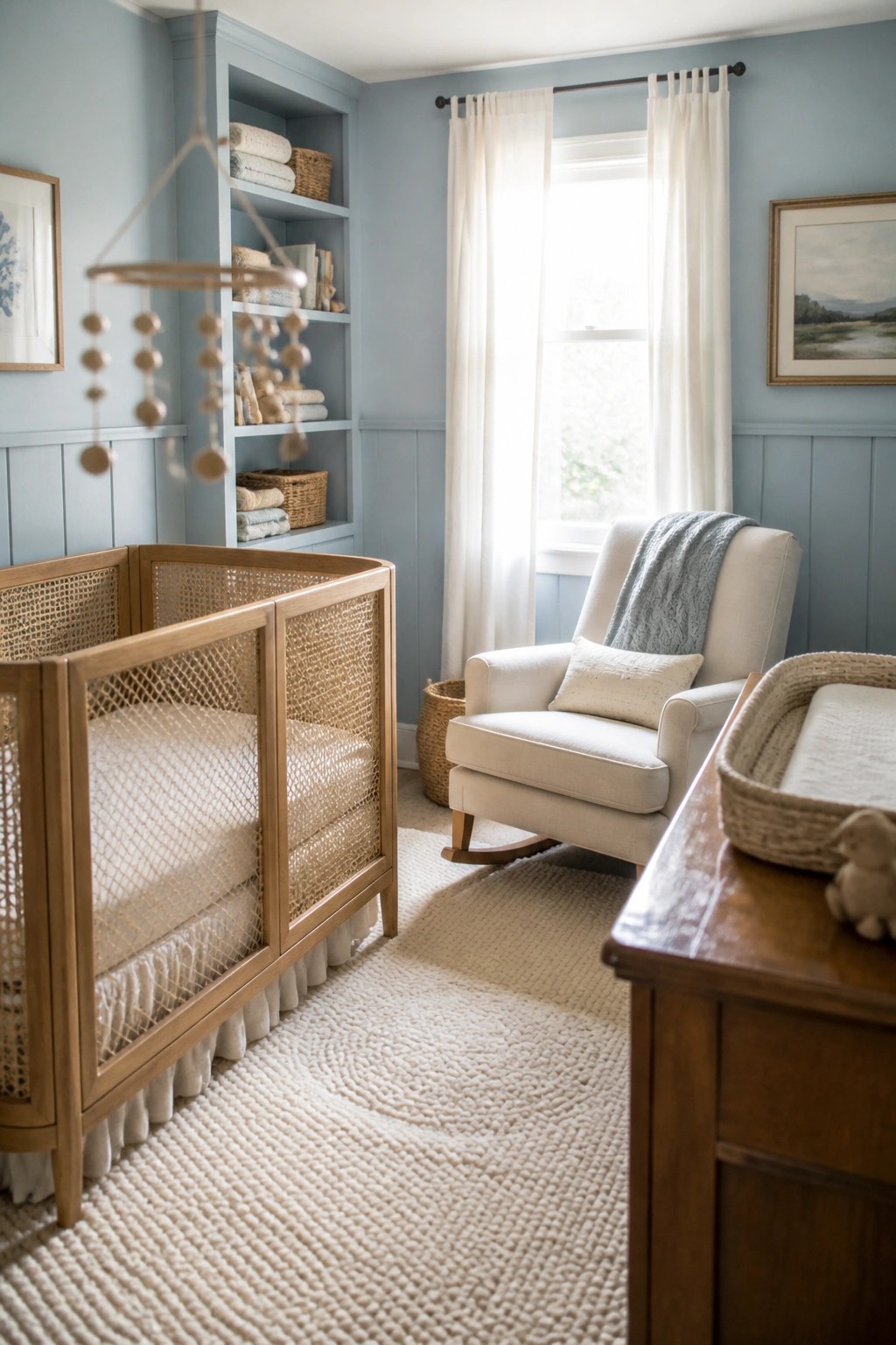
A soft blue like this one creates a calm setting that works especially well in a nursery. The color stays gentle on the eyes and gives the room a settled feeling from the start.
It pairs easily with natural wood furniture and simple white textiles. This approach suits a farmhouse home where you want the walls to feel classic without taking over the space.
Blue Doors And Trim
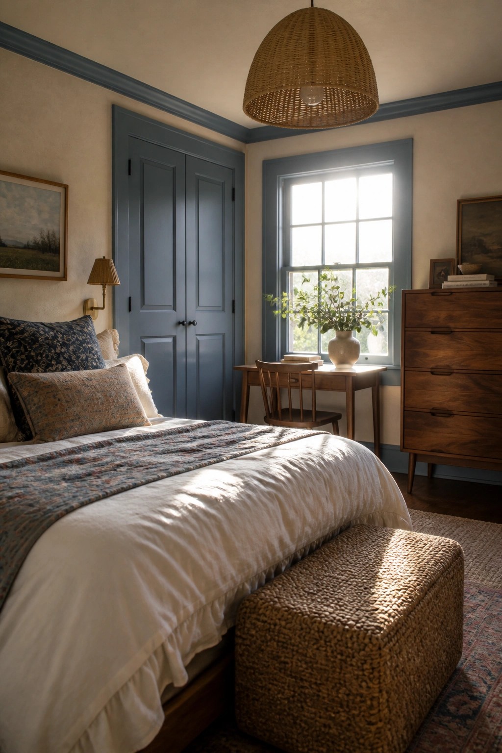
Blue paint on doors and trim brings a quiet order to a bedroom without making it feel heavy. The color stays soft enough to keep the space calm while still giving the room a clear structure.
This approach works best in older homes or farmhouse layouts where the doors and window frames already stand out. Keep the walls light and let the blue do the work on just those built-in elements.
Blue Paint Over Beadboard Wainscoting
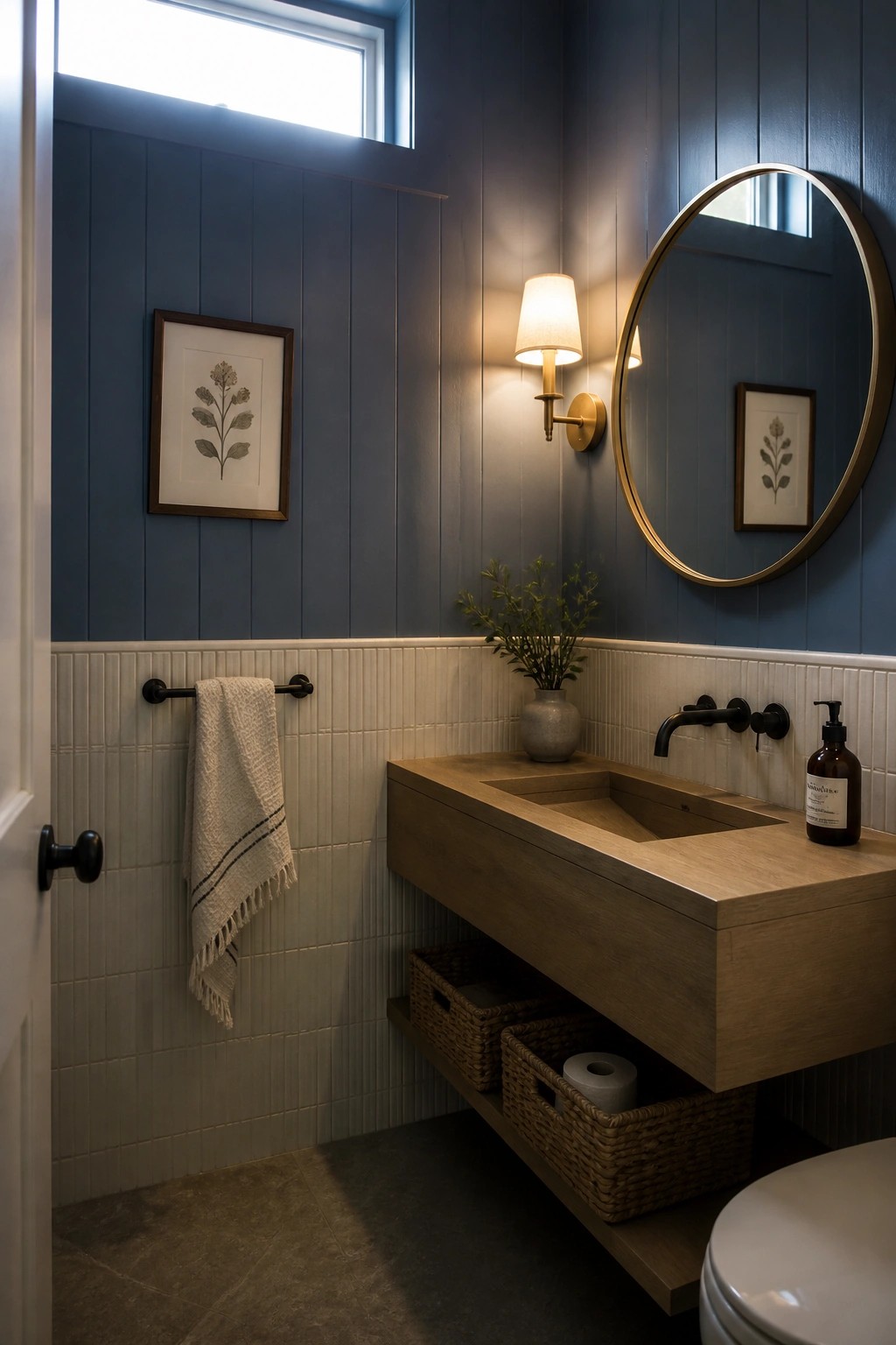
This combination keeps a bathroom feeling calm and classic without going too dark. The blue sits nicely on the upper walls while the lighter beadboard below stops the color from closing in the space.
It works especially well in smaller bathrooms or powder rooms where you want some color but still need the room to feel open. Keep the hardware simple and add wood tones on the vanity or shelves to balance the look.
Soft Blue Paint For Built-In Shelving
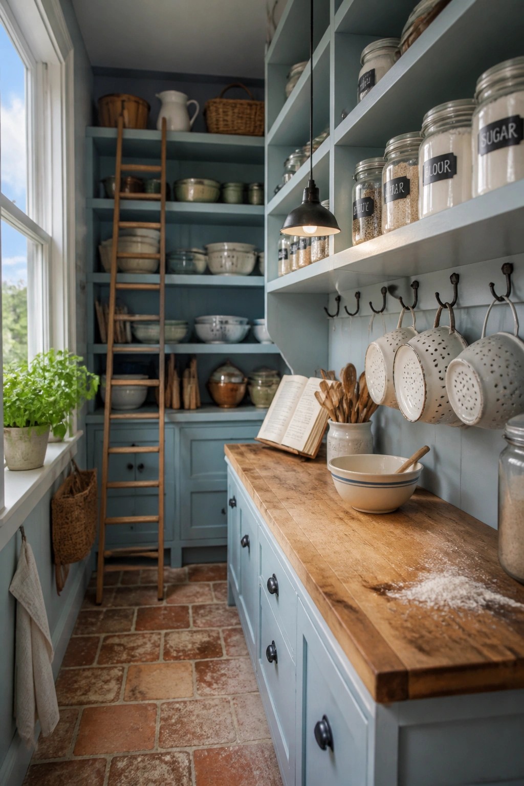
A soft blue on cabinetry and open shelving can make a pantry or kitchen storage area feel calm without looking too styled. The color works well against wood tones and simple hardware, giving the space a quiet farmhouse character that still feels practical for daily use.
This approach suits older homes or any room where you want storage to blend in rather than stand out. Keep the blue on the lighter, muted side so it does not overpower the wood counters or floor. It also pairs nicely with open shelving if you want the area to feel airy instead of closed off.
Soft Blue Walls For The Dining Nook
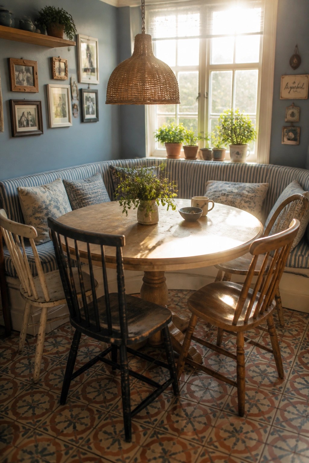
A soft blue on the walls can turn an ordinary dining spot into something calmer and more classic. The color feels easy to live with and pairs naturally with wood tones and simple seating.
This works especially well in older homes or any room that gets good natural light. Keep the blue on the muted side so it stays quiet rather than feeling cold.
Blue Wainscoting for a Calm Look
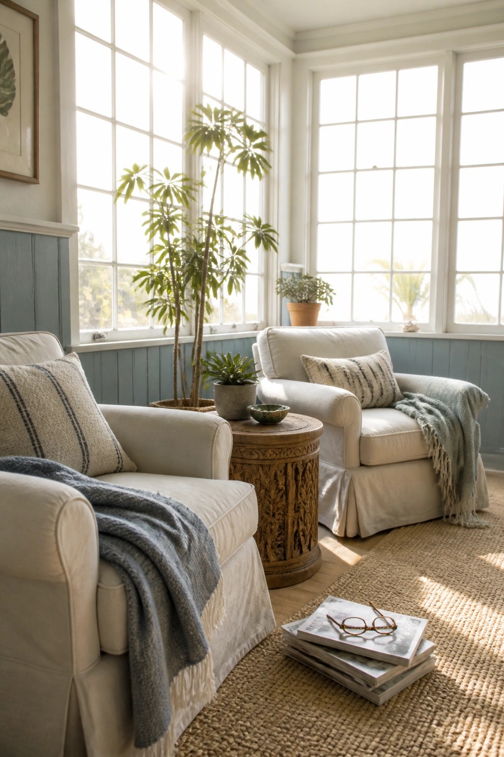
Blue on the lower half of the walls gives a room a quiet base without making it feel dark or heavy. It works especially well when the top half stays white and the space gets plenty of light through big windows.
This approach suits older homes or any room where you want a bit of color but still need it to feel open and easy. Keep the furniture light and simple so the blue stays in the background instead of taking over.
Blue Gray Paint For Calm Hallways
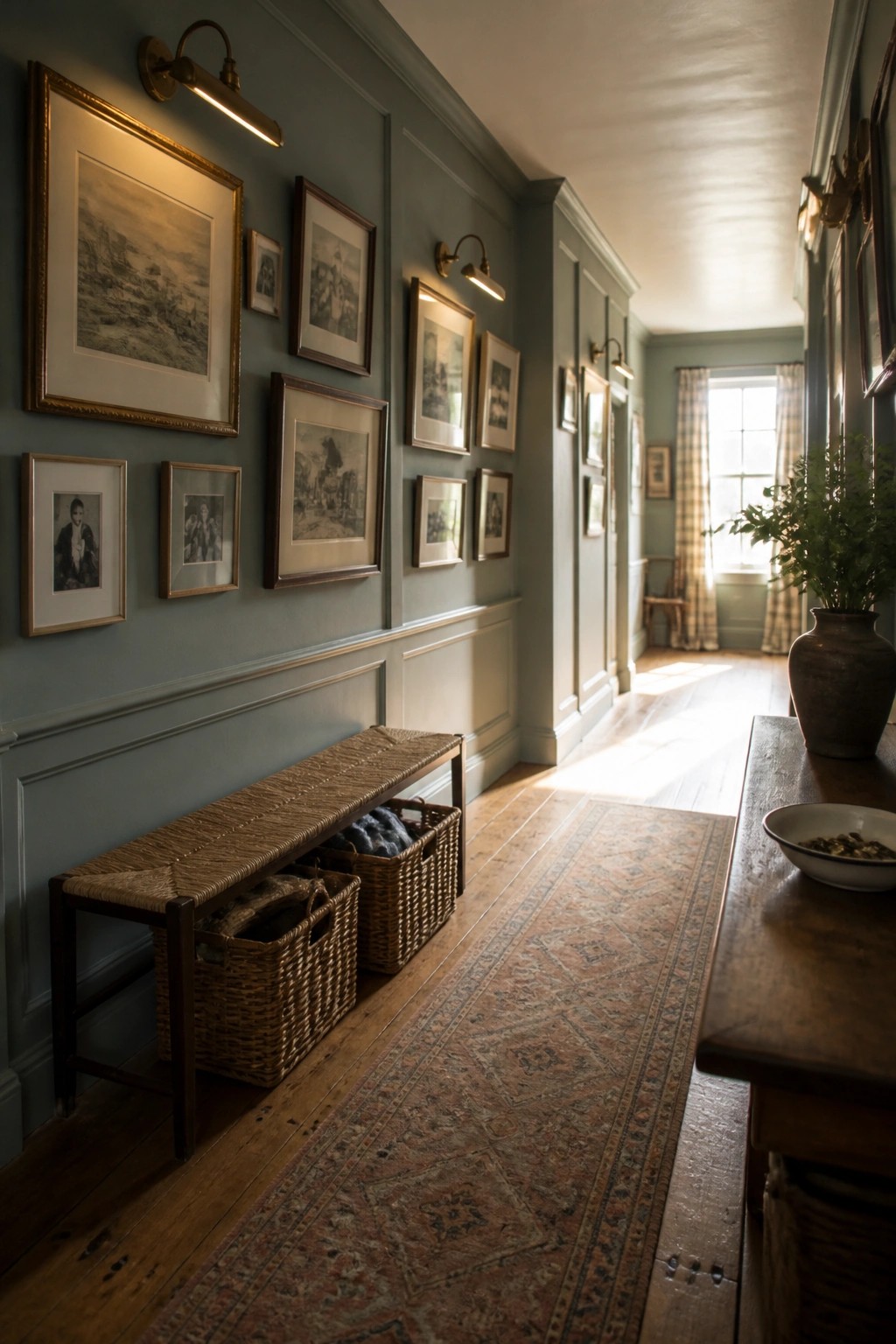
A soft blue gray works especially well in hallways because it keeps the space feeling open and steady. The color pairs easily with wood floors and white trim without making the area feel closed in.
This shade suits older homes that already have paneling or simple moldings. Keep the rest of the space light with natural textures and avoid crowding the walls with too much furniture.
Blue Painted Built-Ins for Craft Spaces
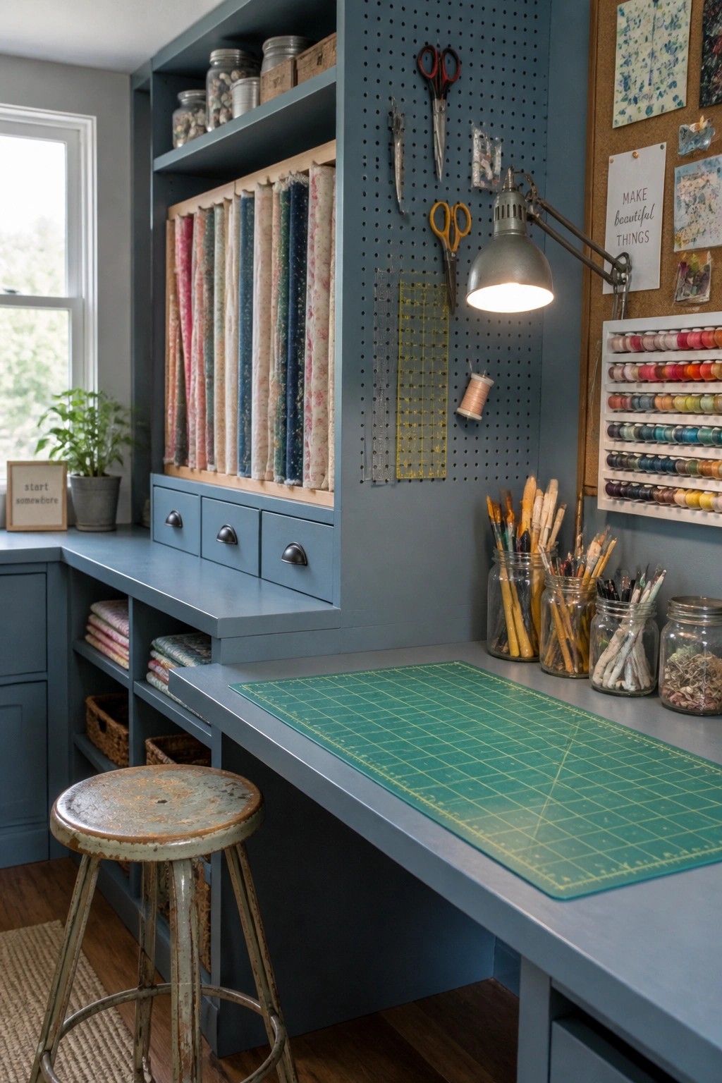
Painting built-in shelves and cabinetry in a soft blue gives a craft room a calm, orderly feel without making it look too stark. The color ties everything together and turns open storage into something that feels intentional rather than cluttered.
This approach works best in rooms that double as work areas, where you want storage that stays visible but still feels restful. It suits older homes or farmhouse styles that already lean toward simple, useful details.
Deep Blue Built-Ins In The Closet
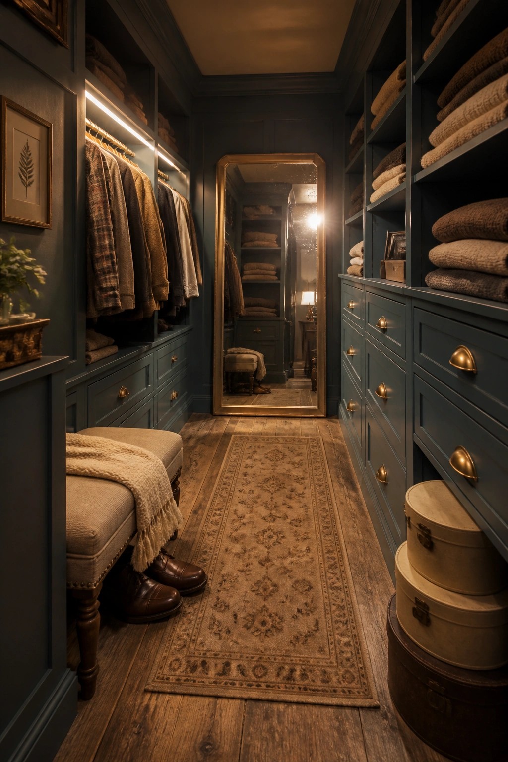
Painting closet cabinetry a deep blue gives the space a calm, settled feel that works well with farmhouse style. The color adds depth without making the room feel closed in, and it keeps the focus on the storage itself rather than bright white surfaces.
This approach suits homes that already use blue elsewhere or want a quiet contrast to wood tones and natural light. It works best in rooms with some natural light and pairs simply with brass or black hardware. Keep the rest of the palette light so the blue stays the main feature.
Deep Blue Built-Ins For A Calm Library
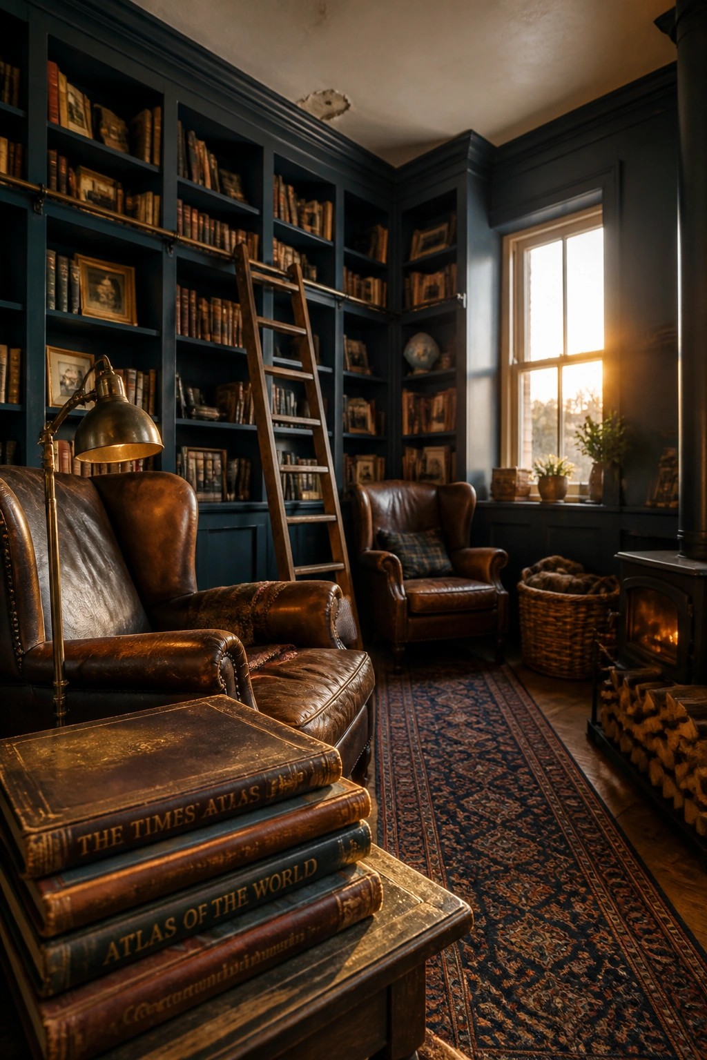
A deep blue on built-in bookshelves gives a room weight without making it feel closed in. The color pulls everything together and lets the books and wood tones stand out in a quiet way.
This approach works best in older homes or farmhouse spaces where you already have tall walls and trim details. Keep the rest of the room simple with wood floors and a few leather pieces so the blue stays the main feature.
Deep Blue Accent Walls
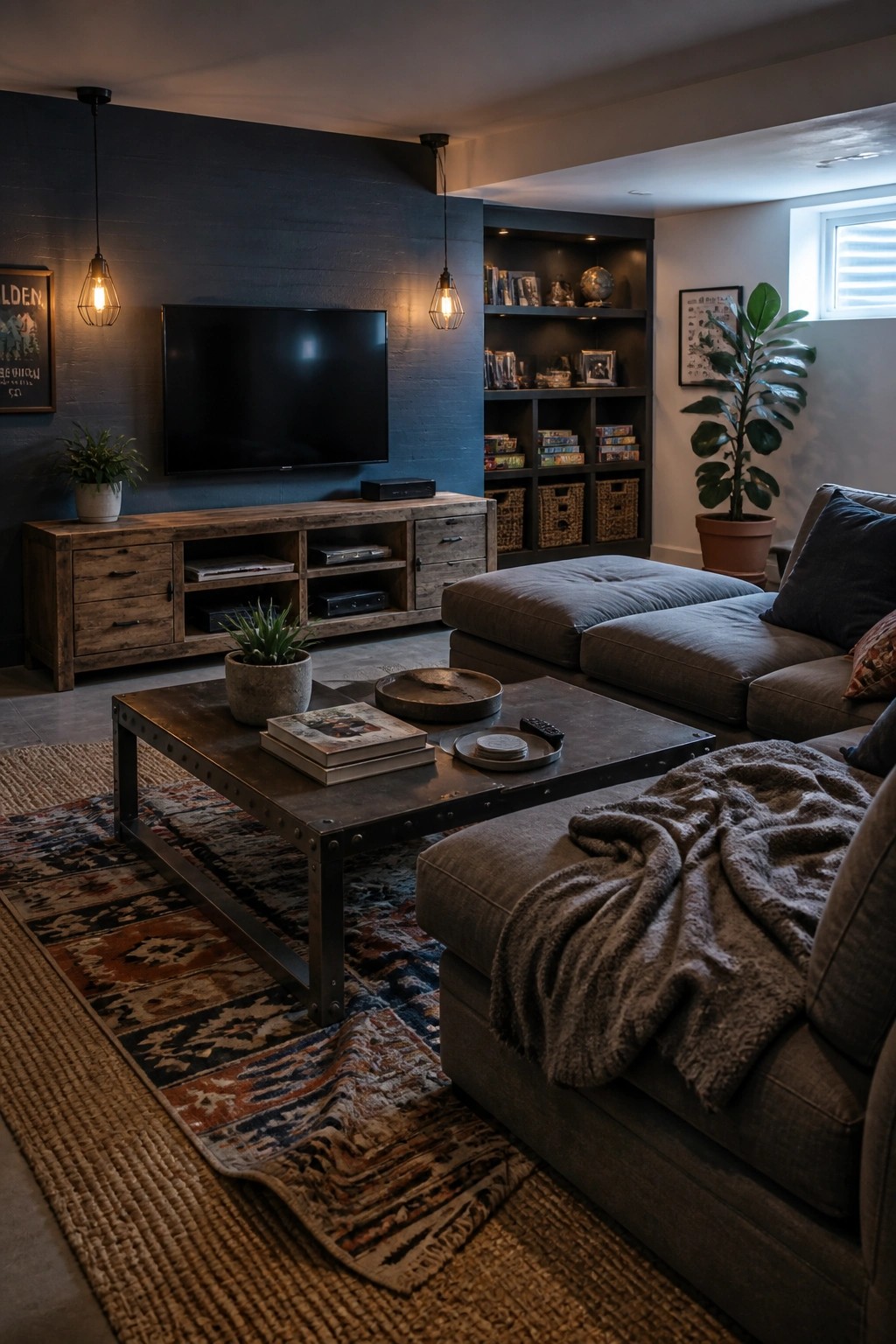
A deep blue wall behind the TV creates a calm, steady backdrop that keeps the living room from feeling too busy. The color grounds the space nicely with the wood console and lighter furniture around it.
This works best in farmhouse homes where you want some depth without darkening the whole room. Paint just the main wall and leave the others lighter so the area still feels open and balanced.
Blue Wainscoting in Stairwells
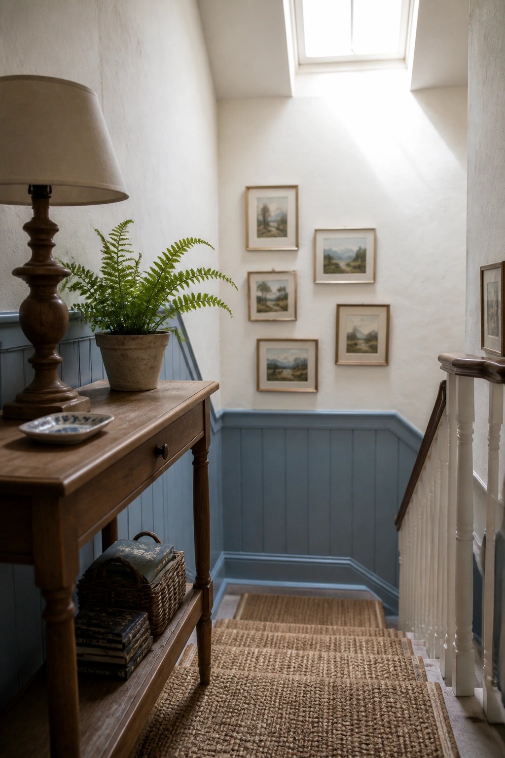
Blue wainscoting gives a stairwell a quiet bit of color without taking over the space. The lower panels catch the light from above and keep the hallway from feeling too plain or narrow.
This works best in homes with white walls above the trim and natural wood accents nearby. Keep the blue soft so it stays calm rather than bold, and let the upper walls stay light to hold the open feel.
Deep Blue Ceilings
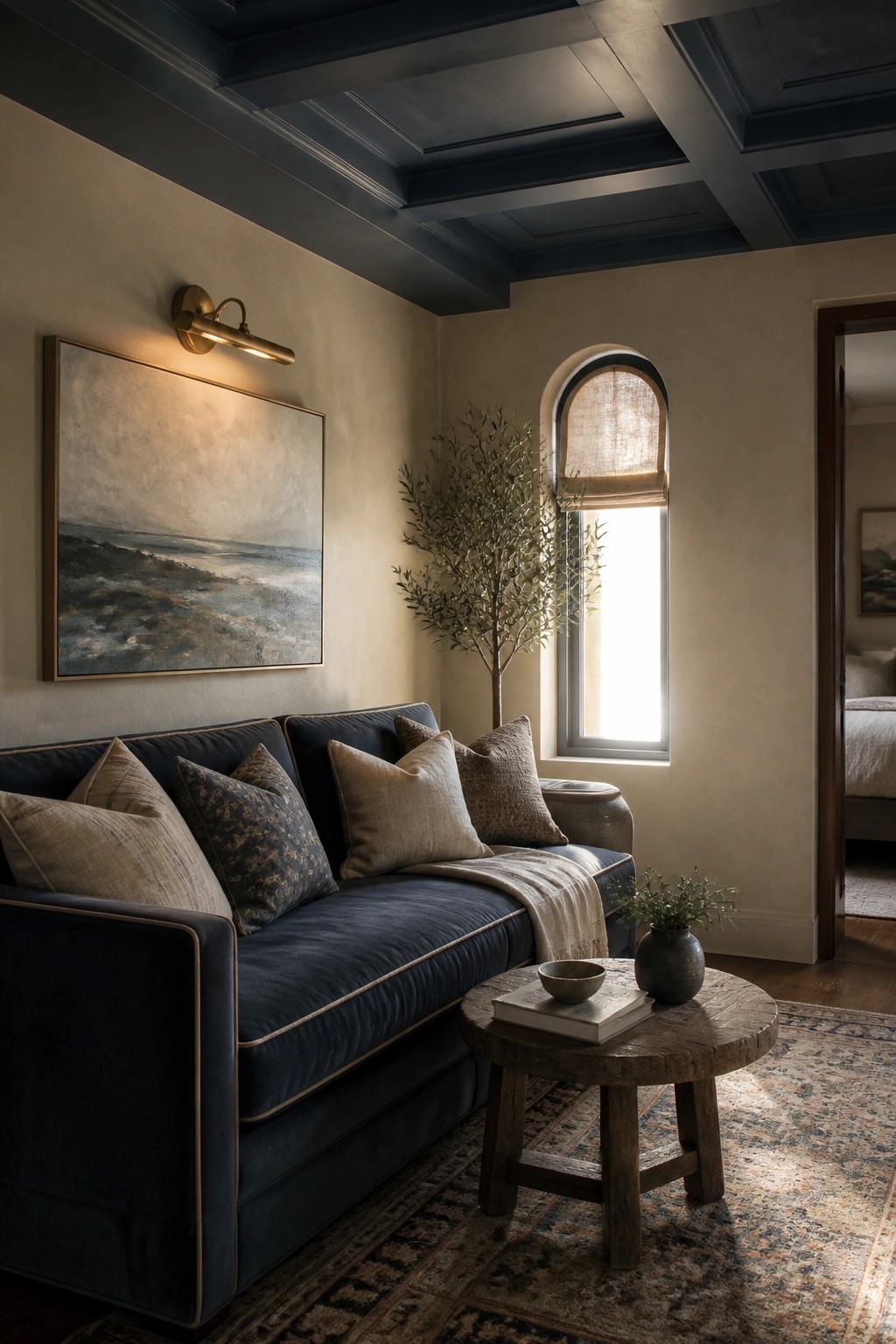
A deep blue ceiling adds quiet weight to a room. It pulls the eye up while keeping the overall feel calm and classic, which fits right into the farmhouse style many people want right now.
This choice works best in spaces with decent height so the color does not feel heavy. Keep the walls light and use simple fabrics and wood tones to let the blue settle in without taking over.
Frequently Asked Questions
Q: Should I test these blues in my actual room before committing? A: Grab sample pots of two or three shades and paint large swatches on different walls. Check them at different times of day to see how the light shifts the tone. This step saves you from a color you end up hating.
Q: What color should the trim be with a farmhouse blue? A: Crisp white trim keeps the look classic and bright. It makes the blue pop without competing. Stick to a warm white if your floors have yellow undertones.
Q: Will a blue this calm work in a busy family kitchen? A: Yes, these soft blues actually tone down the chaos of daily use. They create a peaceful backdrop that still feels welcoming. Just avoid the deepest shades if your kitchen lacks natural light.
