

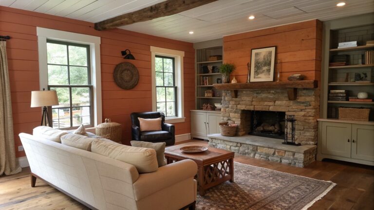
I have found that the right paint color can shift how a whole room feels once the furniture is in place and the light changes throughout the day.
It is easy to pick shades that look good in a store but then fall flat against the wood tones and textures already in the house.
Testing samples on multiple walls helps avoid that mismatch.
When I choose colors for my own spaces I pay close attention to how they warm up the corners and tie the elements together.
Some of these earthy tones seem worth trying because they ground the room without making it feel heavy.
Warm Terracotta Walls In Rustic Rooms
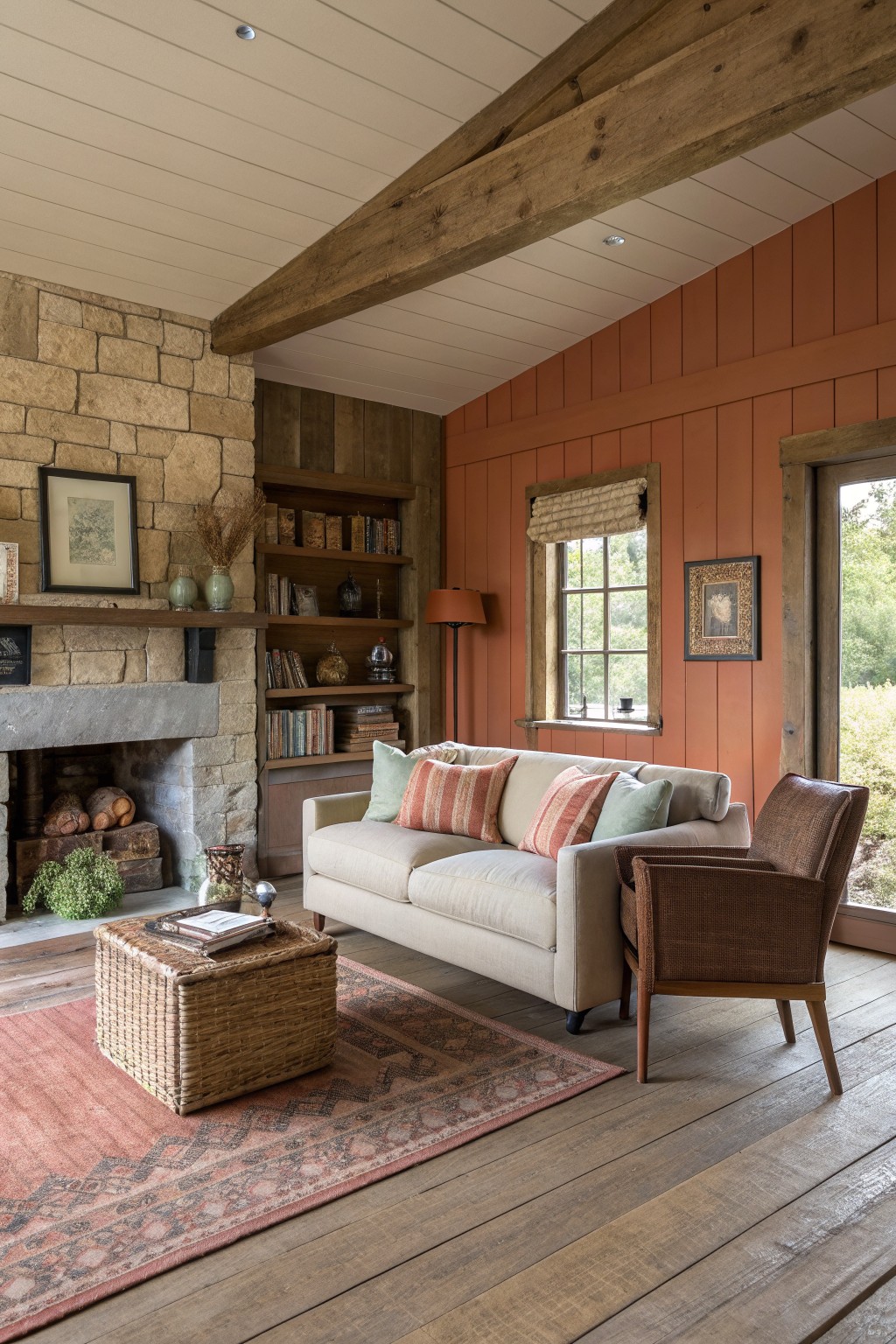
Terracotta paint brings a soft earthy tone that feels natural next to wood and stone. It adds warmth without making the space feel heavy, especially in rooms that already have exposed beams and textured surfaces.
This color works best in living areas with some age or character. Keep the rest of the palette simple with creams and light woods so the walls stay the main feature.
Warm Terracotta On Kitchen Cabinets
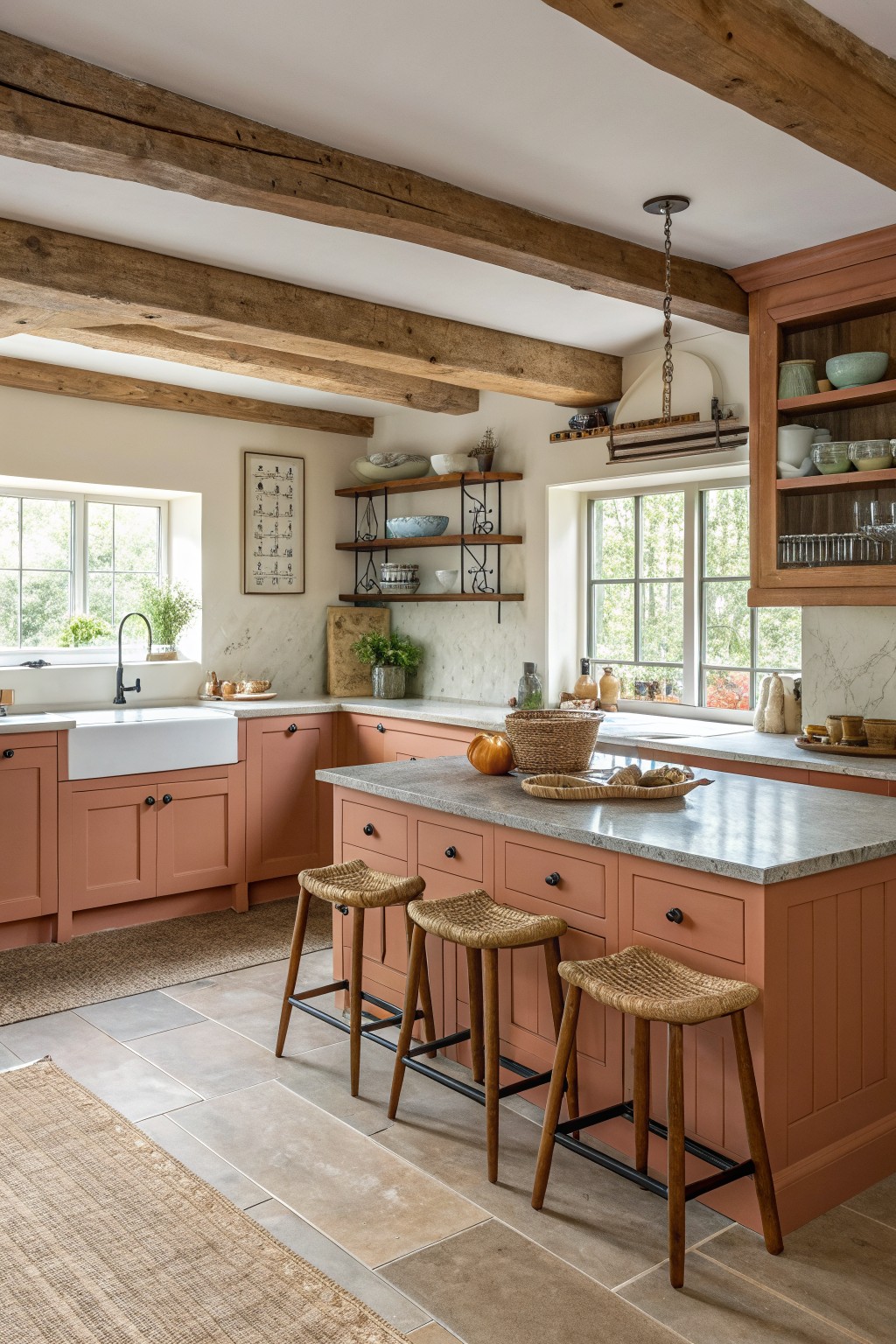
Warm terracotta paint on cabinets gives a kitchen an earthy base that feels settled right away. It works especially well when the rest of the room already has wood tones and stone surfaces, since the color bridges those materials without competing.
This shade suits older homes or new builds aiming for a relaxed farmhouse look. Keep the walls light and the hardware simple so the cabinets stay the main color note without turning the space too dark.
Warm Earthy Paint Colors in Rustic Bedrooms
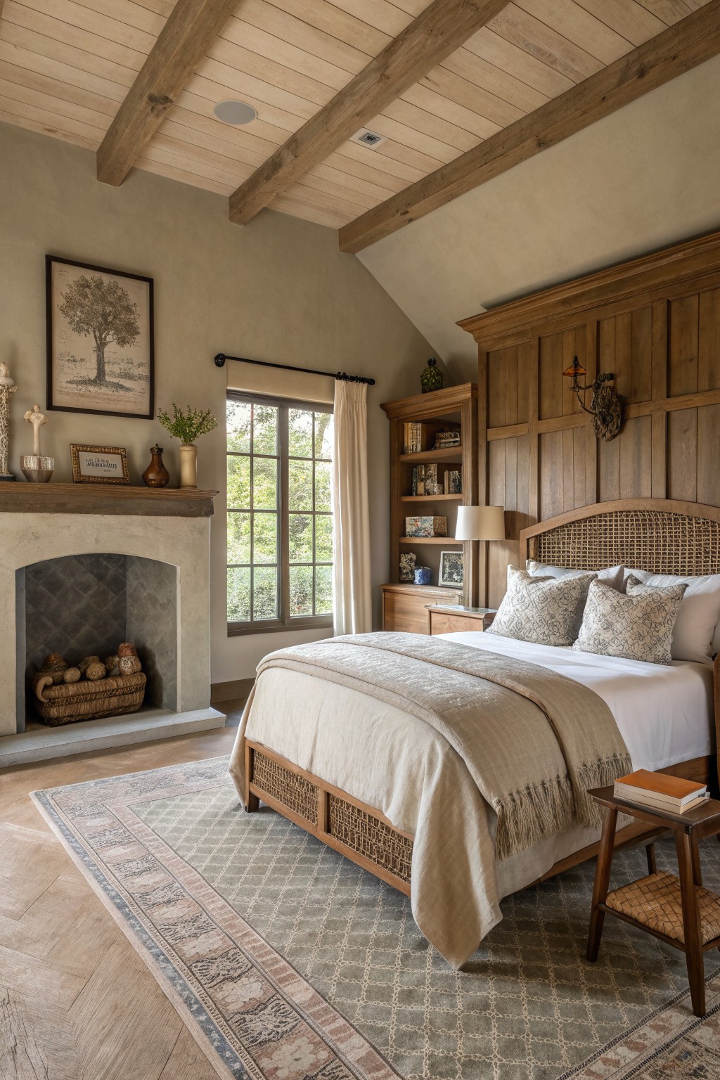
A soft warm taupe on the walls gives a bedroom that settled, comfortable look without trying too hard. It pairs well with wood beams and stone details, letting the natural textures stand out while keeping the space feeling calm.
This color works best in rooms with plenty of wood and simple furnishings. Use it on the main walls and keep ceilings and trim lighter so the room stays bright enough during the day.
Warm Neutral Paint On Shiplap Walls
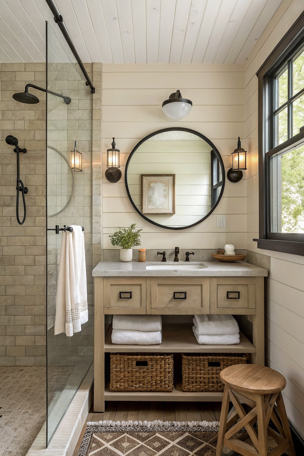
A soft warm neutral on shiplap gives a bathroom that settled, lived-in feel without making the room go flat. It works especially well when the rest of the space already has wood tones and stone, since the paint color helps tie everything together instead of standing apart.
This approach fits best in smaller bathrooms or any room where you want the walls to feel calm rather than bright white. Keep the trim and ceiling lighter so the color reads as intentional instead of heavy, and test the paint on a large sample first because these tones shift a lot with different lighting.
Warm Yellow Paint for the Dining Room
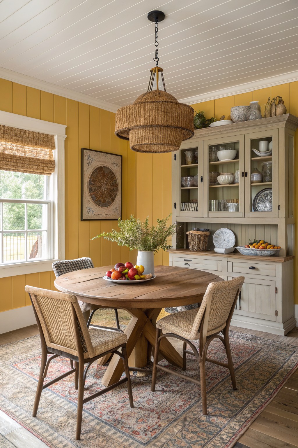
A soft yellow on the walls can make a dining room feel brighter and more welcoming without turning it into a bold statement. It works because the color stays warm and earthy, so it blends with wood tones and simple textures instead of fighting them.
This shade suits homes that already have natural wood furniture and woven pieces. It shows up best in rooms with decent daylight, where the yellow stays calm rather than harsh. Darker or cooler yellows can feel heavy, so test a few samples on the actual wall first.
Built-Ins in One Warm Neutral
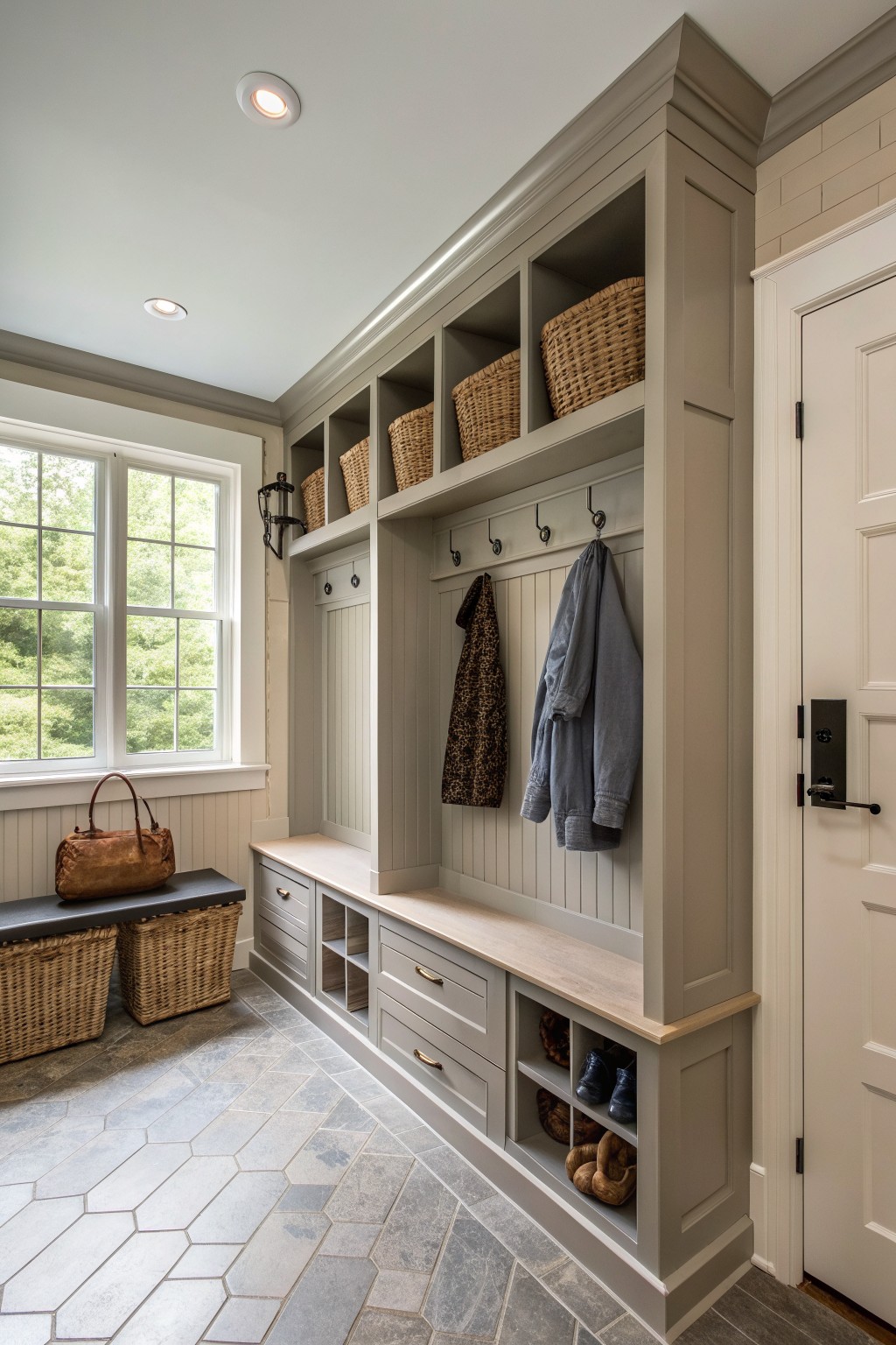
Using the same paint color across the walls and all the cabinetry keeps a busy entry area from feeling scattered. The single tone lets the storage blend in rather than stand out, which works well when there are hooks, open cubbies, and a bench all in one space.
This choice fits a rustic farmhouse home that needs practical storage near the door. A soft earthy gray-beige carries through every surface and still leaves room for the wood tones and baskets to add warmth.
Painting Built-Ins The Same Color As The Walls
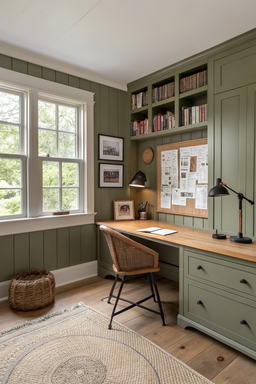
Many people paint their built-in shelves and cabinets the same color as the surrounding walls. It keeps the storage from feeling like a separate piece and helps the whole room read as one calm space.
This approach works well in a home office or study where you need plenty of storage but still want the room to feel open. Pick a warm earthy green and carry it across the trim and doors too so the color feels intentional rather than added on later.
Warm Terracotta On An Accent Wall
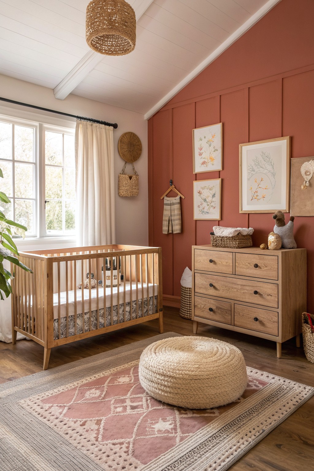
A warm terracotta shade on an accent wall brings a soft earthy tone into a room without making it feel heavy. It works especially well in a rustic farmhouse setting because it adds just enough color while the rest of the space stays light and simple.
This approach suits a nursery or small bedroom where you want some warmth but still need the room to feel calm. Keep the trim and ceiling in a soft neutral and let natural wood pieces carry the rest of the look.
Warm Yellow Walls For Everyday Light
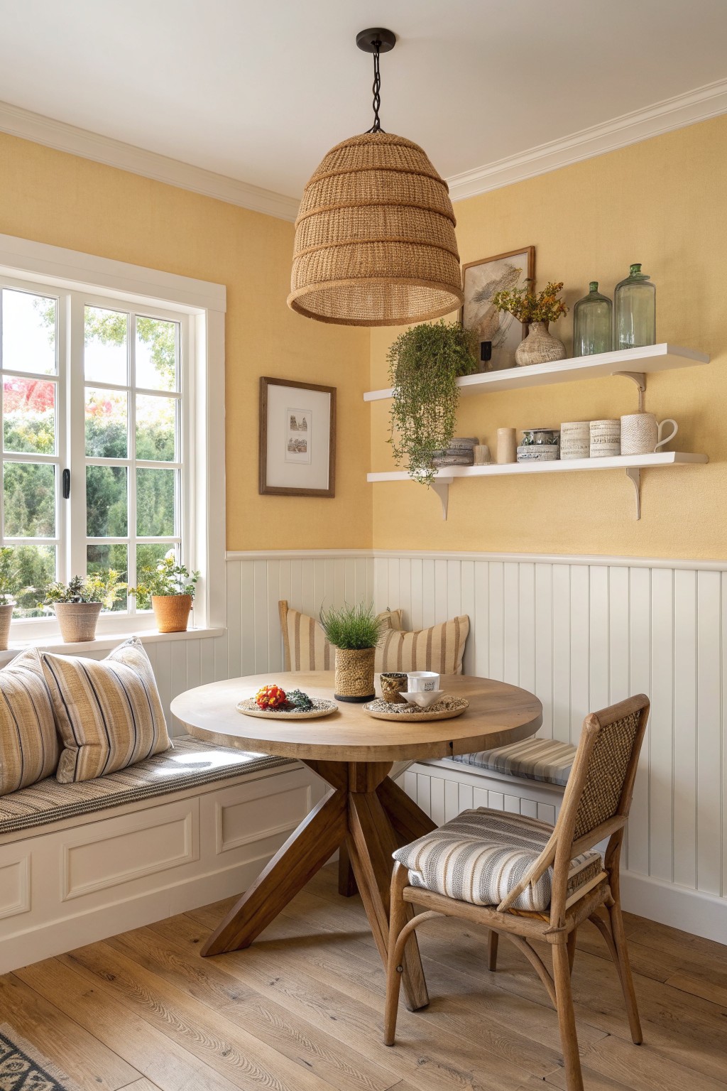
A soft yellow like this works well in a small eating area because it bounces light around without feeling too bright. The color stays grounded thanks to the white trim and wood tones, so the room feels sunny rather than loud.
It suits homes that get decent natural light and pairs easily with built-in benches or simple wood furniture. Keep the rest of the palette quiet with neutrals and natural textures so the yellow stays the main warmth without overpowering the space.
Terracotta Walls In The Bathroom
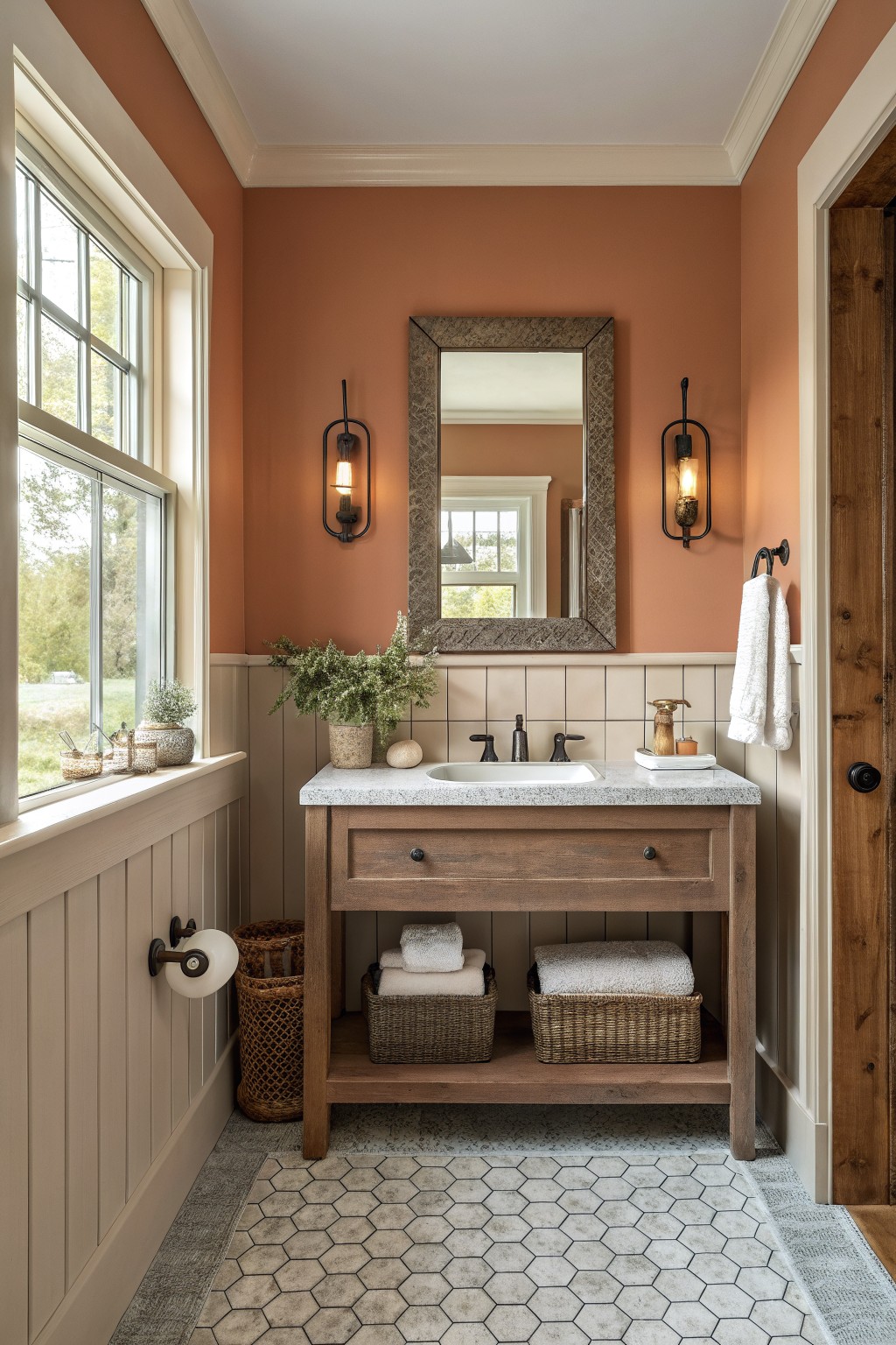
A warm terracotta color on the walls brings a grounded feeling to a bathroom that white paint often misses. It works especially well with wood vanities and simple stone counters because the color anchors everything without fighting the natural textures.
This shade suits homes that already lean rustic or farmhouse. It holds up best in rooms with some natural light, since darker earth tones can feel heavy in very small or windowless baths.
Soft Green Paint For Bedroom Walls
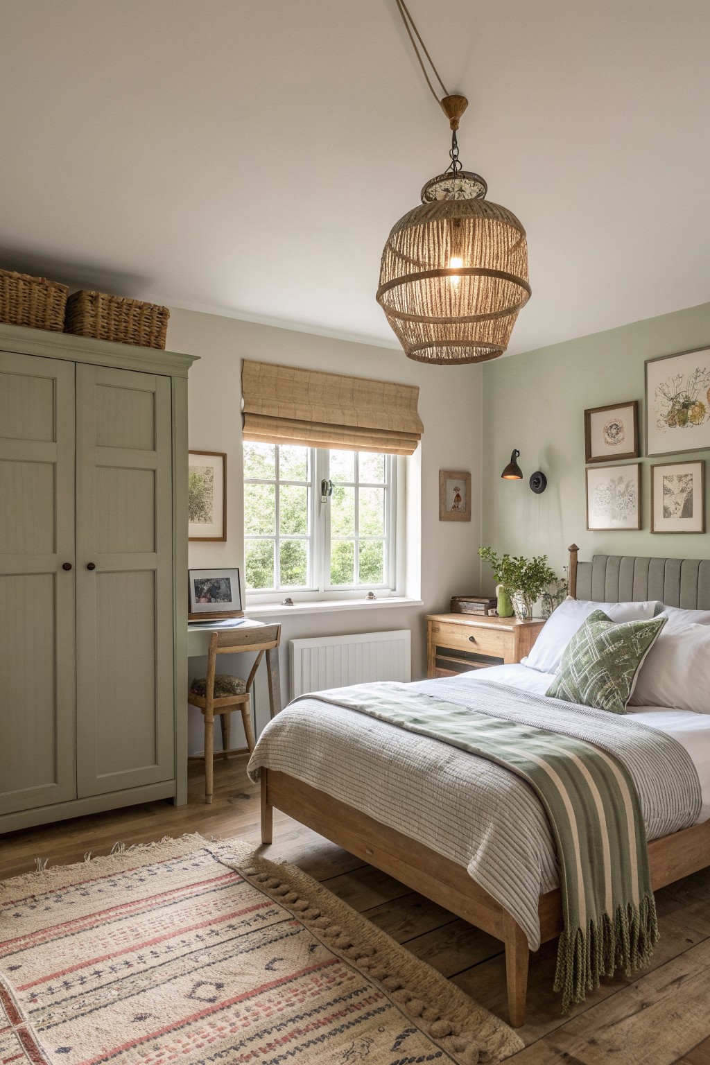
A soft sage green works well on bedroom walls because it feels calm without turning the space too cool or stark. The color sits nicely between gray and green, so it blends with wood tones and natural fabrics instead of fighting them.
This shade suits rooms that get steady daylight and already have simple furniture. It pairs easily with oak floors or a wooden bed frame, and it keeps the overall look grounded rather than busy. Avoid it in very small or dark rooms where the tone can read flat.
Warm Neutrals For Busy Entryways
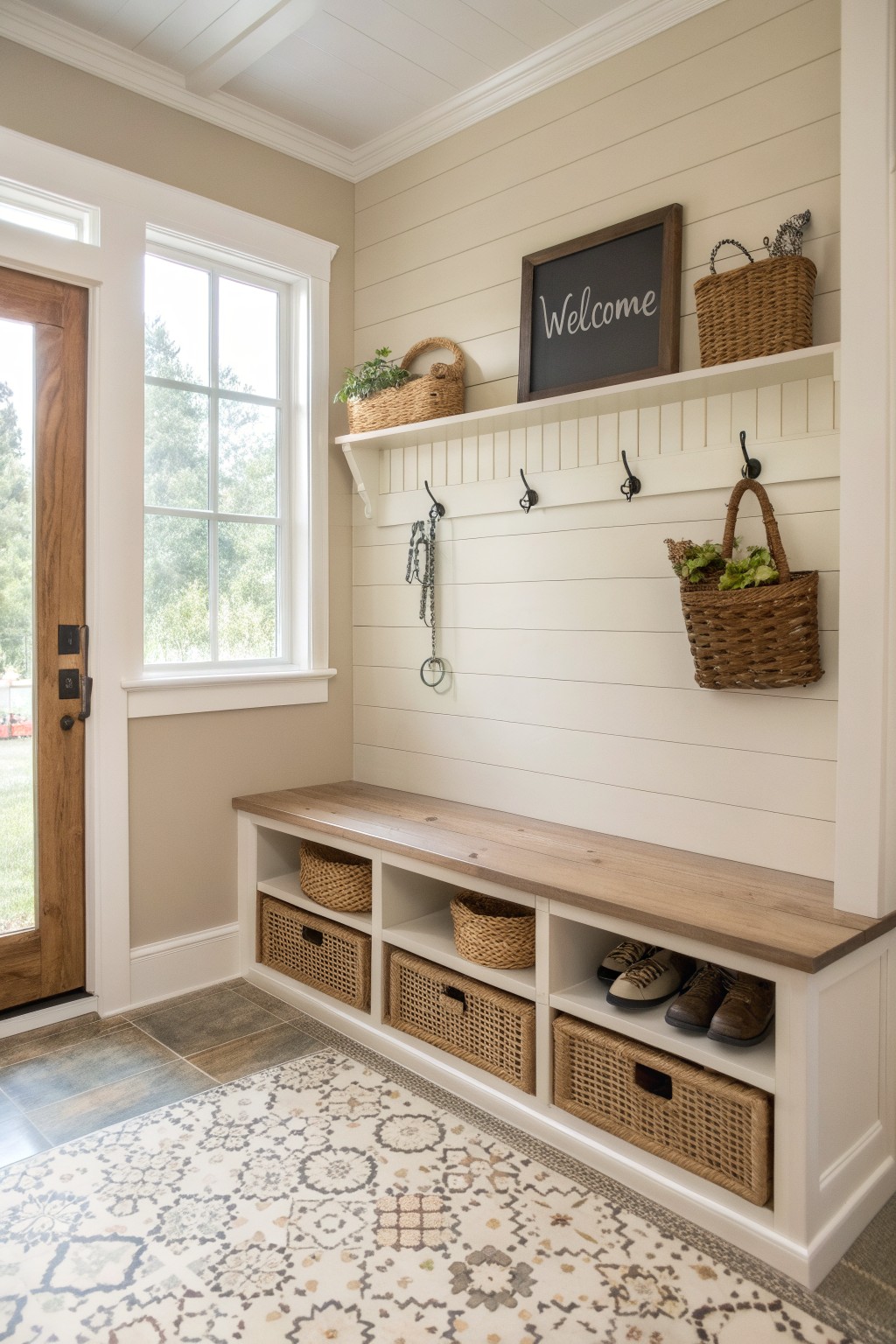
A warm neutral paint color helps a mudroom stay calm even when it holds coats, shoes, and daily clutter. The soft beige tone on the walls here blends nicely with the wood bench and woven baskets without making the space feel stark or cold.
This kind of color works well in any home that needs an entry to handle real use. Keep the same shade on the trim and ceiling so the room feels steady and easy to keep looking tidy.
Warm Wood Tones For Kitchen Cabinets
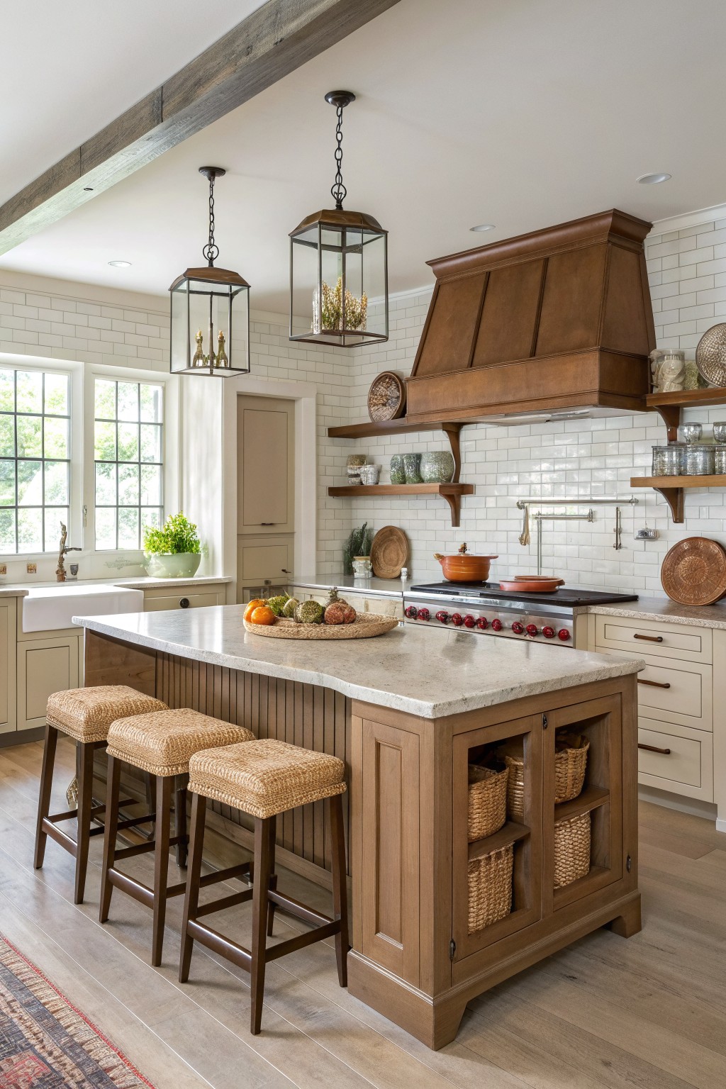
Many kitchens feel more grounded when the cabinets and island are finished in a warm wood tone instead of painted. The natural grain adds texture and keeps the space from feeling too light or washed out, especially when the walls stay in a soft neutral.
This works best in rustic farmhouse homes where the goal is a simple, lived-in look. Pair the wood with light paint on the walls and backsplash so the wood stands out without overpowering the room. Just watch that the wood tone stays consistent across the island and surrounding cabinets.
Warm Neutrals for Built-In Nooks
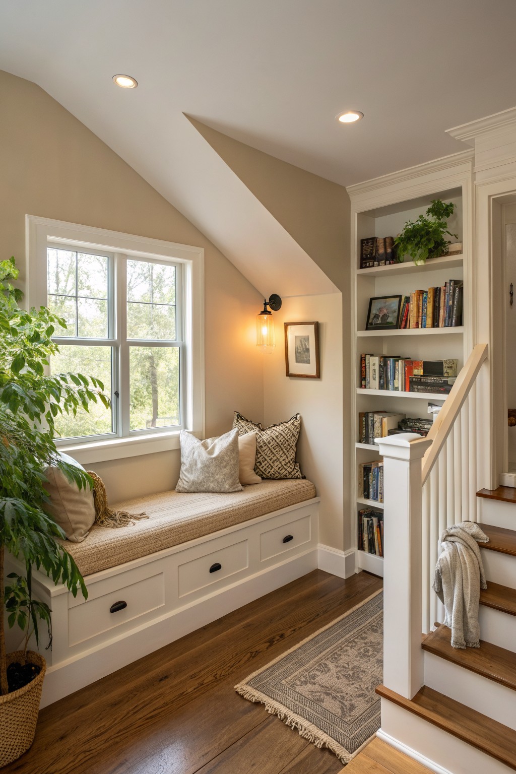
Many homes have these small tucked-away spots under sloped ceilings that can feel a little closed in. A warm neutral paint color on the walls helps the area read as part of the main living space instead of an afterthought.
This works best in older homes or farmhouse layouts where the architecture already has some character. Keep the same tone on the trim if you want the built-ins to feel seamless, and test the color on a larger swatch first since the light changes quickly in these corners.
Warm Terracotta Walls in the Kitchen
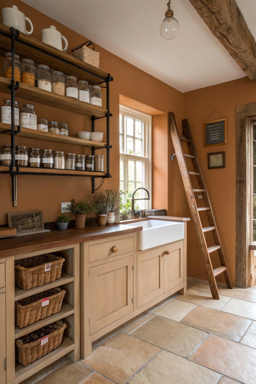
A warm terracotta shade on the walls gives a rustic kitchen a grounded, lived-in feel without much extra effort. It works especially well with natural wood shelves and cabinetry because the color softens the look of all that wood while still keeping things simple.
This approach suits older homes or rooms that already have wood tones and basic fixtures. Keep the rest of the palette light so the walls stay the main feature rather than competing with too many other colors.
Warm Neutrals for Built-In Bookshelves
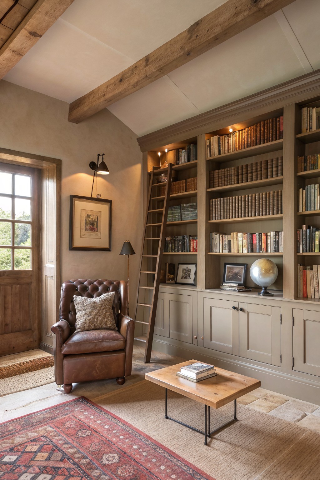
Painting built-ins in a soft earthy neutral works especially well in rustic spaces because it lets the books and wood tones carry the room. The color sits quietly behind everything without competing, which keeps the space feeling calm and collected rather than busy.
This approach suits older homes with exposed beams or plaster walls. Choose a shade that sits close to your wall color but slightly deeper so the cabinetry reads as part of the architecture instead of added furniture.
Warm Earthy Paint for Window Seat Nooks
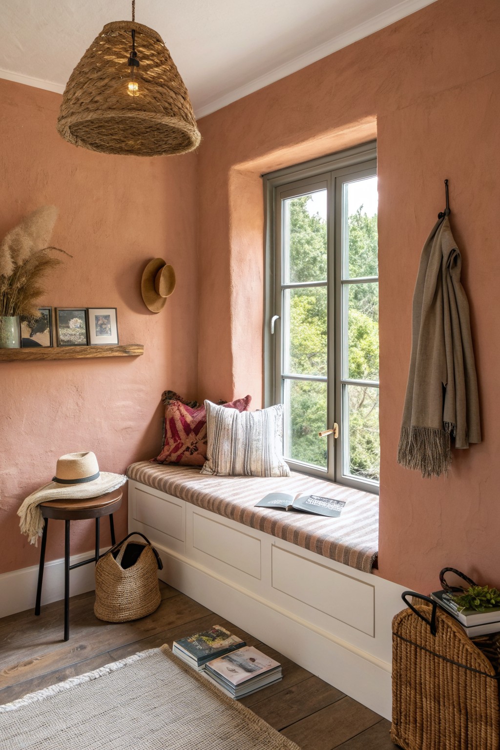
A soft terracotta shade on the walls gives a window seat area real presence without feeling heavy. The color grounds the space and makes the built-in seating feel more intentional, especially when paired with simple striped cushions.
This works best in rooms that get steady natural light so the tone stays warm instead of muddy. Use it in older homes or spaces with wood trim where you want the walls to feel connected to the rest of the house rather than just decorative.
Warm Sage Gray On Entry Walls
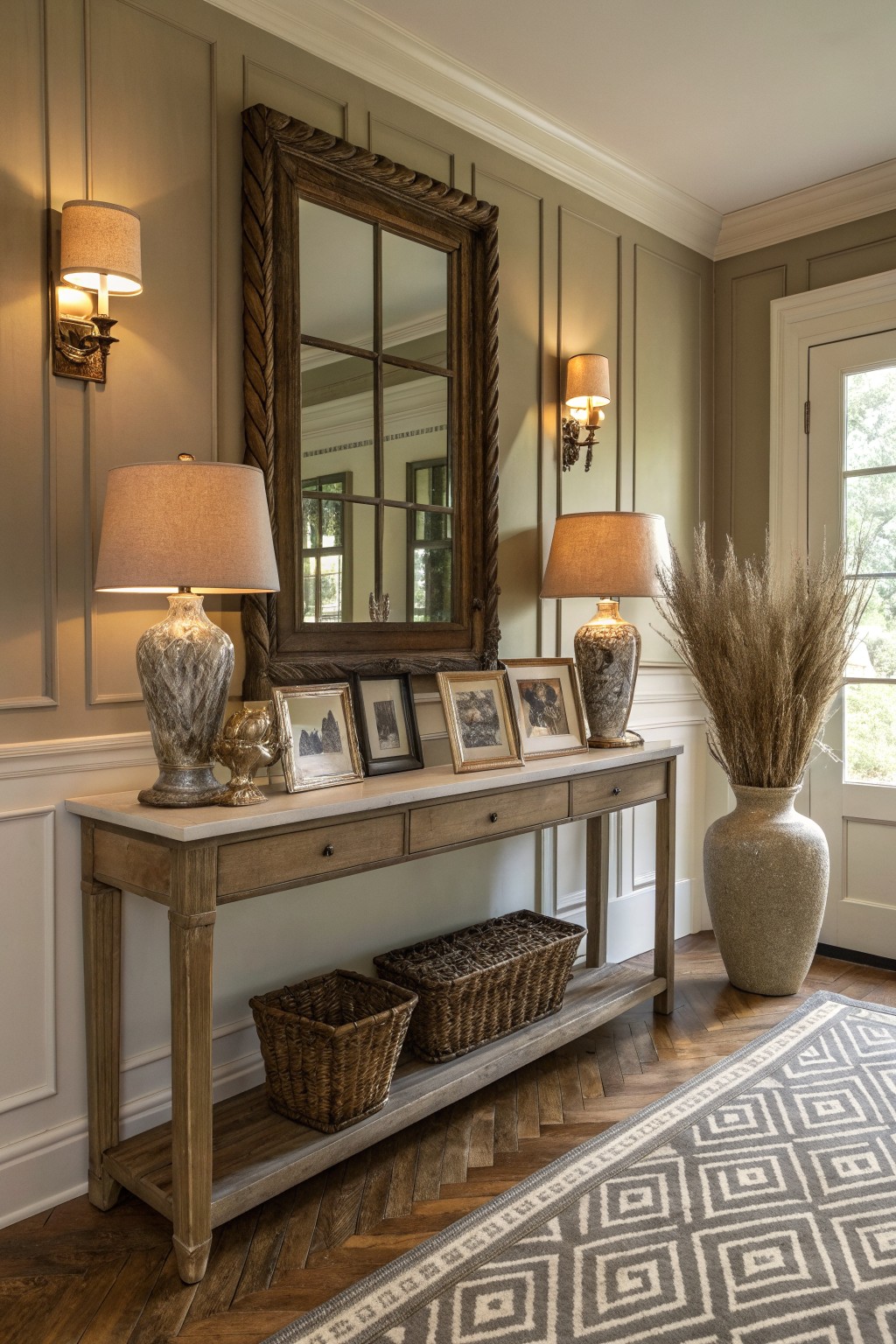
This muted gray green gives an entry or hallway just enough color to feel welcoming without making the space feel closed in. The tone stays soft and warm, so wood furniture and natural textures still stand out instead of getting lost.
It works best in homes that already have trim and paneling, since the color settles into the details rather than fighting them. Test the paint on a large board first and move it around the room, because the green undertone shifts with the light more than a plain gray does.
Built In Bars With Warm Wood Tones
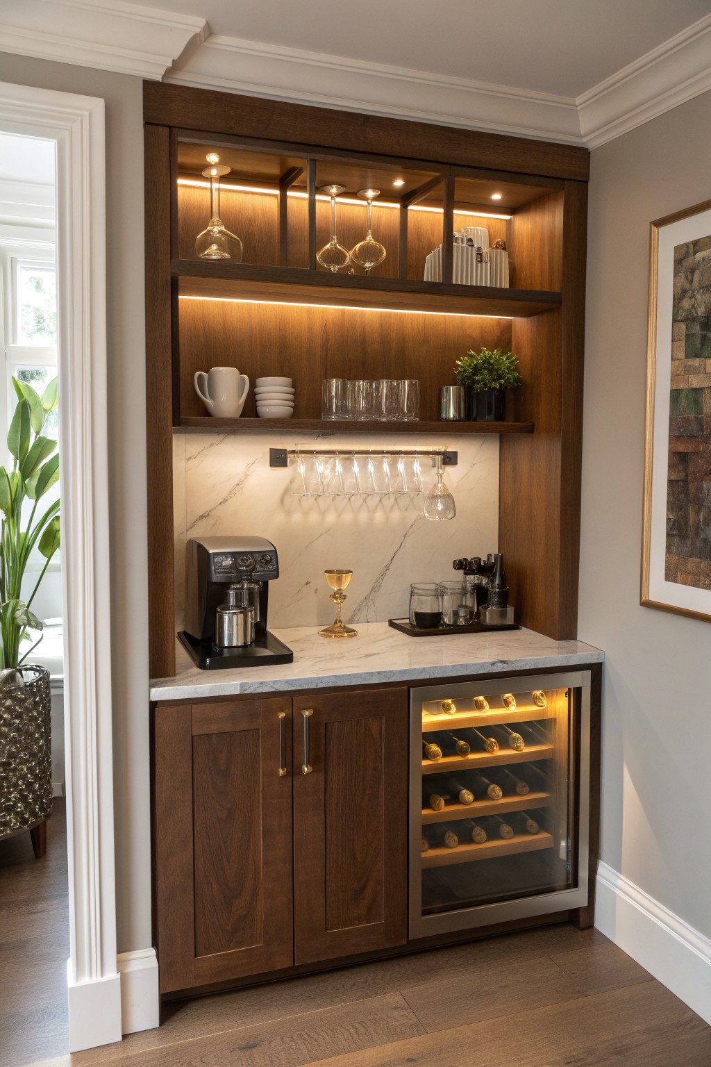
A small built in bar makes good use of an awkward corner or empty wall. Dark wood cabinetry paired with open lit shelves gives the space a grounded, lived in feel that fits right into a rustic farmhouse home. The wood brings warmth without needing much extra color.
This setup works best in a kitchen, dining room, or family room where you already spend time. Keep the wood finish in a medium to deep earthy tone and let the lighting do the rest. Avoid crowding the shelves so the bar stays easy to use every day.
Warm Earthy Paint for Hallway Walls
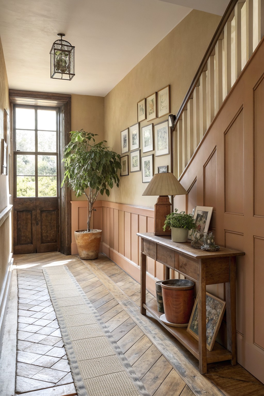
Many older homes benefit from soft terracotta or warm beige tones in hallways because these colors keep narrow spaces from feeling cold or closed in. The paint works with existing wood trim and stairs to create a simple, lived-in look that still feels pulled together.
This approach suits homes with traditional paneling or wainscoting. Keep the lower section a shade or two lighter or warmer than the walls above to add quiet depth without extra decoration.
Terracotta Walls For A Warm Rustic Bath
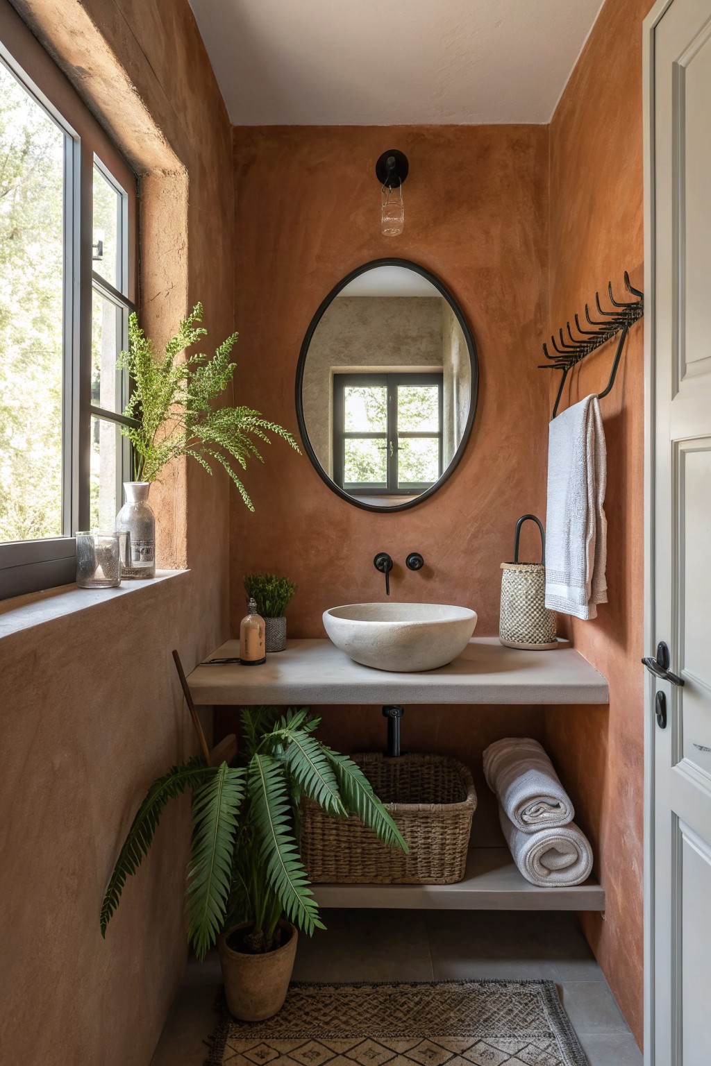
Terracotta paint gives a bathroom that grounded, lived-in feeling many people want in a rustic farmhouse home. The color holds warmth even on cloudy days and makes the space feel more personal than plain white ever does.
It works best in smaller bathrooms where you can use the depth without it closing in too much. Pair it with simple counters and natural textures so the walls stay the main feature without fighting everything else around them.
Frequently Asked Questions
Q: How do these colors look with lots of natural light? A: They warm up the room and feel even more inviting. Stick to the mid-tone options so the space does not feel washed out.
Q: Should I paint the whole room or just an accent wall? A: Full walls give that true rustic farmhouse vibe. An accent can work if you want to test the waters first with a bold earthy tone.
Q: What about matching these paints to my old wooden beams? A: The warm palettes play off wood tones really well. Choose shades that pull from the same brown family as your beams.
